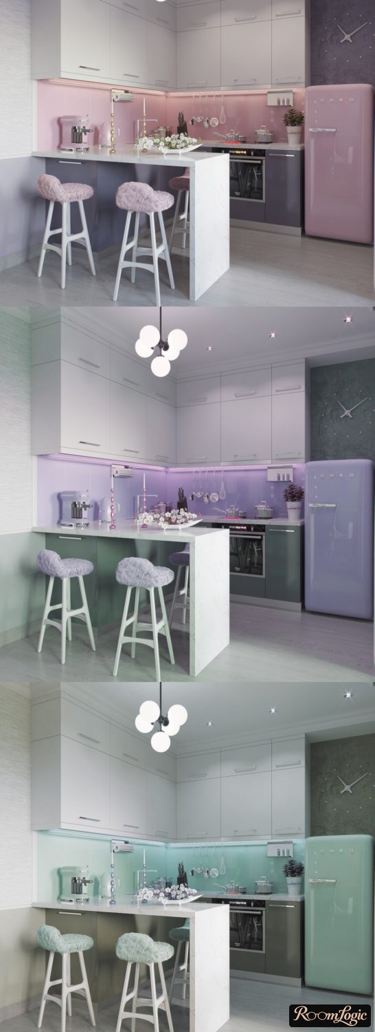
In real apartments, rooms are small and budgets are not unlimited, and this puts a ton of restrictions on kitchen design.
That is where we will start.
Practical Kitchen Design
Obvious ideas that people still get wrong:
- Upper cabinets to the ceiling are standard. With them, the kitchen interior looks built-in and modern. Clutter and dirt do not collect. There is extra room for rarely needed items.
- Lift-up hardware for upper cabinets costs more than swing doors but gives no advantage in convenience or appearance – forget it.
- Pullout hardware for lower cabinets also costs more, but it is much more convenient – this is worth paying extra for.
- Handles are unnecessary on upper cabinets with any opening system. Make the upper doors 3/4 inch longer and open them from the bottom.
- Build these into the sink: a faucet with separate outlets for tap and filtered water, and a soap dispenser. The area immediately becomes clearer.
- Use the windowsill by putting a countertop in its place.
- Additional lighting (the backsplash, for example) should switch on at the kitchen entrance from the same two-gang switch as the main light. Not separately, as most people do. Ideally, the switch should be easy to press with your knee (admit it, you also like eating outside the kitchen and often leave with your hands full?).
Important! There is a fork ahead.
If you are interested in these rational kitchen design ideas and real photos where they are used, go here:
- Small kitchen interiors
- Tiny square kitchen remodeling
- Kitchens up to 65 square feet
- 100-square-foot kitchens – common apartment kitchens and not only those.
- U-shaped kitchens
Because limited space is exactly where you have to go deep into ergonomics and follow the rules.
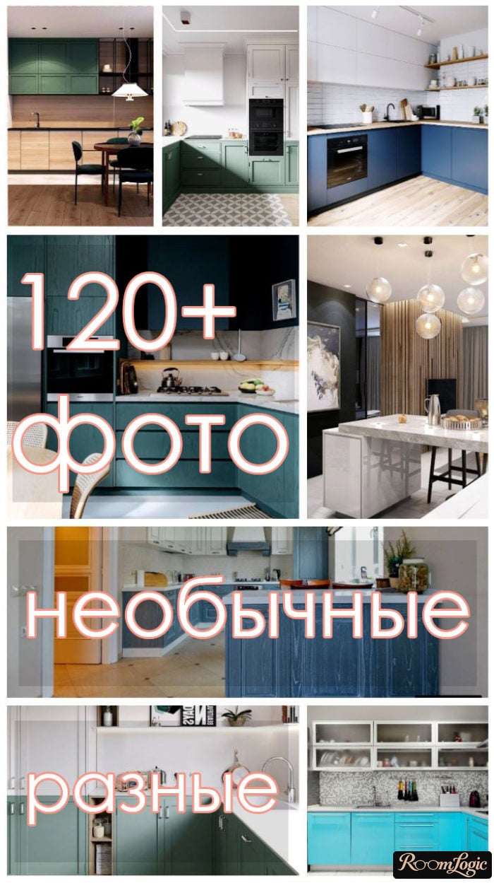
What follows here is a photo gallery of bright, unusual designer solutions that look stylish and interesting despite the rules. Plus links to articles about styles and so on.
Kitchen Interior Styles
Modern style does not require perfect obedience to the rules, and that is why it is so cool.
Below is about the feeling created by the appearance, not about holding the kitchen interior inside artificial boundaries.
Also read the overview of all interior design styles.
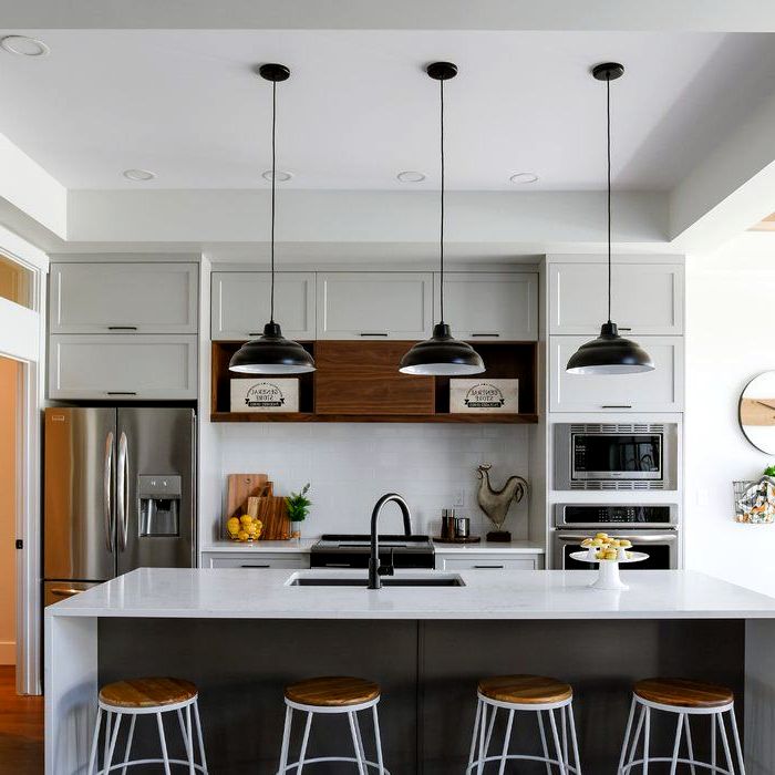
1. Scandinavian
A very modern approach to a kitchen remodel:
- Simple finishes and furniture
- Neutral colors (white, gray, wood)
- Small accents through patterns or bright spots
The result is a cozy interior without kitsch or showing off, for minimal money, but with individual touches.
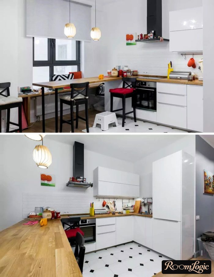
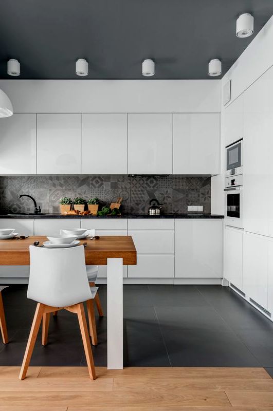
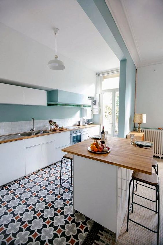
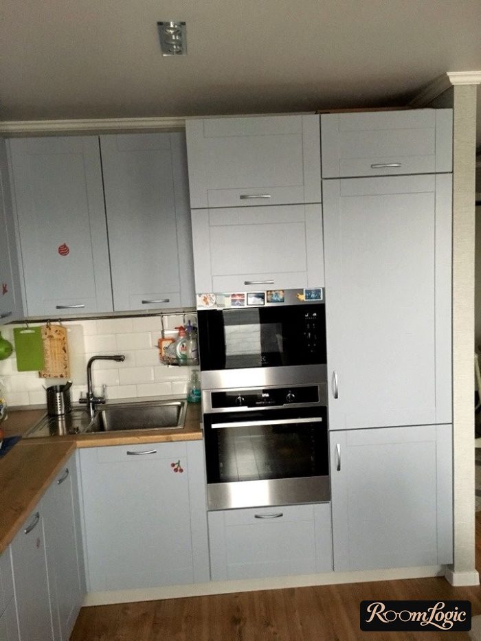
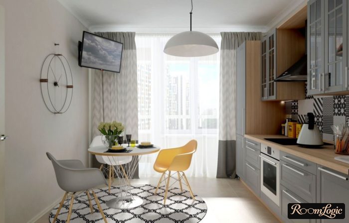
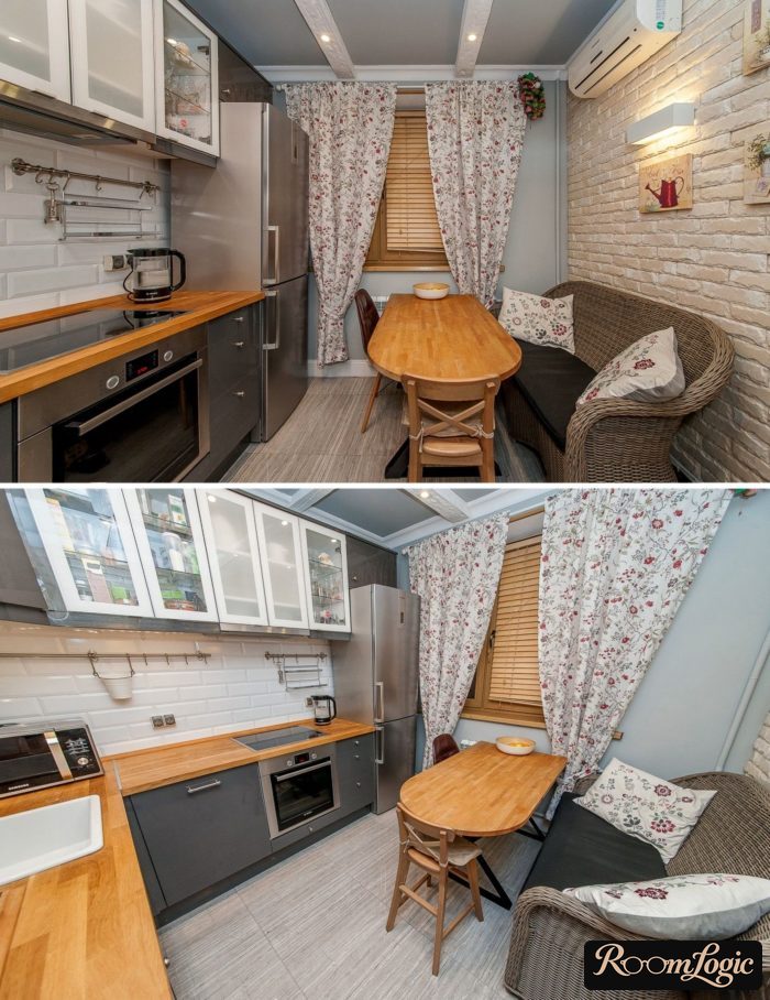
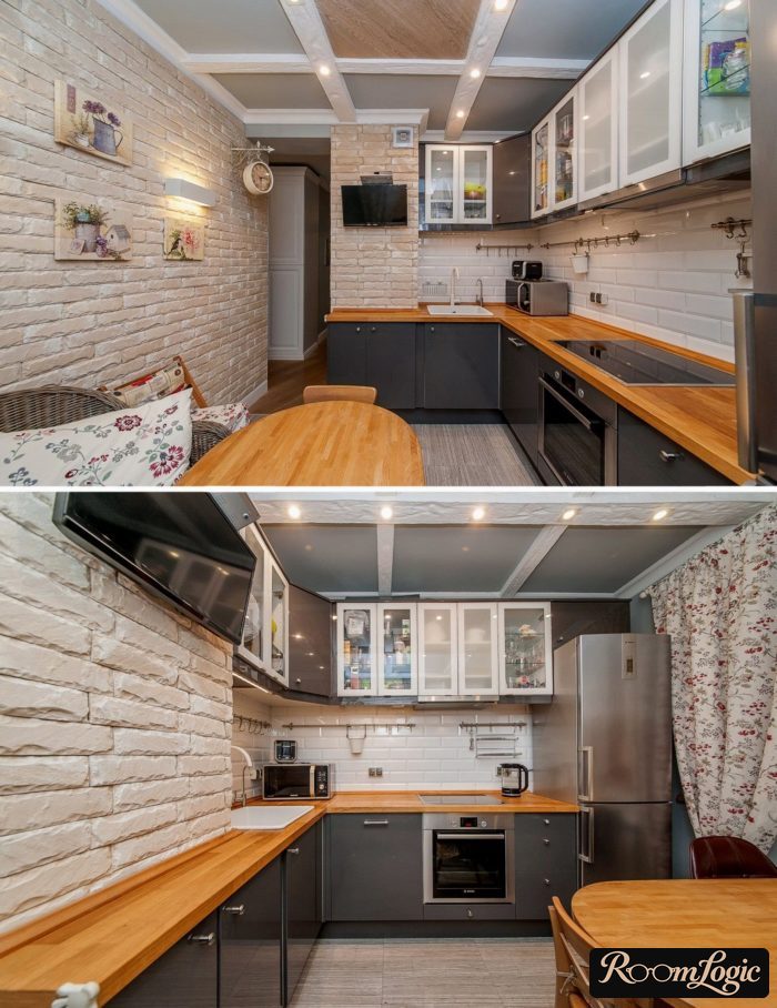
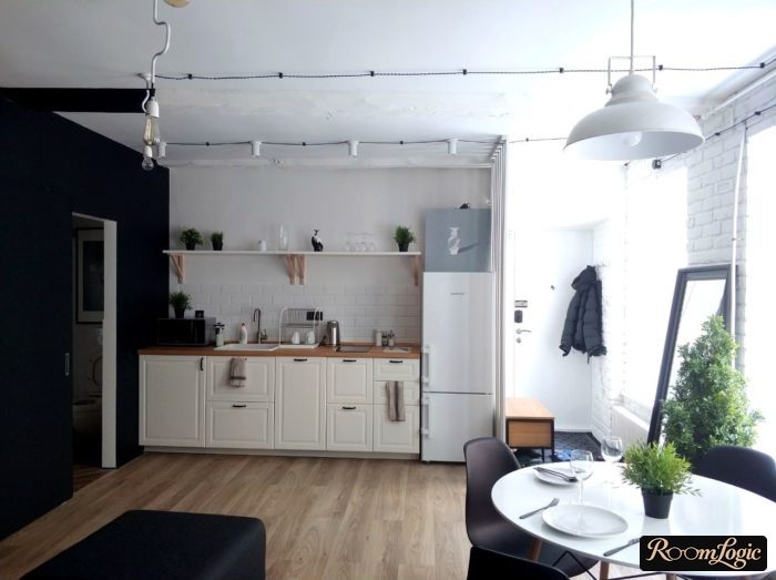
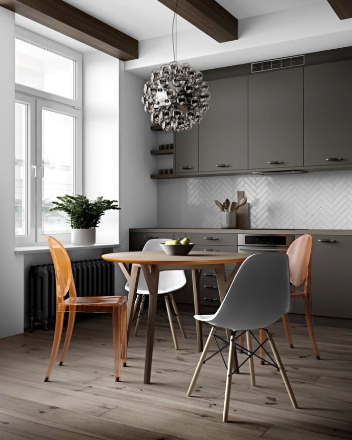
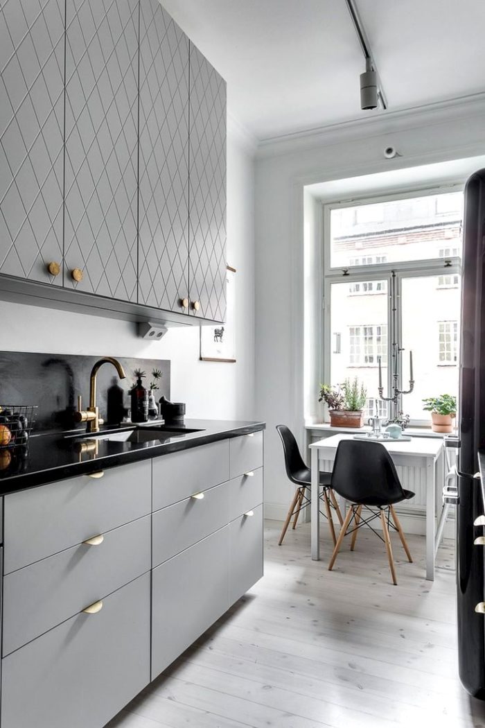
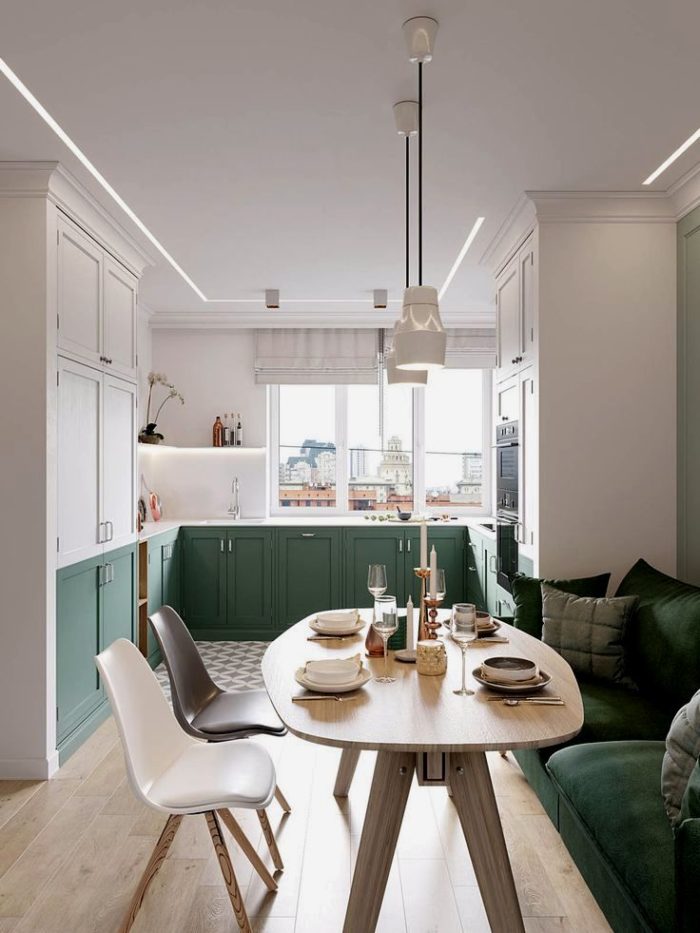
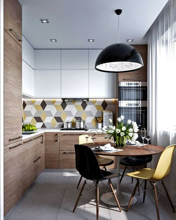
The photos clearly show that you do not need to overthink it. Just 1 interesting detail is enough to make a kitchen interior unusual:
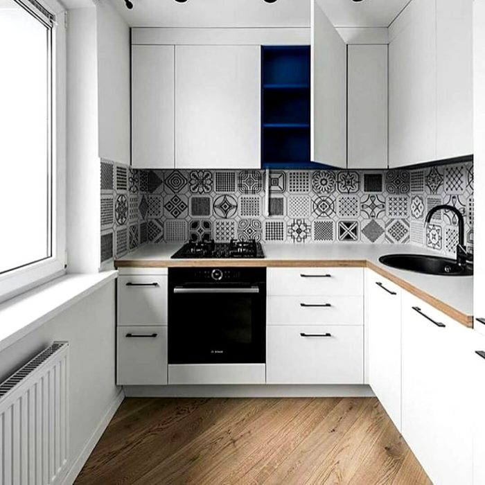
- Three-dimensional cube tile or black-and-white patterned tile on the backsplash
- An L-shaped breakfast bar with a view out the window
- Turquoise walls and patterns on the floor
- Light gray matte milled cabinet fronts
- Exposed wiring and a concrete ceiling painted directly
That is the whole point of Scandinavian style – overall simplicity and local accents.
Many photos and ideas for adapting it to real apartments: Scandinavian kitchen interior.
2. Neoclassical
A very popular style that does not actually exist.
But the idea is good:
Take neutral elements from traditional styles (milled cabinet fronts, decorative handles, elaborate light fixtures), but calmly use modern things for everything else. This approach is widely used in the U.S. and is called transitional or traditional style there.
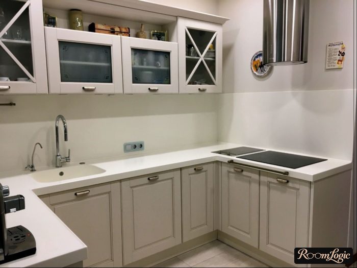
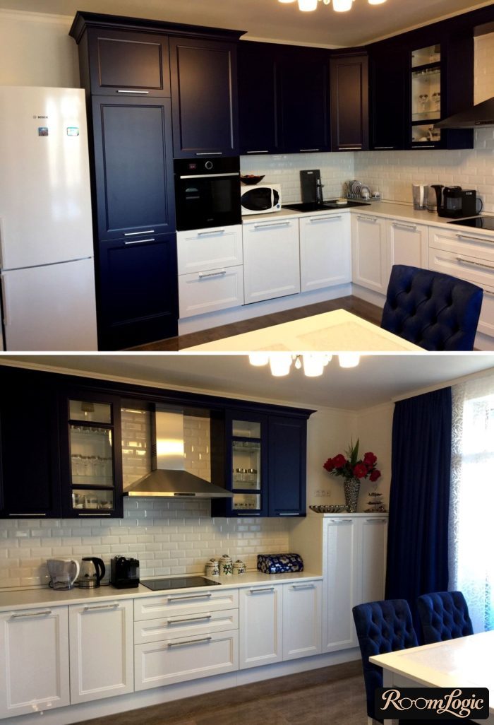
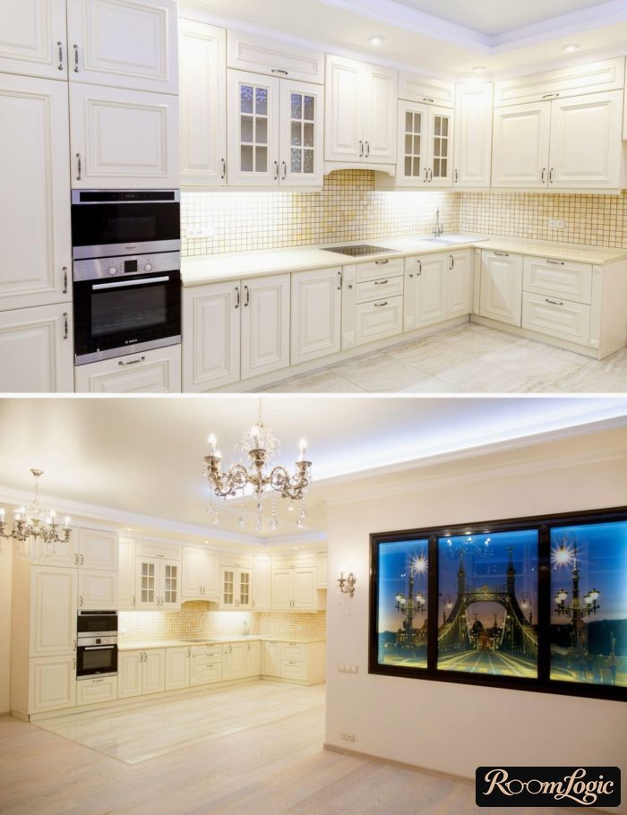
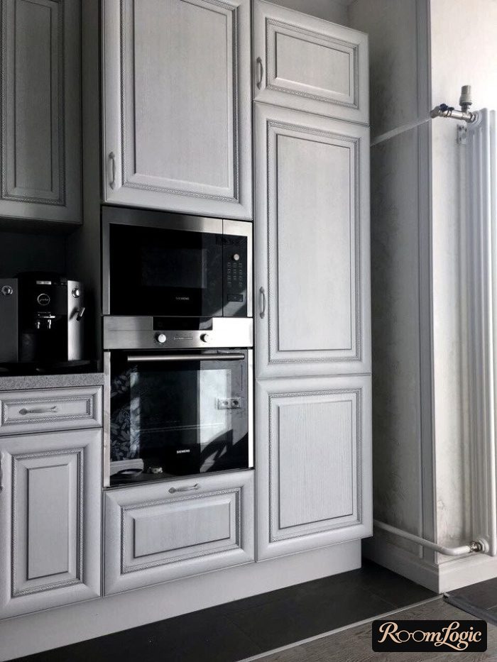
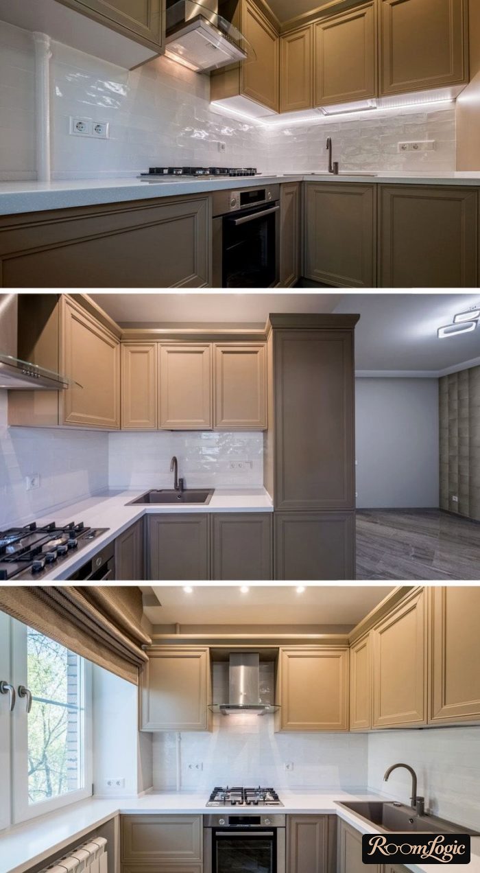
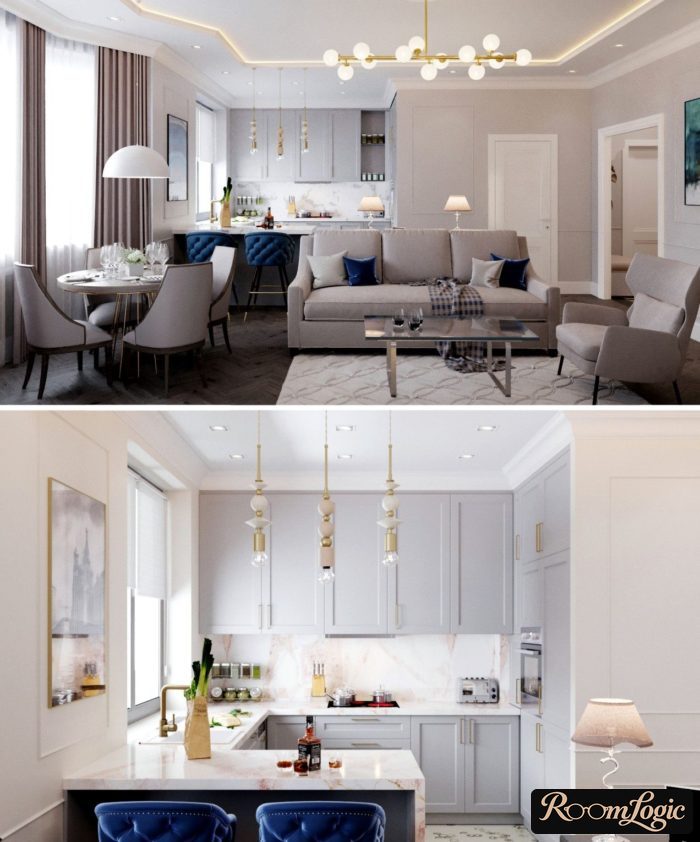
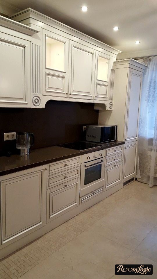
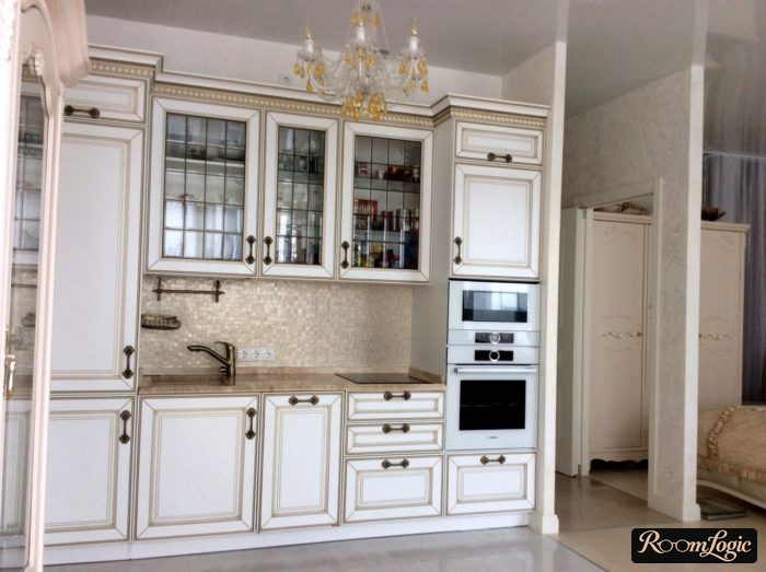
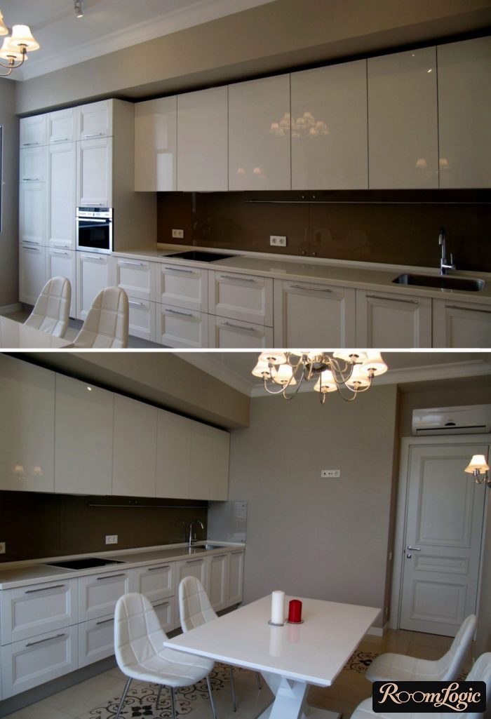
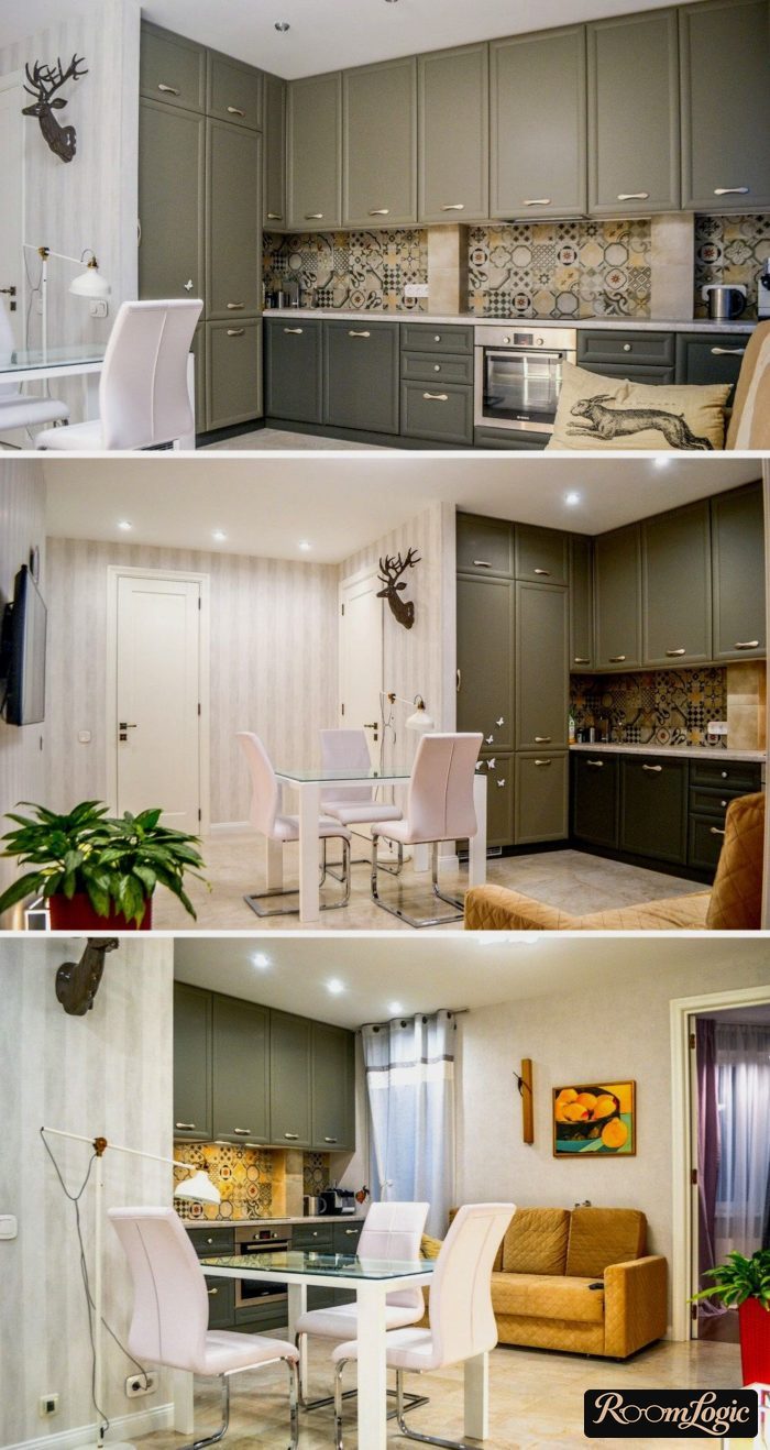
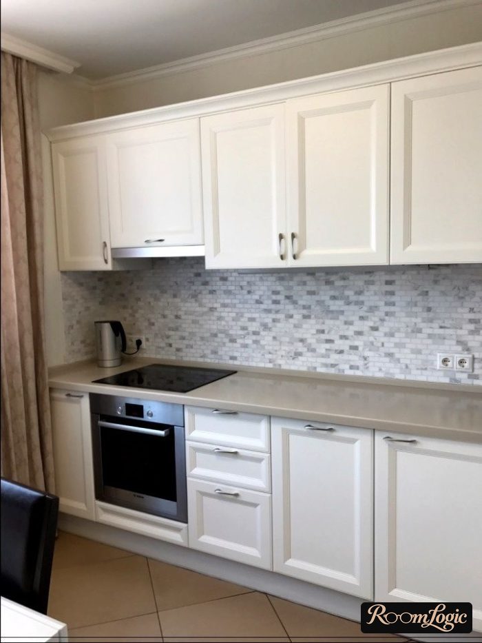
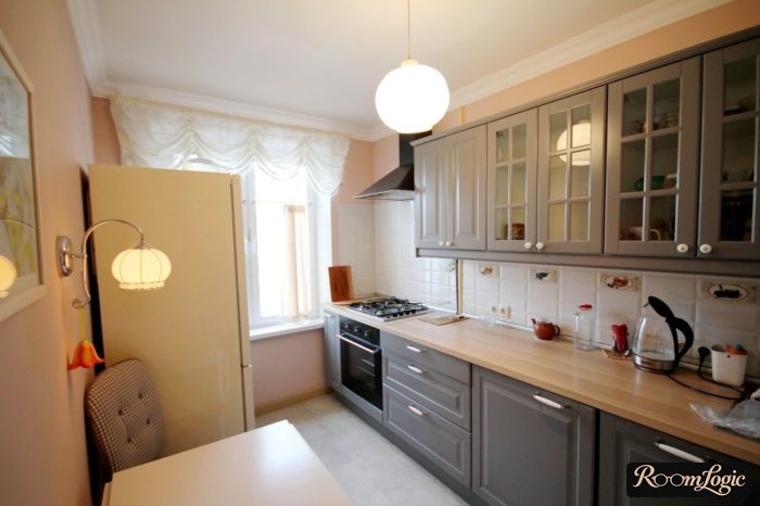
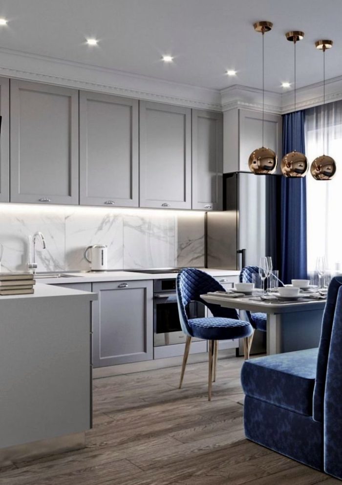
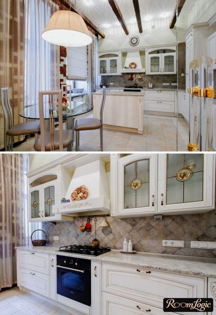
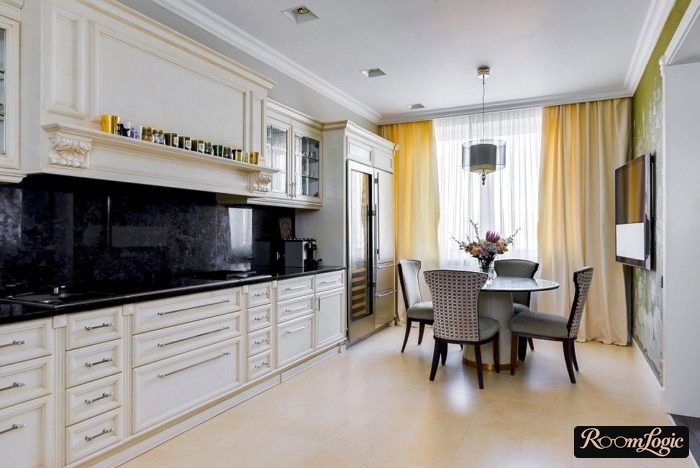
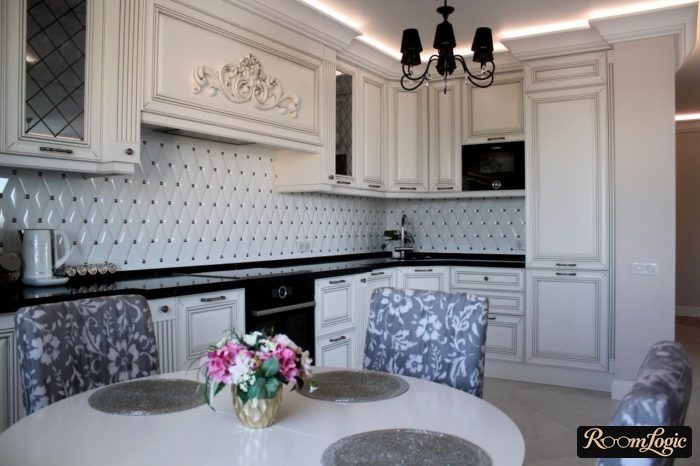
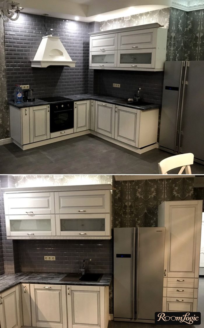
Leave out gilding, murals, molding, and other deliberate signs of luxury that increase the budget without guaranteeing a better remodel. Read about neoclassical kitchens.
You get a cozy, beautiful kitchen without overpaying for imitation traditional appliances and furniture. In the feeling and overall impression of the design, these kitchens resemble Scandinavian ones, while the furniture resembles a Provence-style kitchen.
3. Loft
We do not care about the rules, so all we want from the style is:
- Brutality
- Surfaces with rough texture (concrete, brick, travertine) that we will then light and get beautiful, deep shadows
- Dark colors
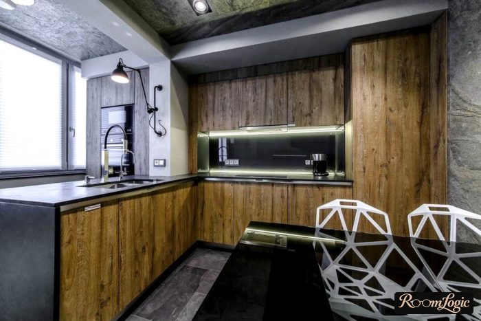
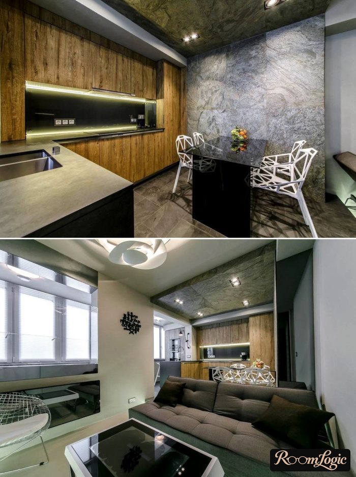
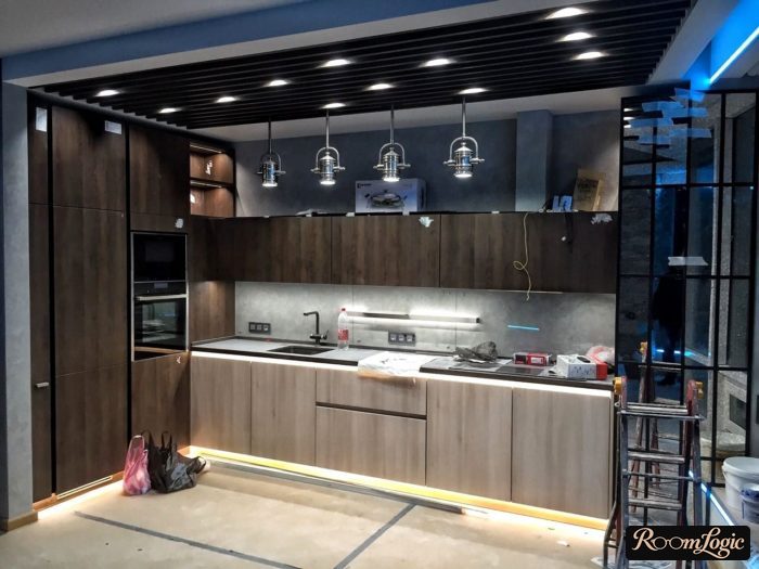
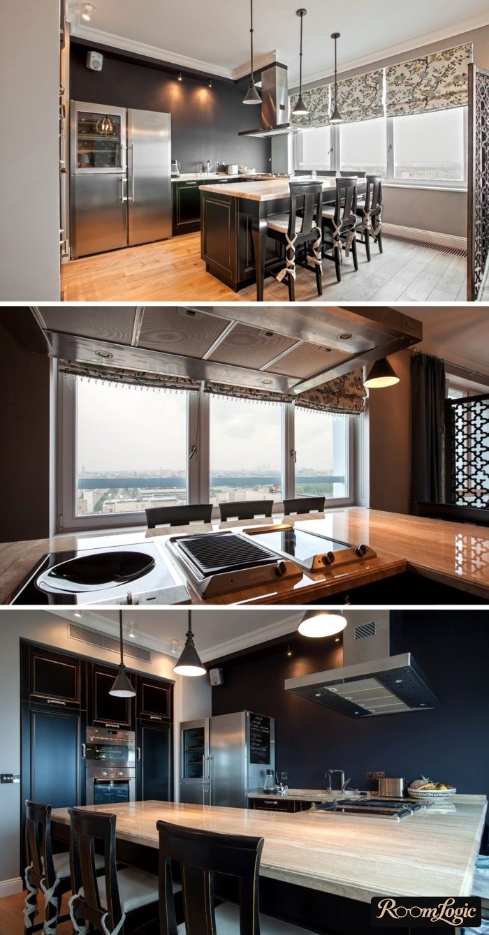
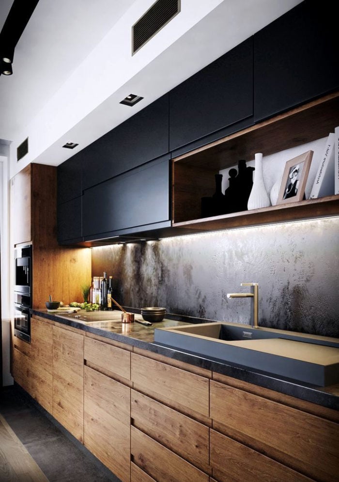
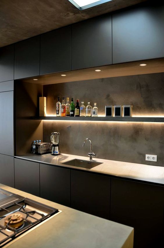
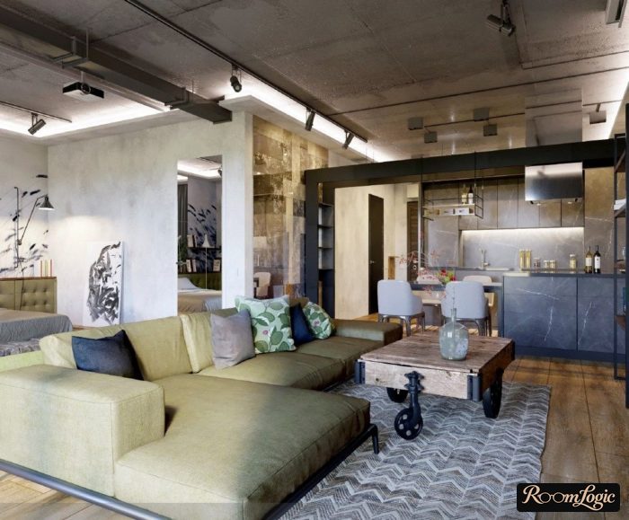
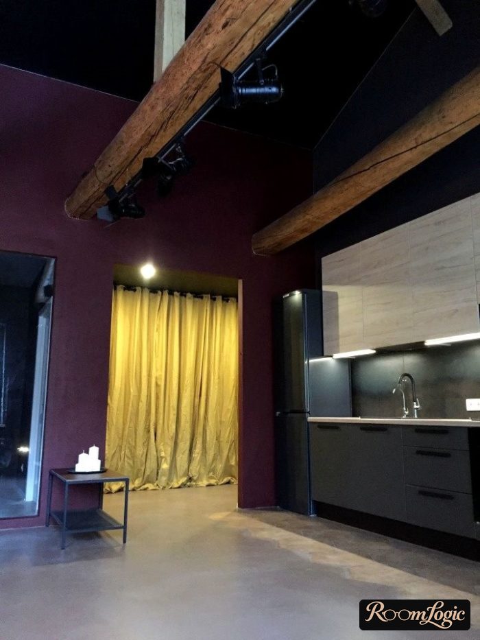
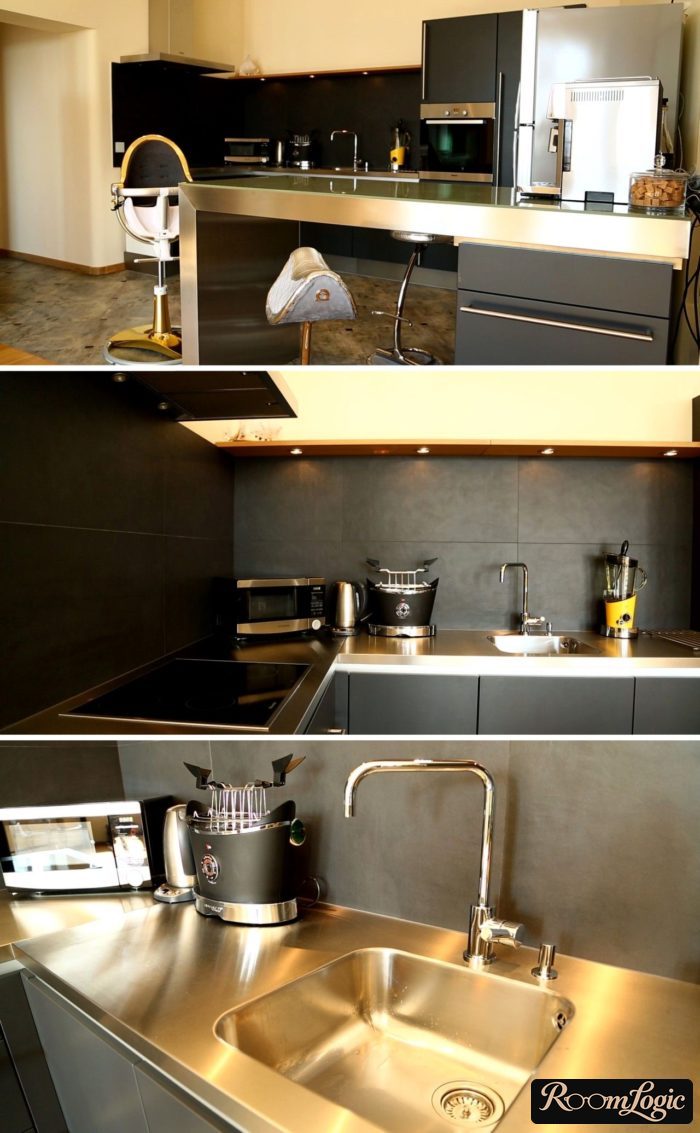
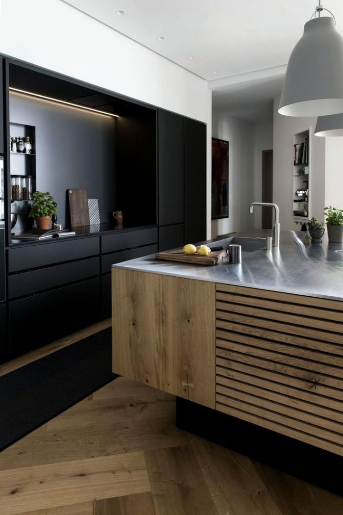
The drawback:
every kitchen solution has to be interesting. A regular radiator or faucet can easily break the overall image, while designer ones are expensive. That is why it is easier to borrow individual style elements than follow it completely. I have already covered all the details of loft-style kitchen design in an apartment (there are plenty).
Loft likes large spaces, so it may make sense to remove some walls. Read about the details of open-plan kitchen and living room design.
4. Minimalism
The permanent foundation of every modern style. In real apartments, kitchens grow a large number of objects and end up in permanent disorder. That is why closed storage is everything to us.
The standard combination of colors that do not draw attention is a white kitchen with wood countertops. In this version, even a slight mess will not destroy the feeling of minimalism, plus it is practical and inexpensive.
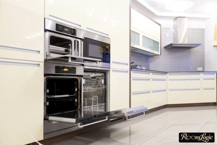
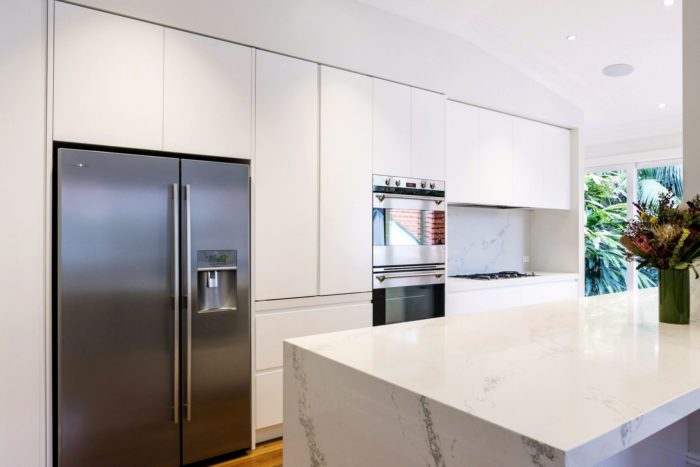
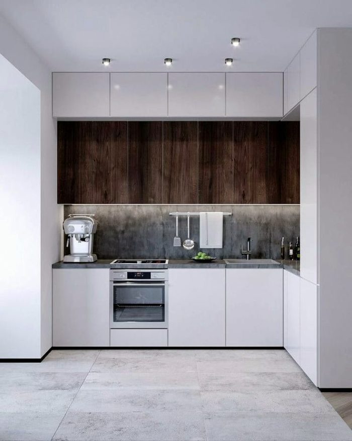
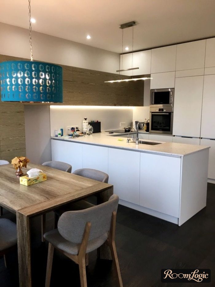
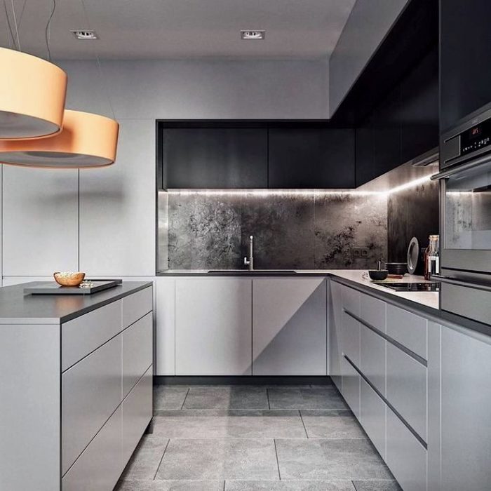
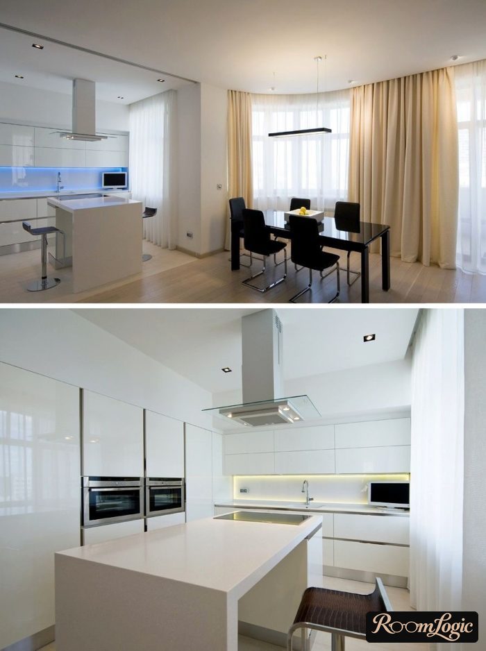
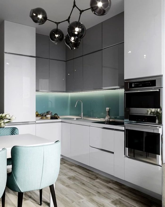
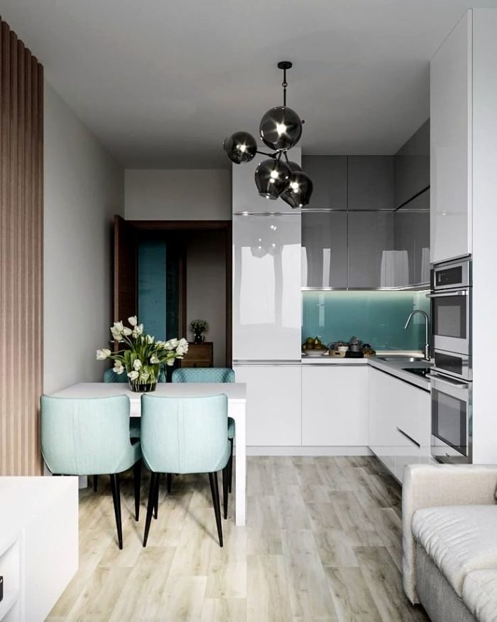
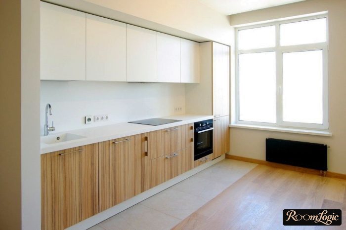
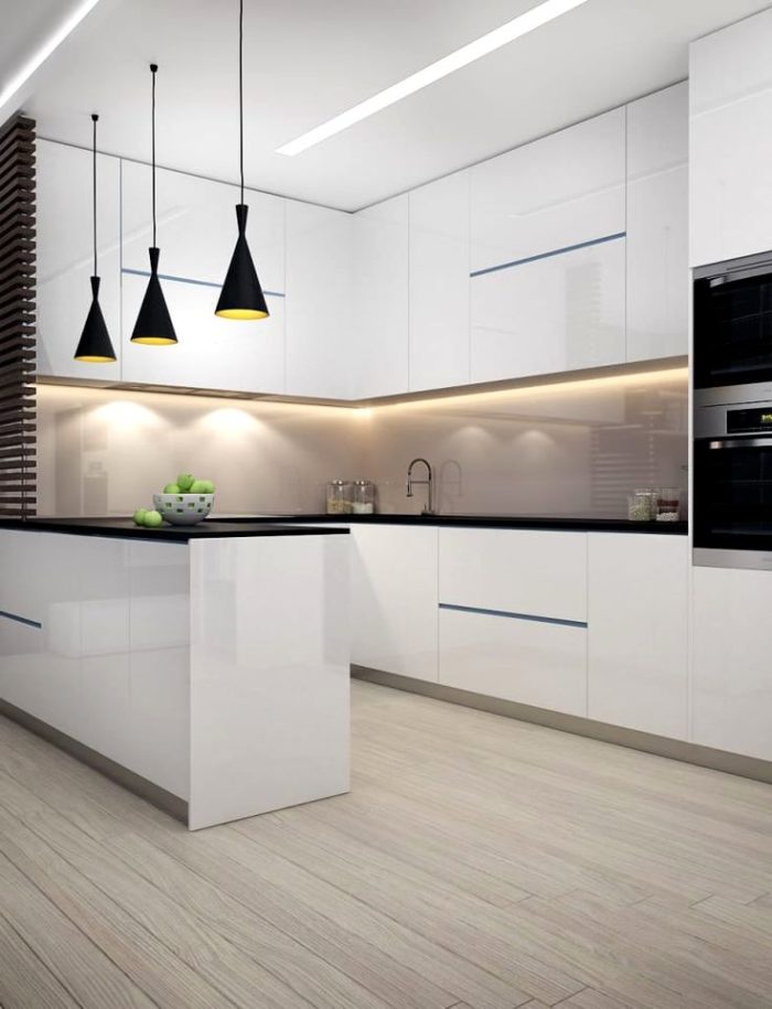
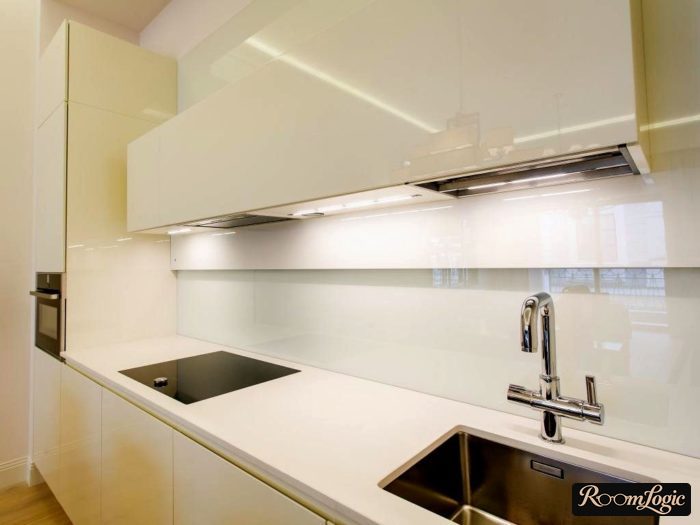
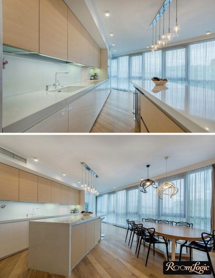
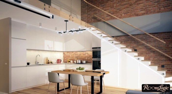
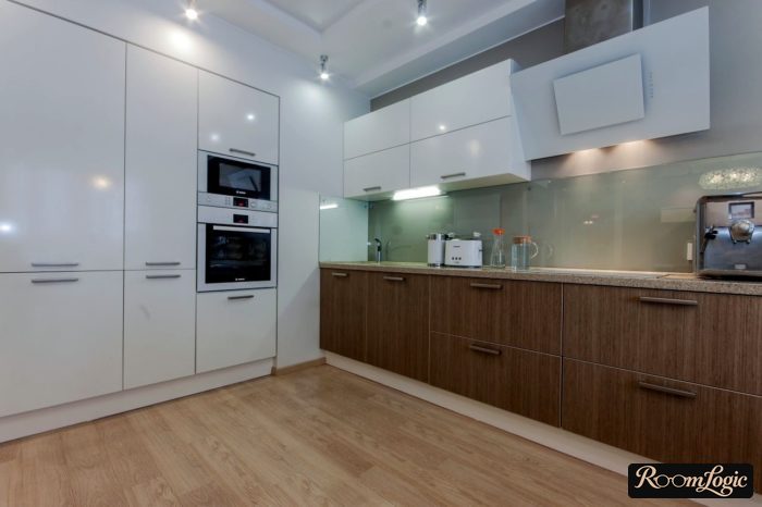
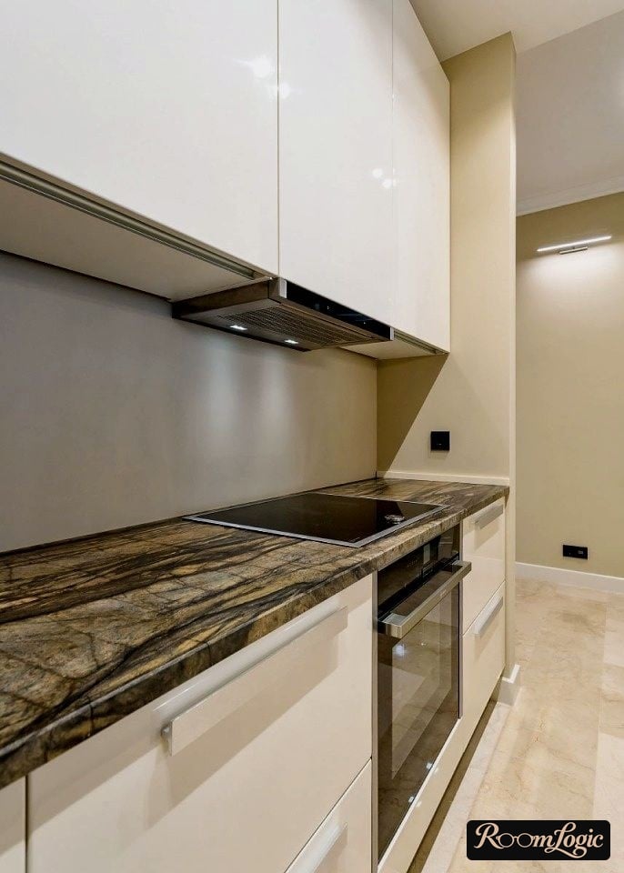
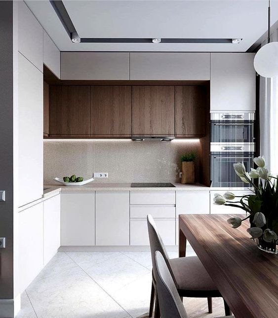
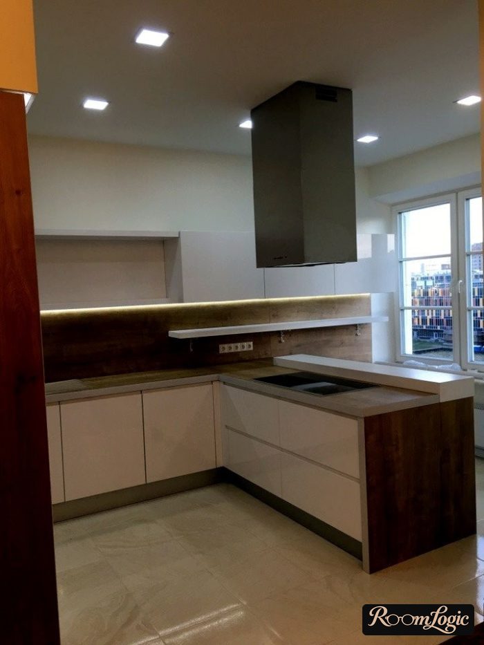
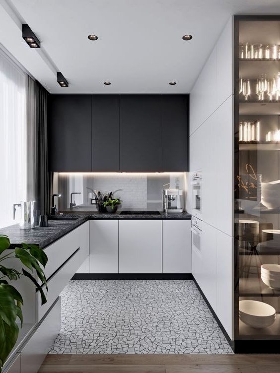
Like any stylish modern kitchen, it requires every appliance and piece of furniture to be completely built in – there should be no dark corners, upper cabinets stopping short of the ceiling, freestanding ranges, or microwaves.
The biggest advantage of minimalism is that even if you make a ton of mistakes with the finishes and choose the wrong flooring and cabinets, the kitchen design will still remain acceptable.
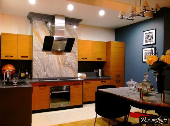
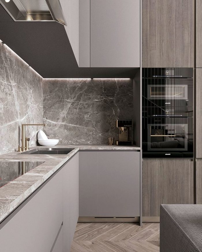
Dream Kitchen Design
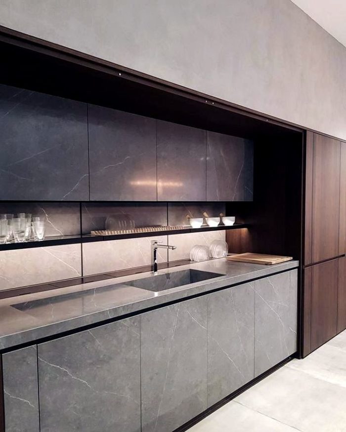
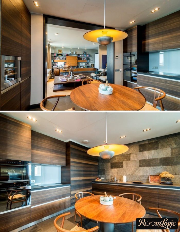
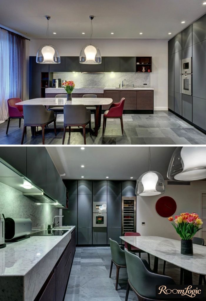
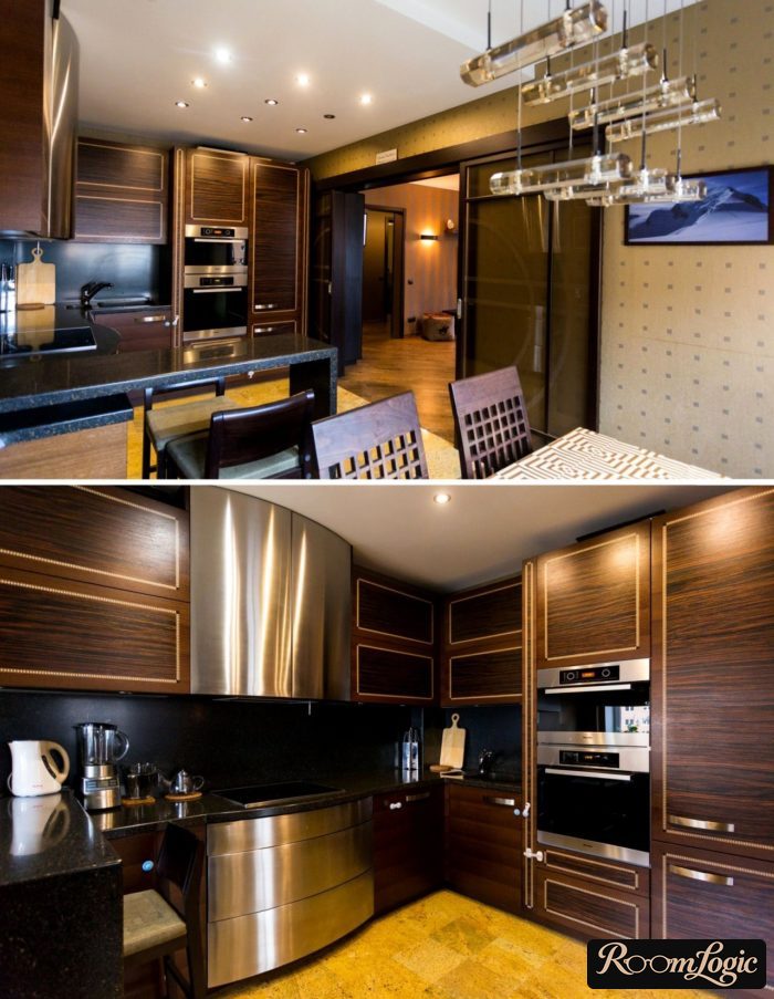
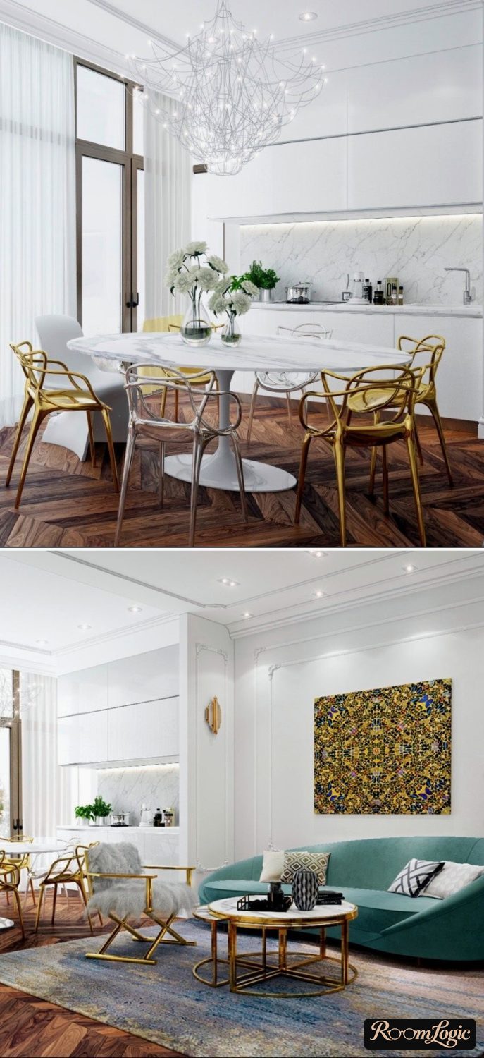
Do not even try to implement the kitchen designs in this section without a large budget and a design plan. But you can borrow individual features.
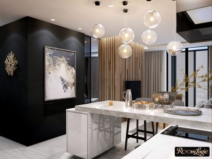
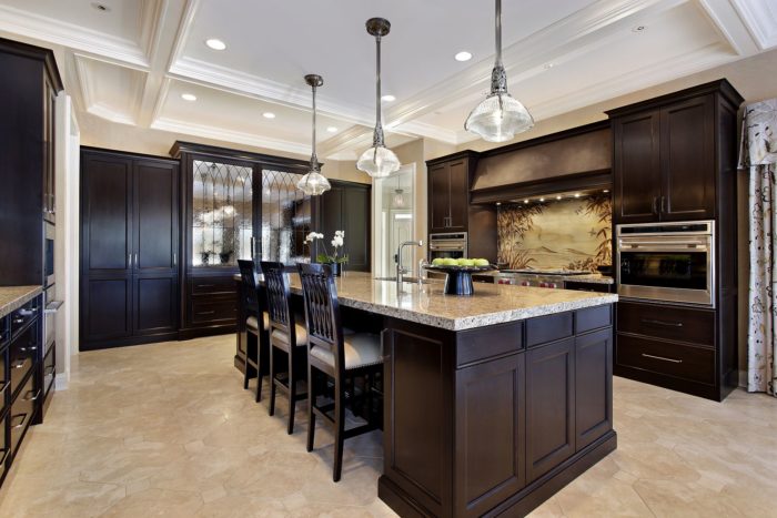
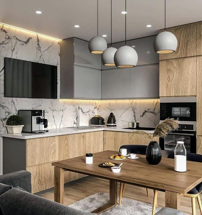
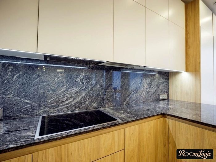
In many ways, the kitchens in the pictures look beautiful and expensive because of luxury materials: stone, stone veneer, hardwood floors, solid-wood cabinet fronts, and natural wood on tables and breakfast bars.
But there are 2 ideas that can be moved from a dream kitchen into a real design:
- Designer light fixtures. There are now many copies and simply similar versions of Italian and other expensive fixtures, but made in China or Poland. They are often no worse in quality – globalization has a positive effect on the “spread” of design.
- Bold, localized color accents. The last section is devoted entirely to color.
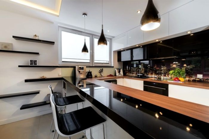
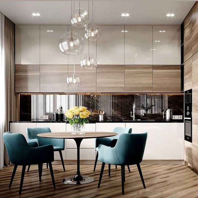
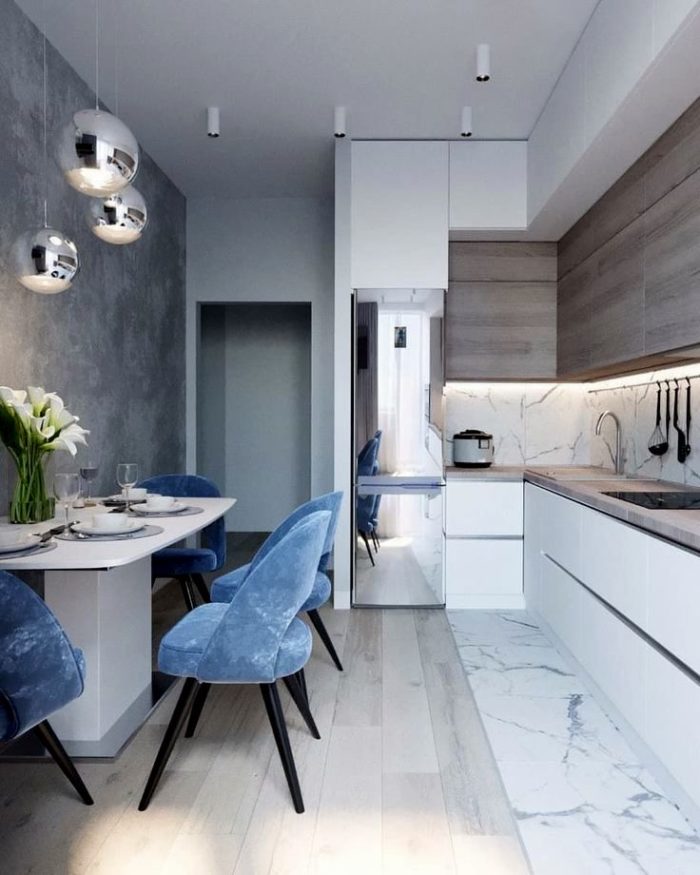
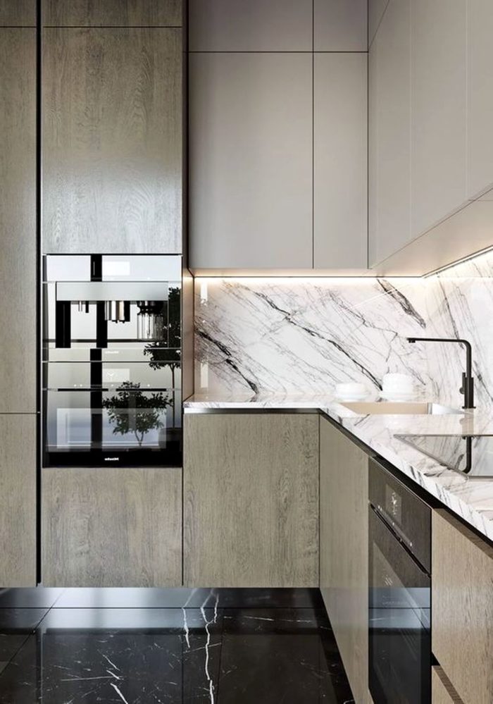
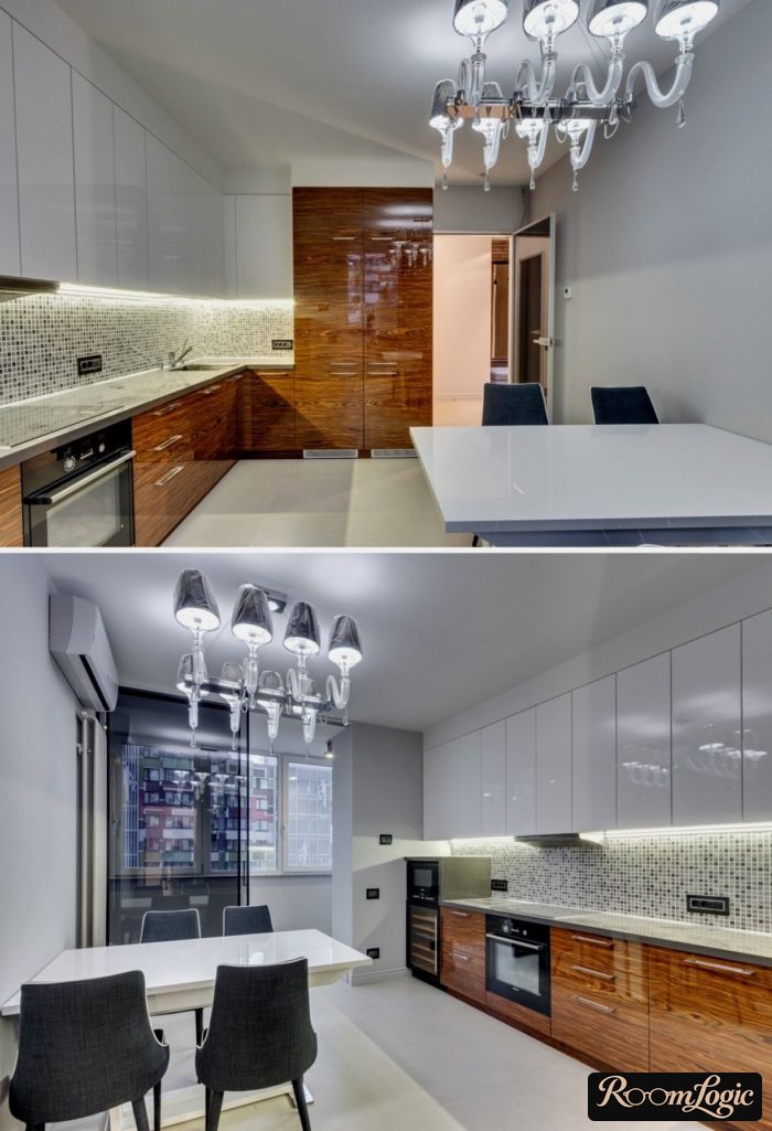
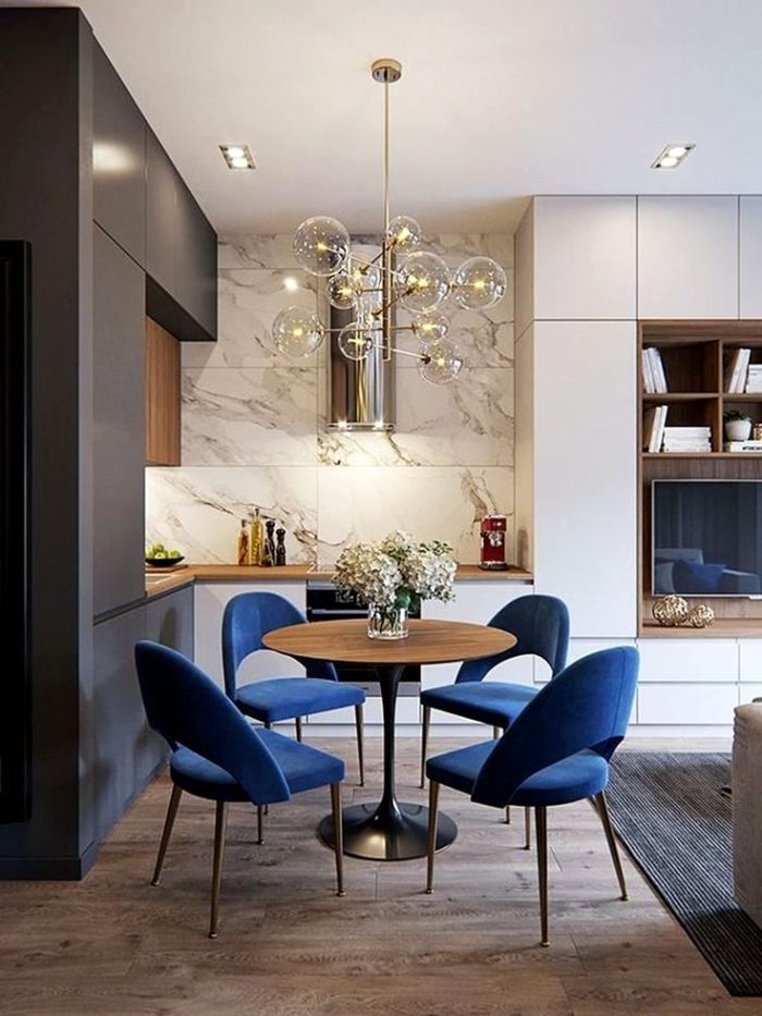
For an example, let’s divide the photos into 2 groups:
- The kitchen design is based on expensive things and cannot be reproduced on a budget
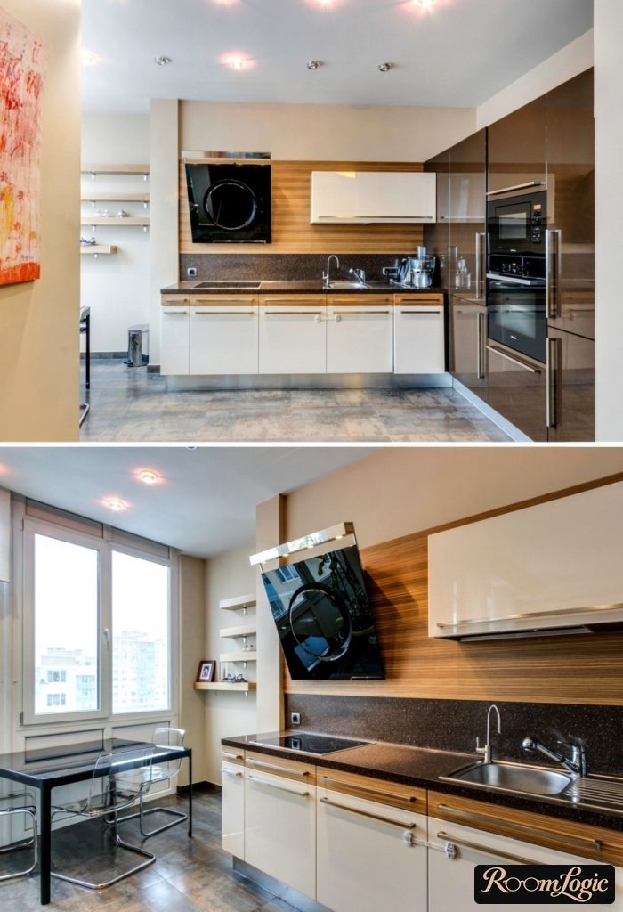
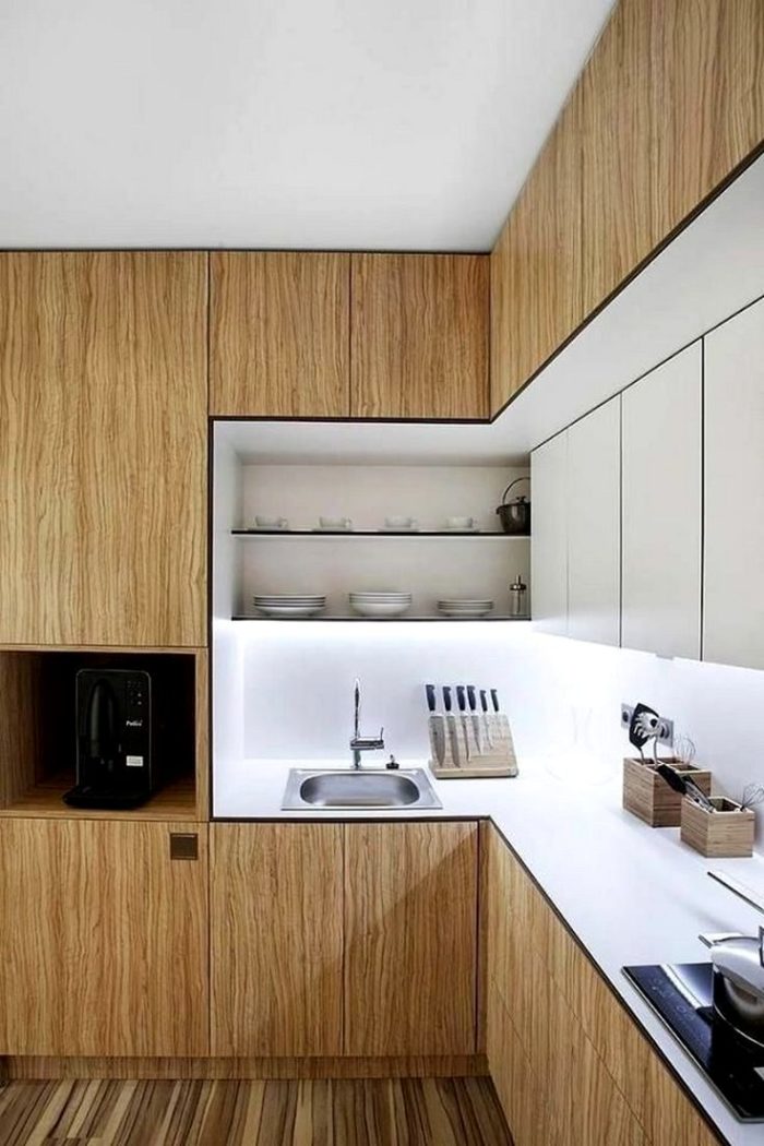
- Interesting kitchens with unusual ideas made from ordinary materials
Expensive:
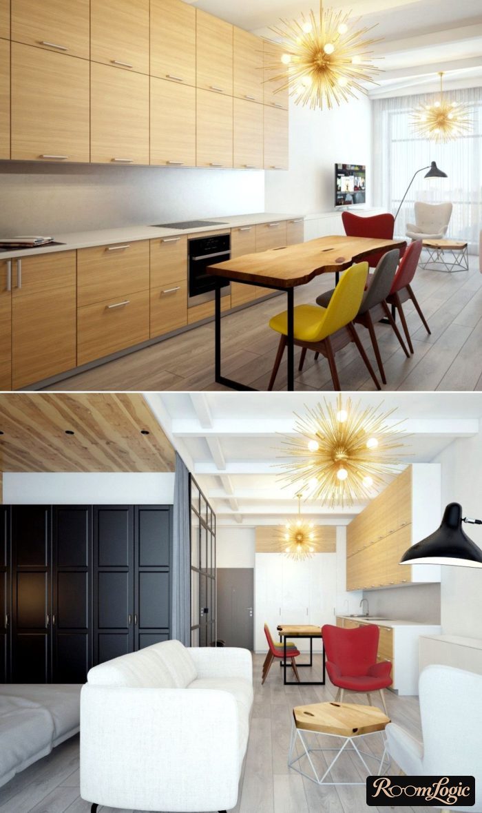
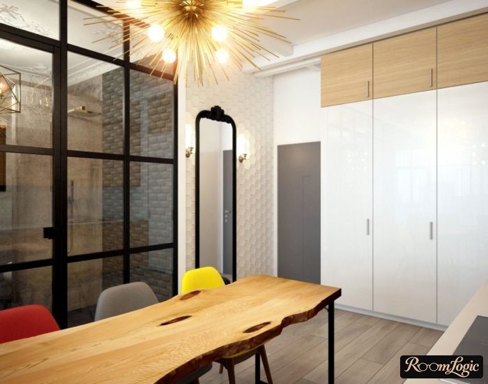
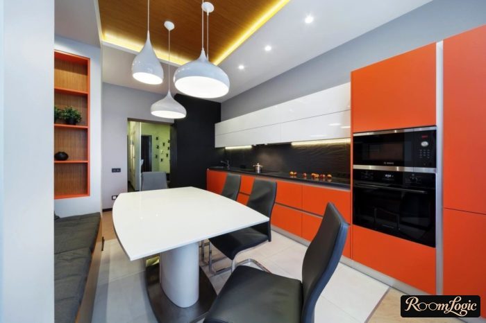
Interesting:
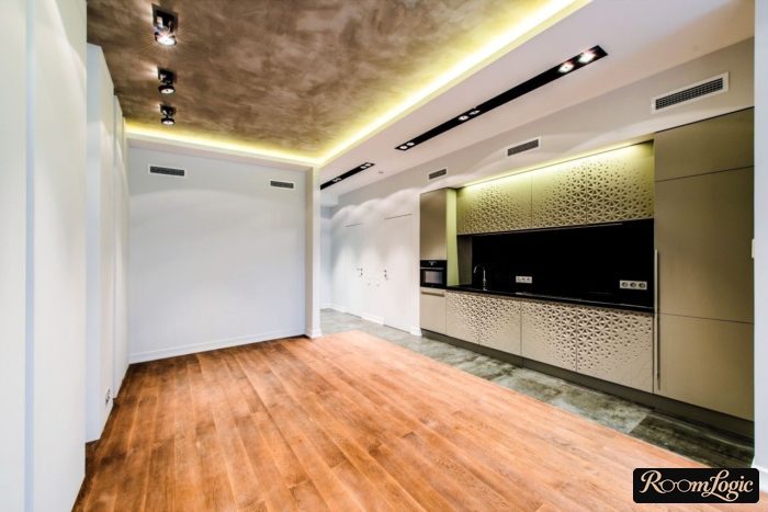
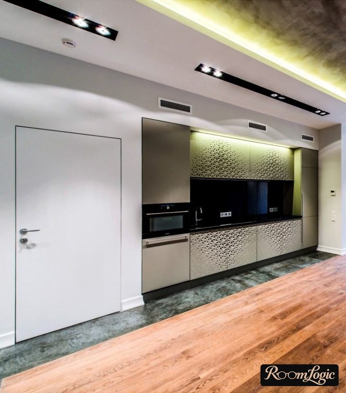
Interesting Colors
Usually I write: make kitchens white, make them light, do not use bright colors, and especially not dark ones because they are impractical too.
And not without reason: brightness in an interior = risk. But at the same time, it is a simple and free way to make an unusual kitchen design. Here are 2 photo examples where unconventional accents made the remodel very interesting:
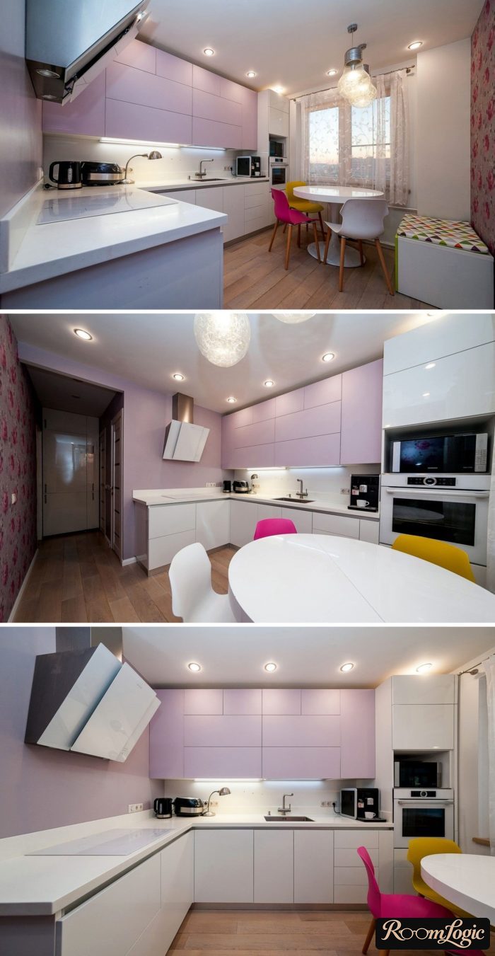
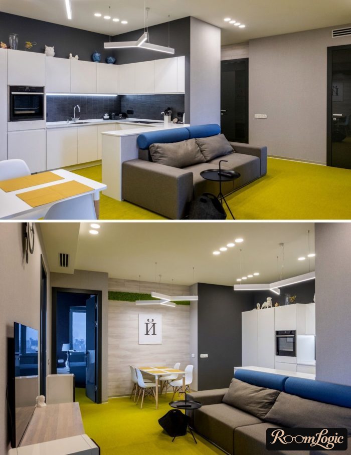
Let’s look at 2 types of color that I usually do not recommend, but before that, I strongly advise understanding my article about combining colors in an interior – without it, the chance of mistakes approaches 100%.
There I explained why using pure color in furniture and finishes is a bad idea. But unusual muted colors and their shades are an interesting solution.
Cool Colors
For a while, pure blue kitchens were in fashion, and they were awful. Although the potential of blue shades is enormous.
Add black, and you get a dark blue kitchen:
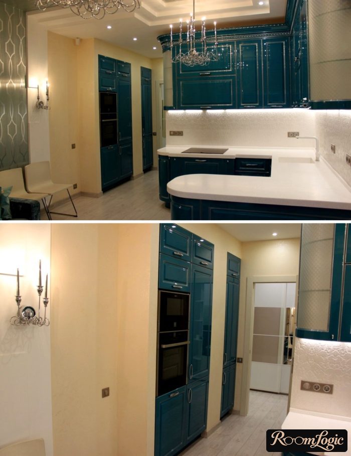
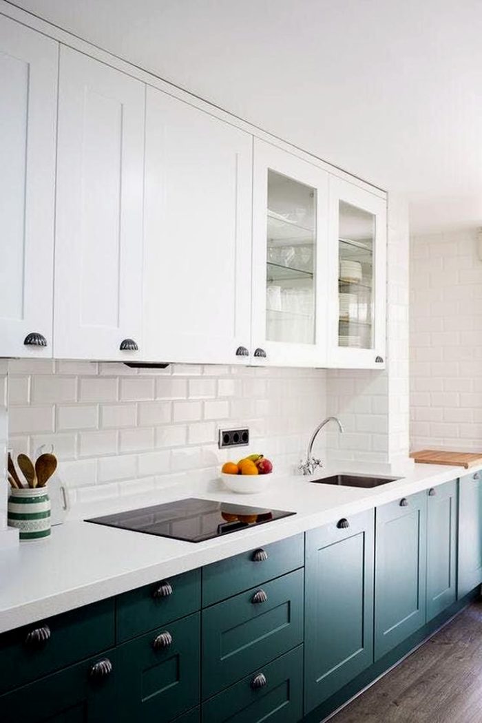
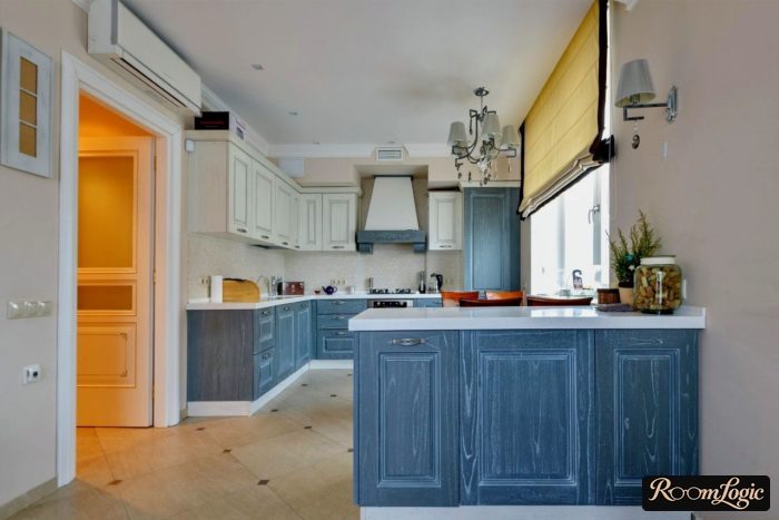
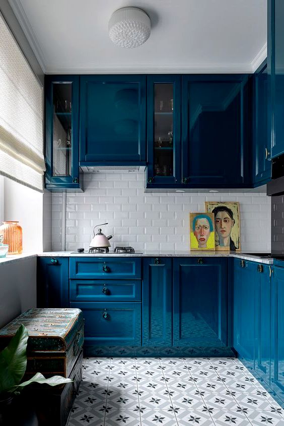
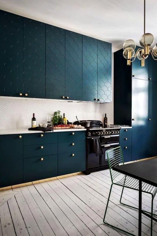
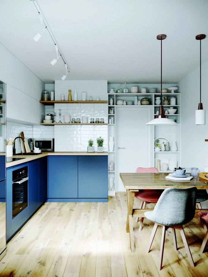
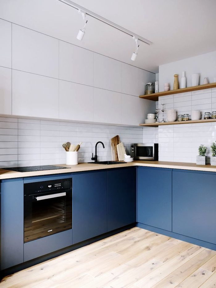
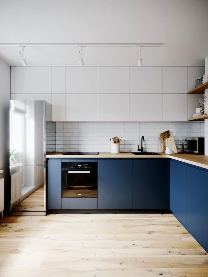
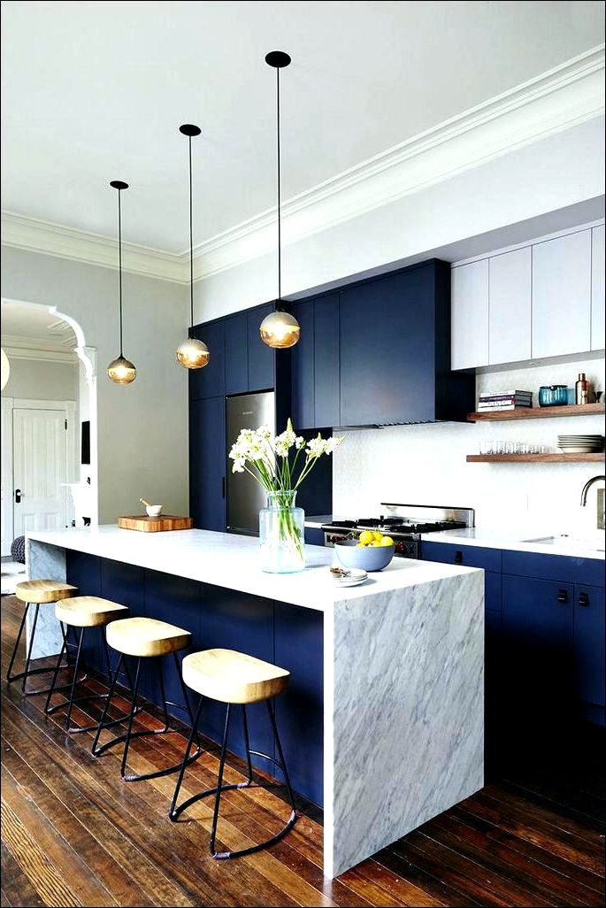
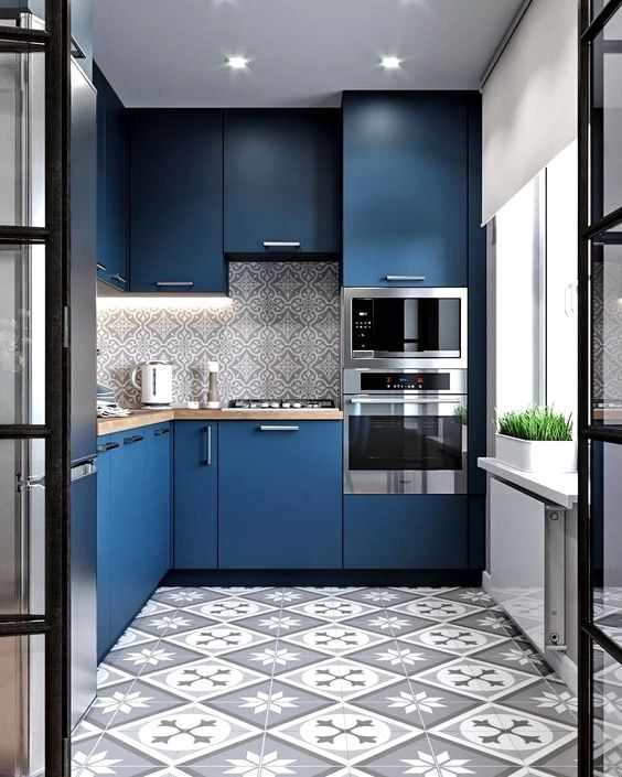
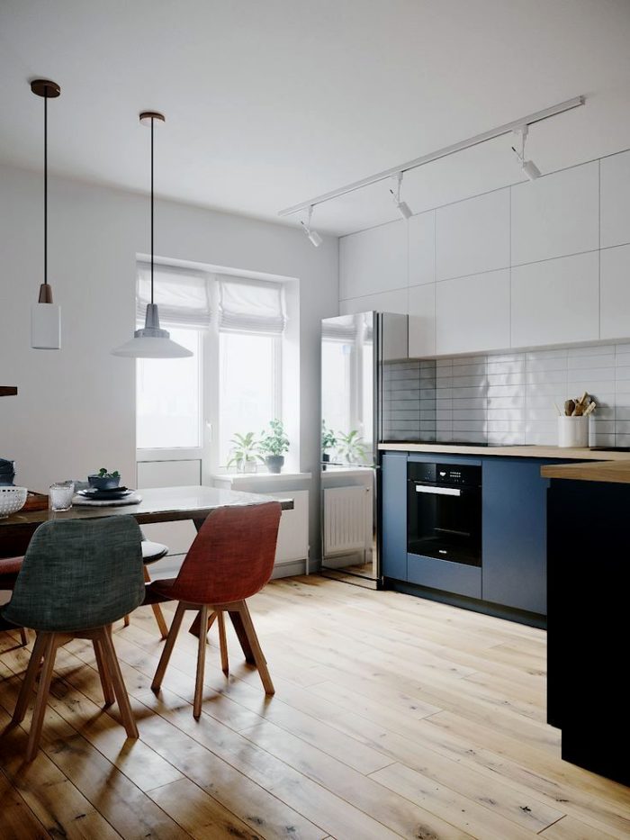
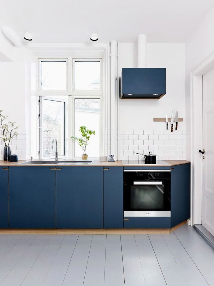
An unusual kitchen design idea: solid-wood cabinet fronts painted a non-neutral color while preserving their texture (grain, knots, and so on).
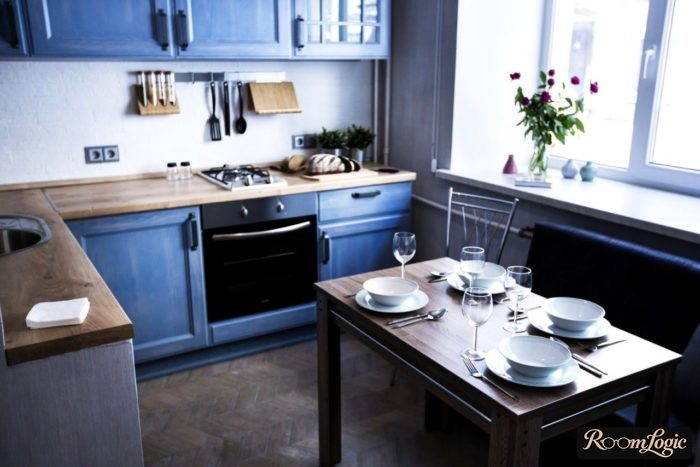
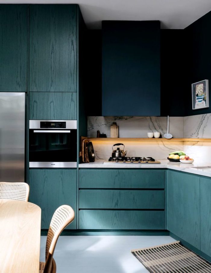
Light blue looks very fresh:
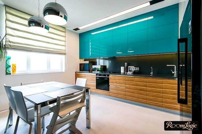
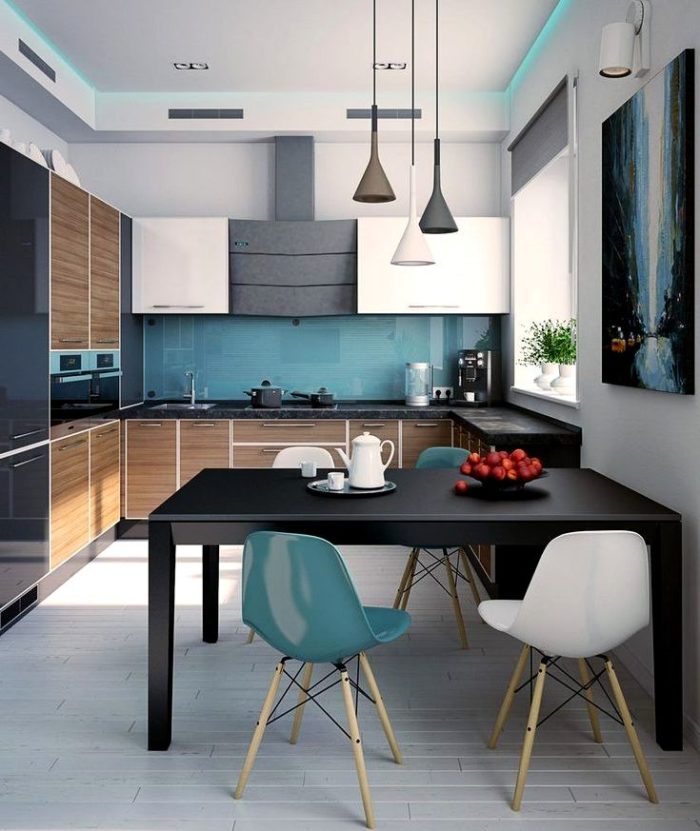
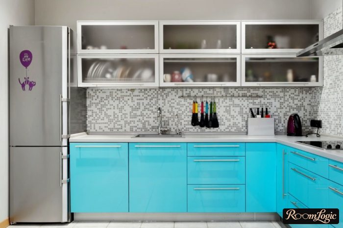
But my favorites are blue with gray and green added, moving toward muted mint and muted turquoise. Despite being unpopular and non-obvious, this kitchen design solution is fairly safe in terms of the chance of making a mistake.
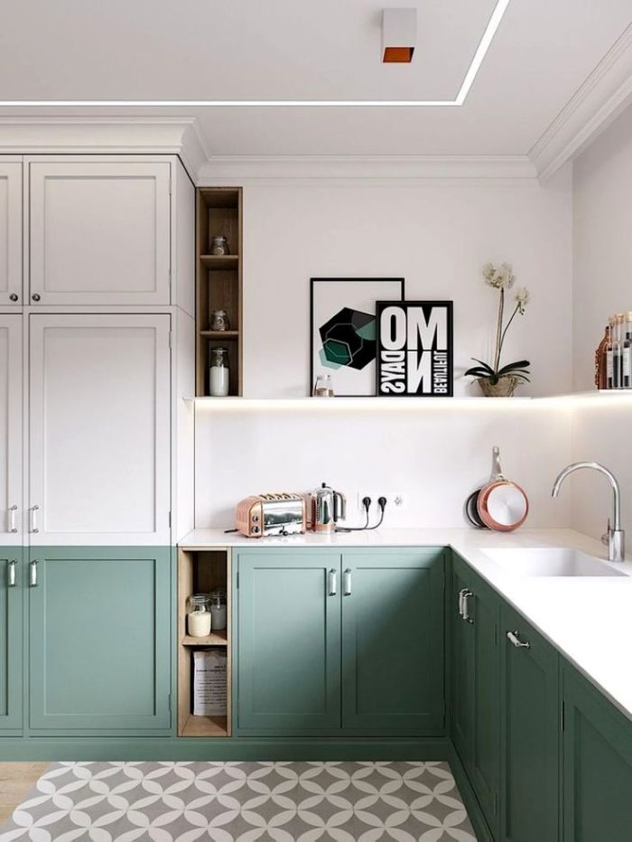
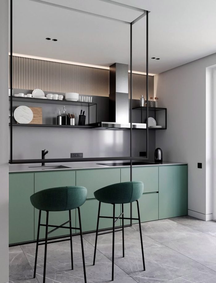
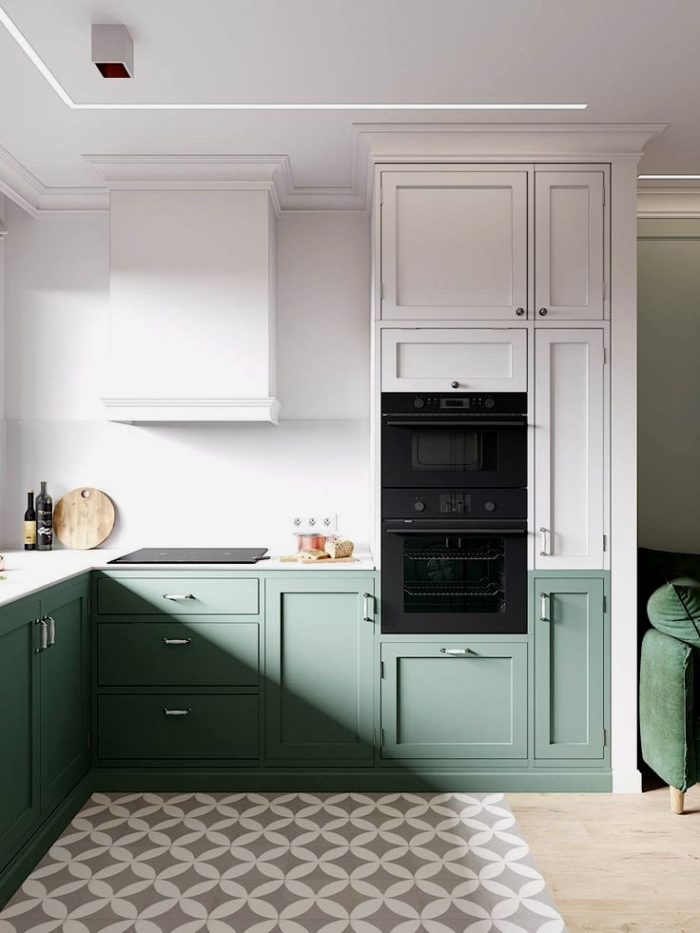
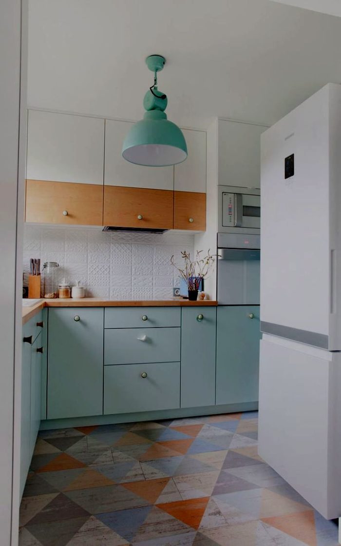
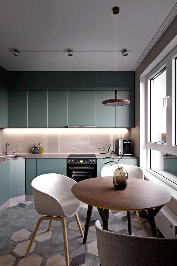
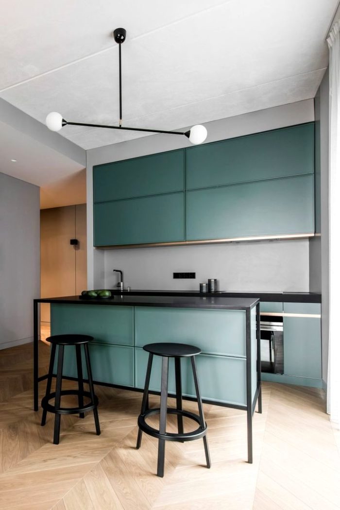
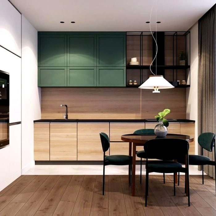
But a green kitchen is a very risky solution. This color looks very different in sunlight and without it, so I would not recommend using it in a room that gets lots of natural light – the result will be unpredictable.
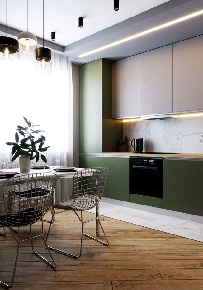
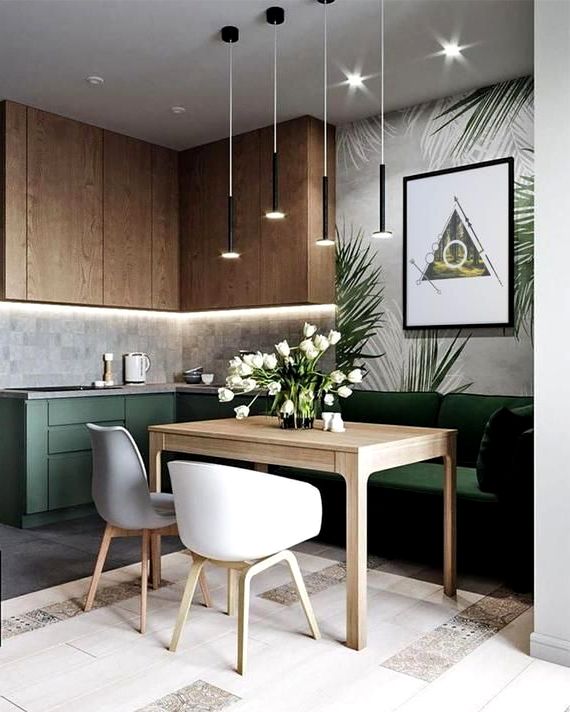
Dark Colors
I do not recommend black or any dark glossy cabinet fronts – a terribly impractical option. But a matte, uneven finish can make an interesting kitchen.
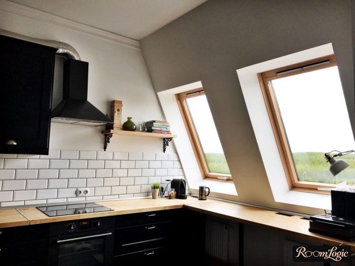
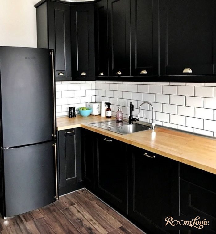
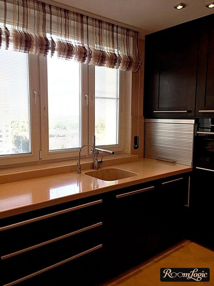
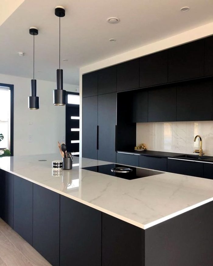
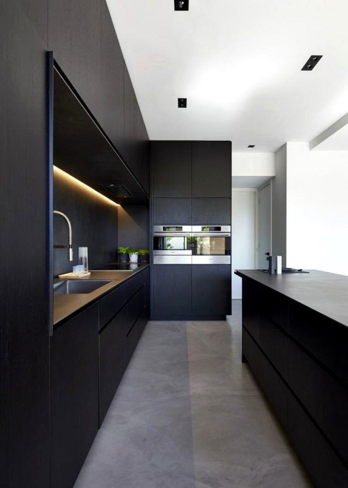
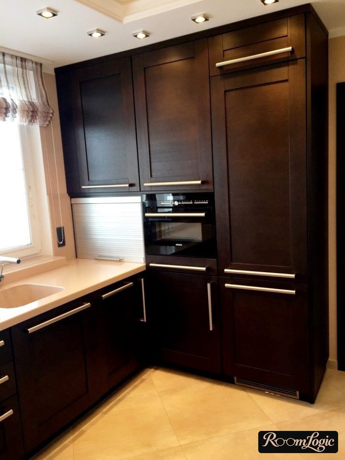
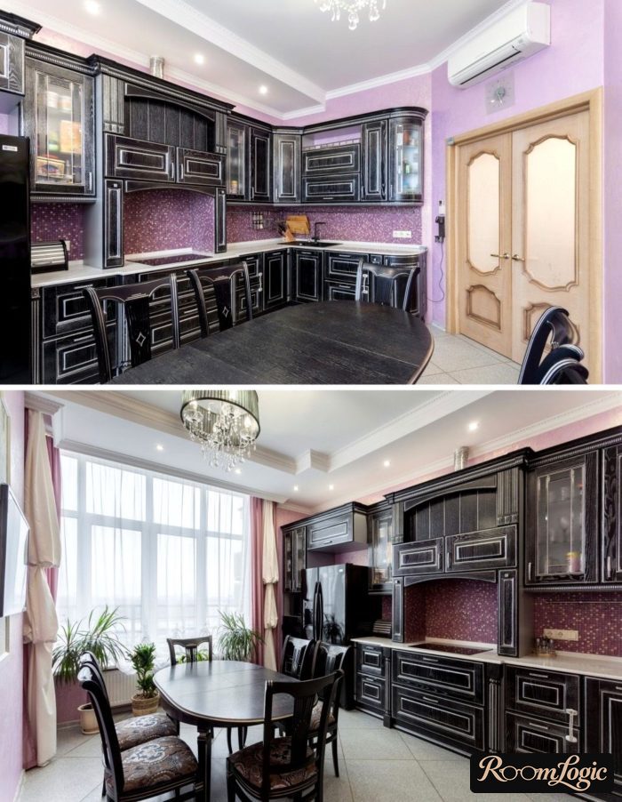
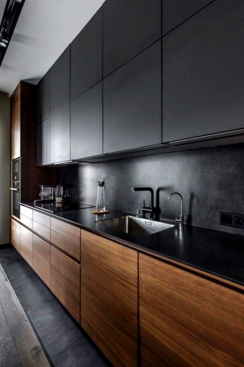
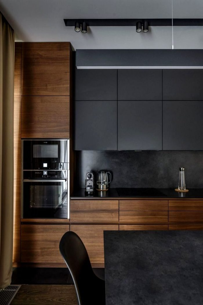
It is still suitable only for large spaces and requires lots of artificial light.
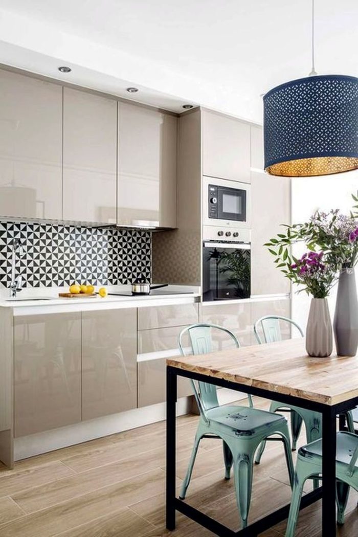
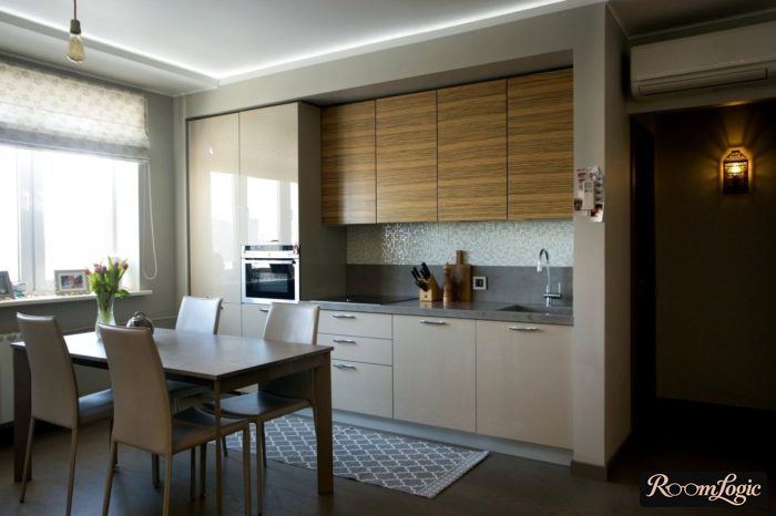
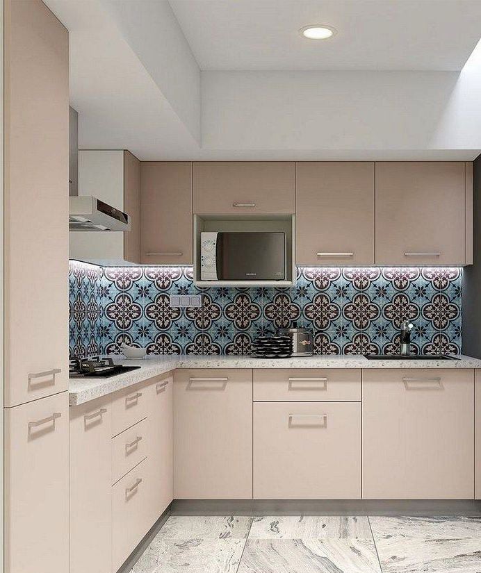
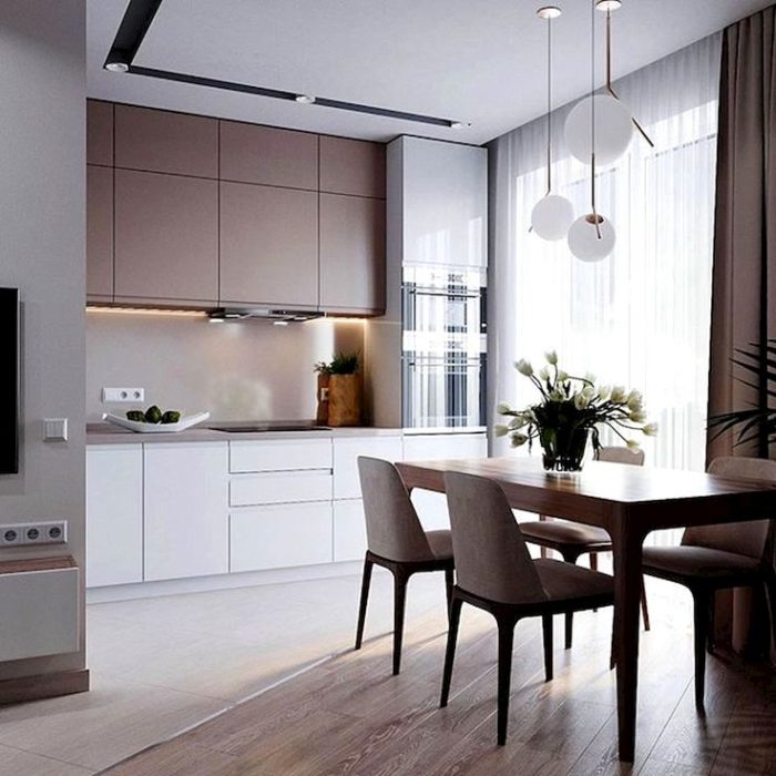
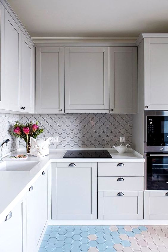
If you want to move away from tired white, beige in shades of light bronze and warm milk may be enough.
This article is unlike my others and is more about photos, ideas, and inspiration.
I usually give clear recommendations to protect you from common mistakes. I strongly recommend reading the other articles, and good luck with your remodel!