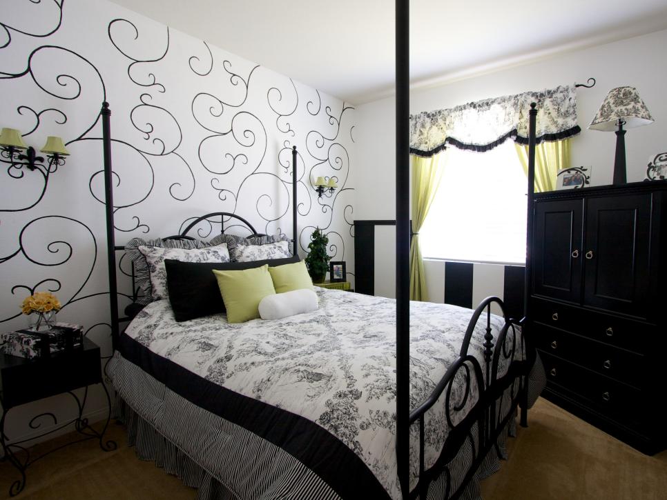
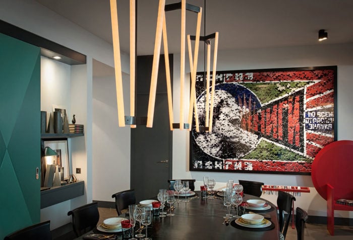
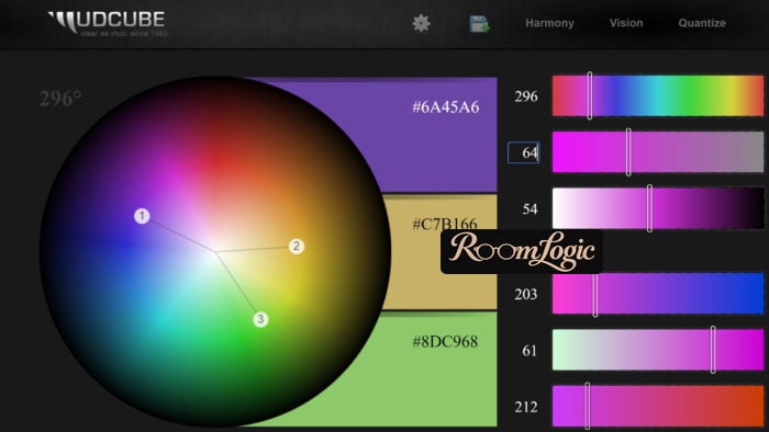
Interior color combinations are chosen with the color wheel – a spectrum shown as a circle, where different brightness, or lightness, corresponds to a different distance from the center.
You can utilize the tool above to upload an interior picture and test how changing objects’ colors could dramatically influence whether the interior looks fancy or ugly.
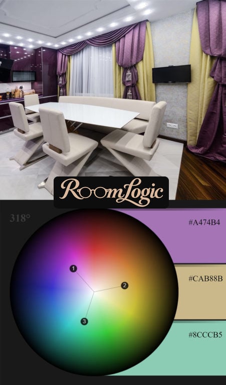
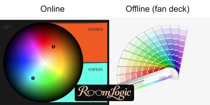
Any chart of interior color combinations is only a special case, because the wheel can generate an infinite number of such charts.
This is difficult material, but if you get through it, you will reach a fundamentally different level of understanding design. And not only interior design.
Color in an Interior
The Color Wheel
I will immediately show how the color wheel can be used in practice. All the theory comes later.
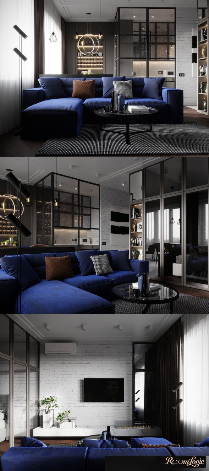
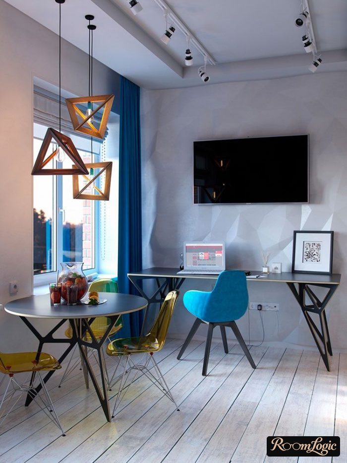
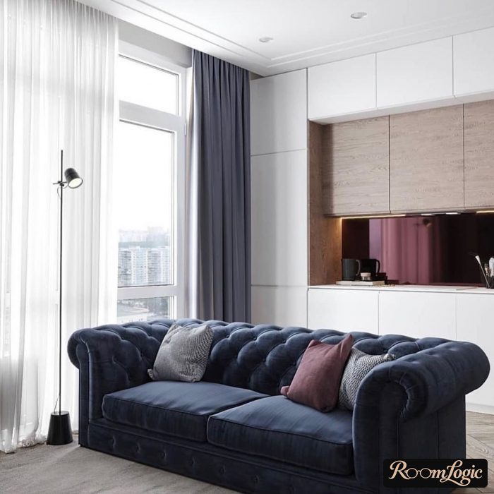
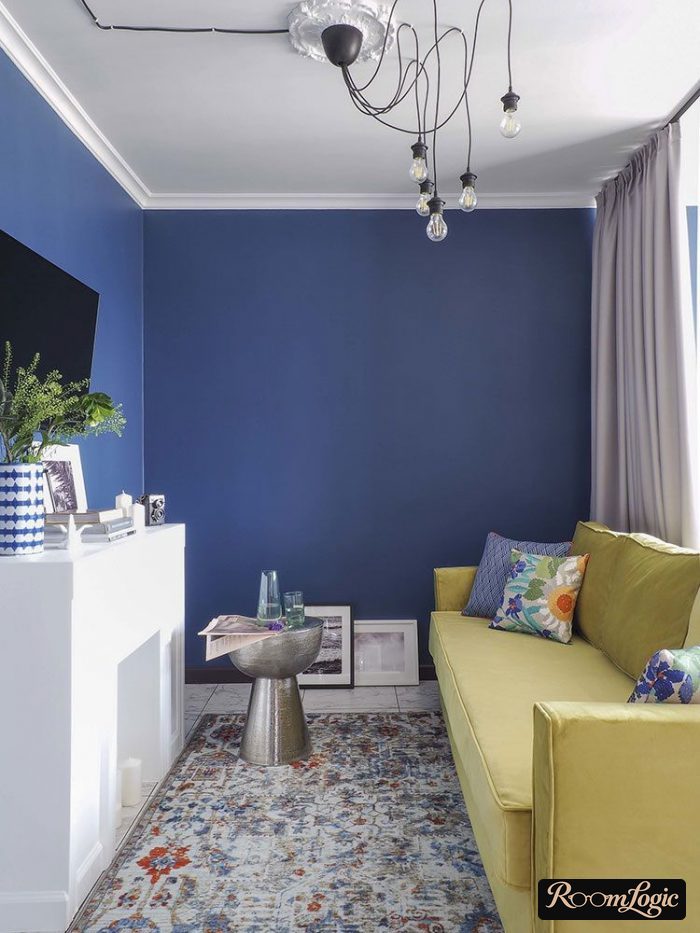
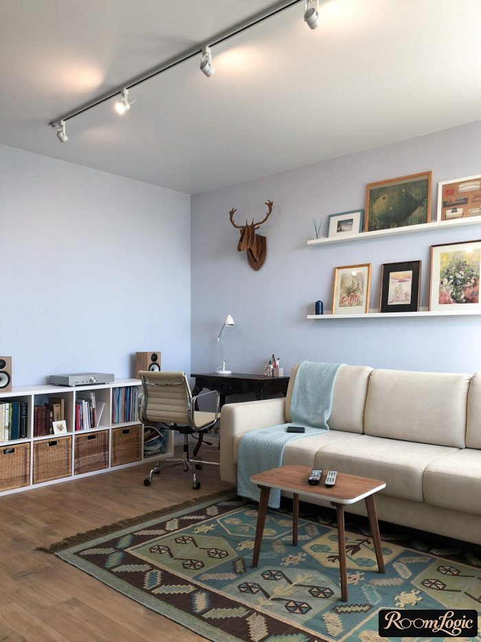
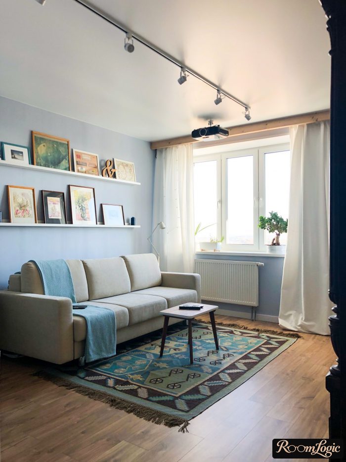
Let’s take a real example of an unusual interior with clear blue accents:
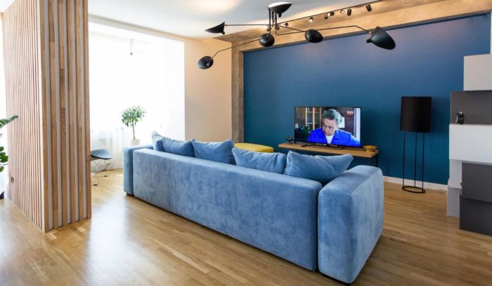
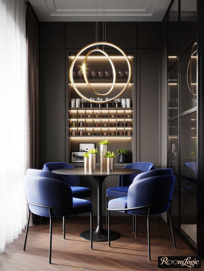
The basic colors are white, gray, black, and several shades of brown wood. Muted blue was chosen as the accent. It looks great.
Let’s check it against the theory, which I moved and now comes later. Break the interior into a color scheme and choose combinations for blue in two ways: complementary schemes for two- and three-color combinations. The link to the tool and the explanation are in the next section.
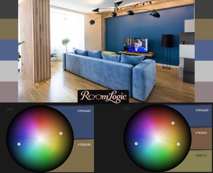
As we can see, muted blue is exactly the ideal accent for this amount of wood and warm gray, made warm by the color temperature of the bulbs. But maybe this is only a coincidence, and other tones would look good too?
Let’s experiment with the sofa and the wall.
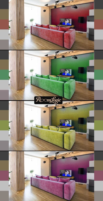
None of them work.
The original blue version is the best. What if we use no accents at all and take basic colors, gray and black for example?
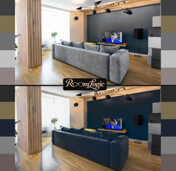
It turns out quite well, although someone may say it is a little boring. This clearly shows that basic colors combine beautifully in an interior without risk.
More photos of this apartment are in the article about contemporary interior design.
Interior Color Combination Chart
There is no magic chart. Every one of them is simply a set of special cases. But there are simple rules for combining any colors, and an infinite number of such charts can be generated.
There are three parameters:
- The color itself, also called the hue. It comes from mixing the three primary colors: red, green, and blue.
- Lightness, simplified as brightness – the amount of white and black mixed into the hue. Geometrically, this is the distance from the center of the circle.
- Saturation – the amount of gray.
All colors with the same lightness and saturation go together.
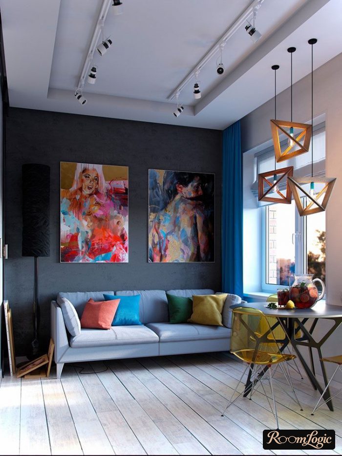
In practice, everything is more complicated for an interior because not all colors are suitable at all. You also need to account for their share of the interior and everything that any other objects will add.
The most perceptive readers will immediately understand that, with so many options, any hues can be combined by changing the amount of white, gray, and black in the mixture.
Important!
EVERY object in the room has to go together, not only the bright ones. That is why it is hard to make a stylish interior with overly bright shades or pure colors. They will not go with the floor, baseboards, doors, and so on, which usually have natural wood shades with low lightness and saturation.
That is also why pastels always fit well.
Low-saturation colors work in interiors.
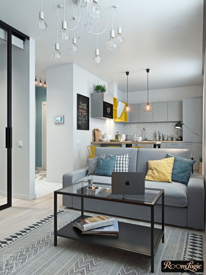
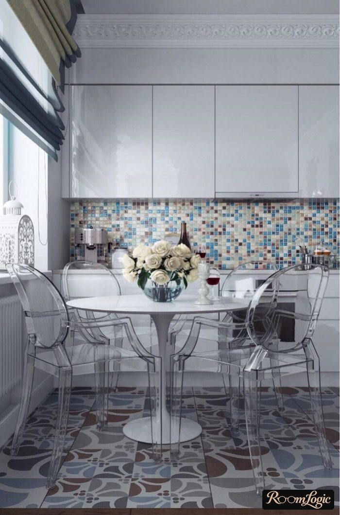
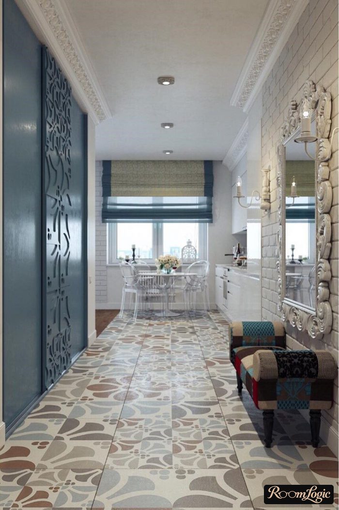
That is why Scandinavian style is so good. The pastel color palette makes it easy to carry out – all the rules are already built into the interior style itself.
A Scandinavian-style kitchen interior, for example, has no bright spots at all. It uses a low-saturation palette, which rules out imbalances and serious mistakes.
Choose a Palette
You have seen a practical example of working with color and the theory. Now choose one of three approaches for yourself:
- No accent colors at all, only the basic palette: white, shades of gray, and wood. This is enough for most small apartments, and it is the safest path. I will explain why it is good below.
- One additional accent color plus its shades. This is also an easy path when you still want some brightness.
- Several colors. This is where the combination rules come into play. It is not as difficult as it seems, but it is important to know the theory, so this comes last.
An interior is not a painting made with paint and not an advertising poster. Brightness is not required. Combining colors in an interior means choosing one or two proper hues and adding them carefully and in controlled amounts to a generally neutral palette.
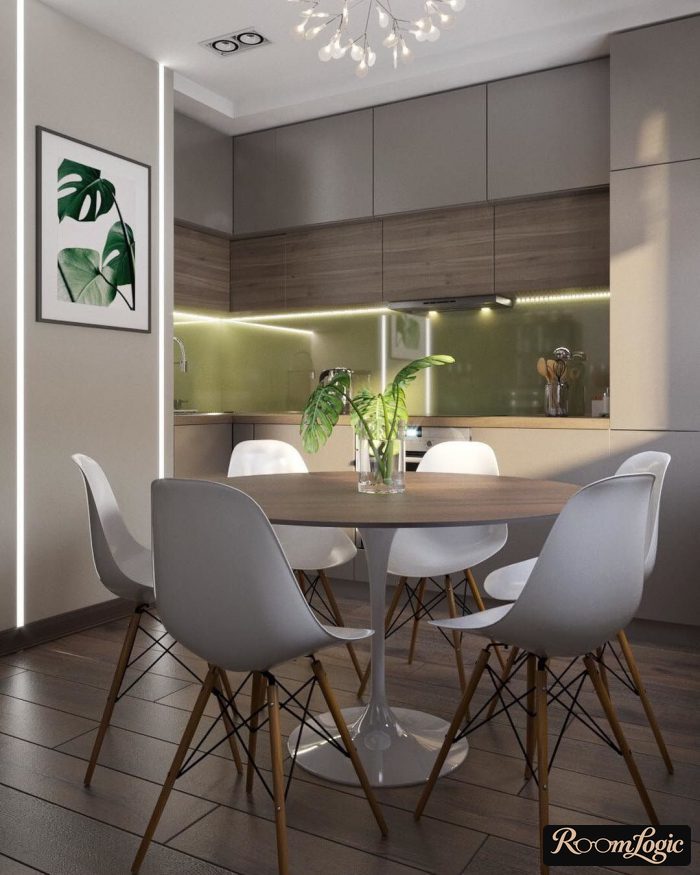
1. Natural Colors
Briefly about interiors without accent colors, using a neutral palette of white, gray, black, and wood.
They are enough to create a stylish interior. They combine easily with one another. This is a safe color scheme in which the worst possible result is a slightly boring interior. A perfect result is entirely possible too. But adding accents can make the design either better or worse.
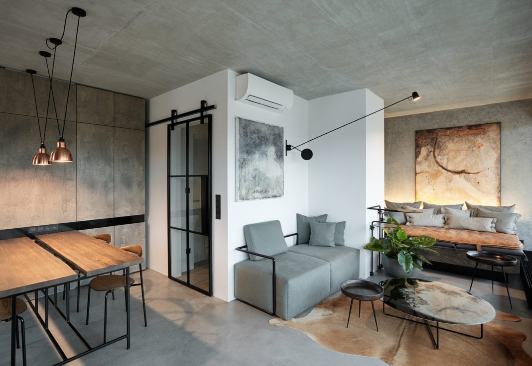
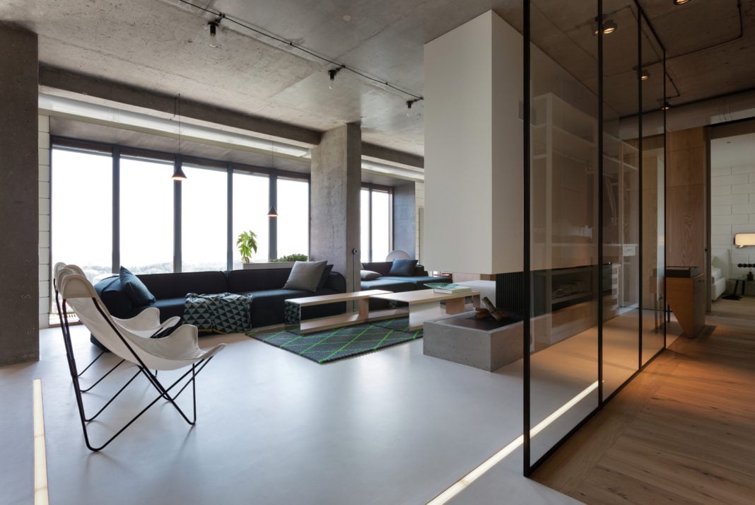
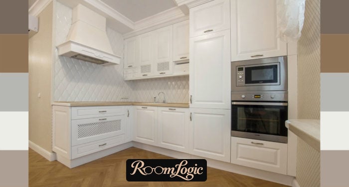
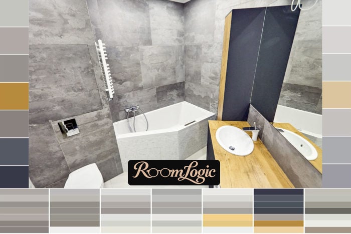
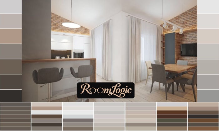
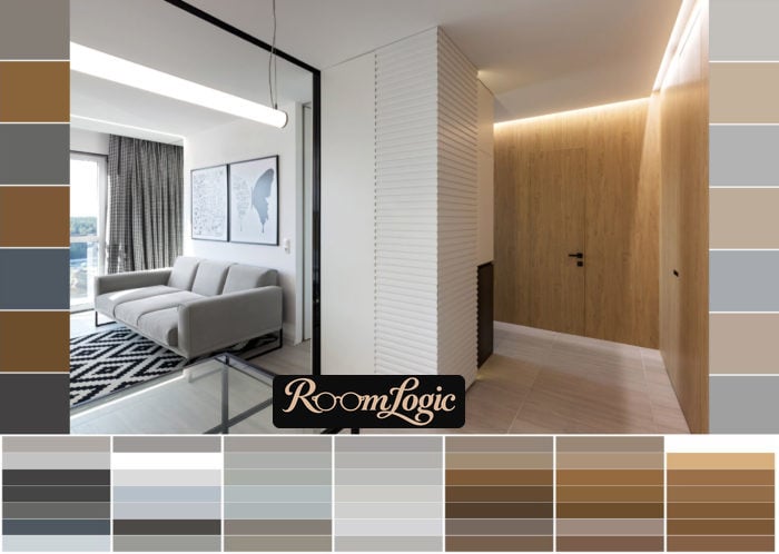
Let’s break several real interior photos into palettes:
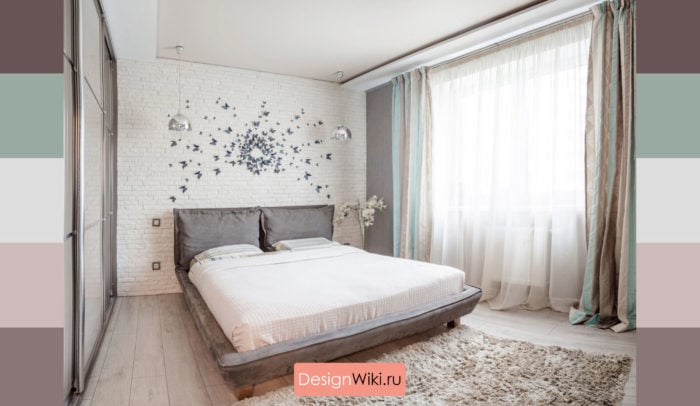
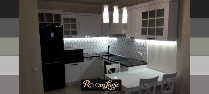
Stop.
They seemed almost monochrome, but it turns out there are a pile of shades!
That is the whole trick! It comes from the uneven texture, the play of light and shadow, reflections, and the color temperature of the chosen bulbs. That is exactly why you do not always need to add bright hues.
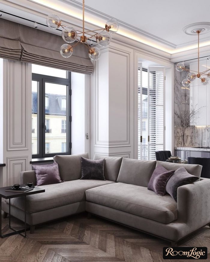
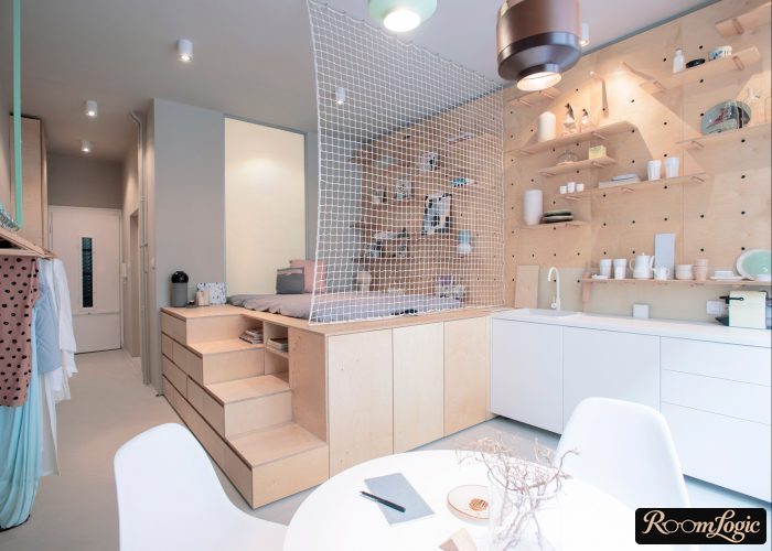
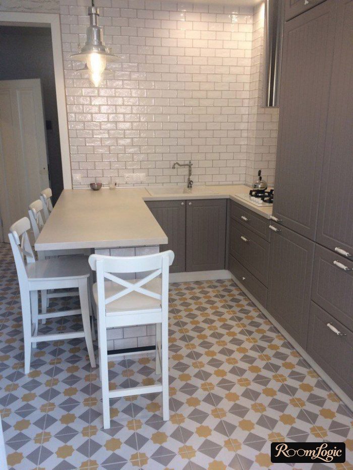
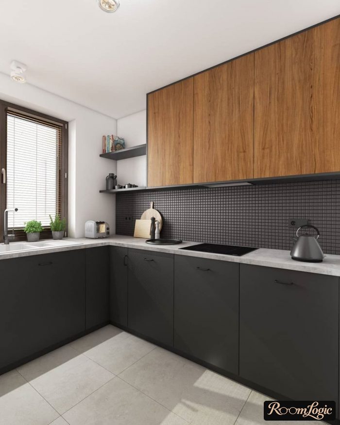
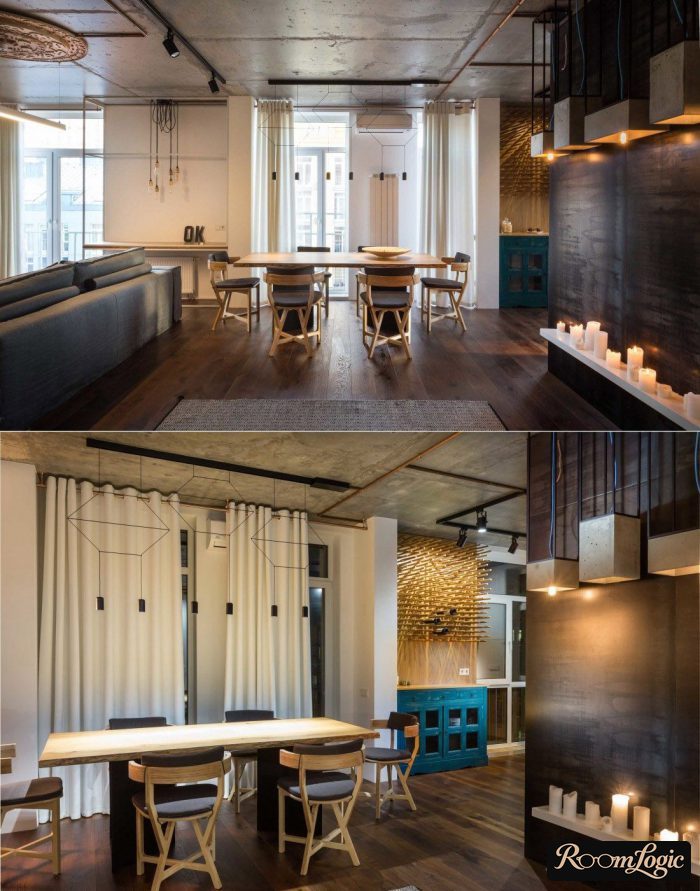
If you like the last photo, see more in the article about loft-style kitchens. In the general article about kitchen design, I collected a pile of unusual interiors, and half of them are done without color accents!
2. Shades of One Color
Another simple approach:
- Choose one hue. The standard ones are blue, light blue, and yellow. But it can be any color, even pink, if it has low saturation and looks good.
- Distribute it through different parts of the interior, following the rule that the brighter the color, the smaller its share can be.
- Do not forget that its brightness and saturation must work with the floor and other wood in the interior.
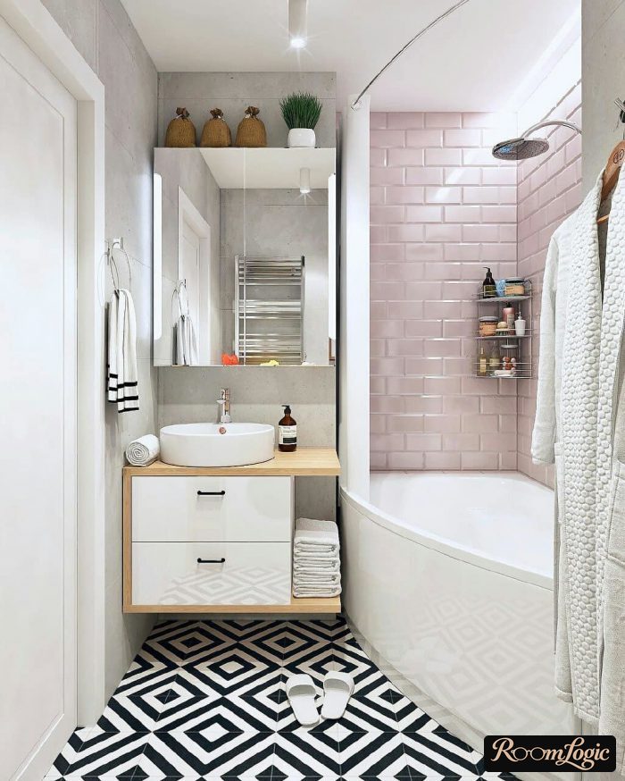
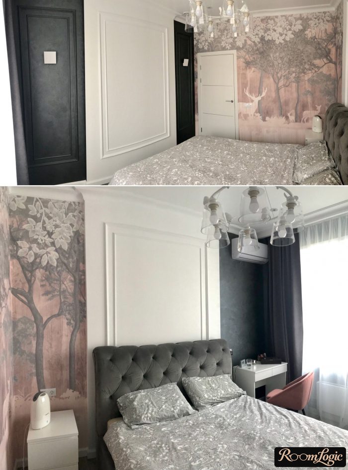
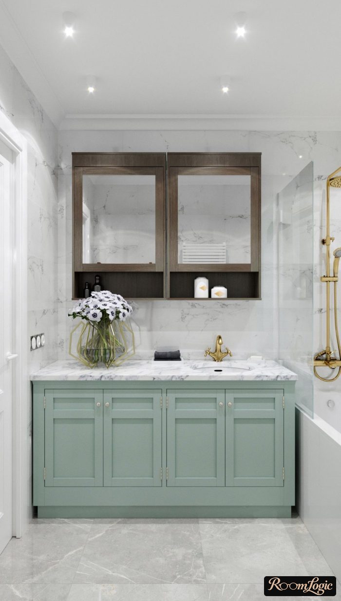
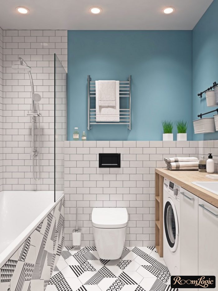
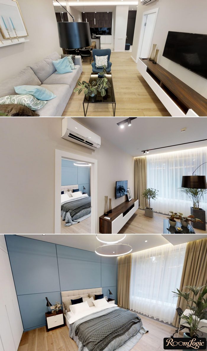
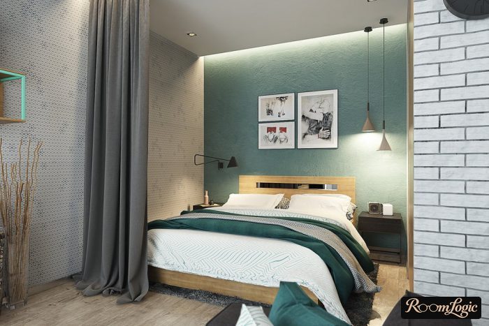
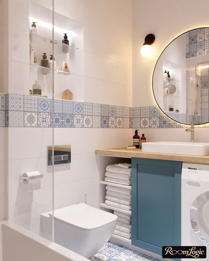
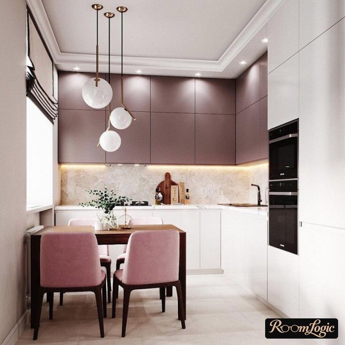
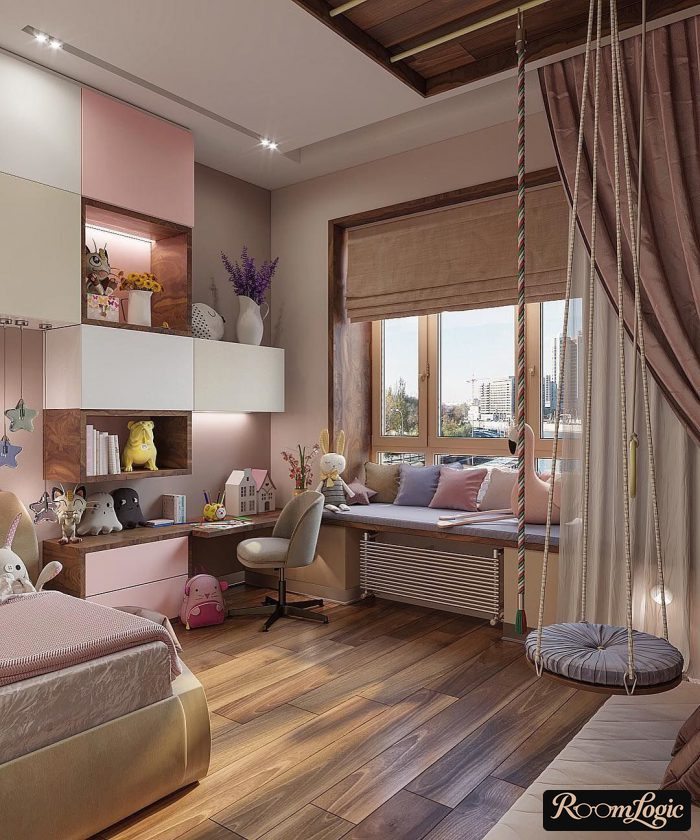
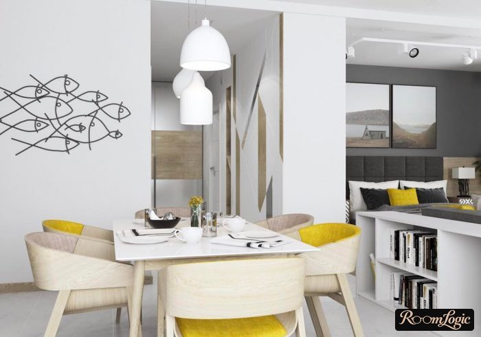
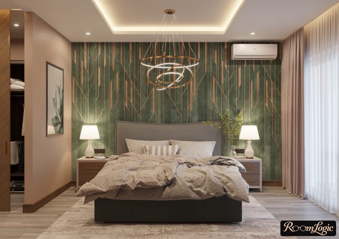
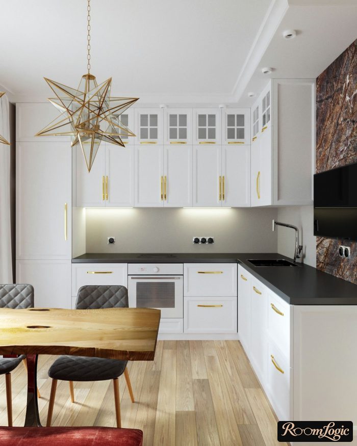
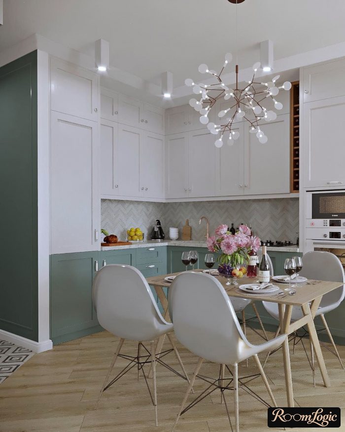
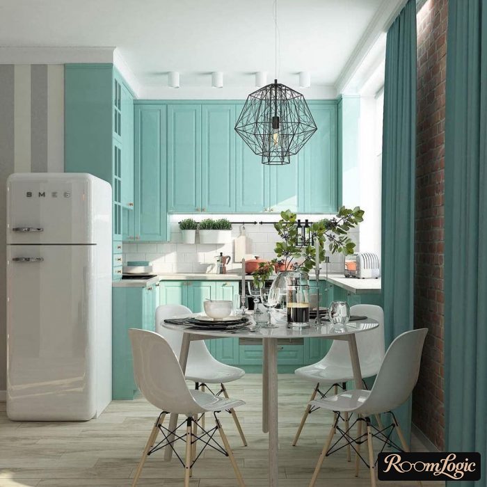
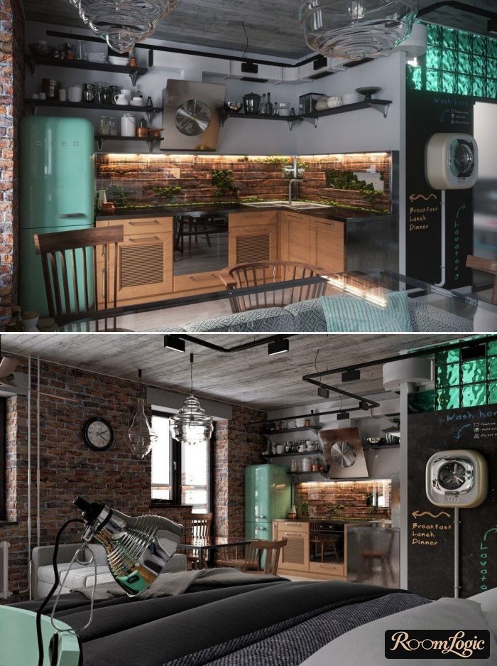
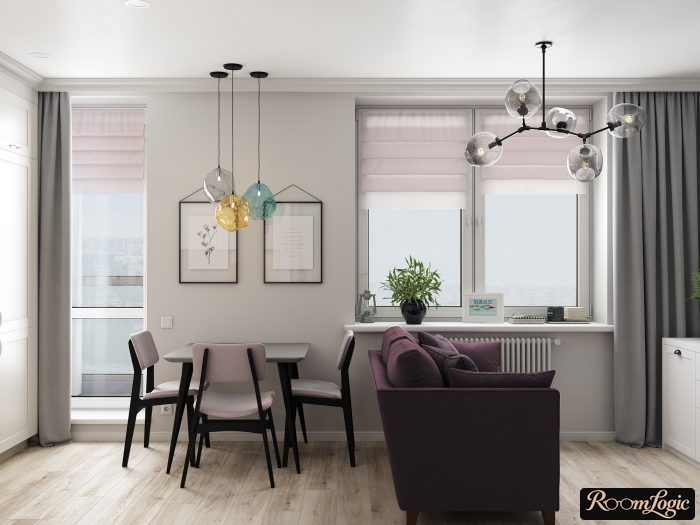
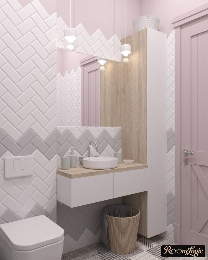
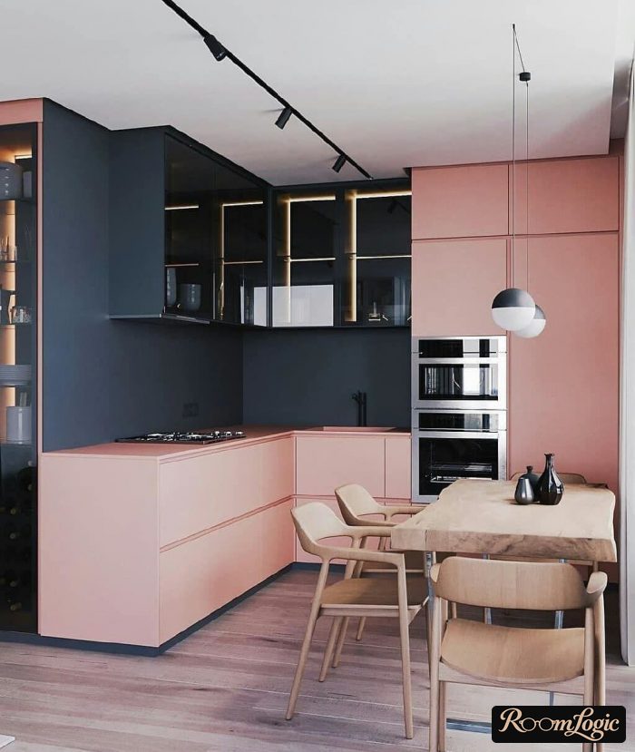
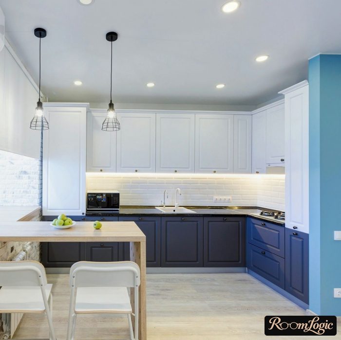
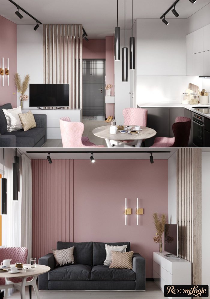
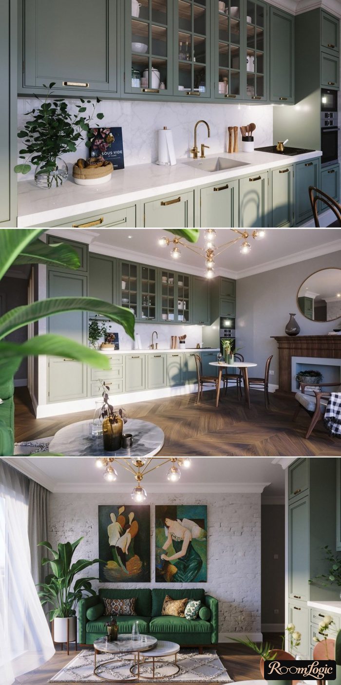
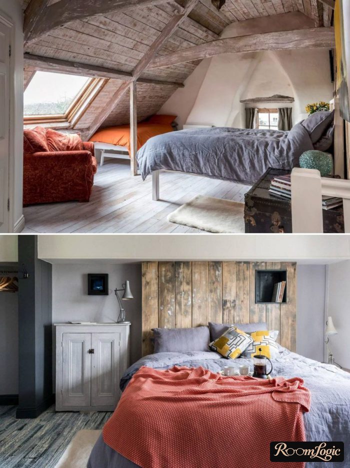
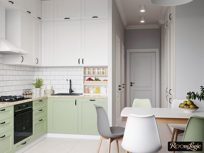
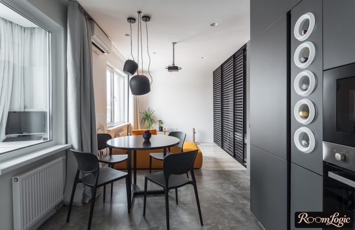
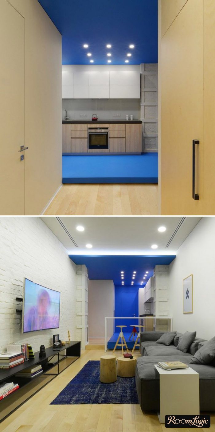
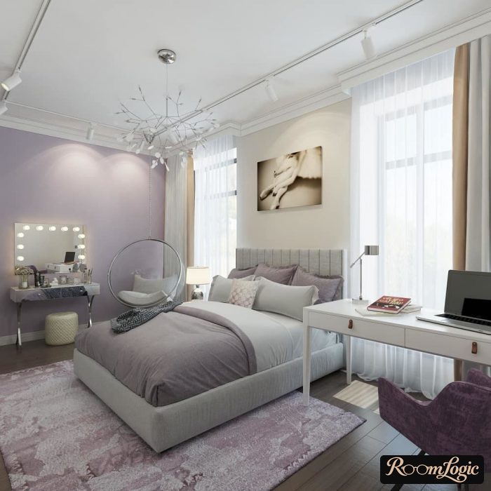
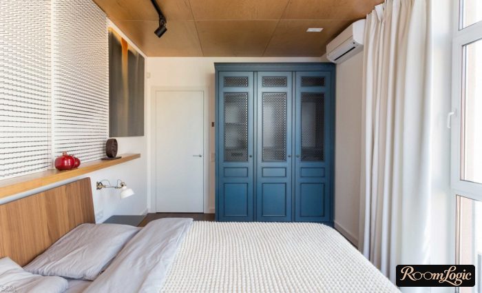
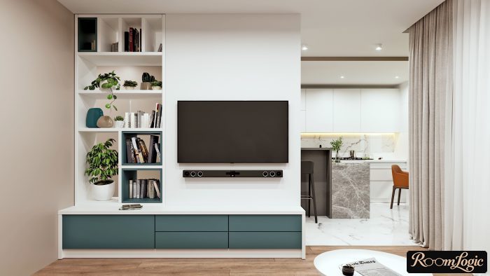
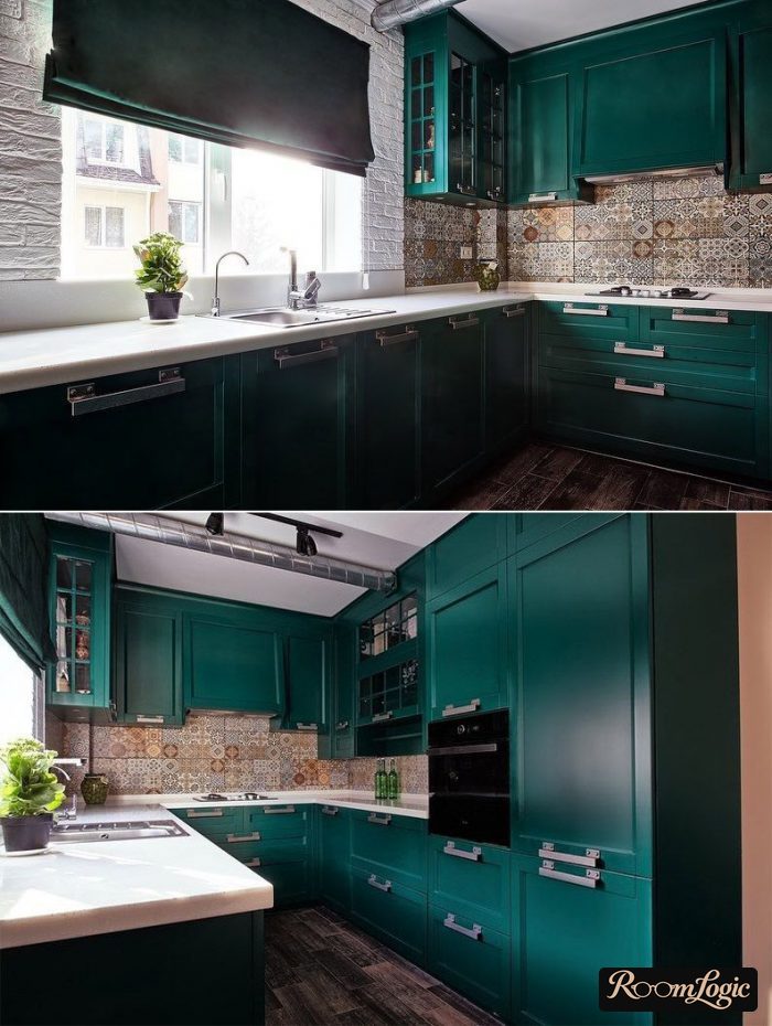
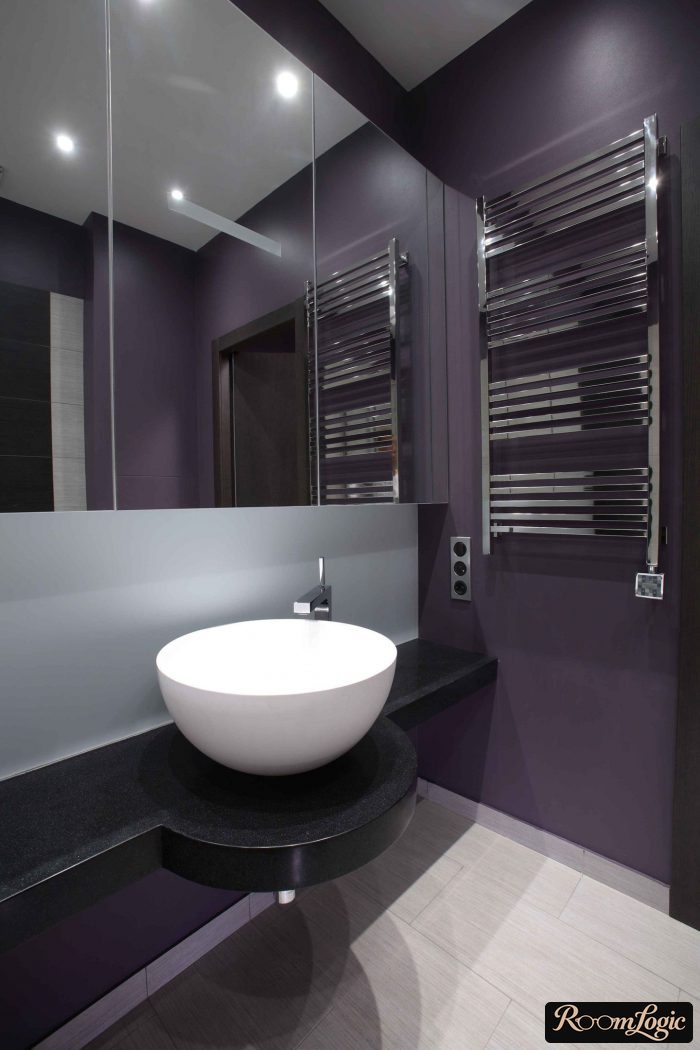
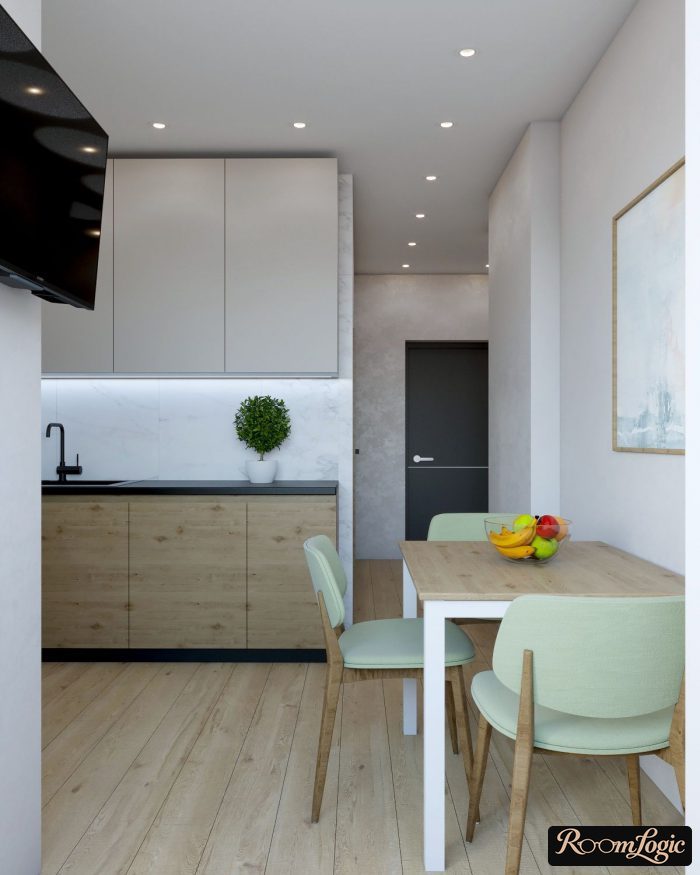
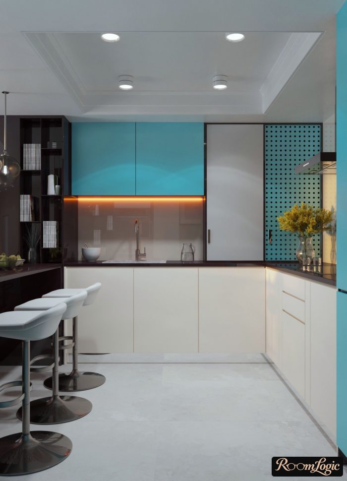
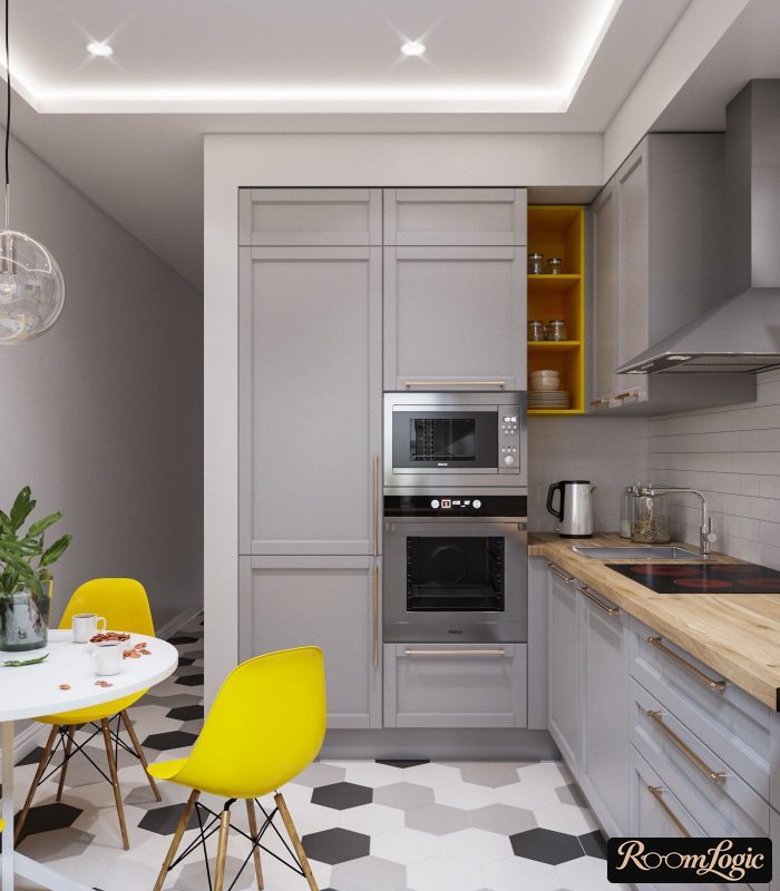
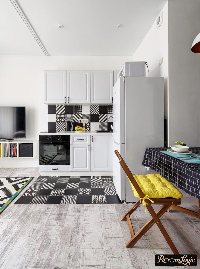
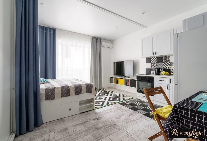
This can be done even after the remodel, entirely through decor without involving the finishes at all:
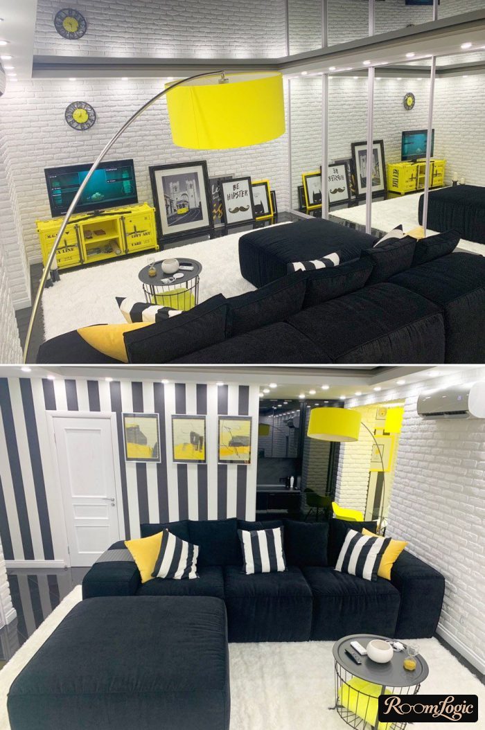
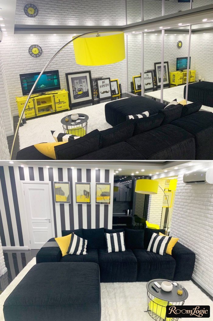
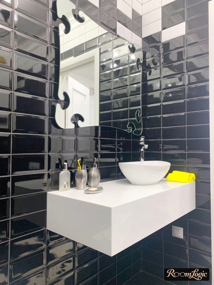
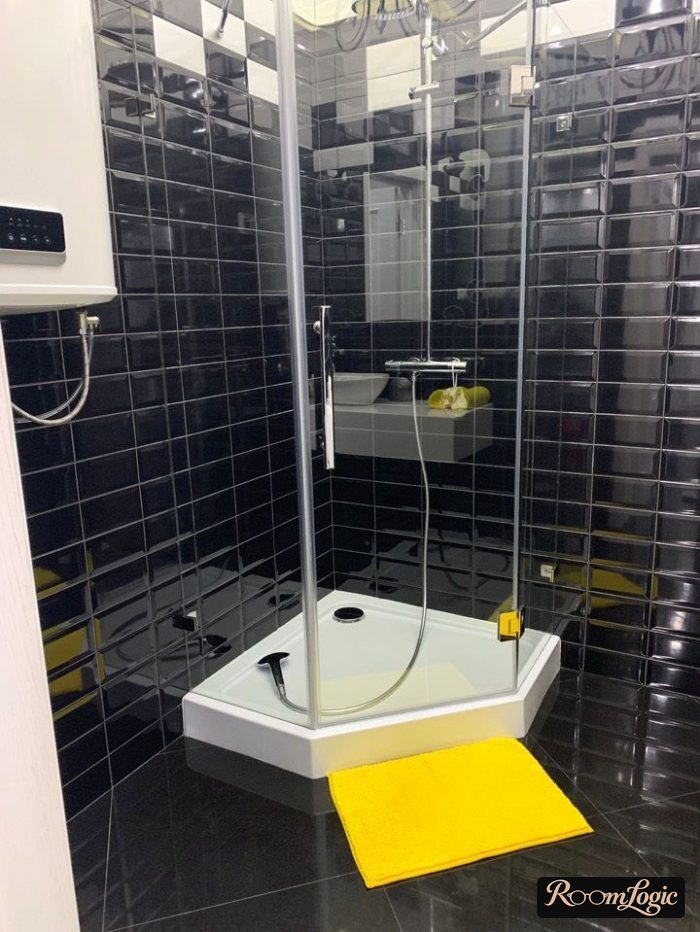
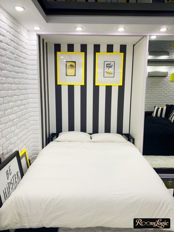
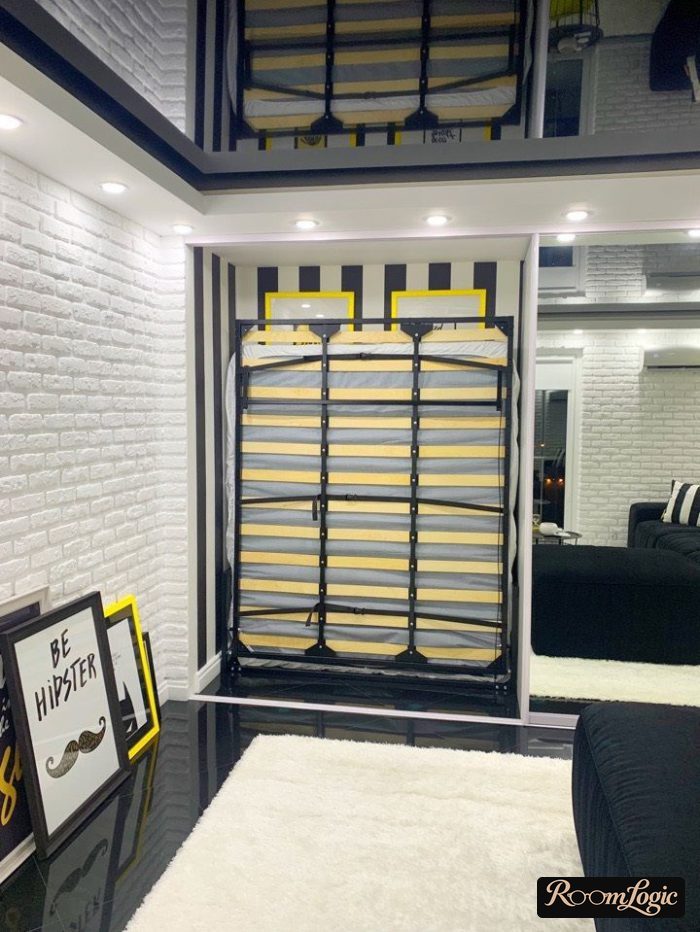
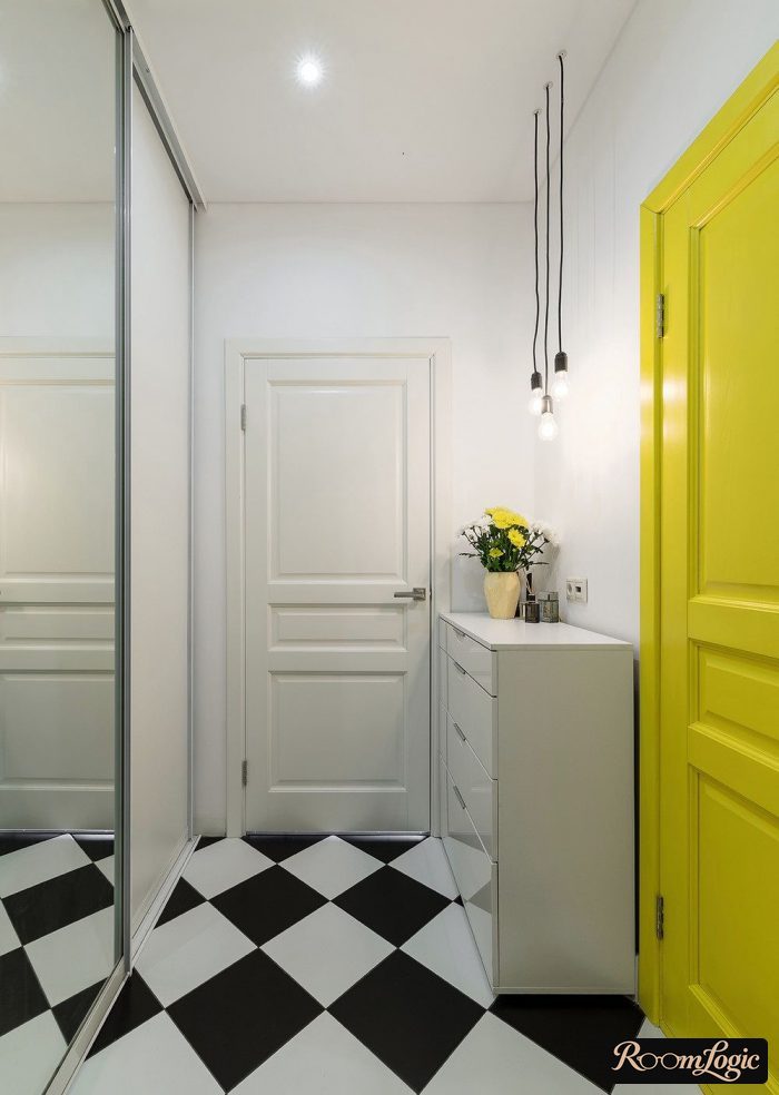
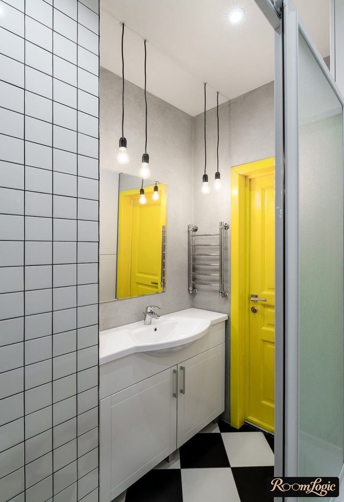
Finishes and furniture are more difficult. The chance of making a mistake is higher, and the mistake is not as easy to fix.
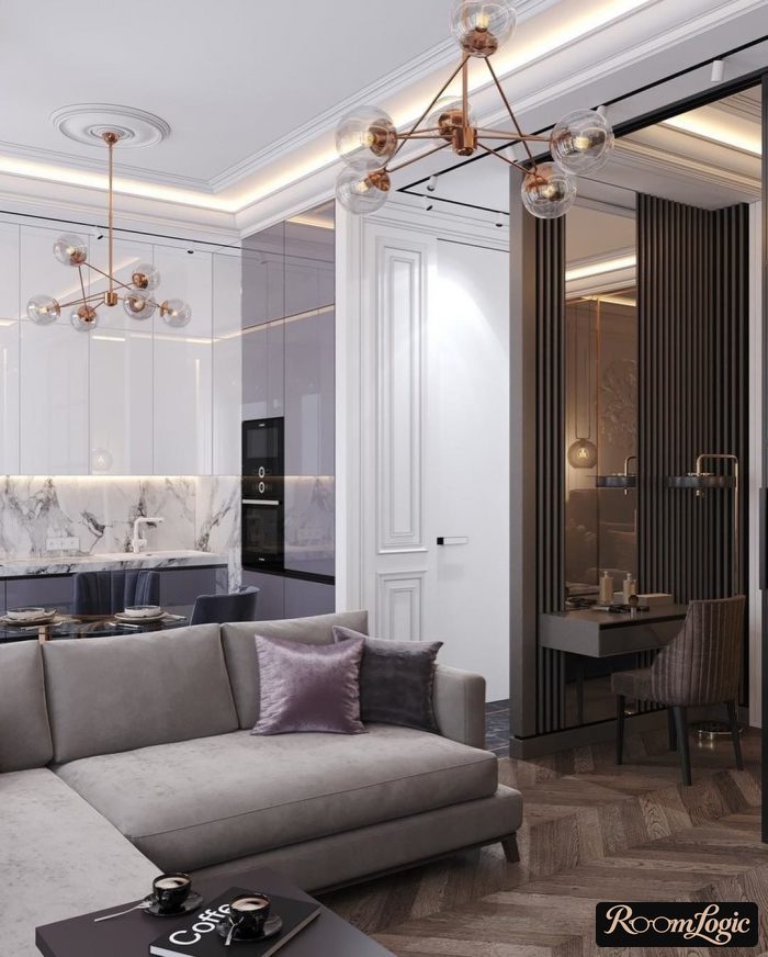
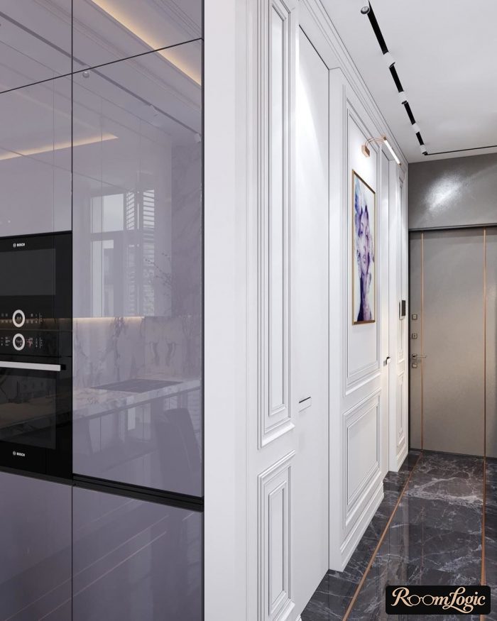
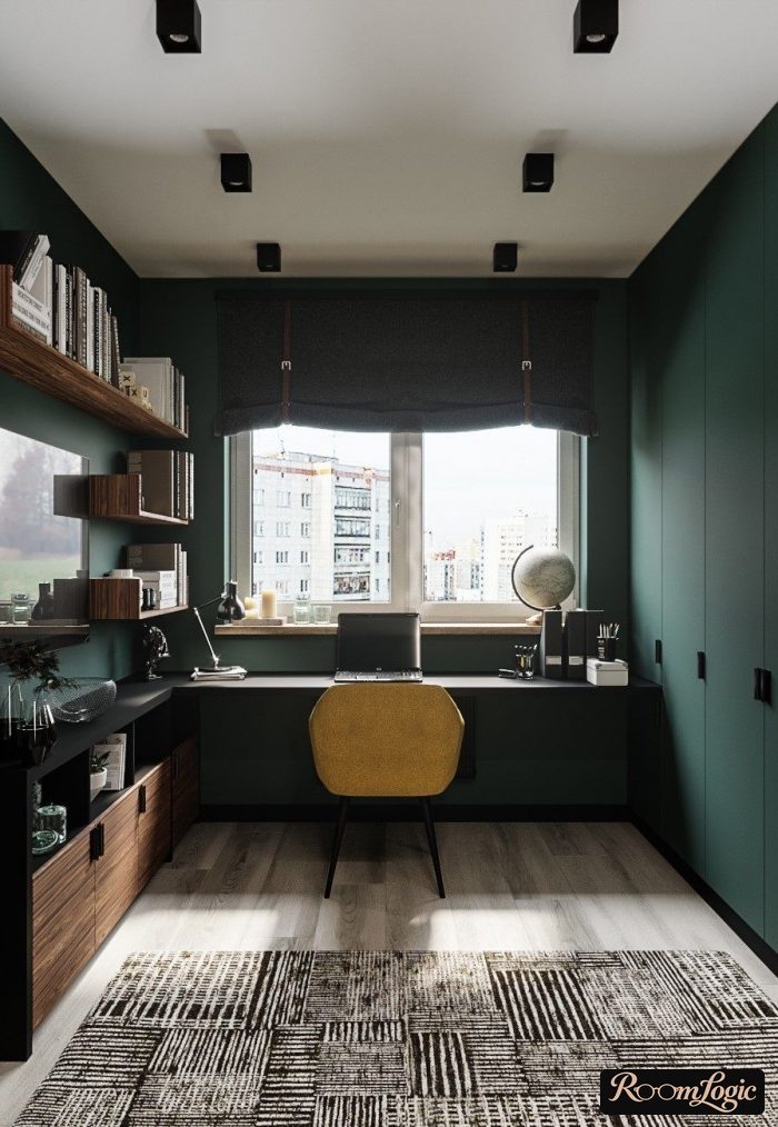
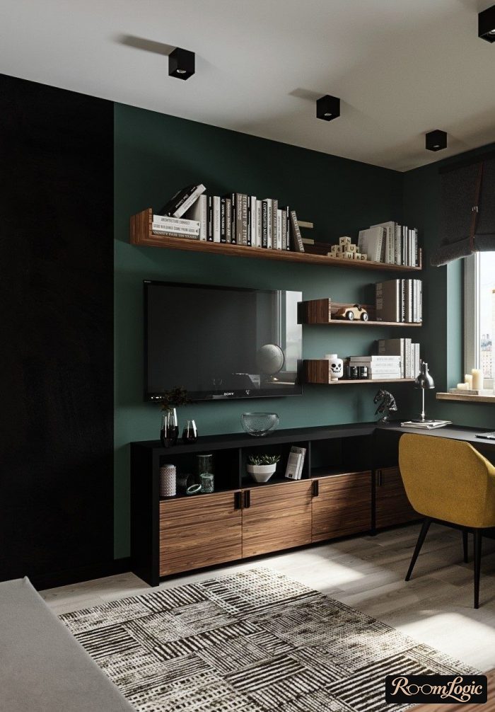
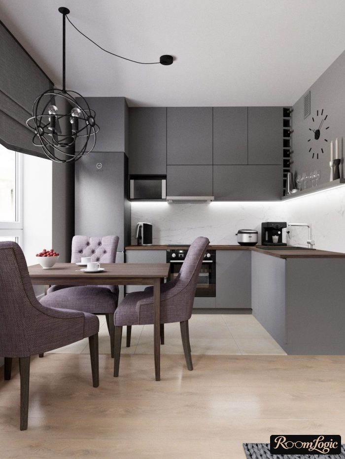
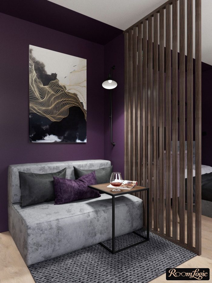
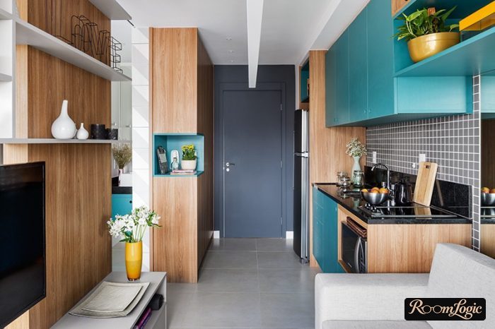
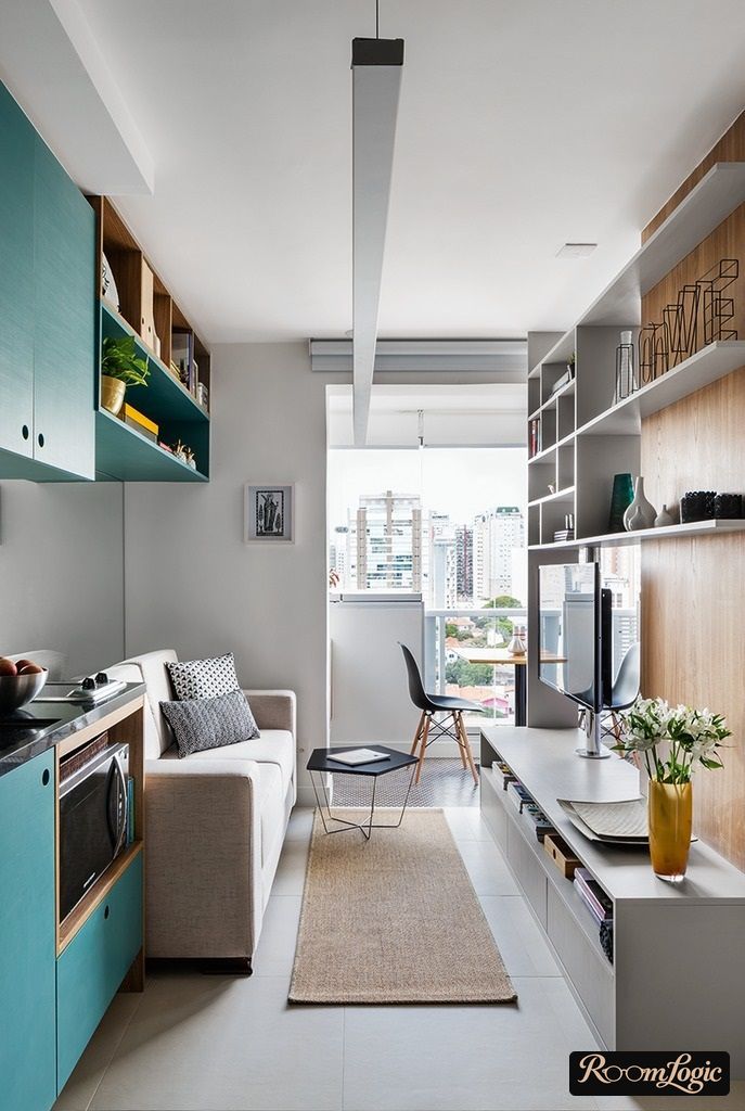
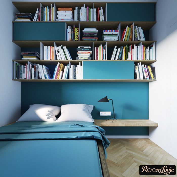
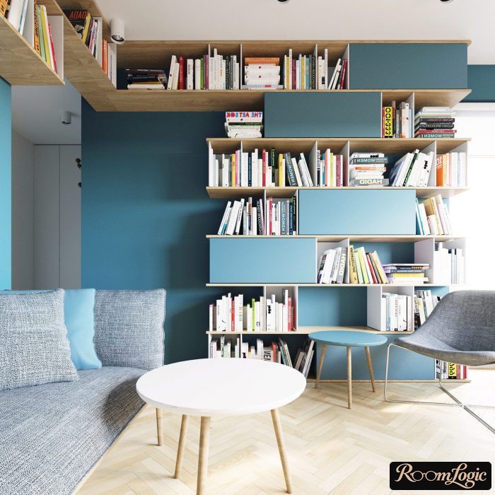
See many examples of this approach in the article about gray kitchens.
3. Combine Several Colors
You cannot do this without the color wheel. Open the color wheel or simply follow the pictures here.
In the upper-right corner, click “Harmony” and choose the type of combination. Then move the mouse around the wheel. Every parameter except saturation is controlled by moving the mouse around the circle. Saturation is changed with the second slider from the top in the right-hand column, labeled “Saturation.” It changes the wheel itself.
There are different types of color combinations, and each type has its own geometric illustration on the wheel.
- Analogous. A set of colors next to one another on the wheel.
- Contrasting, also called complementary. They are opposite each other on a line through the center. Brown and blue, for example.
- Conflicting. They are on lines that cross at a right angle in the center of the color wheel. Red and blue, for example.
- Triad. The colors are equally far from one another and form an equilateral triangle. Red, green, and blue – the three primary colors – form exactly this triangle.
- Two pairs. Two pairs of complementary colors whose lines cross at a right angle in the center of the wheel.
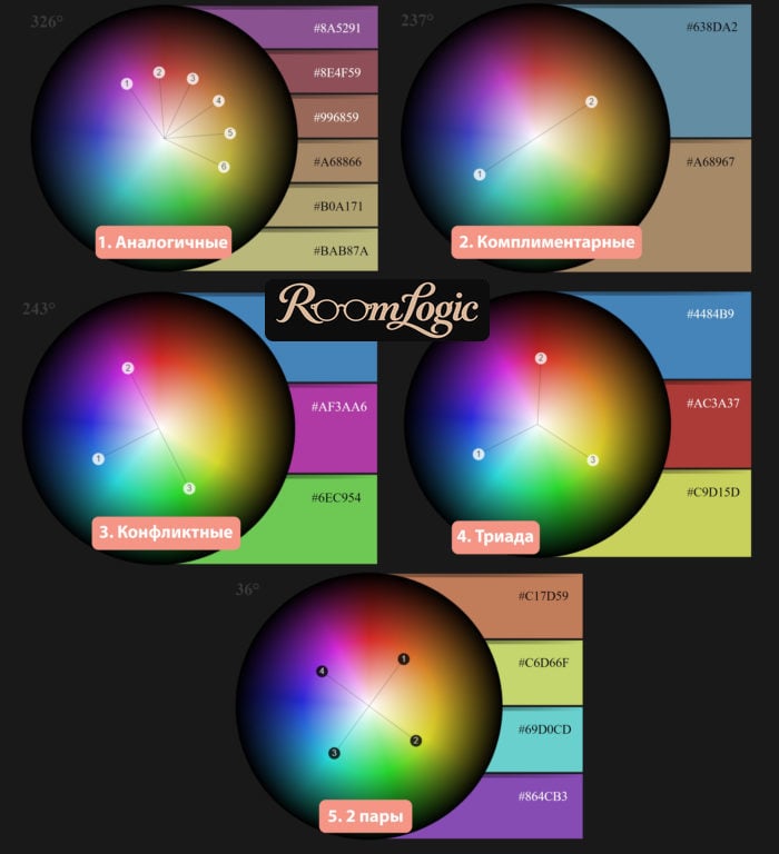
For interiors, it is best to use the first two: analogous and complementary. With the others, the proportion requirements are too strict. Make a small mistake and you get conflicting colors.
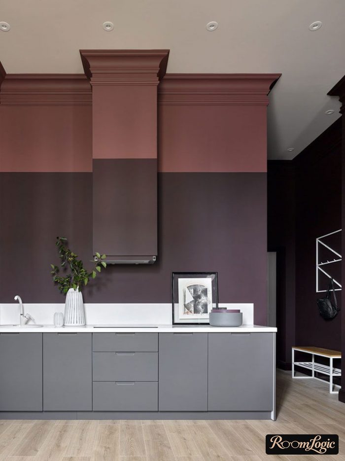
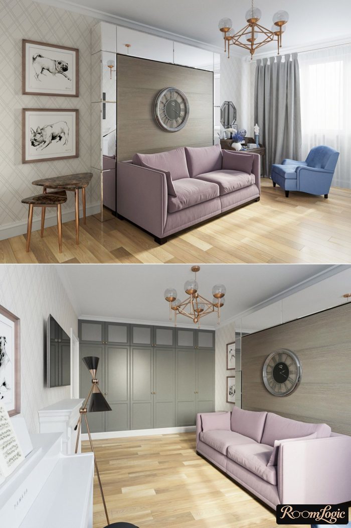
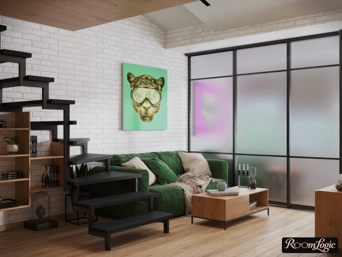
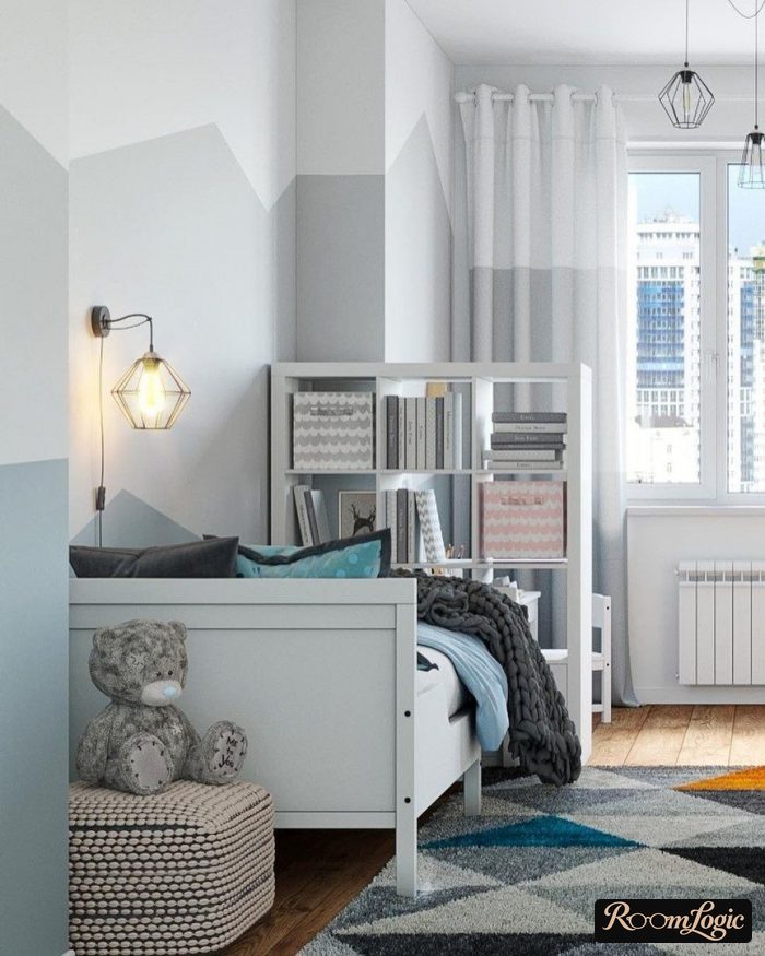
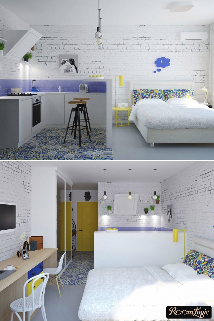
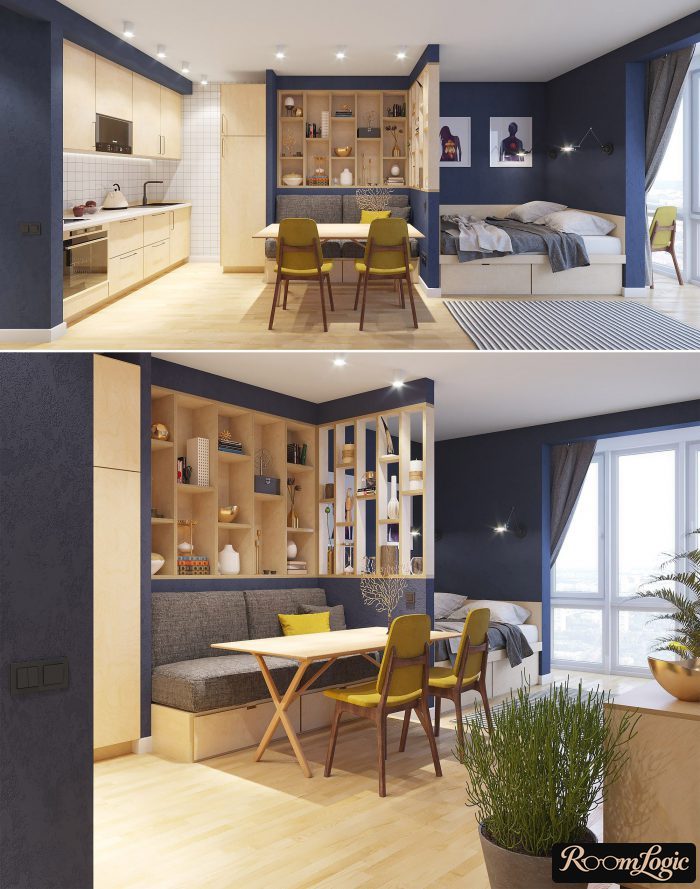
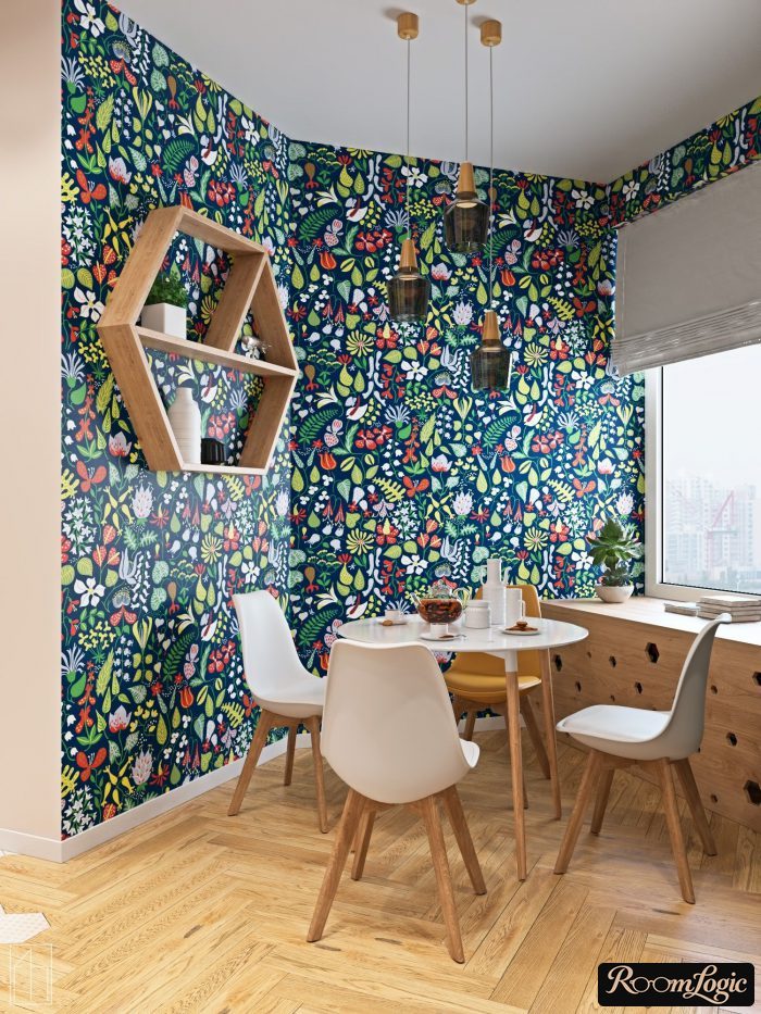
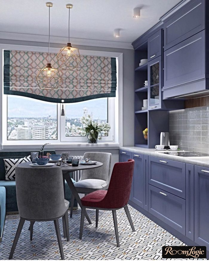
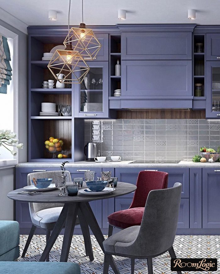
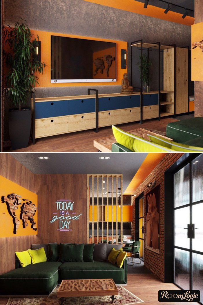
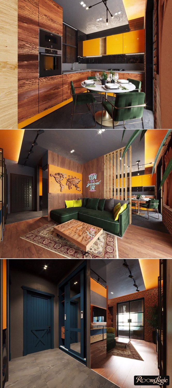
The basic neutral color is white or gray. This is easy and correct because they work with standard finish materials.
I advise never moving away from them if you have no experience or have not hired a genuinely great designer. Use brown, peach, black, or any other color as the background if you want to suffer.
For interiors, we are interested in the two inner rings, the pastel colors, and the two outer rings, the dark colors, plus the same rings at another saturation, meaning with a different amount of gray.
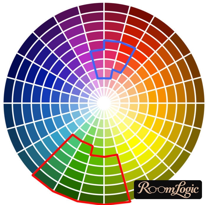
The highlighted areas contain colors I do not recommend using in an interior. That does not mean they are bad. They are simply risky. Combining them in an interior is difficult. I warned you.
Pastels from the middle of the diagram can be used in the finishes, but without fanaticism. Muted dark colors work well for textiles: curtains, rugs, bedding, and upholstered furniture.
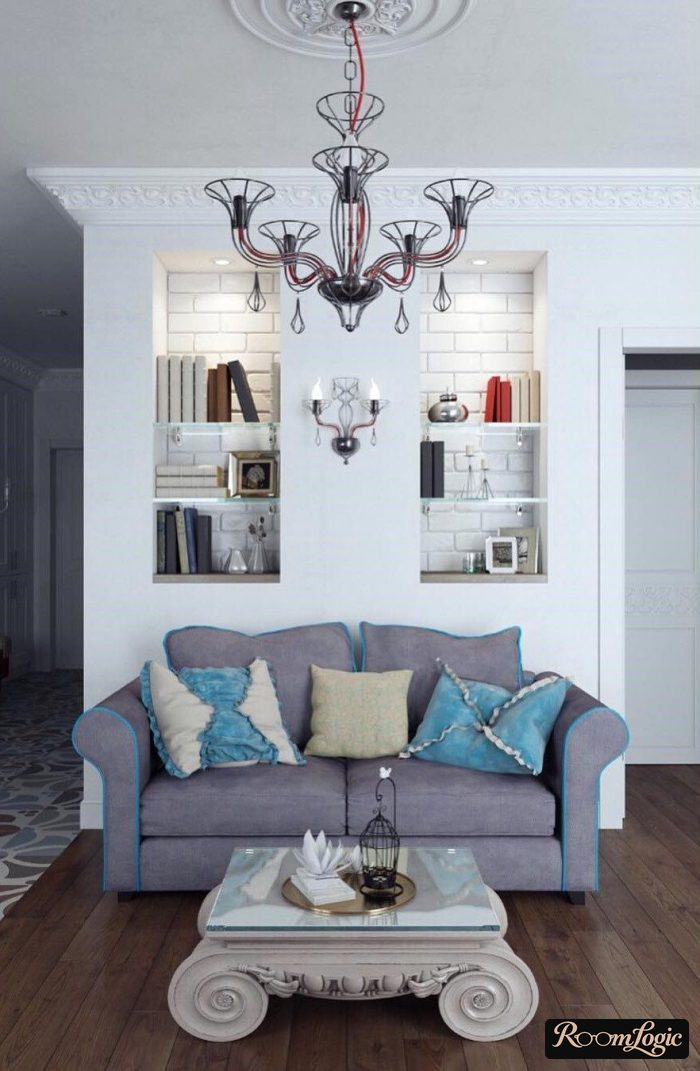
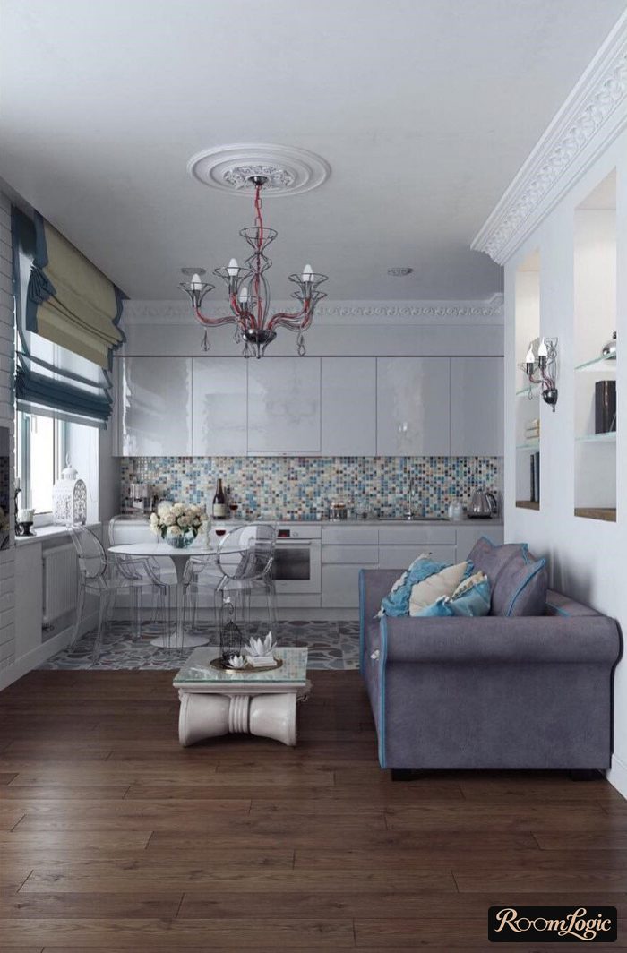
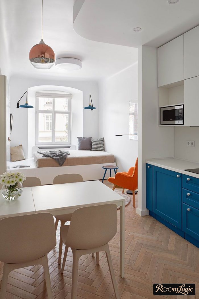
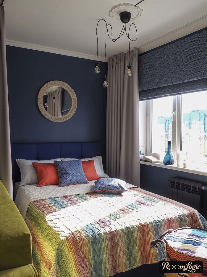
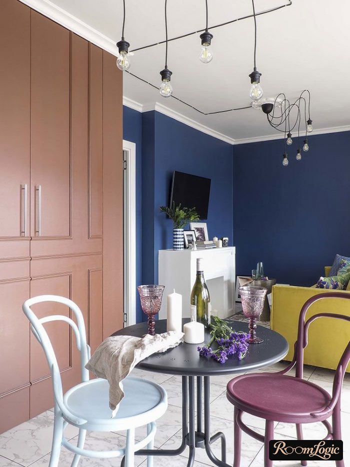
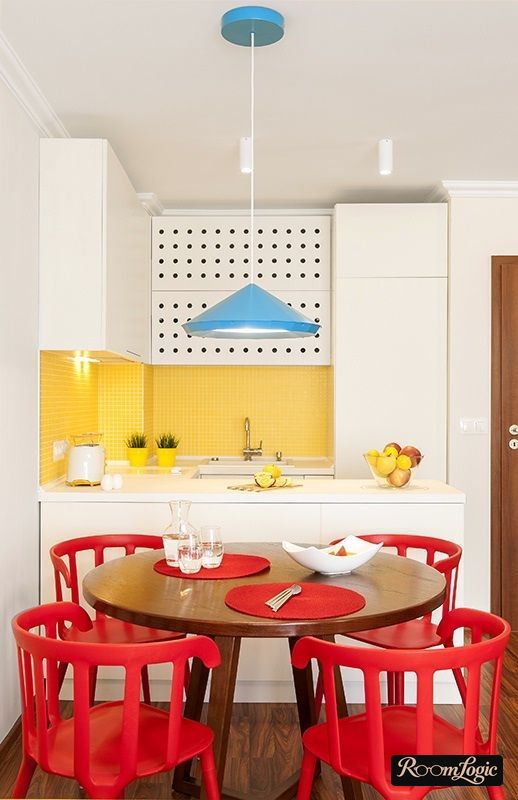
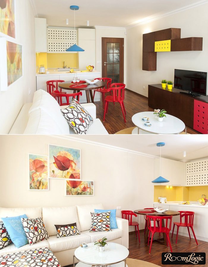
Why are the others bad?
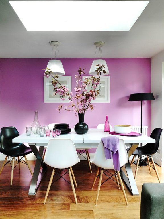
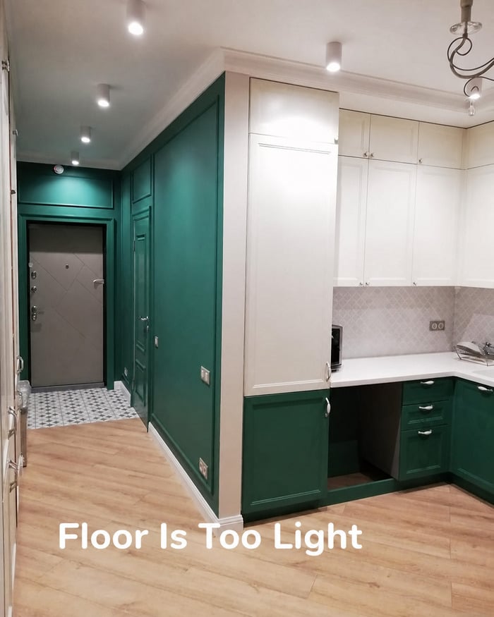
They do not go with natural materials and the natural tones of the finishes. The most standard amateur mistake is letting the floor color ruin everything. People choose an accent from the middle of the wheel or even from the dangerous areas without thinking that most flooring materials imitate wood, which does not match anything bright in either lightness or saturation:
By the way:
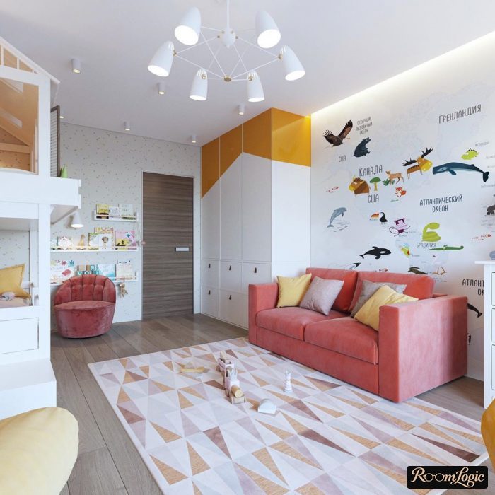
That is why I advise using white furniture in kids’ rooms. It is the only way to use the bright colors children like so much.
Pure red, green, and blue absolutely should not be used in interiors. They are too aggressive, put pressure on the mind, and draw all the attention to themselves.
And no, muted colors look great and are not boring. In the last section of the article about interesting kitchen interiors, I collected options with exactly these color combinations.
So, exclude these from the interior:
- Pure red, blue, and green.
- Bright saturated pink, red, purple, and orange.
- Dark and muted greens. Keep natural grass green, pale pastel green, and every mixture such as pistachio.
- Pale peach in the finishes. It can be used in textiles. The reason is that peach became tiresome in generic remodels in the early 2000s.
Where and with what should colors be added?
Bright accent colors should be added with anything except the finishes. Do not make the walls themselves, or worse the ceiling, aggressive. That is not how design is done. Furniture, rugs, paintings, pillows, curtains, and accessories are used for accents. They are easy to add and remove. Leave the finishes in natural tones.
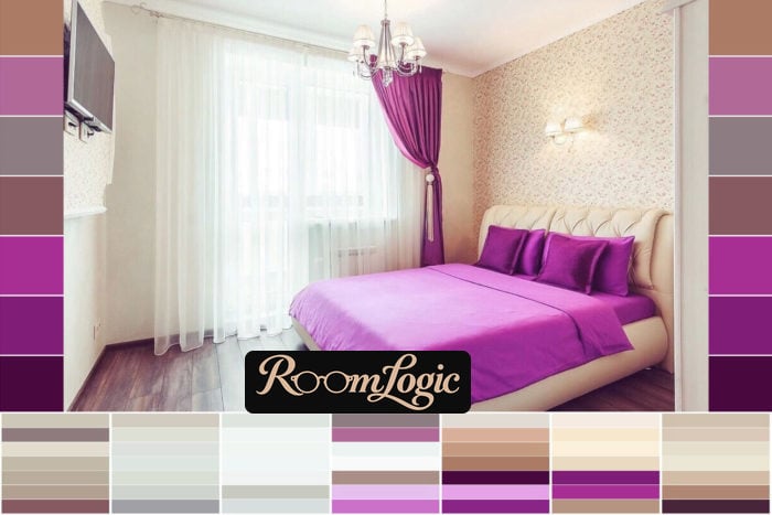
For good, complicated examples that use many shades and still produce a harmonious interior, see Provence-style kitchen interiors.
Ready-Made Palettes
There have been no ready-made schemes so far, and yes, they are not needed. You can build an interior around any shade.
About Charts
First, it is important to understand that none of the rules are absolute. In the list of combination methods, I wrote about conflicting colors and did not recommend them. That does not mean the result will be bad. It simply means a high level of risk. Below is an example of conflicting colors, blue and red, in a kitchen.
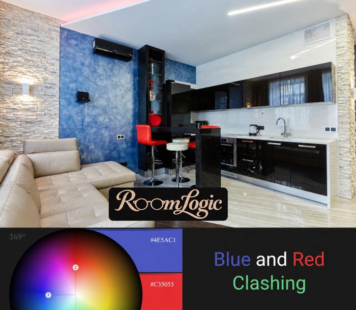
Some people will like an interior with this combination, and some will not. I do not. That is the problem with conflicting colors: they are not universal.
Now we know:
- Interior colors go together when they have the same lightness and saturation.
- There are simply different types of combinations.
- Even conflicting colors may appeal to many people.
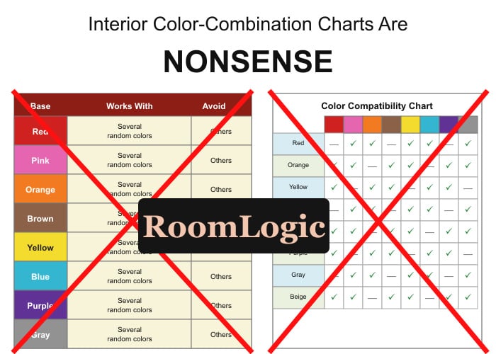
This means it is impossible to formalize the information into a chart. Any attempt to claim otherwise and present supposedly ready-made combination charts is nothing more than ignorance and nonsense.
All ready-made color combination charts are nonsense.
I have explained the essence of color theory. Other people try to pass special cases off as secret knowledge. Pastel green does not go with orange, and pastel pink does not go with green, not because some people with secret knowledge put it in a chart, but because they are at different distances from the center of the color wheel. Why compare them at all?
That is exactly why I recommend taking shades from the inner and outer edges of the wheel. They work with natural finish materials.
It is easy to write that light wood does not go with bright pink. But it is important to understand that this happens because they are at different distances from the center of the wheel. The color wheel is not invented. It reflects the physical meaning of color, and this distance reflects their real physical properties.
Open the wheel, lower the saturation by adding gray, and move through the analogous colors near the center or edge. There is your ready-made piece of a combination chart.
Fashionable Combinations
But if charts do not work, what about turquoise and brown? Or pistachio and muted pink? A funny note: when I first wrote these examples, all of this was fashionable. By the time of the update, it no longer was.
That, ladies and gentlemen, is fashion.
From the standpoint of design perception, every properly chosen color combination is equally good. Psychology creates the differences. When something becomes fashionable, it starts appearing everywhere. The more we see something, the more we get used to it, and the more we like it. After a while, it becomes tiresome, and a new fashion appears.
Here are several once-fashionable interior color combinations. They are no better or worse than the others; they were simply popular:
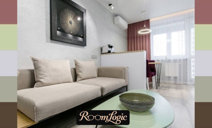
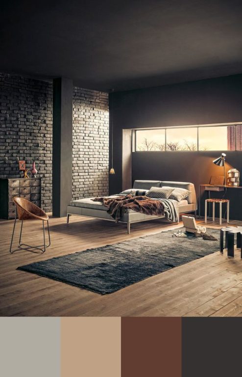
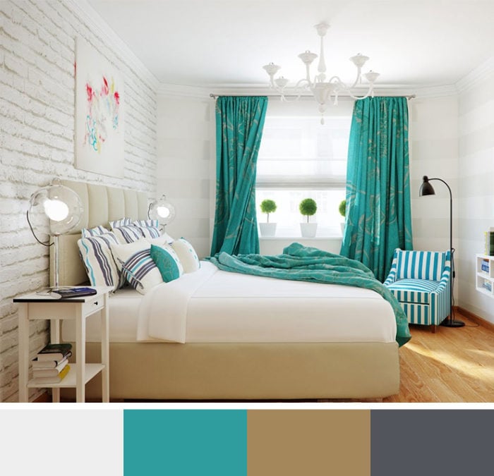
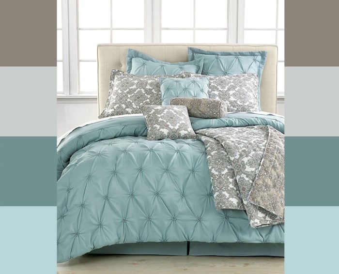
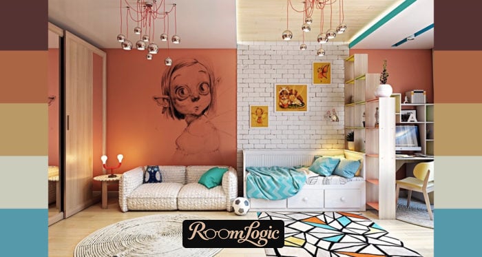
And I have not even mentioned that different design styles use different palettes and different combination methods. This drives the final nail into the coffin of every chart and fashion. Use the wheel and get a timeless interior.
I hope I managed to dispel the mystery and confusion around combining colors in an interior, and that the new tools help you make the design of your apartment perfect. Good luck with your remodel!