Seven main rules for combining wallpaper in one room:
- If you are looking for budget wallpaper, choose only solid colors without drawings or patterns.
- Cover most of the wall area with calm background wallpaper, and use bright accent wallpaper on one or at most two walls.
- Choose the wall with the fewest other objects, located on the room’s axis of symmetry, as the accent.
- You can understand the principles of matching wallpaper by looking through ready-made collections.
- The same theory used for any other material applies to combining wallpaper colors. Pay attention to saturation.
- The basic background colors with the lowest chance of a mistake are white and gray.
- Wallpaper does not have to be the center of attention. Your style may need the most neutral options possible, with something else adding the interesting part.
Wallpaper is used less and less in contemporary interiors and is generally considered a budget wall finish. But there are situations where nothing except wallpaper can create the desired effect. This applies to almost every classic style and to designs that need complex geometric or textured decoration on the walls.
Well, since we have established that sometimes wallpaper is unavoidable, let’s figure out how to combine it in an interior.
Choosing Wallpaper
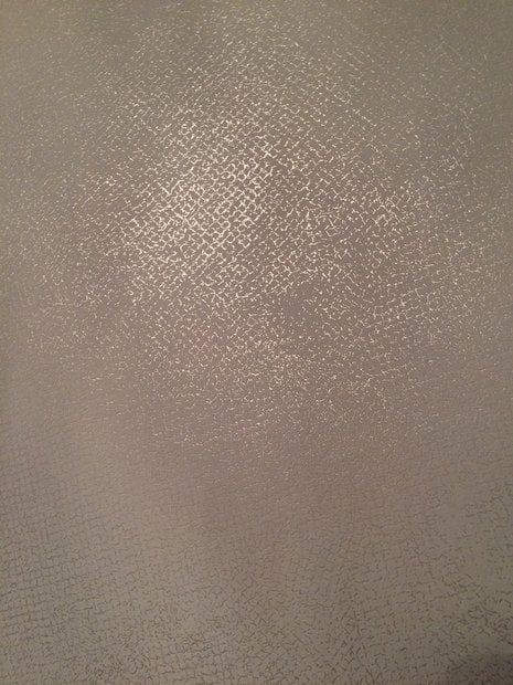
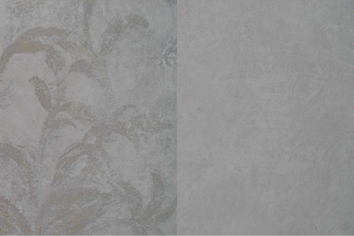
The most important thing: do not buy cheap wallpaper with drawings and patterns. This is the worst thing you can do. The print quality is always terrible, and it shows. If the budget is very limited, choose solid-colored wallpaper without drawings or patterns. It is perfectly fine. Just compare expensive and cheap wallpaper. If the difference shows even in a photo, imagine how it looks in person.
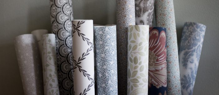
In this article, we will talk about wallpaper for contemporary styles, because we already covered classic wallpaper down to the bone here: combining wallpaper in a bedroom.
When choosing wallpaper, first pay attention to its surface: smooth or textured. The variety of wallpaper in appearance and price is enormous. But we will talk only about options up to about $2 per square foot, because there is simply no point paying more for wallpaper. At that price, you can already start looking at decorative plaster:
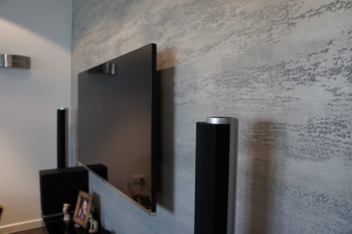
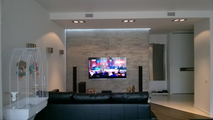
Wallpaper is objectively worse than decorative plaster, and they cannot compete in the same category. That means we need to understand why we are choosing wallpaper, and there are two reasons:
- It is the most budget-friendly finish. Wallpaper is inexpensive, hanging it is simple and inexpensive, and the wall does not need to be prepared perfectly.
- Proper patterns, drawings, and complex color schemes can be carried out only this way, which is why wallpaper is used even in kitchens.
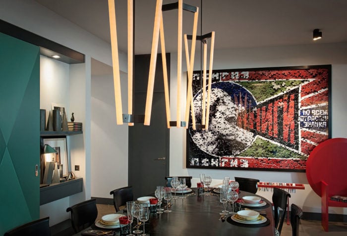
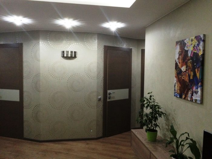
Here are several photo examples where nothing except wallpaper could create this effect:
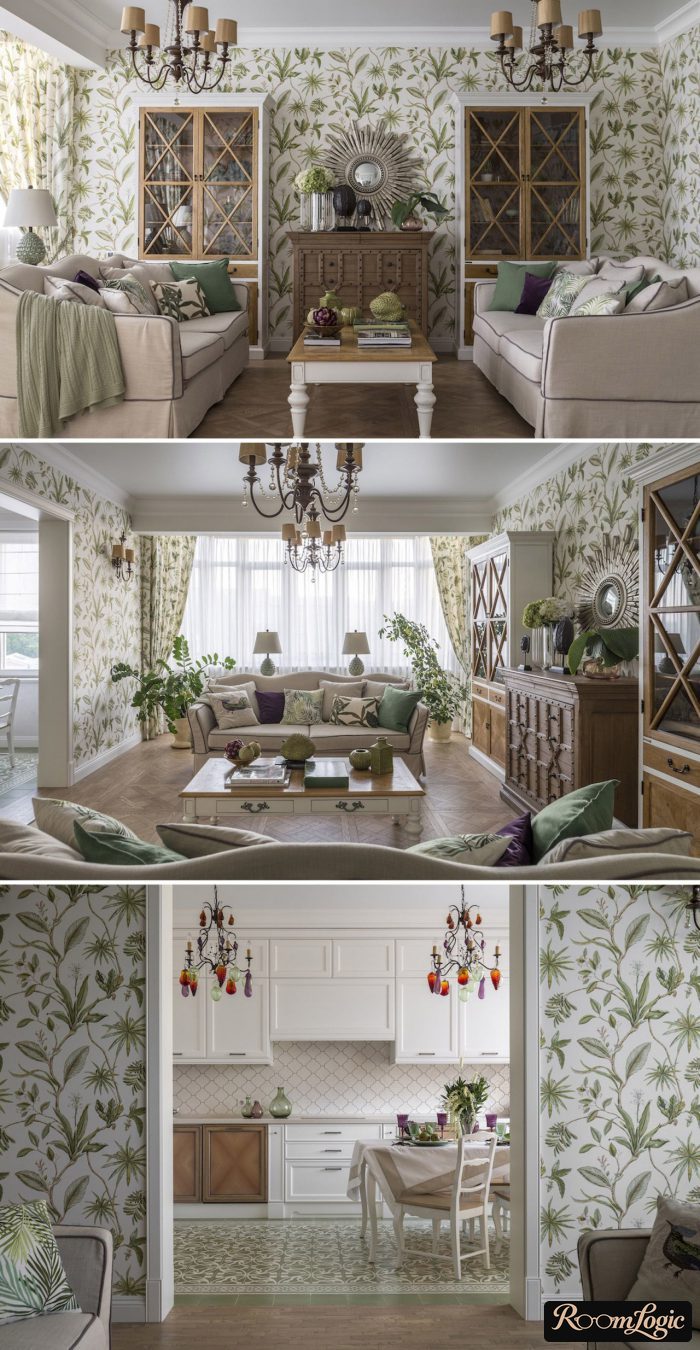
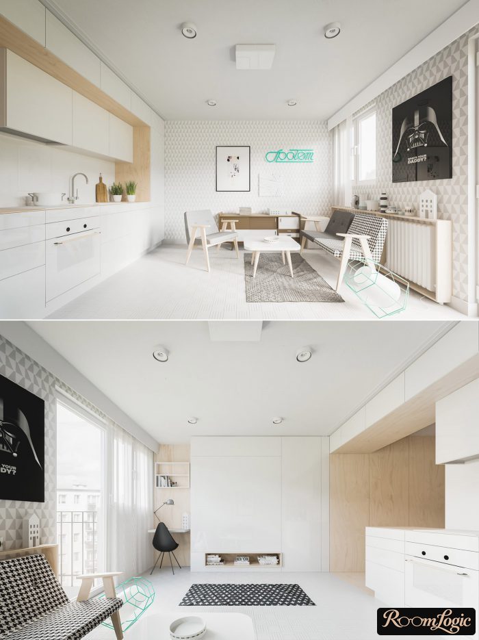
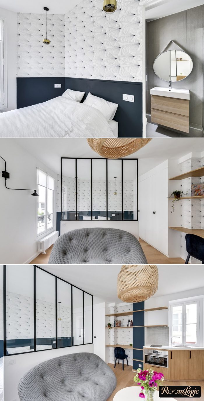
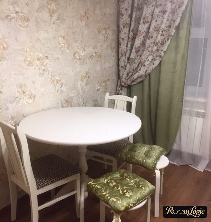
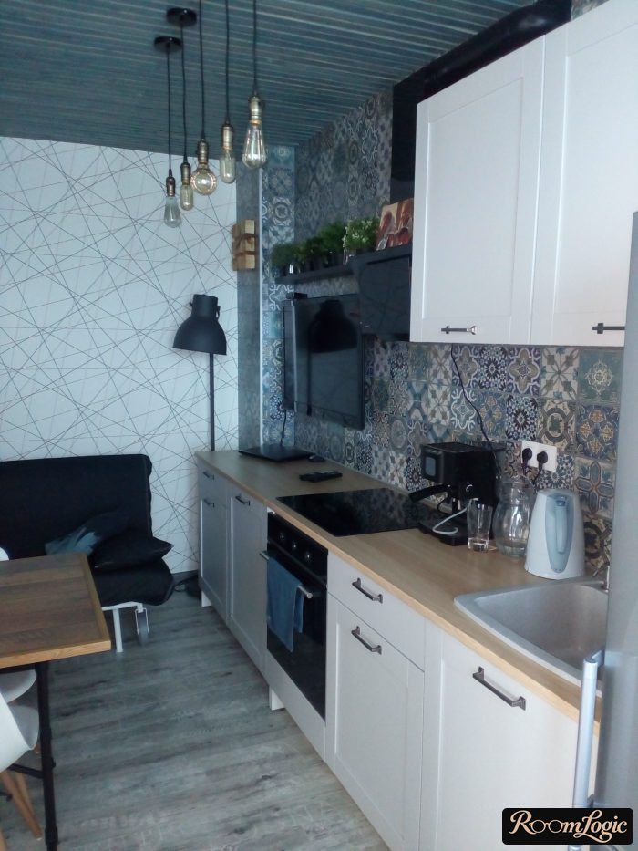
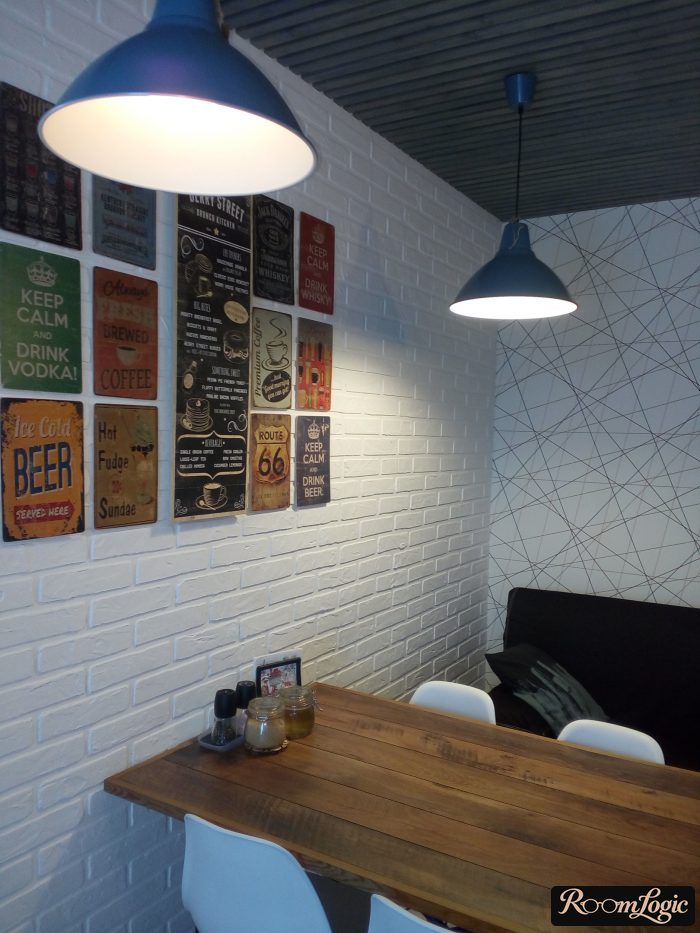
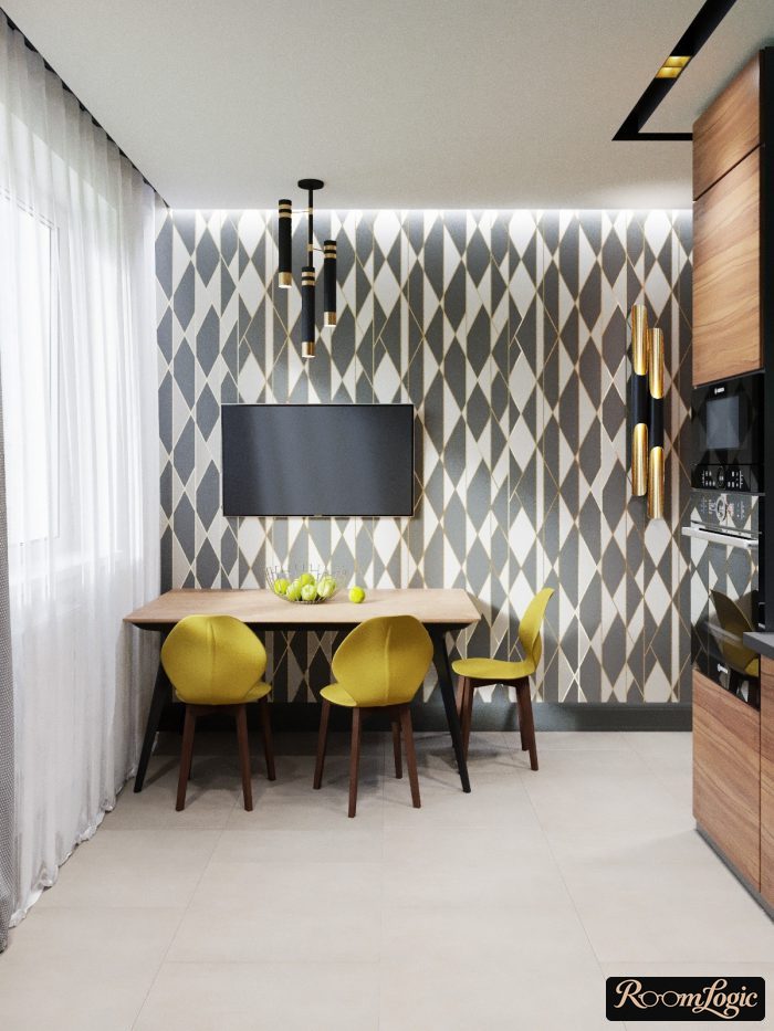
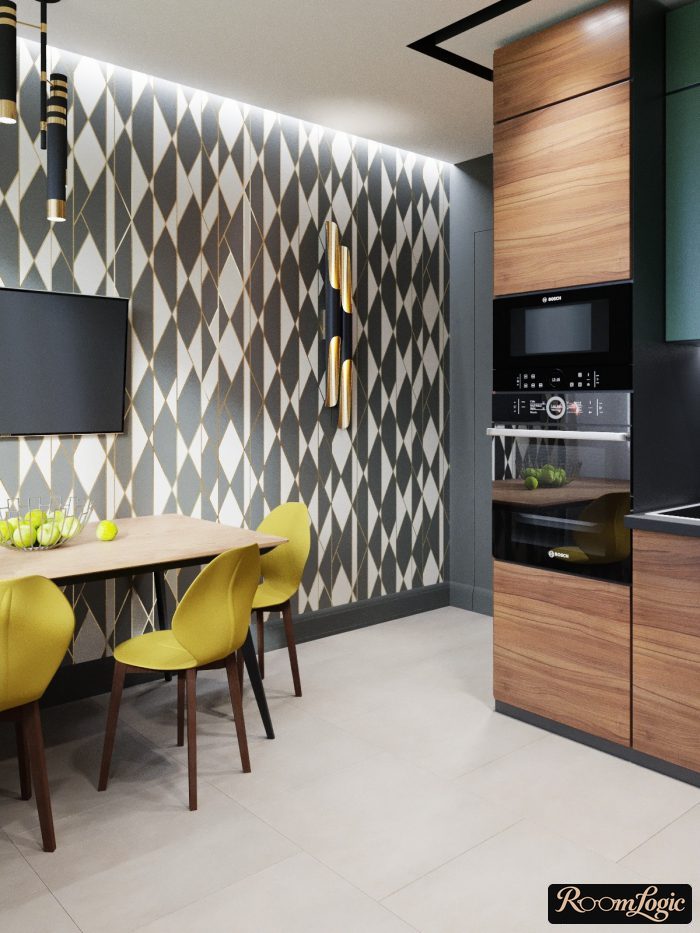
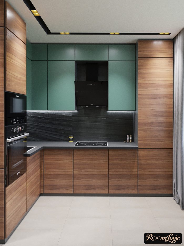
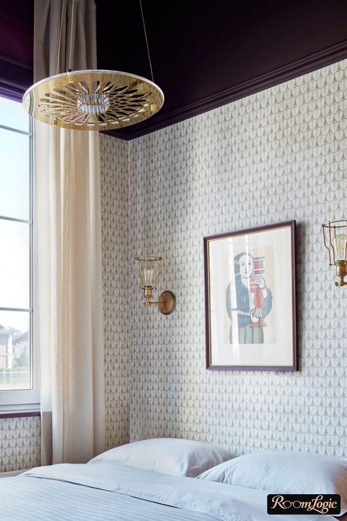
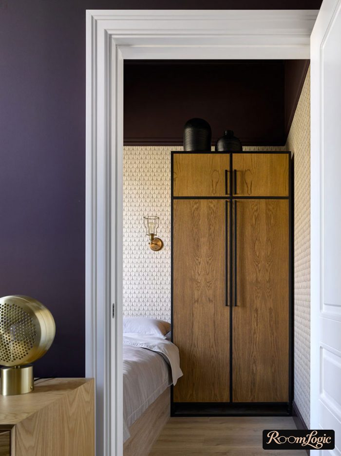
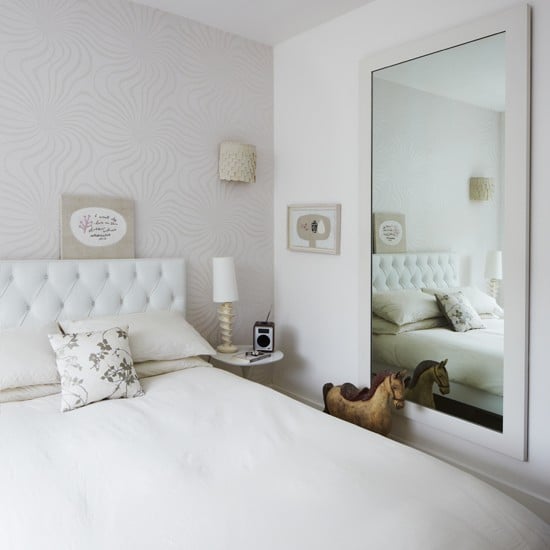
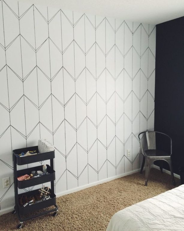
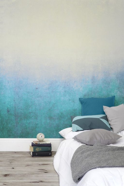
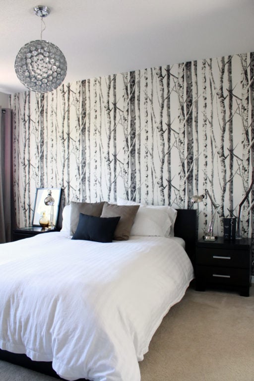
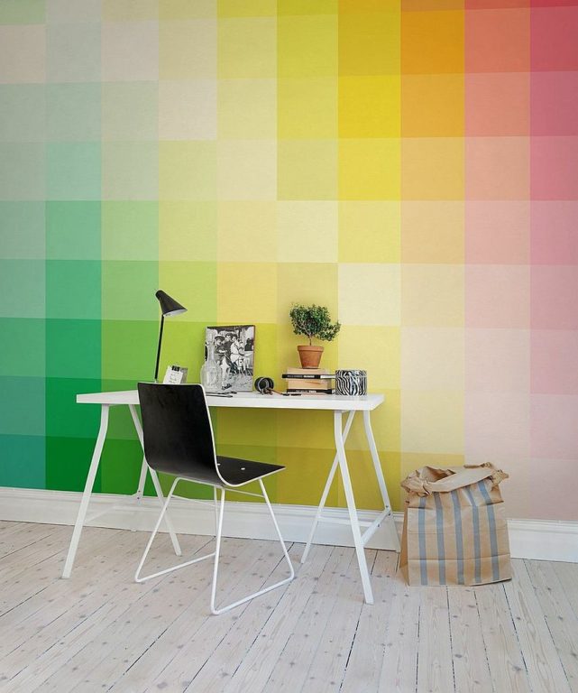
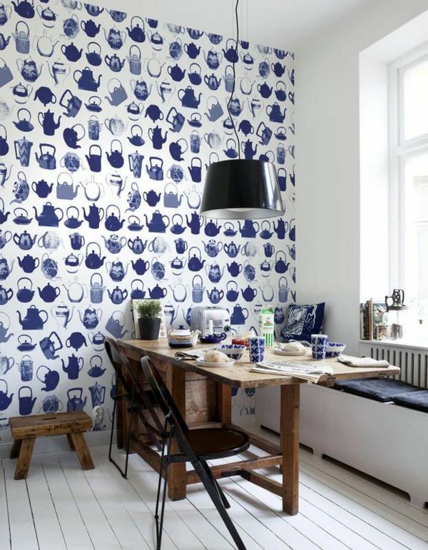
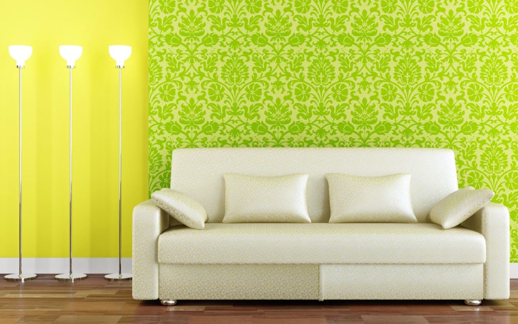
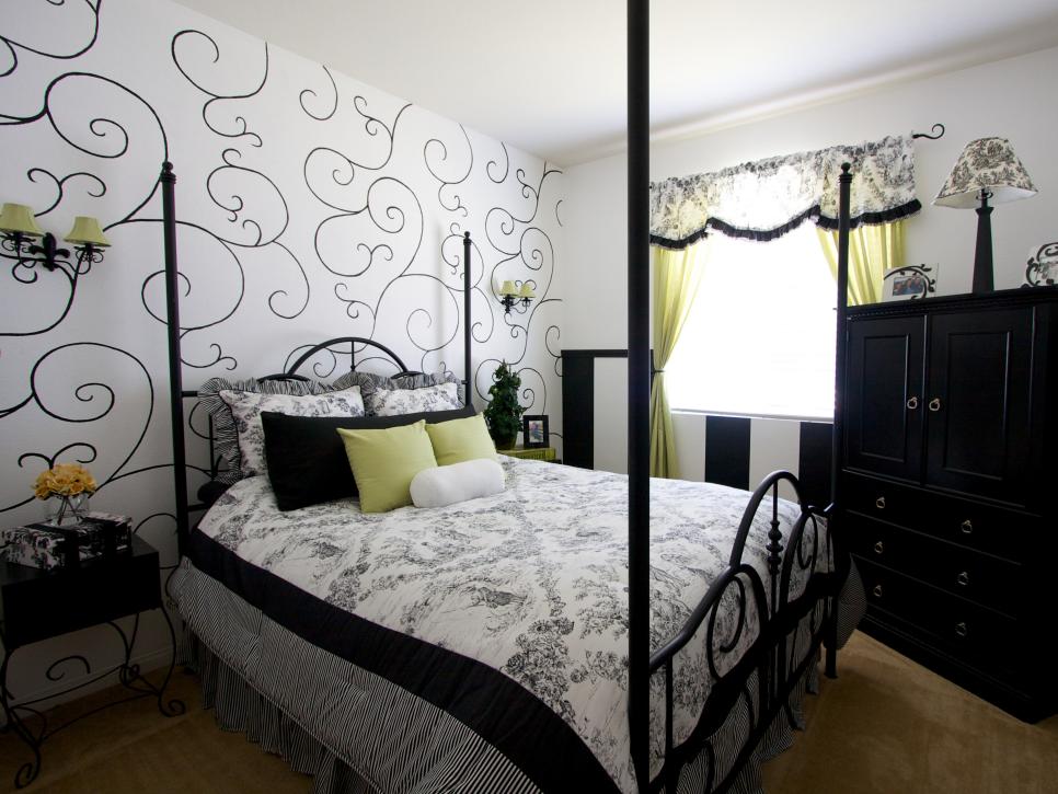
The conclusion is that it makes sense to choose solid wallpaper and wallpaper with interesting geometric and color patterns. Those combinations in an interior are exactly what we will discuss. Again, we are talking only about contemporary styles. Classic design gives wallpaper plenty of room; read about classic wallpaper in the bedroom article.
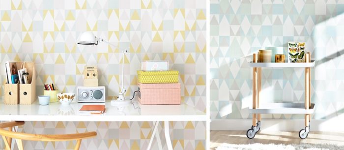
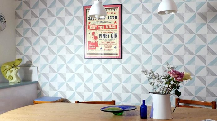
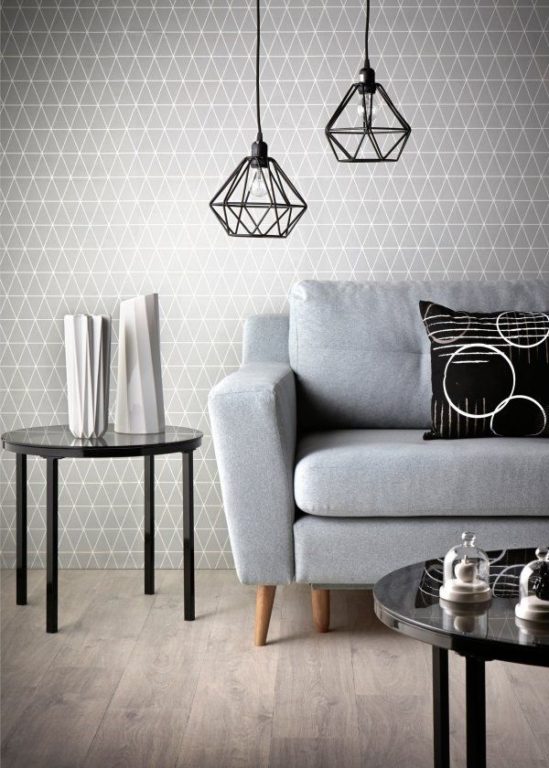
Combining Wallpaper in One Room
There are five ways to combine wallpaper:
- Divide the room horizontally. This is an option for classic styles or traditional American style. The lower and upper halves of the wall are covered with different wallpaper, with a molding border or a special wallpaper border between them. Usually, one of the wallpapers is striped.
- An accent wall. Every wall except one, or even part of one, is covered with unobtrusive background wallpaper. One wall is highlighted with contrasting wallpaper.
- Wallpaper inserts. Niches are covered with wallpaper, or wallpaper panels are framed. This is used only in classic styles.
- Different walls get different wallpaper, without any particular logic.
- Wallpaper patchwork. A creative and labor-intensive decoration method. There are many variations, but the method depends heavily on your sense of taste and proportion, so it is risky.
The most popular and conceptually correct method is the accent wall.
Immediately divide all wallpaper into two main types: accent and background. Accent wallpaper has bright colors, aggressive contrasting patterns, or geometric patterns. Background wallpaper is solid, without patterns or drawings, in calm pastel colors. Accent wallpaper is used on one or at most two walls, and this is a strict rule.
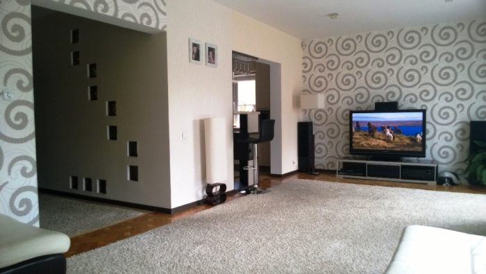
Never use accent wallpaper on more than two walls. One is better.
The rule for choosing an accent wall is simple: the less loaded the wall, the better. If two walls are equally free, choose the one on the room’s axis of symmetry. Loaded means anything that breaks up the plane: windows, doors, shelves, paintings, electronics, and furniture. Accordingly, when a wall is overloaded, choose simple wallpaper:
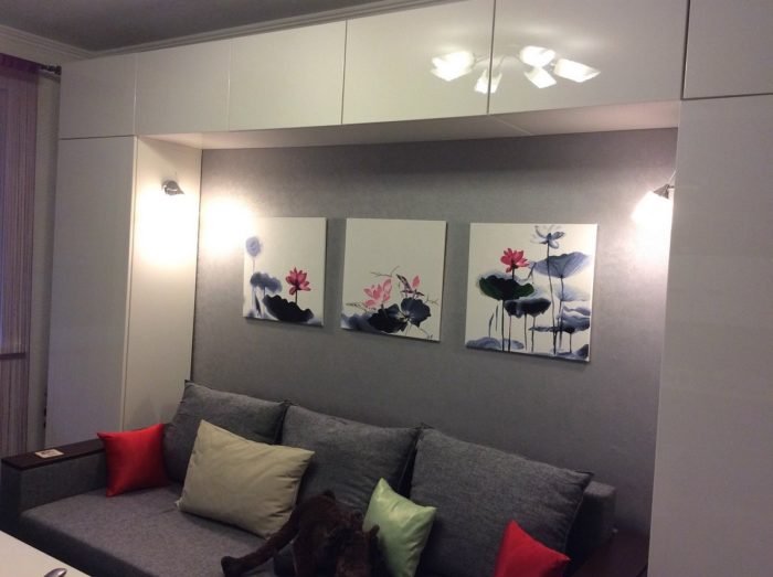
In living rooms, the wall behind the sofa is most often the accent, followed by the wall behind the TV. On the other two walls, the plane is broken by a window with a radiator and a door. If the walls behind the sofa and TV are small, that is also an argument against using accent wallpaper.
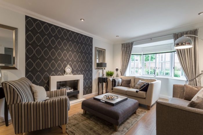
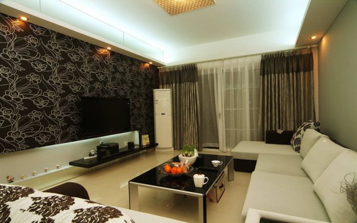
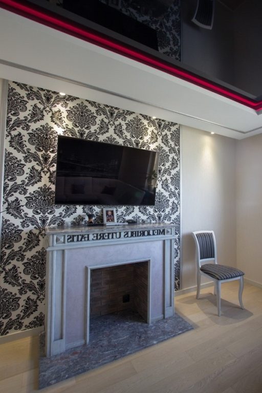
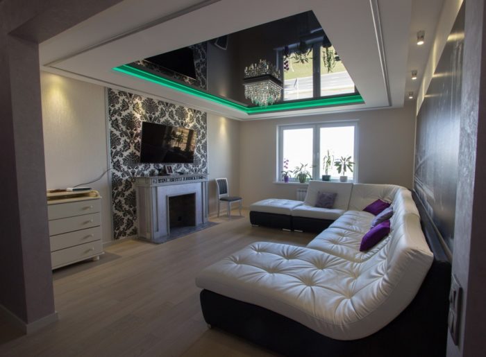
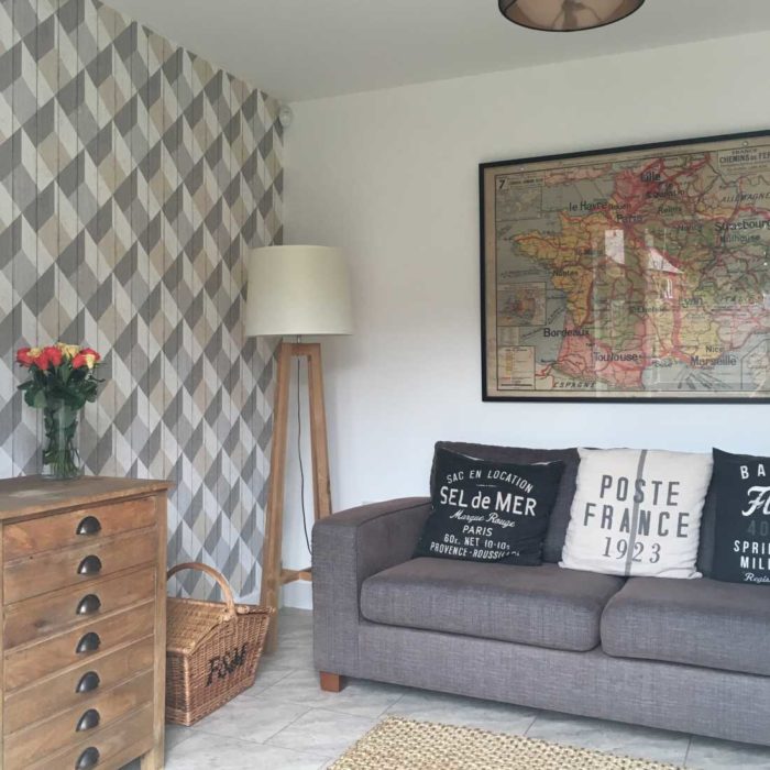
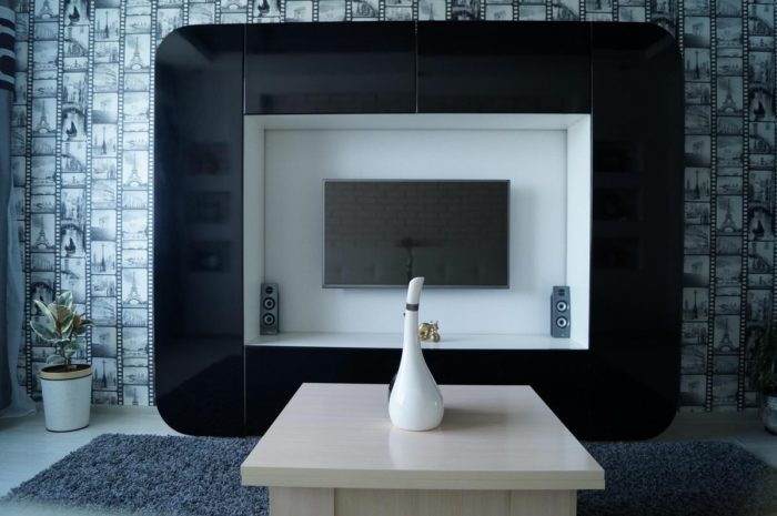
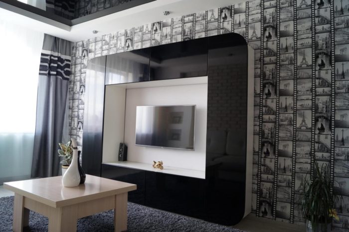
If every wall is loaded, you do not need an accent wall at all. Design is not made only with finishes. Using only calm background wallpaper is perfectly normal. Murals and other interesting options are especially sensitive to other objects on the wall:
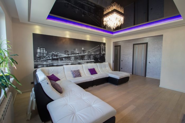
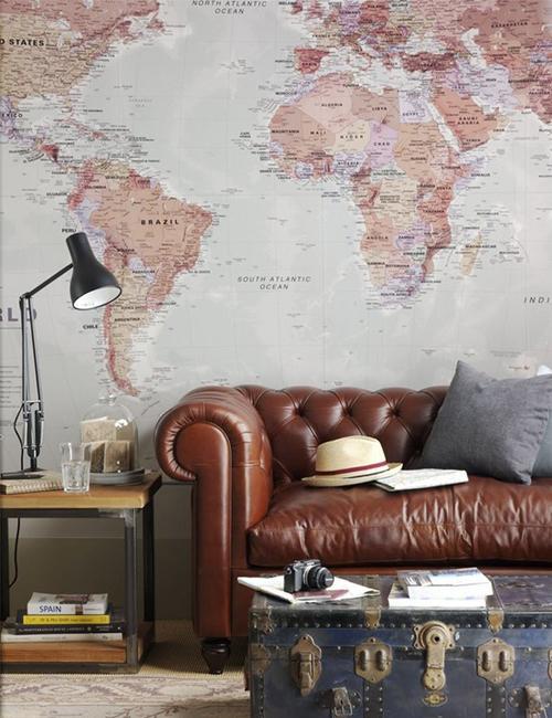
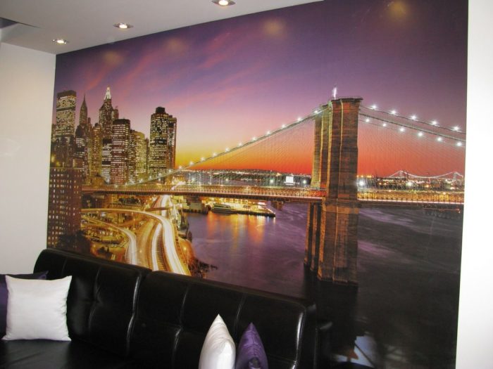
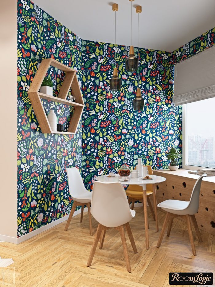
A common mistake is hanging accent wallpaper on a wall overloaded with objects:
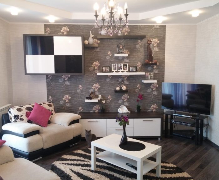
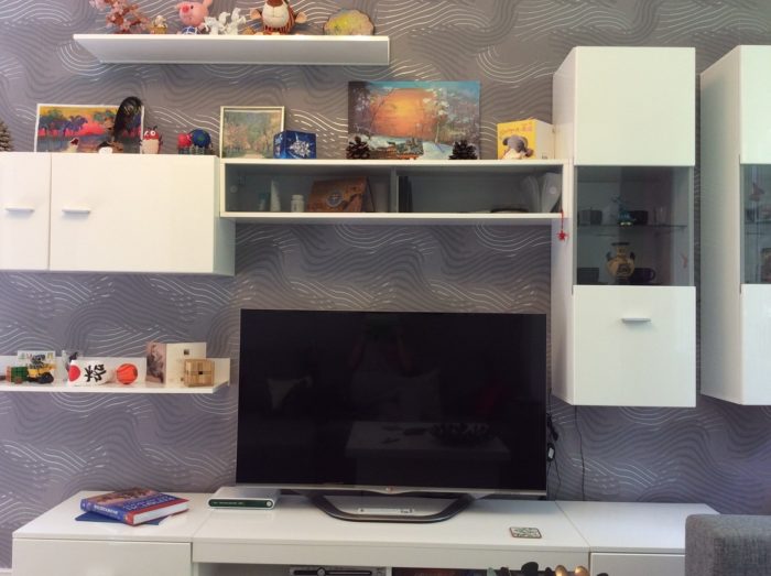
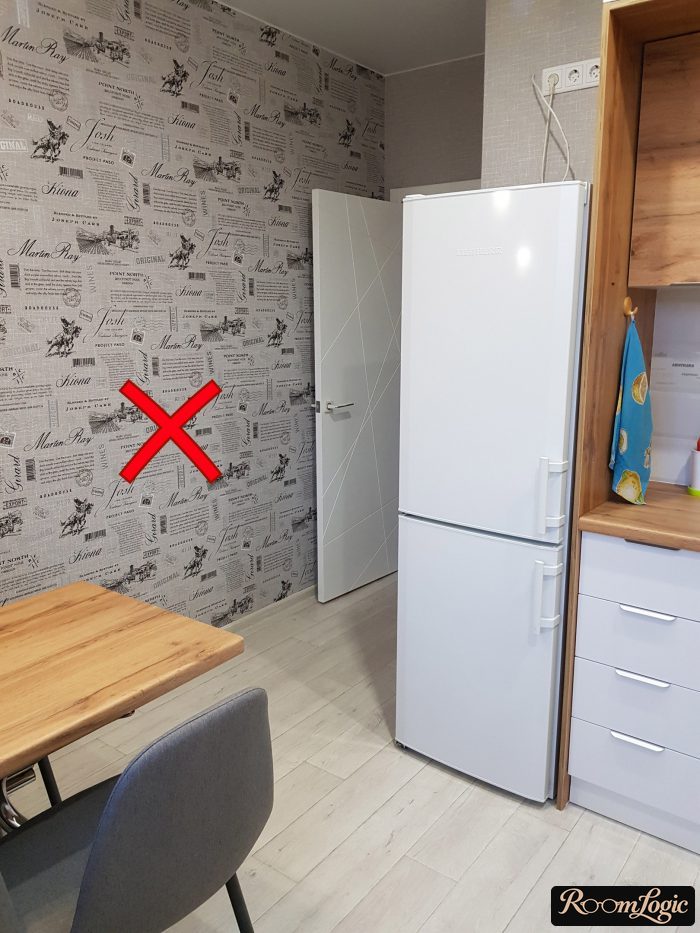
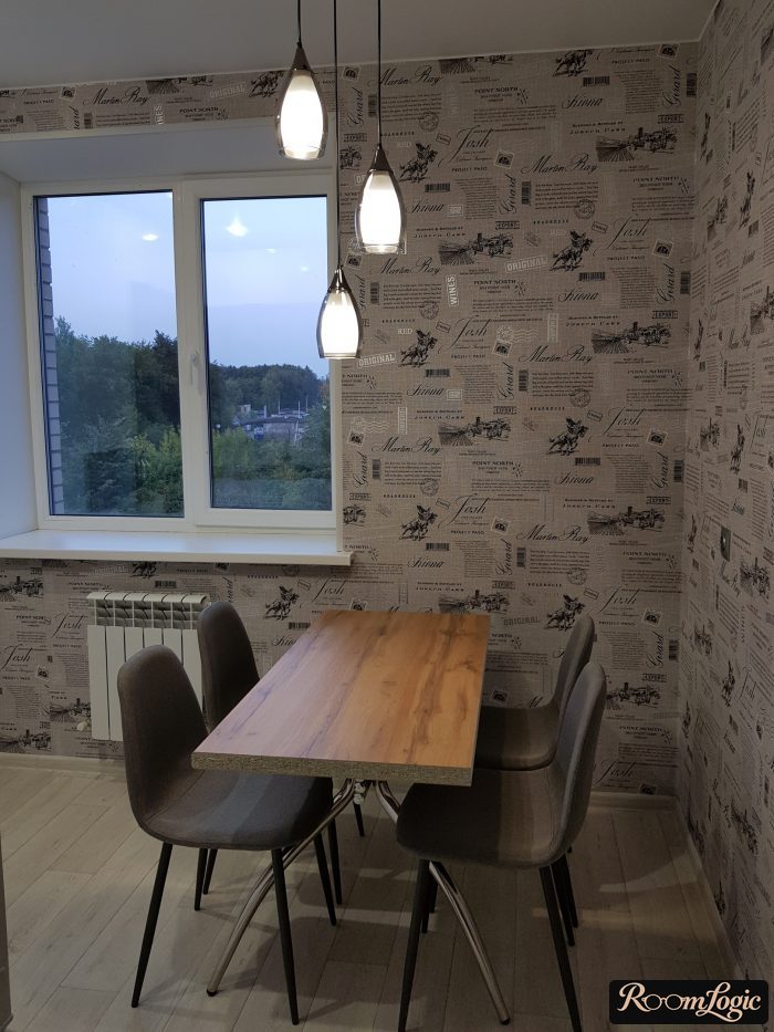
Another mistake is adding wallpaper only because the wall seems boring. Below is a clear example. In this situation, a white wall with a couple of light fixtures or abstract paintings would work better.
Combining Wallpaper Colors in a Room
It is unclear whether a sense of taste can be taught or whether it forms before conscious age. Some people find questions of combining colors in an interior easy and natural. Others need theory.
Bright Colors
Wallpaper collections are good visual examples of matching wallpaper by color, pattern, and texture. Manufacturers release ready-made matching sets of several background and accent wallpapers. And we have to give them credit: wallpaper within one collection really does work well together.
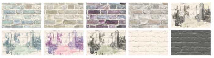
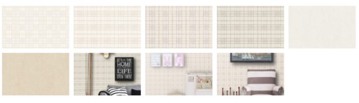
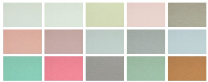
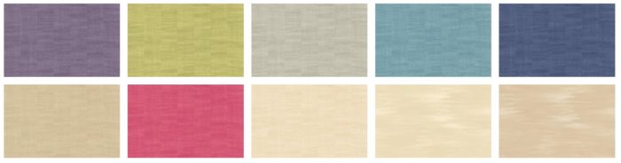
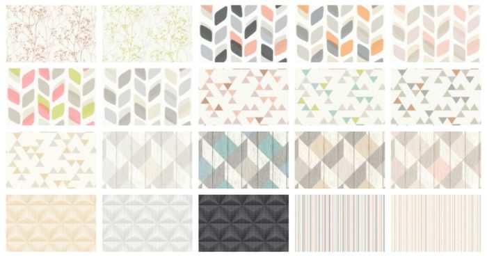
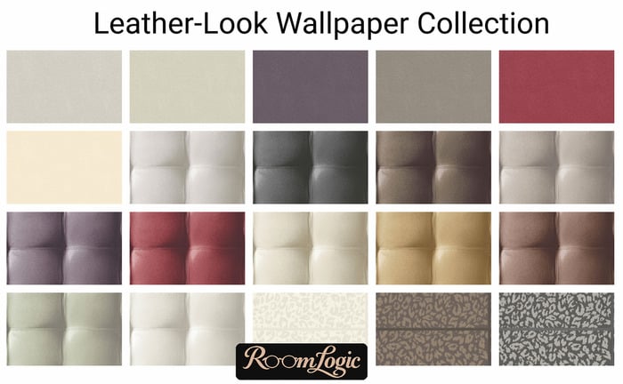
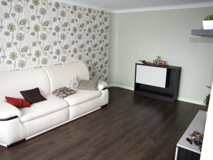
As the photos show, color is only one way to combine wallpaper. Wallpaper within a collection does not work together only because the colors match. It is about the drawing, texture, and, most importantly, color saturation. We already wrote in detail about the importance of saturation in interior color combinations. All of it applies to combining wallpaper too.
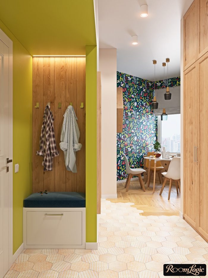
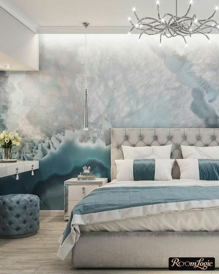
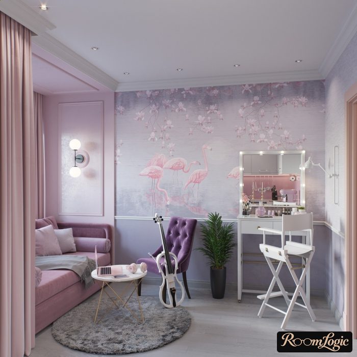
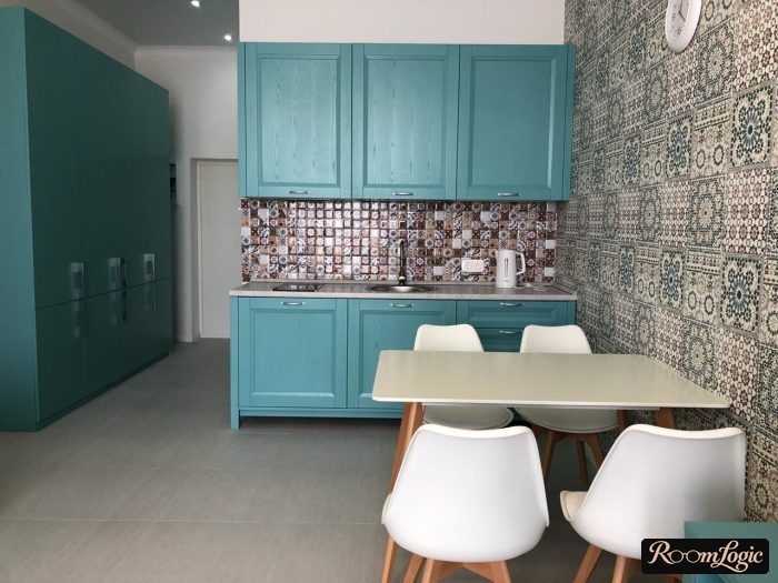
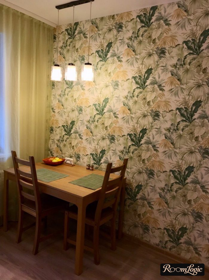
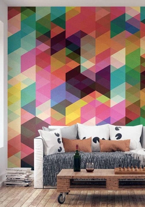
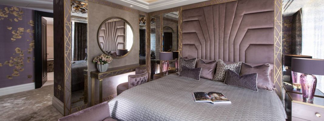
The basic two-color combinations remain the same. White and gray are universal background colors. They go with absolutely any bright color. If you want to use something other than white as the base, see the combination chart at the link above. Here is a photo example with background white and accent purple:
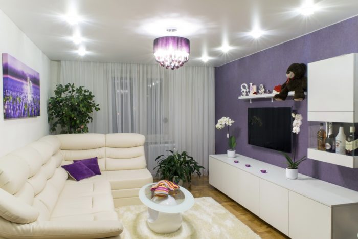
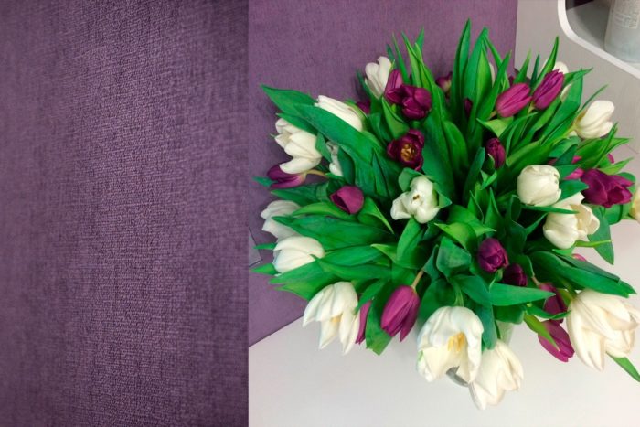
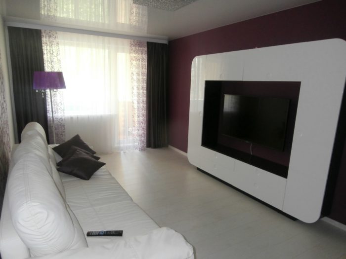
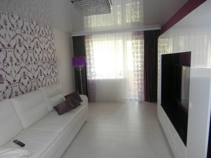
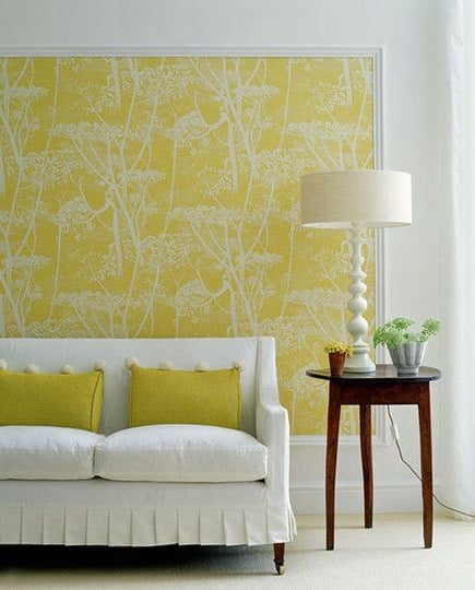
These simple wallpaper combinations work with other colors too:
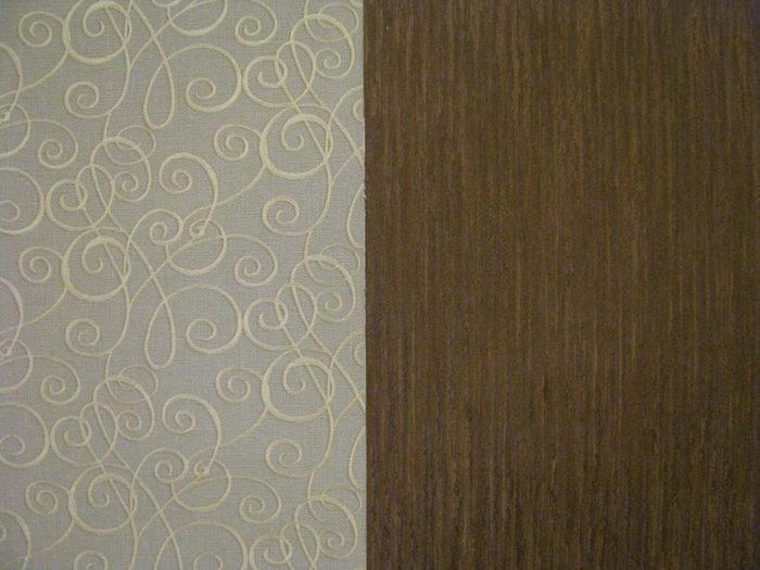
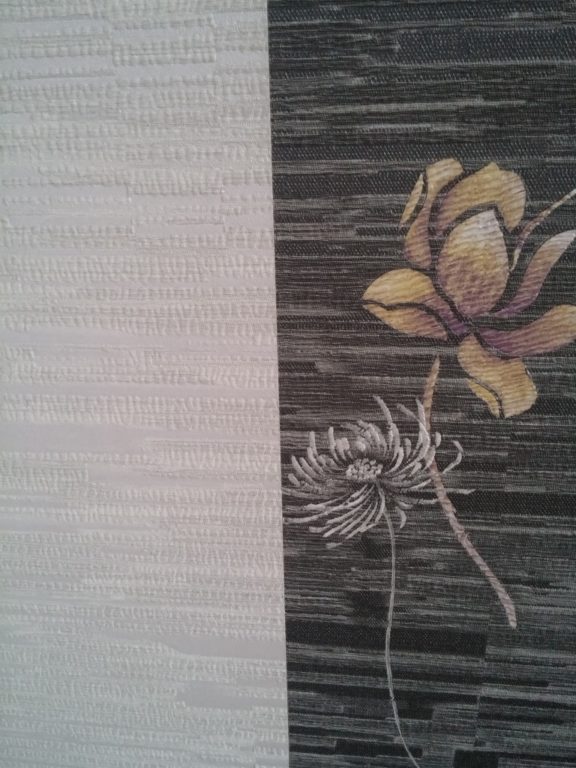
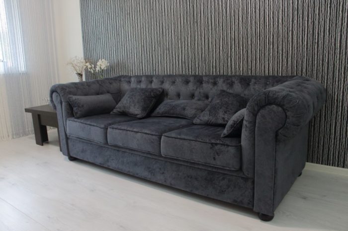
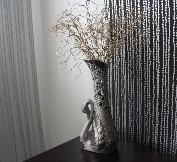
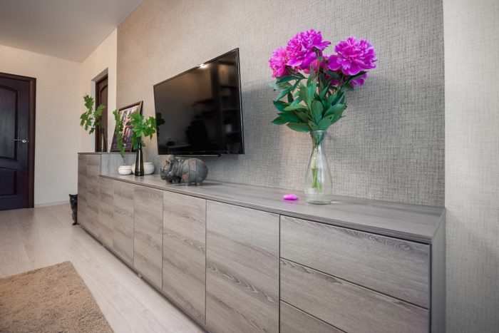
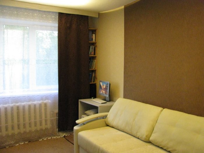
Since wallpaper comes in rolls, there is no problem joining two kinds on one wall. In that case, the question of whether they work together is especially important. Photo examples:
Calm Neutral Colors
The main thing is to remember that the walls are only a background. Many people make the mistake of choosing overly bright wallpaper colors. This often happens because, during planning, we imagine the future room and want it to be bright. We do not account for the fact that a real apartment looks nothing like a drawing or a photo taken immediately after the remodel. Rooms have furniture, possessions, appliances, curtains, and so on, and all of those have their own colors too. If the walls are also bright, the result can be a mess. One bright wall is almost always a good idea. More is already a risk.
The walls are only a background.
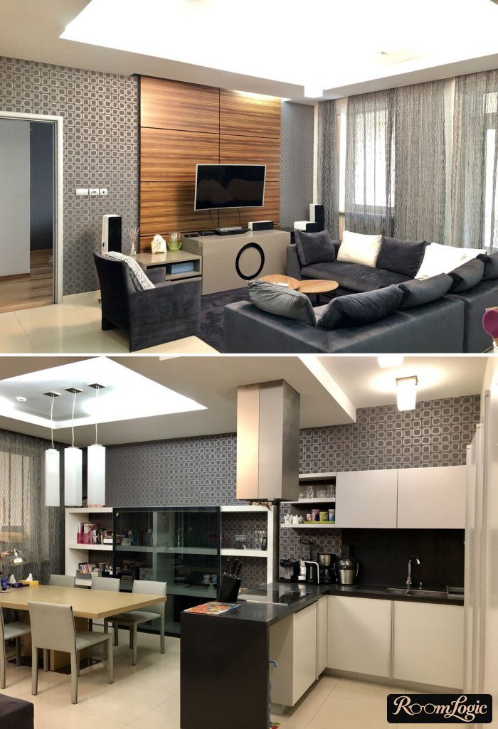
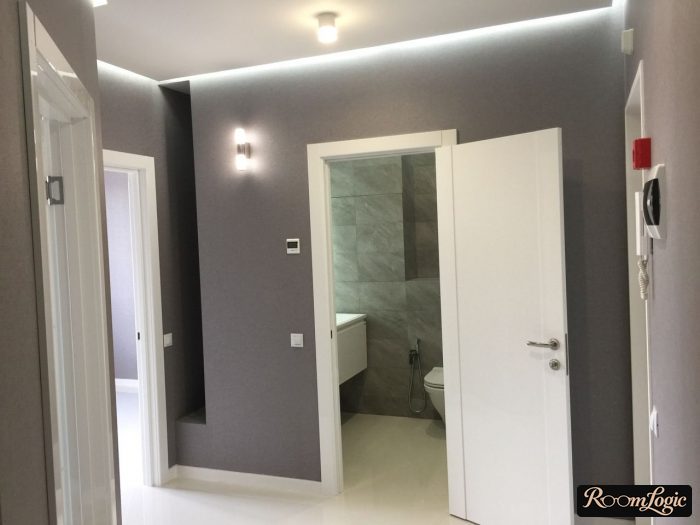
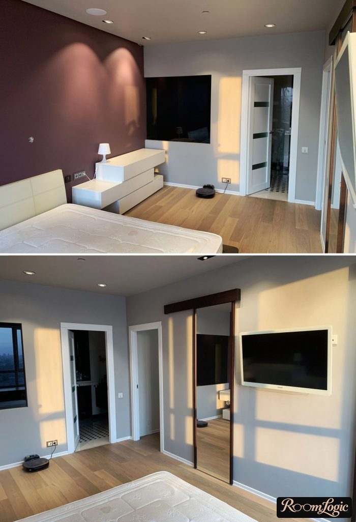
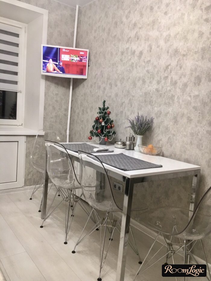
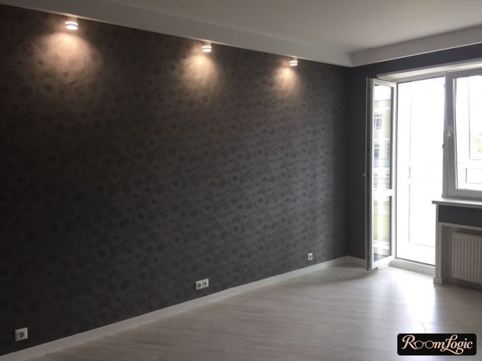
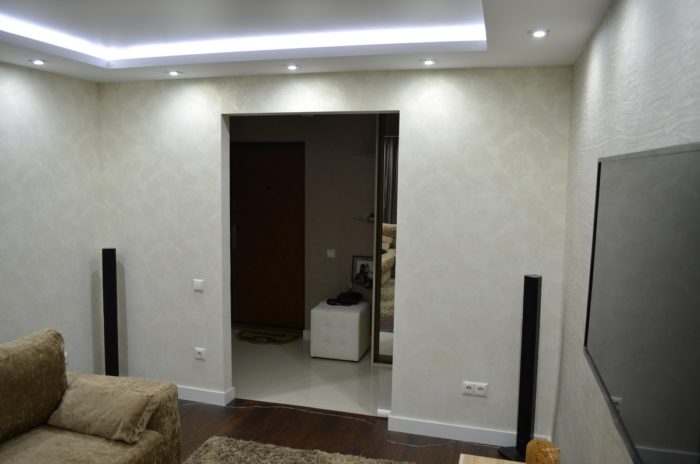
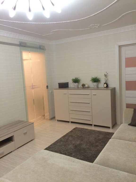
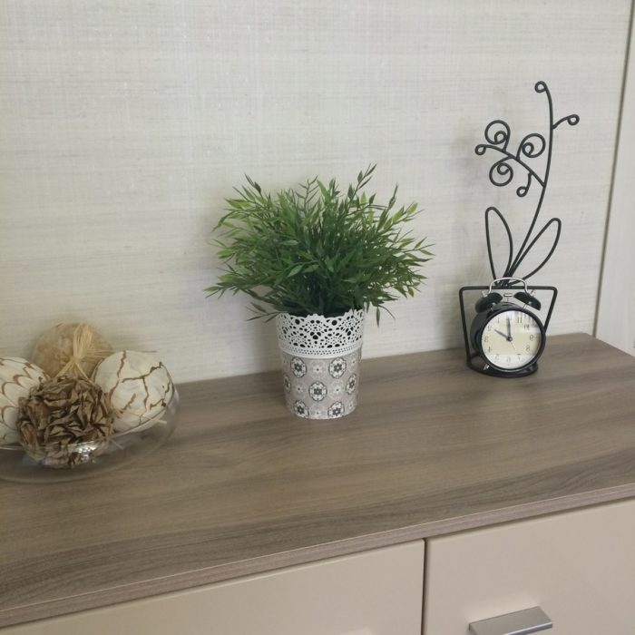
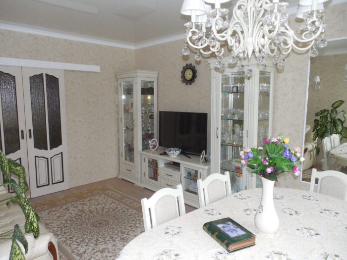
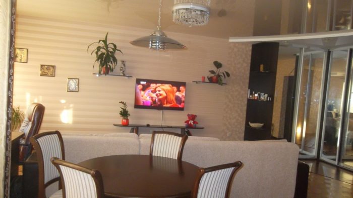
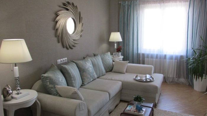
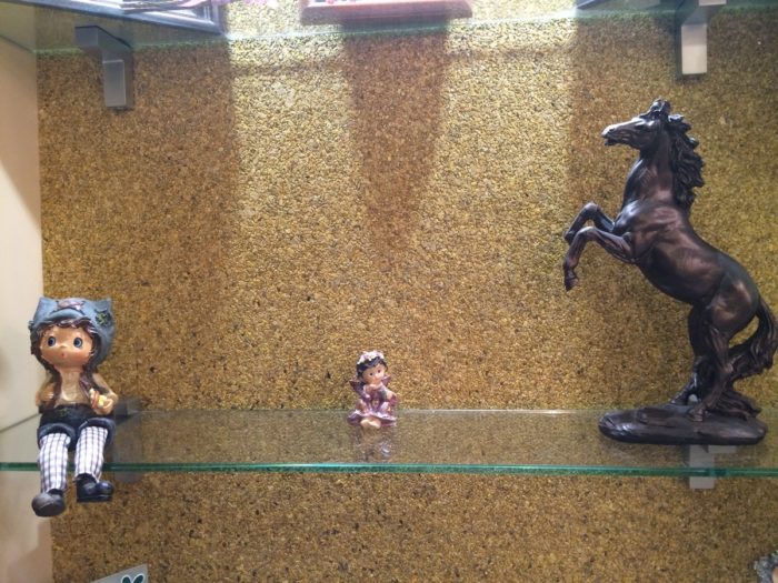
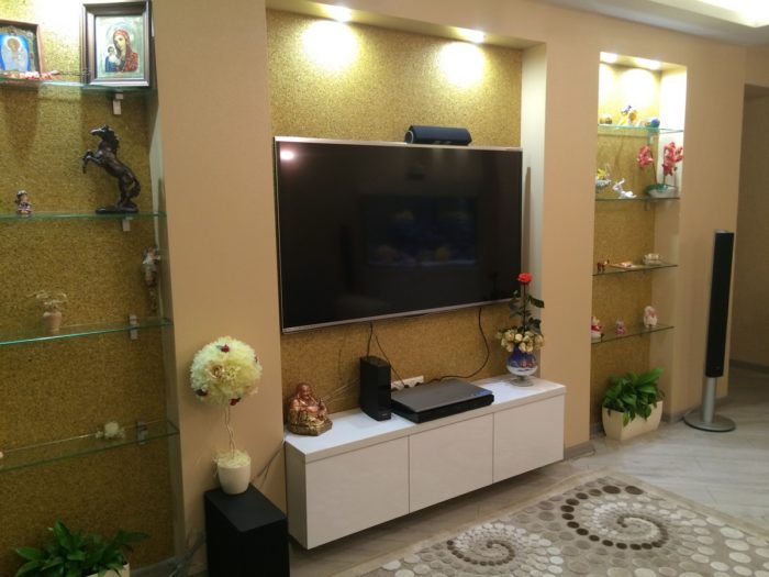
Wallpaper can be an accent because of an interesting texture rather than color. Here, for example, is mica wallpaper made from fine sand. The photo does not show it very well, but in person it is definitely an accent:
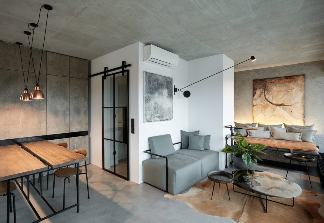
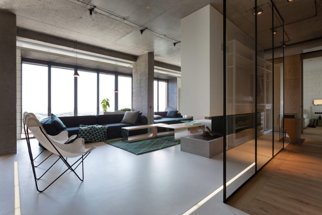
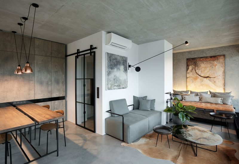
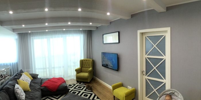
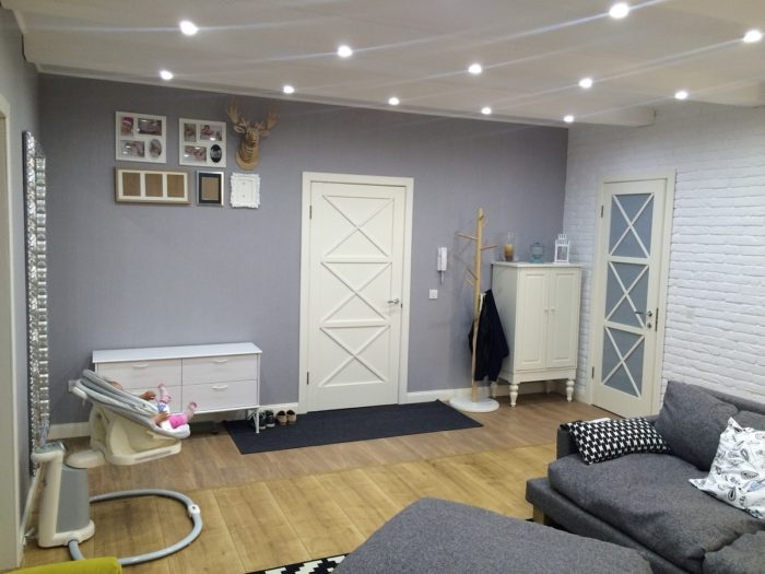
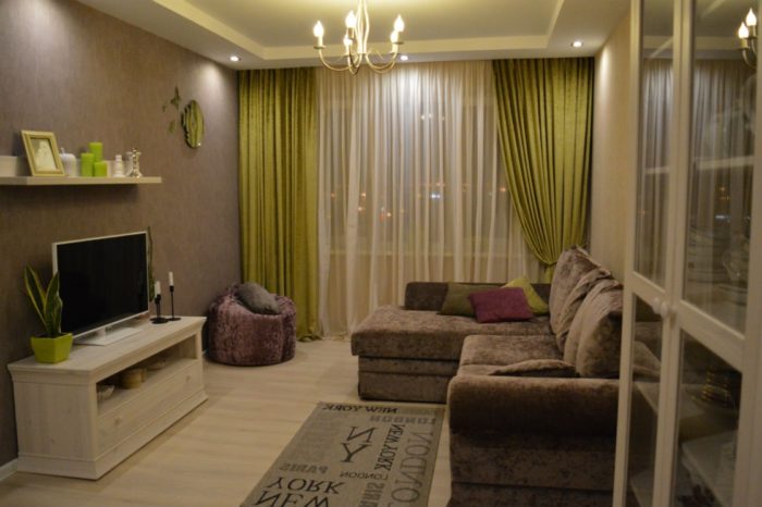
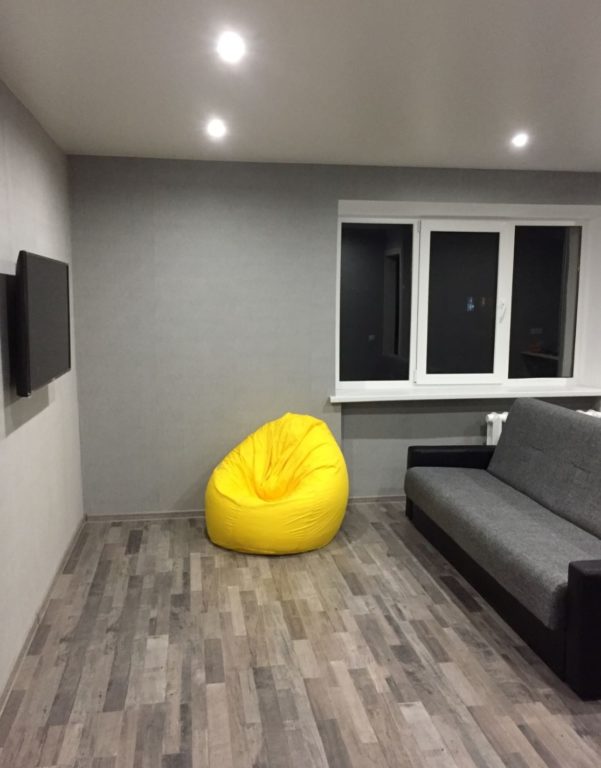
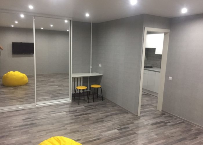
In contemporary design, solid-colored wallpaper is used simply as a replacement for paint. It creates no accents and does not draw attention to itself at all. Here is photo proof that this is still an interesting, not boring option.
I almost forgot: photos show wallpaper very poorly. You always need to see it in person. I hope the theory was useful. Good luck with your remodel!