Up to 95 percent of tile for sale is complete junk. Let’s figure out what to look for when choosing the best bathroom tile and what to avoid.
How to Choose Tile
Choose Tile in Person
The first thing you absolutely have to understand is that tile cannot be chosen from online photos. You have to go to stores and sort through the options in person. Be sure to touch everything. Texture can be felt with your hands.
Photos show only color and size, and even those imperfectly. Texture, light reflection, geometry, and edge type can be judged only in a store. There are several kinds of displays, and they are not all equally good.
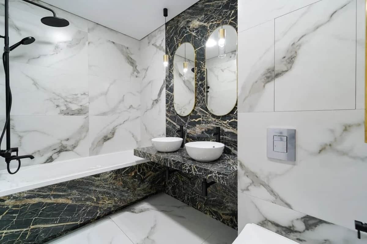
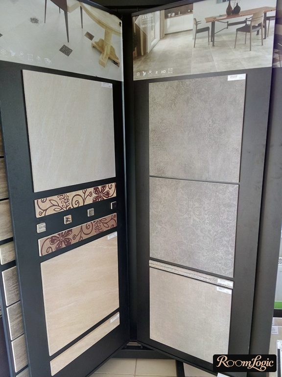
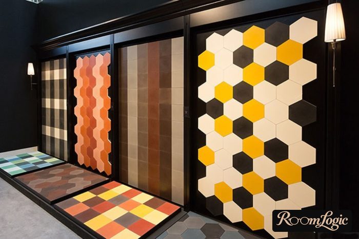
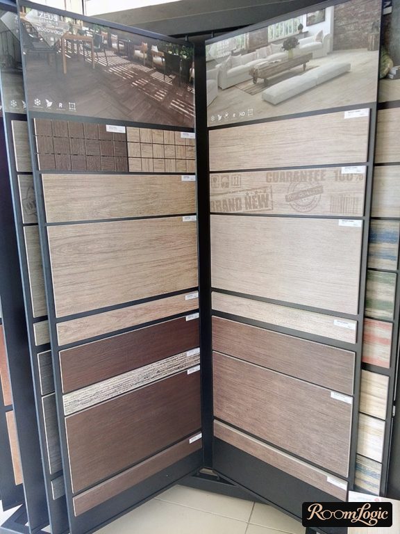
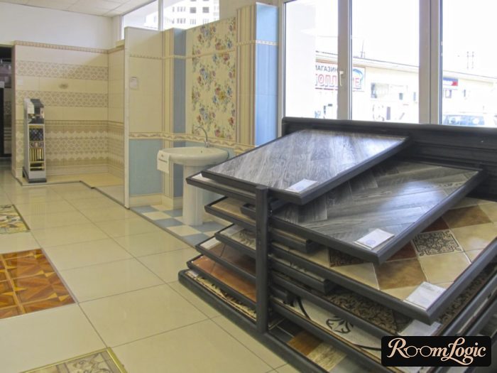
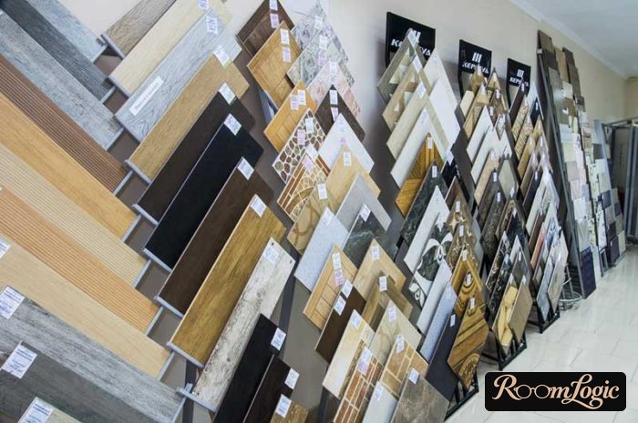
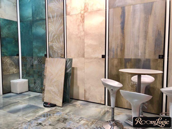
Only expensive showrooms install the display as it would be in reality, using thinset and grouted joints. The last photo shows an example with Italian tile. Ordinary tile is attached with construction adhesive and no grout. Do not let these displays fool you because they do not show the edges or what the joints will look like. When choosing, take two loose tiles and check their geometry by placing the face of one against the back of the other. They should sit tightly with no gaps or holes.
At first, simply visit several stores and photograph the samples you like with their price tags. The price range is very broad, and you should never choose the first tile you like. One more thing:
Do not listen to sales associates’ advice about appearance and design.
These people are neither contractors nor designers. Taste and a sense of beauty are not job requirements. That means their opinions and advice will be almost random in quality and may be shaped by a desire to push leftover stock or expensive borders and decorative inserts, which are terrible about 99 percent of the time.
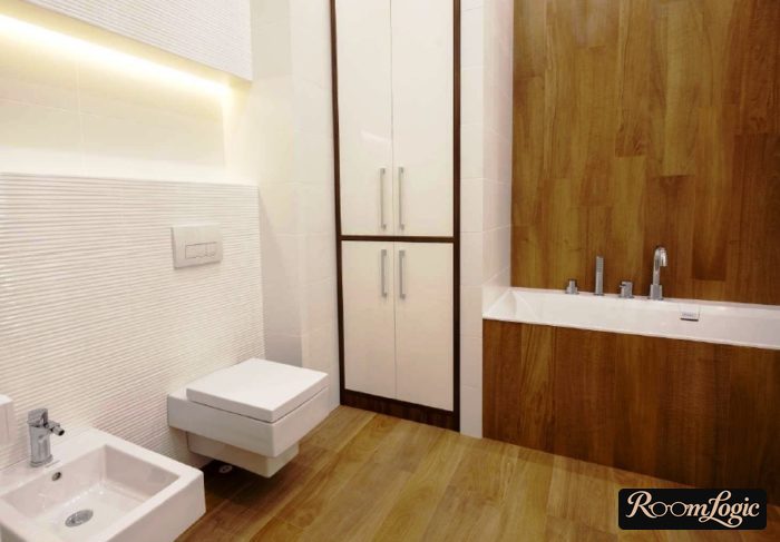
The best tile types, including concrete- and wood-look tile, differ greatly. It is absolutely impossible to choose them from photos.

Matte and Semimatte Are Better
A lot has already been said about appearance and texture in the article about bathroom tile, but it is important to repeat it here.
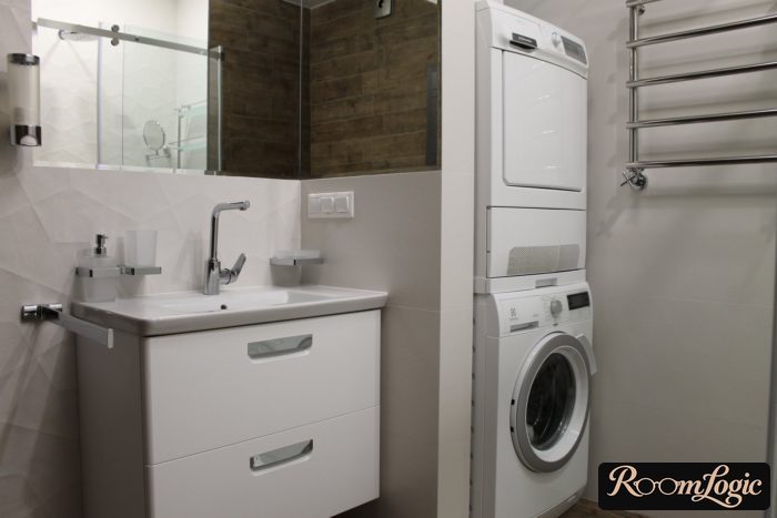
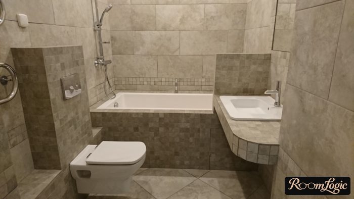
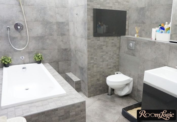
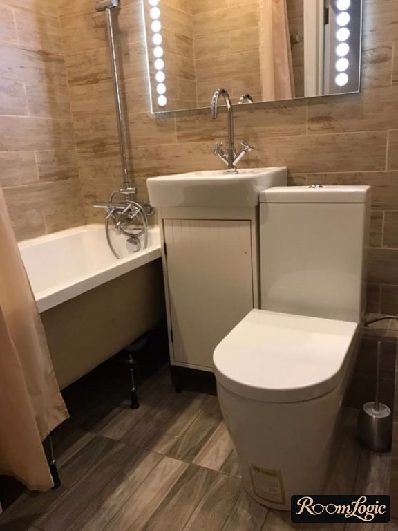
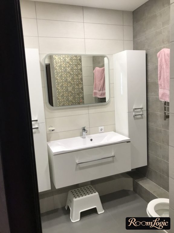
Matte and semimatte tile looks better, more expensive, and more natural than glossy tile.
If someone tells you the opposite, either that person has not seen enough finished bathrooms in person or has no taste. See the pile of photos proving that matte tile looks great in the articles about loft-style bathrooms and Scandinavian bathrooms. Wood, concrete, stone, travertine, metal, and marble are the materials imitated by tile worth choosing.
Natural materials are a basic idea of contemporary bathroom design.
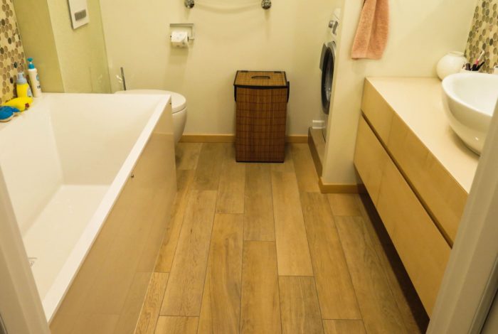
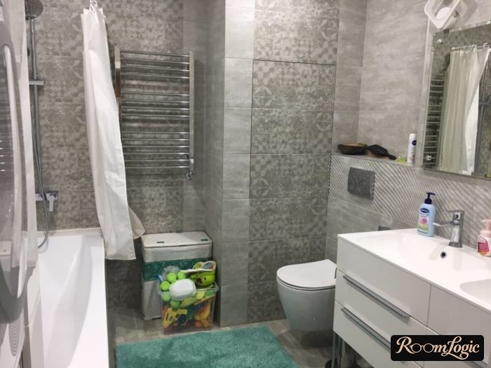
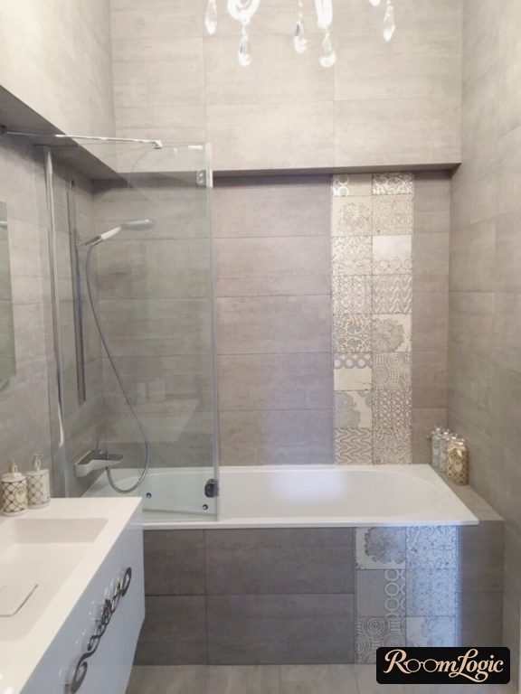
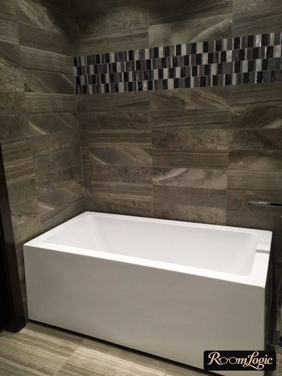
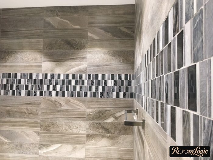
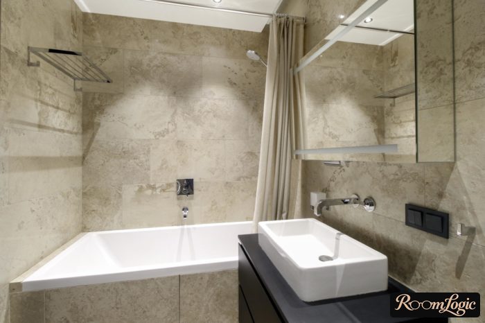
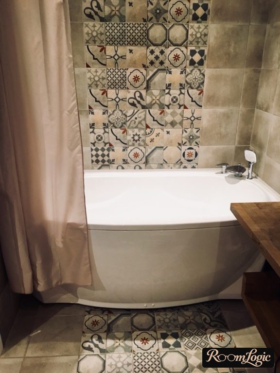
We are choosing a finish material. Why should it be glossy at all? No one gets the idea to paint the walls with high-gloss paint. So why do some people think the bathroom walls should be covered with some unclear glossy glazed thing?
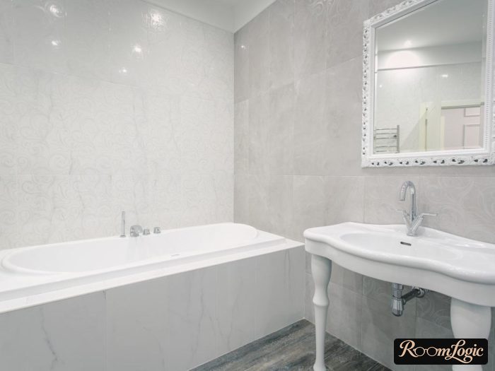
Of course, there are exceptions. Marble-look tile and some other options for classic styles are fine in gloss.
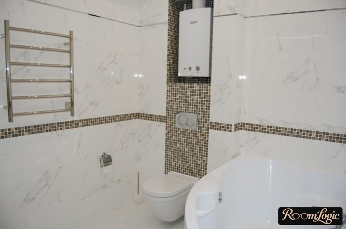
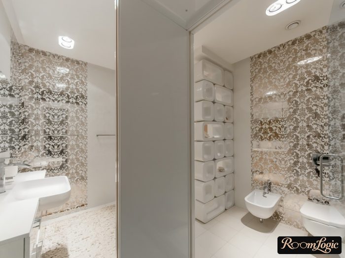
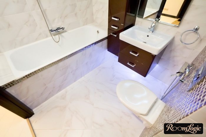
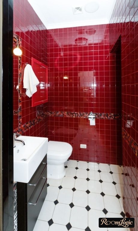
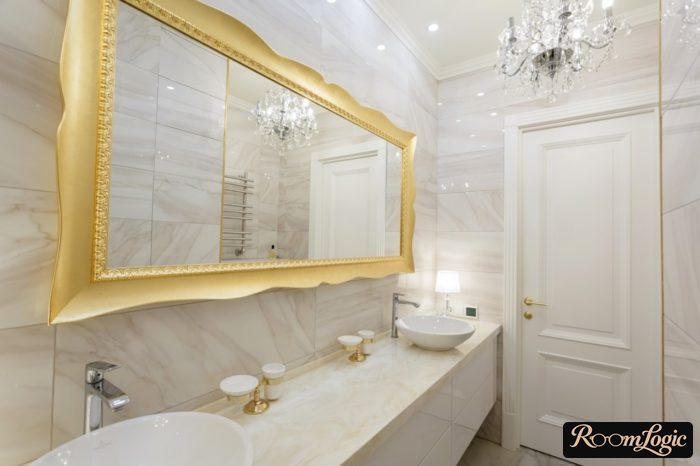
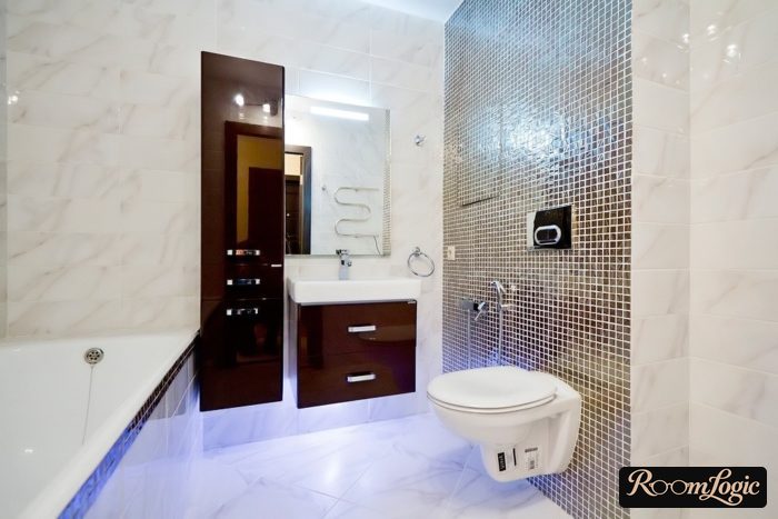
Fine, but no more than that. Even expensive, great marble-look examples do not use pure gloss:
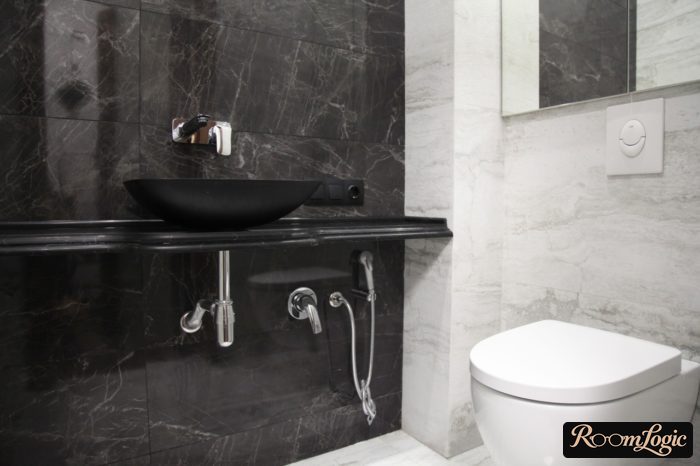
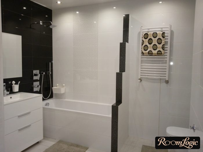
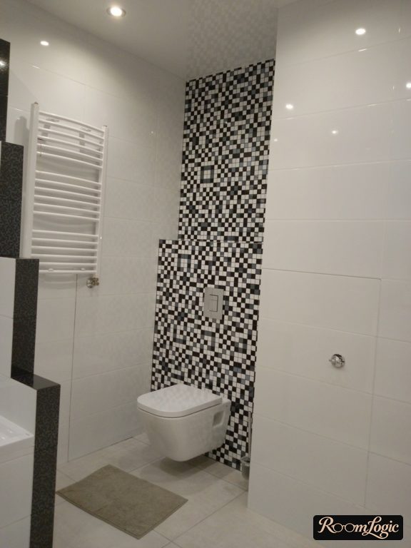
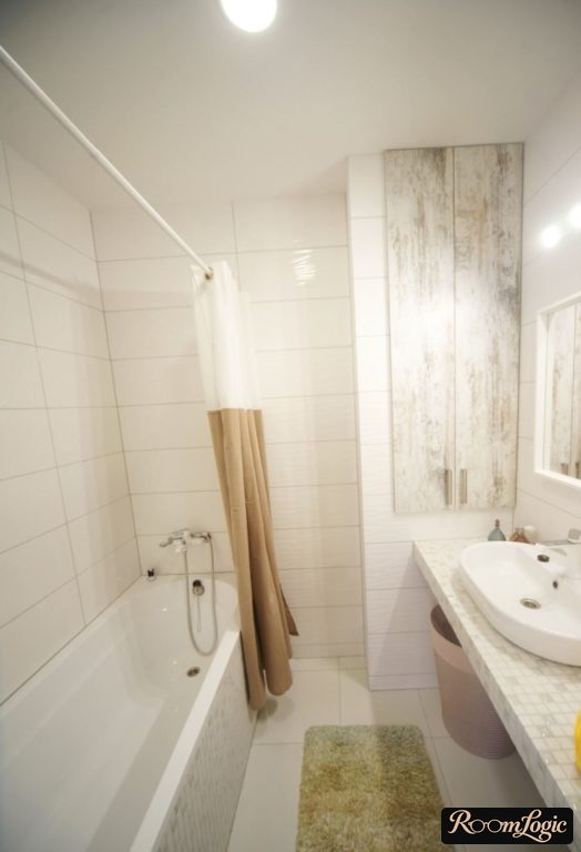
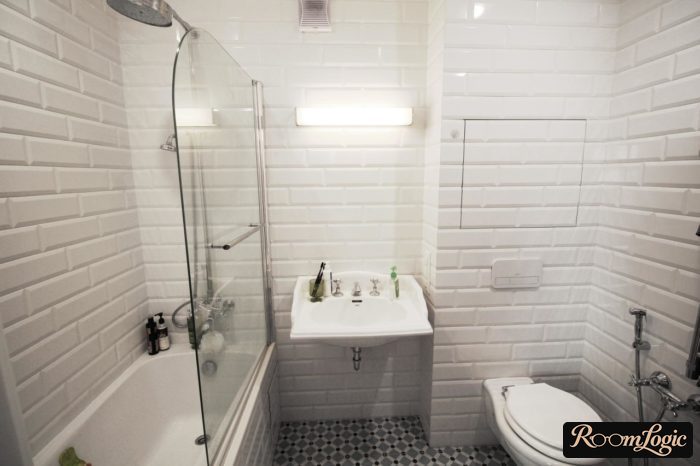
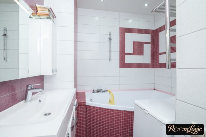
Other exceptions are solid white and black tile, white subway tile, and mosaic:
Rectified Tile Edges
Rectified tile, sometimes called seamless tile, has an edge cut square at 90 degrees. This makes the joints look much narrower after installation. This edge used to exist only on very expensive brands. Now even budget options often have rectified edges, and this tile is unquestionably better than ordinary tile. It has not one disadvantage, and narrow joints look very cool.

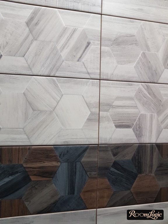
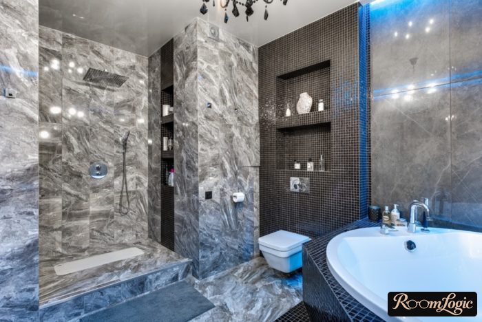
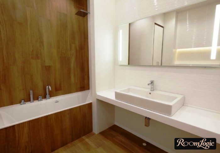
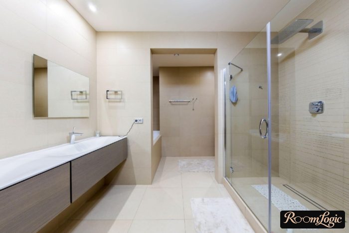
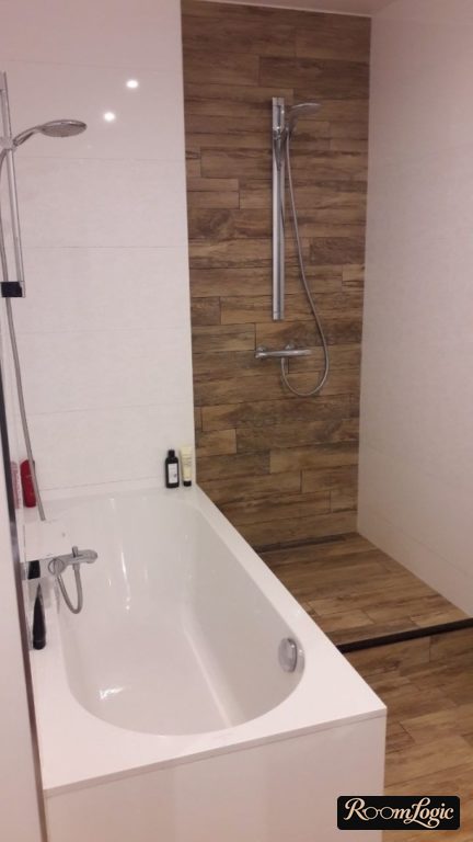
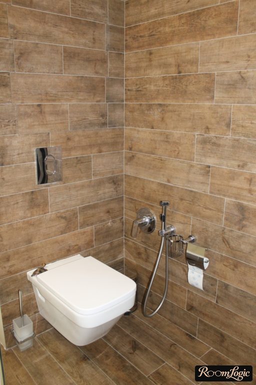
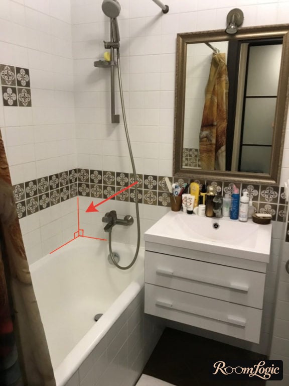
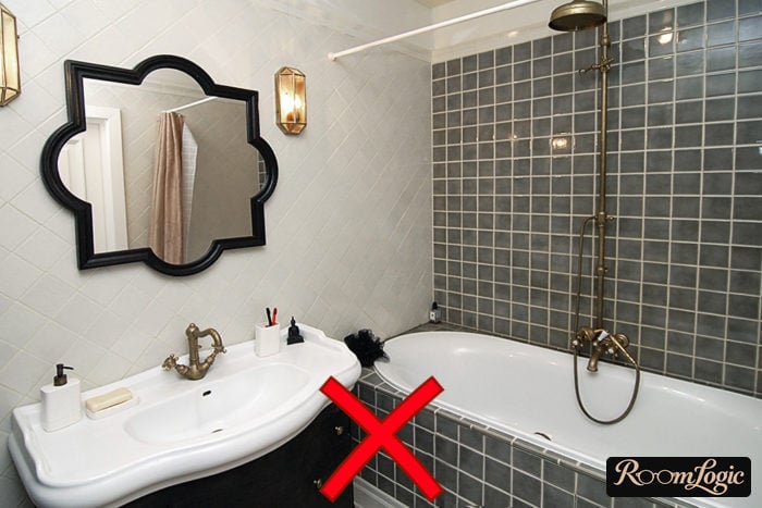
Here is an example with a decent appearance, but the beveled glazed edge makes the joints look simply enormous. If it shows this clearly even in a photo, imagine how it looks in real life.
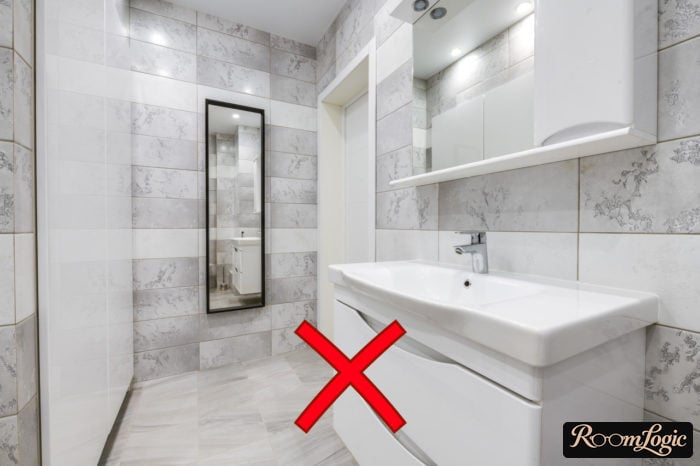
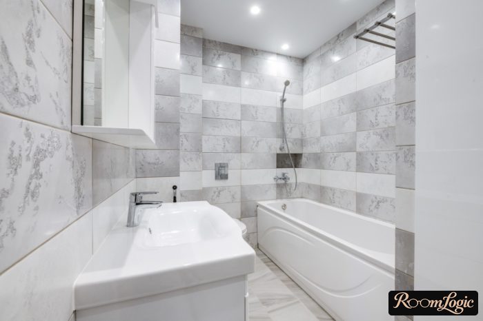
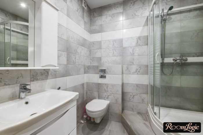
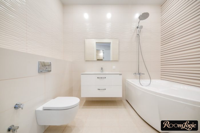
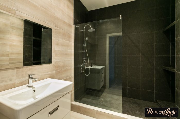
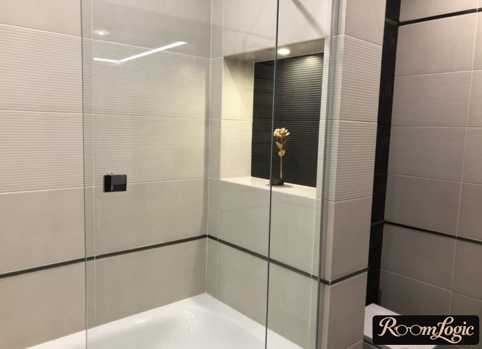
This may seem like a small detail, but first, the devil is in the details, and second, it really matters and affects the finished remodel. Choose rectified tile, choose the grout color properly, and the bathroom appearance will already be on a fundamentally different level.
Porcelain on the Floor, Ceramic on the Walls
Usually, porcelain tile rather than ceramic tile is installed on the floor. It is harder and heavier. You cannot tell the difference by appearance, although porcelain more often imitates natural materials. When choosing bathroom tile, there is no point focusing on this. Any tile rated for floors will handle bathroom loads without a problem.
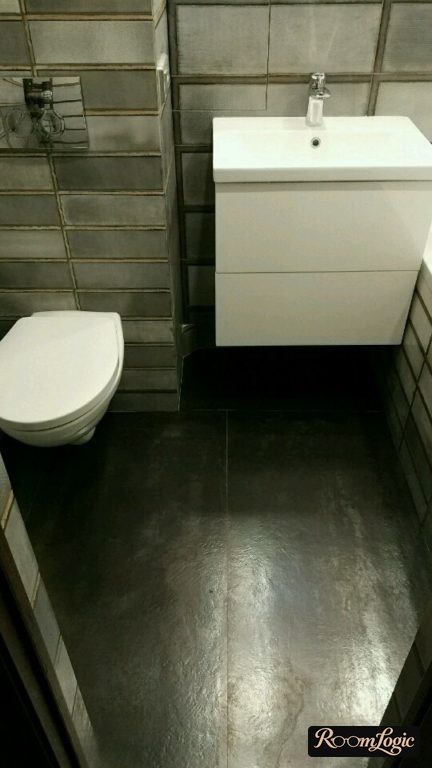
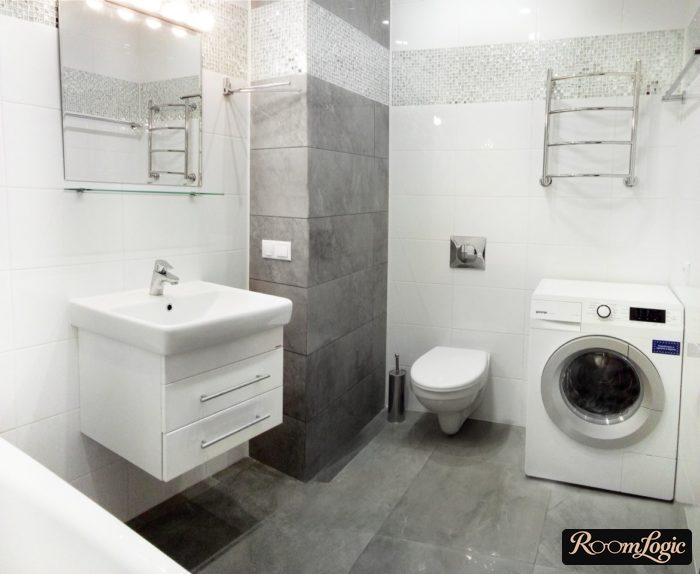
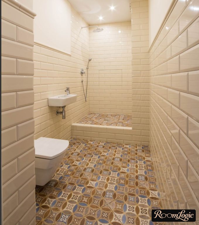
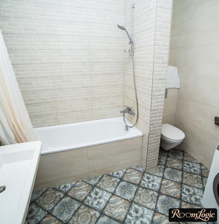
The more interesting situation is when you like porcelain tile but want to use it on the bathroom wall. This is possible, but porcelain is much stronger and heavier, which is more of a disadvantage than an advantage on a wall. Installing it on a wall needs enough spacers and support at the horizontal joints, or the weight can compress them and make the horizontal joints narrower than the vertical ones. Strength is the second problem. Wall tile needs holes for outlets, faucets, and so on. Cutting them in porcelain is possible, but do not be surprised by the price. In short, porcelain can be installed on a bathroom wall, but it is technically more difficult and costs more.
Read separately about finishing a bathroom with tile. It is no less important.
Light Tile Is More Practical Than Dark Tile
If the rules above are followed, the bathroom color is no longer so important. The main thing is to use natural colors rather than some bright or acidic mystery. A bathroom will already look decent in a palette from white to black, plus muted shades of other colors.
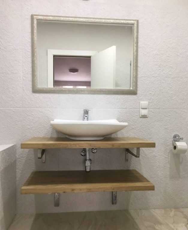
White tile hides water splashes and wall deposits better. Dark tile has to be scrubbed much more often because white mineral spots from dried water remain on it. The most practical bathroom tile color is gray. It comes in very different forms, and combining several kinds with different textures can produce an interesting result:
Tile Is a Finish
Choosing bathroom tile means choosing a finish material, not decor and the entire design. Some elements can be highlighted with color or patterns, but only in spots and with balance. There are also fixtures, towels, and lighting, which creates a play of light and shadow. Hence the rule:
One tile or one wall does not have to be beautiful by itself. We are designing the entire bathroom and simply choosing its finish material.
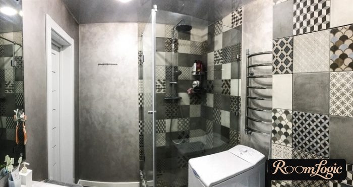
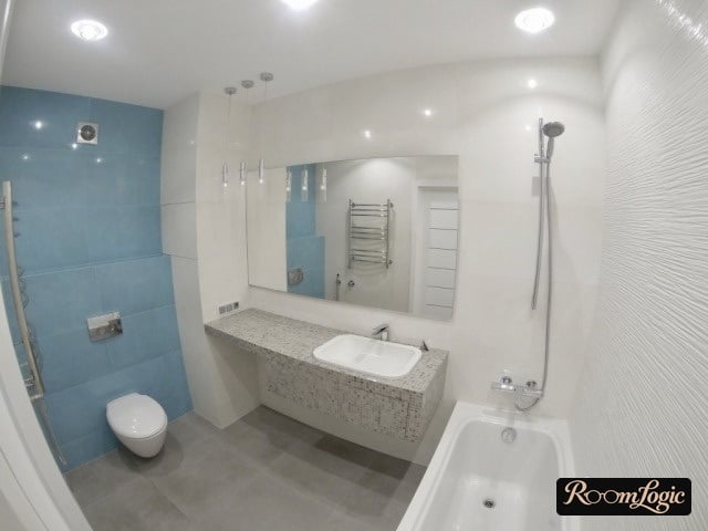
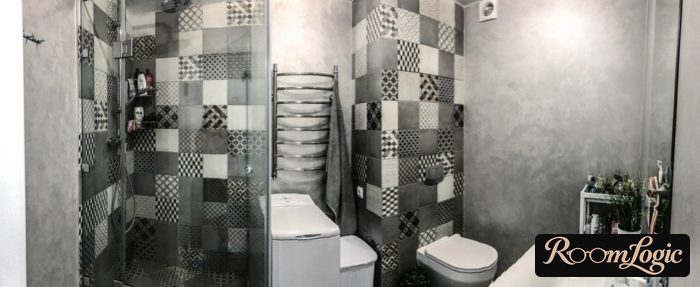
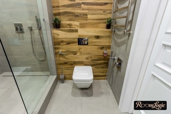
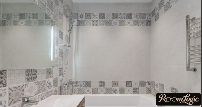
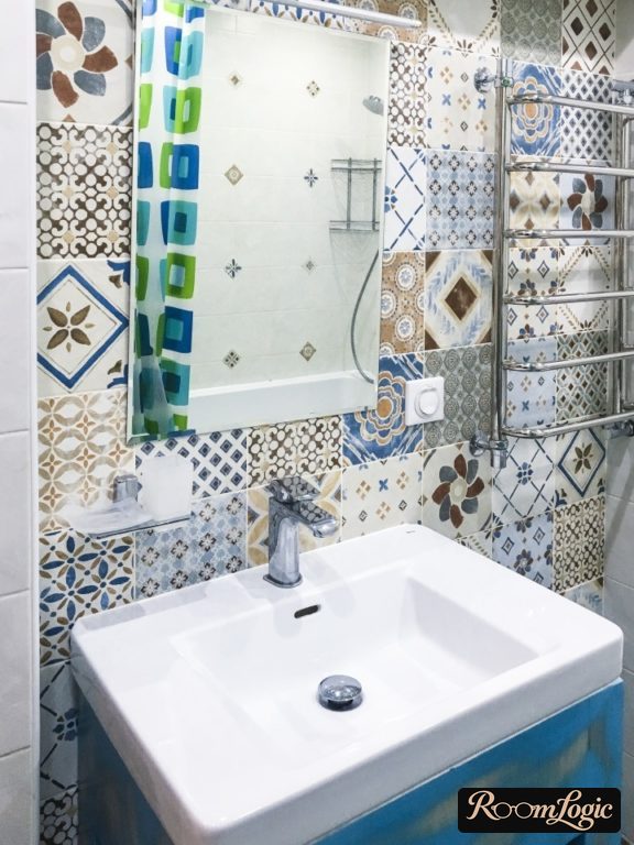
Here is a photo where the accent tile was chosen and used correctly:
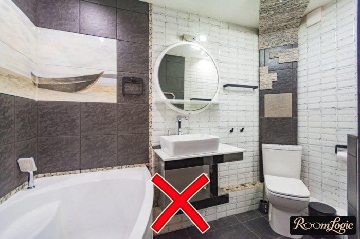
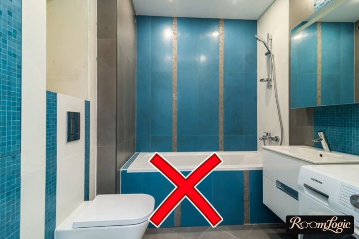
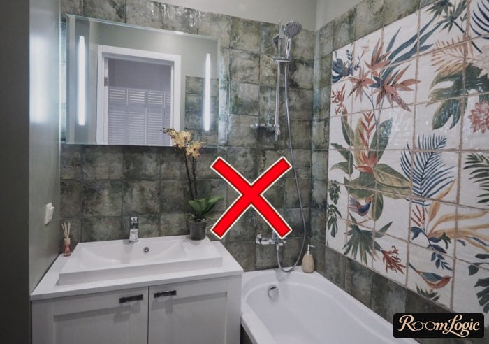
And here someone decided every wall needed extra thought and predictably overdid it:
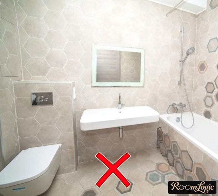
Tile Size
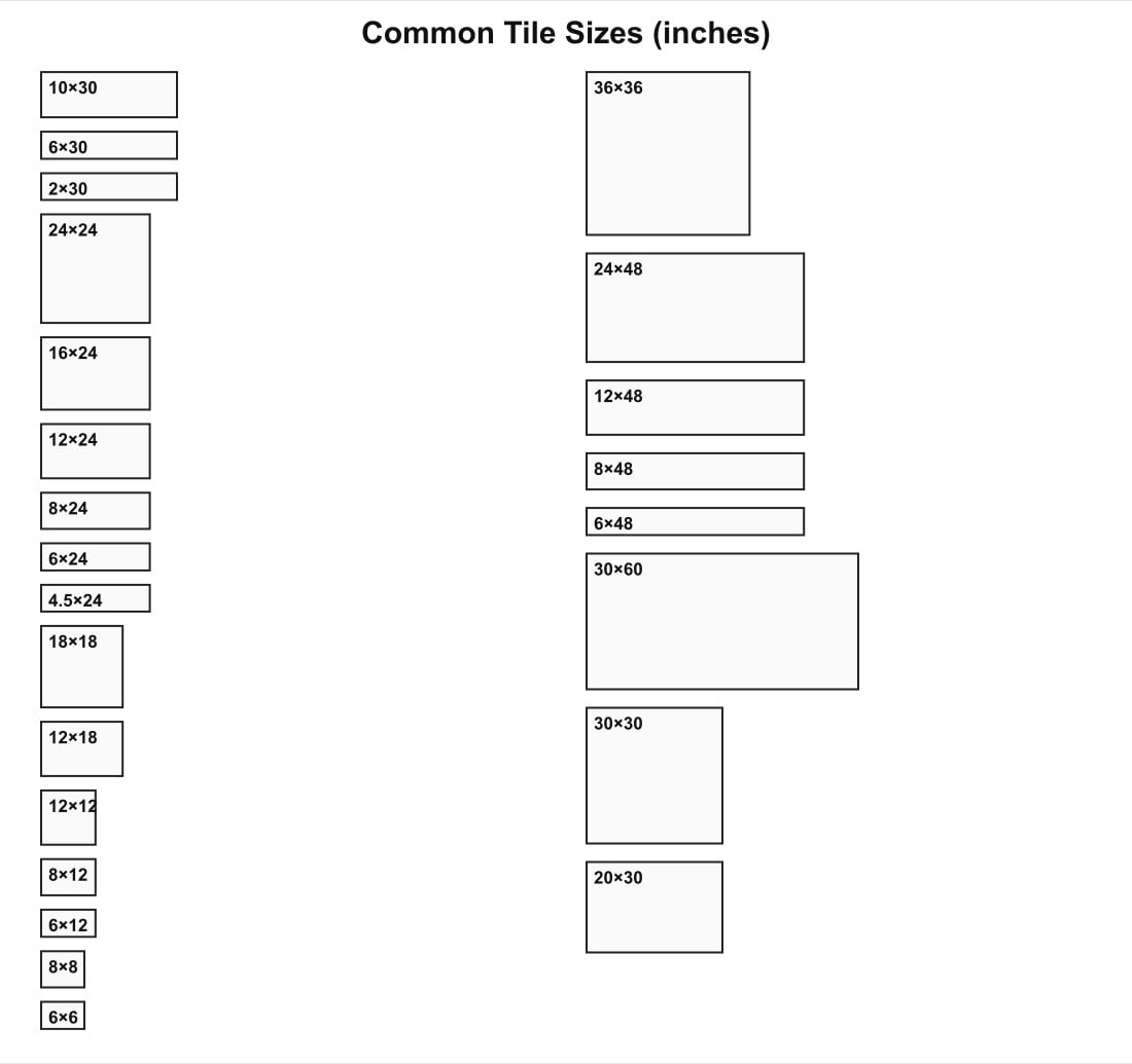
It is more accurate to talk about the combination of aspect ratio and size. Square bathroom tile should be chosen only in a large size, starting around 24 by 24 inches. Smaller squares should be used only for patterned accent tile, such as patchwork. Smaller square tile looks dated.
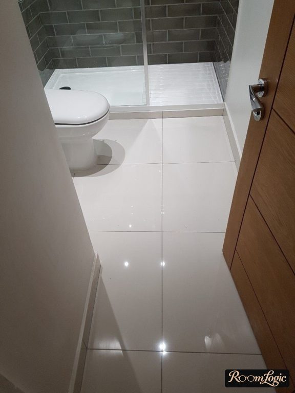
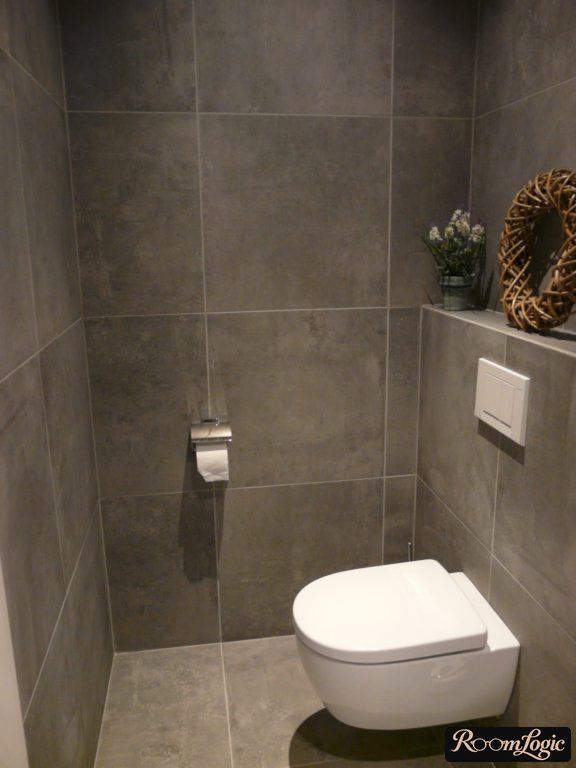
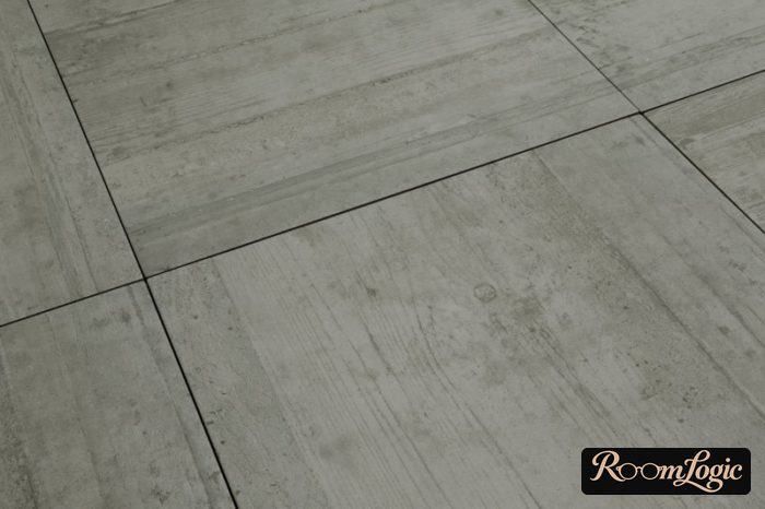
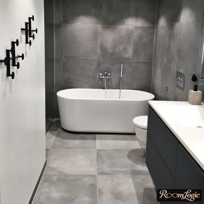
There are exceptions where very small squares suit a particular style. But keep in mind that this still creates an unjustifiably large number of joints.
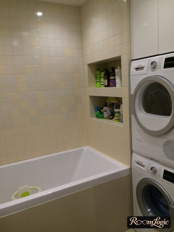
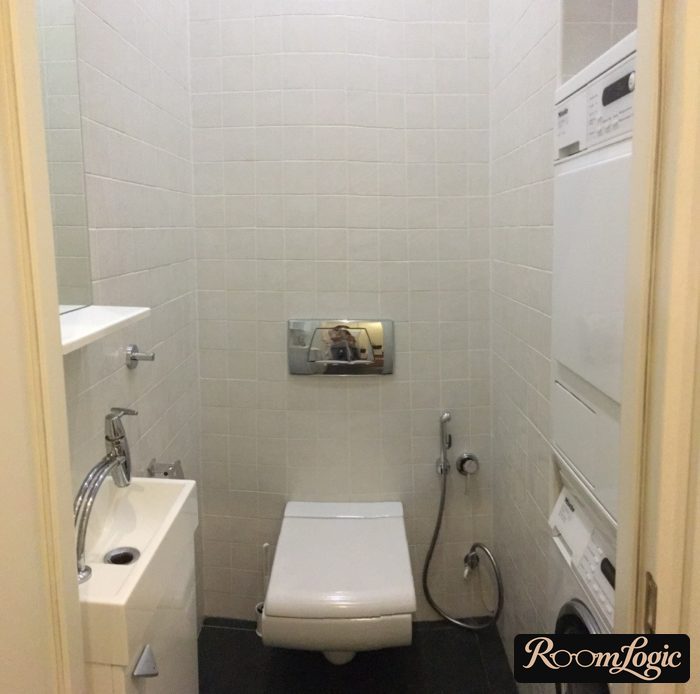
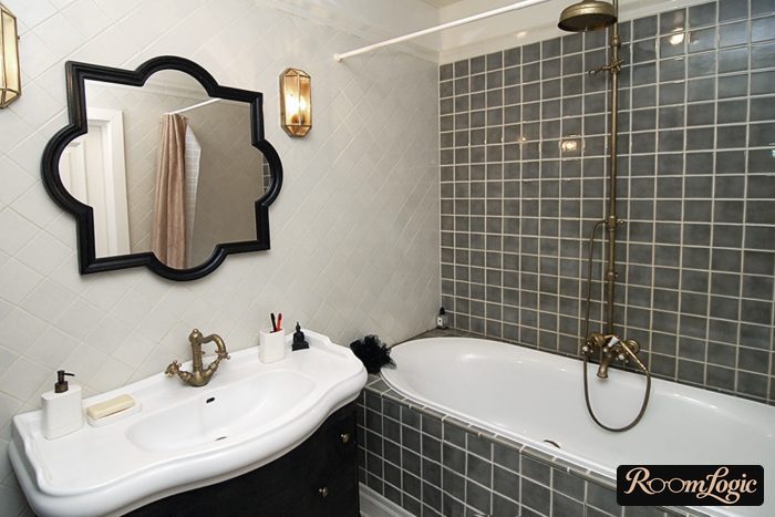
A two-to-one aspect ratio works only for very large tile. It is expensive and too rare a case for most bathrooms, so we will not dwell on it.
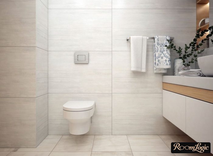
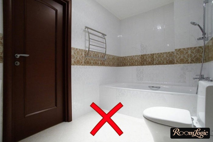
Almost every decent budget option has an aspect ratio of at least three to one. Of course, there are exceptions, and expensive Spanish and Italian options can look great at any size. But if you are shopping at the budget end of the market and have a small bathroom, pay attention to the three-to-one size.
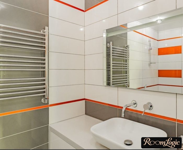
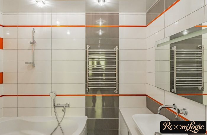
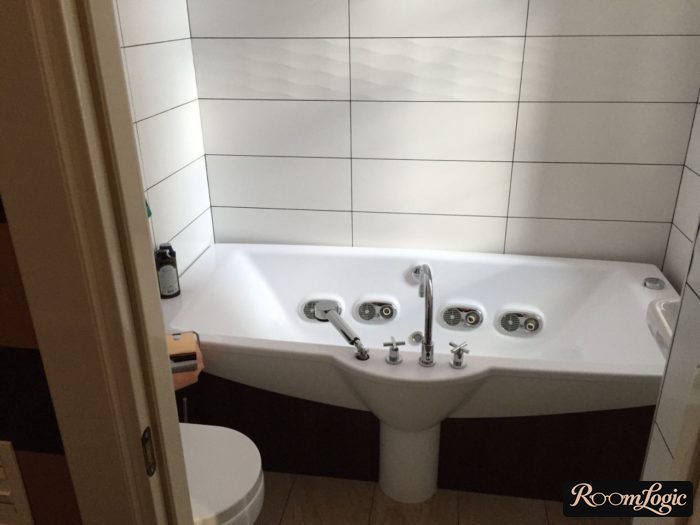
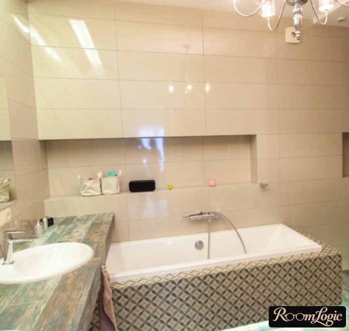
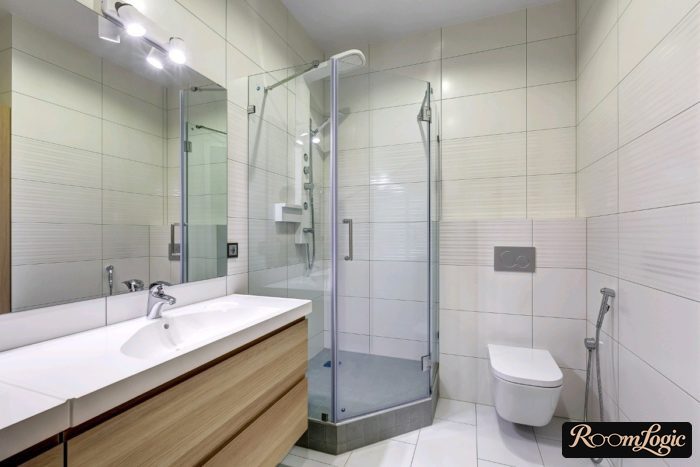
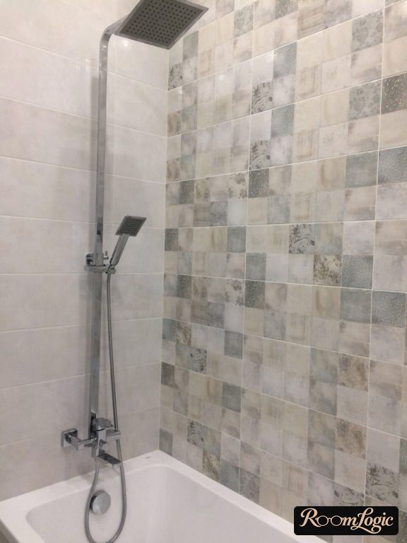
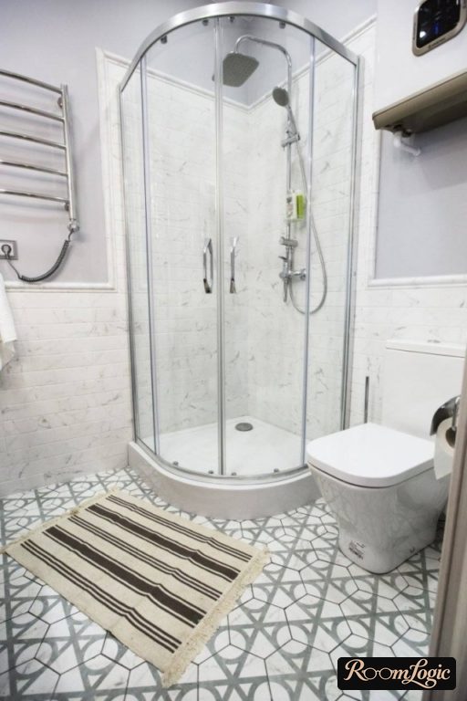
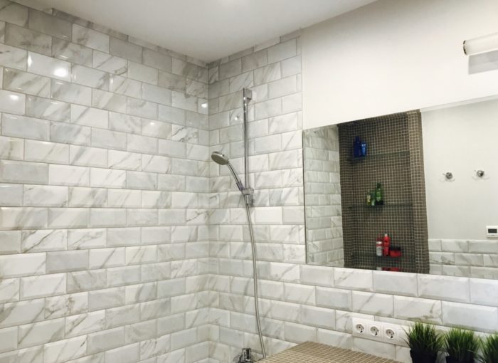
Exceptions include mosaic, brick shapes, pentagons, hexagons, and other accent tile:
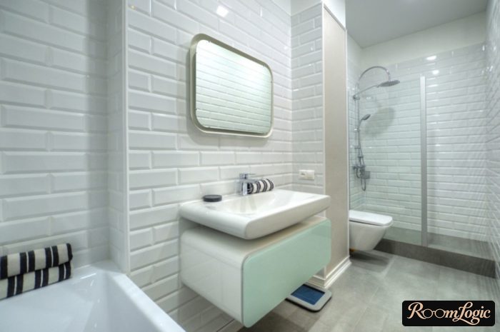
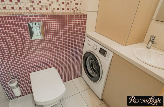
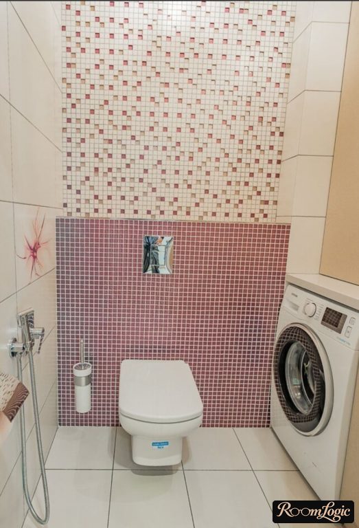
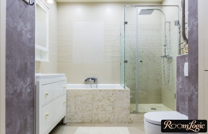
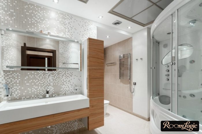
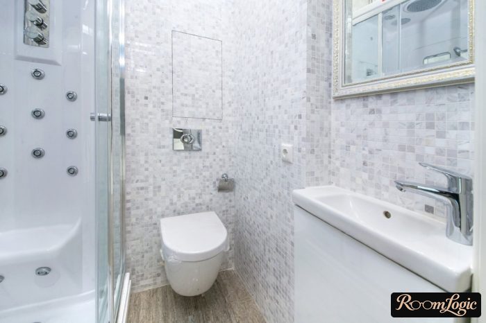
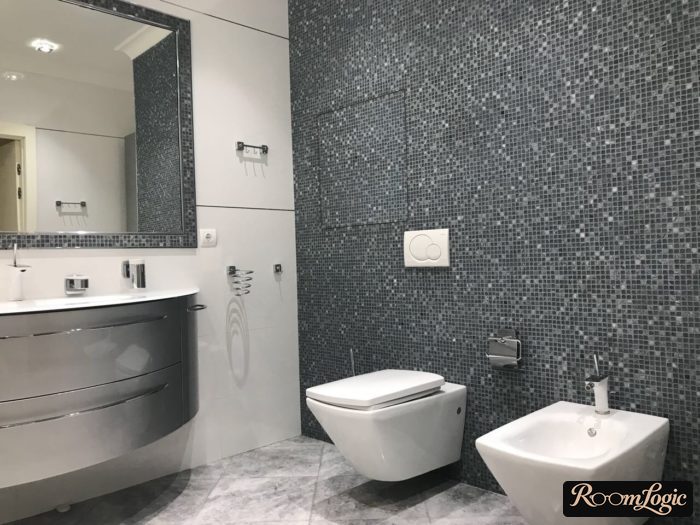
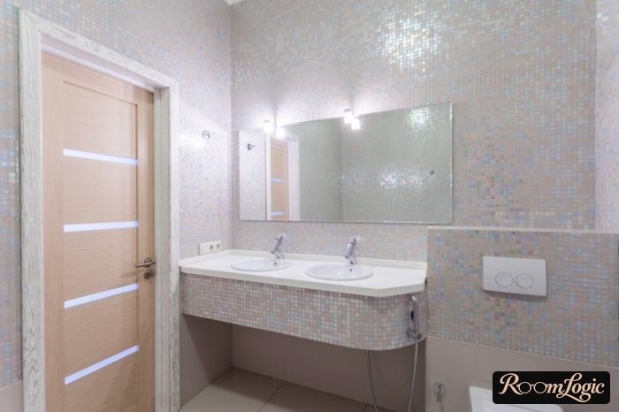
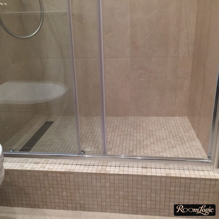
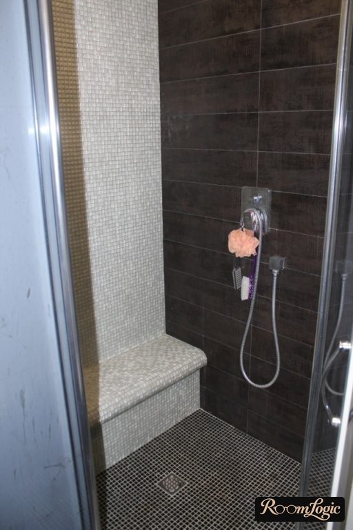
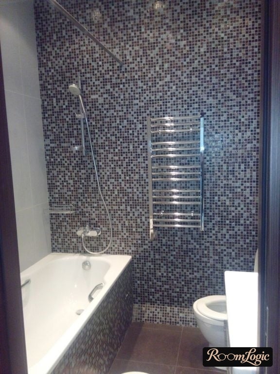
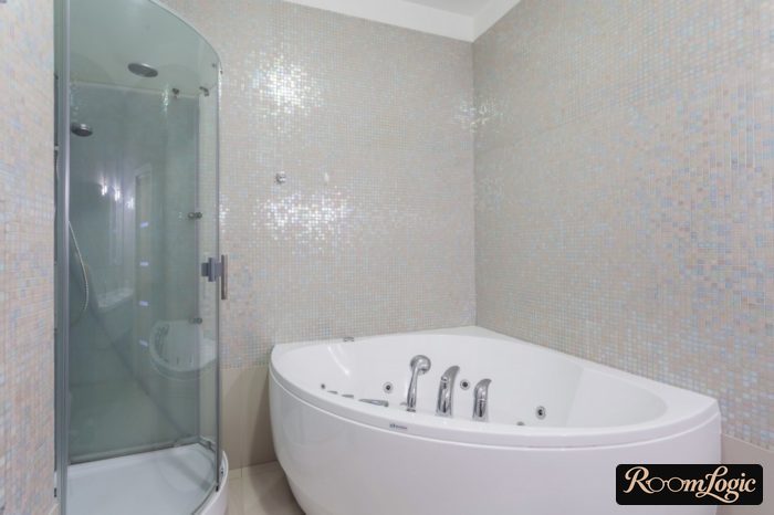
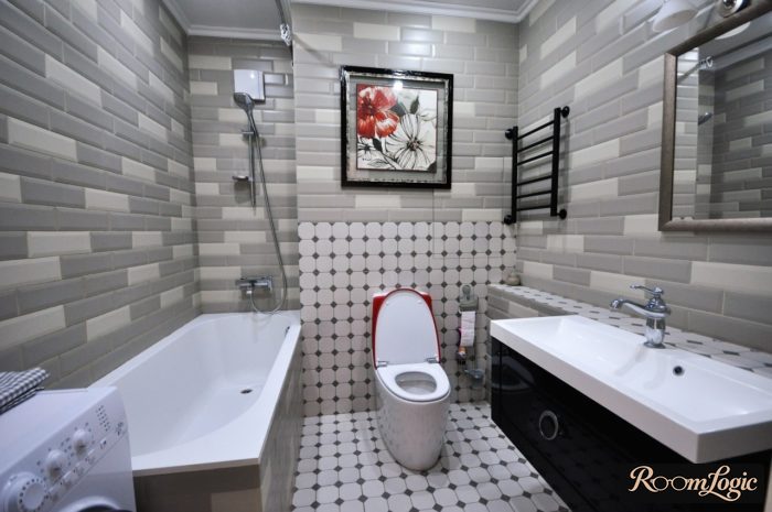
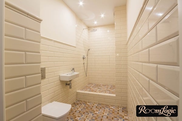
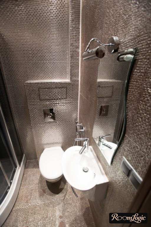
There is one more thing to know about tile size. When choosing tile from different collections, keep in mind that even when the listed size is the same, the actual tile may differ by roughly 1/16 to 1/8 inch. What is 1/16 inch, you ask? It is enough to make joints from two supposedly equal tile sizes impossible to align. Do I need to explain that joints failing to line up at corners and transitions look terrible?
That is exactly why you have to choose tile in person at a store with a tape measure. To combine different collections, measure them yourself and make sure the dimensions match within about 1/32 inch. If not, tell the tile installer. Experienced installers may use spacers of different sizes and align the joints through different thicknesses. But this is additional work that is not always possible, and the installer has to agree.
The size should match the size of your bathroom. Large bathroom tile always looks great on a large display, but imagine it in the actual dimensions of your room. If fewer than three pieces fit across the entire wall, consider a smaller option. Two or more tiles per wall is the standard. Given the size of typical source apartments, there is room to experiment only in a full bathroom with a toilet.
Tile You Should NOT Choose
Some tile for sale is complete junk that should not exist at all. But as long as people choose it for reasons no one understands, it will keep destroying their bathrooms. A list of terrible options that should never be used under any circumstances. First the photo, then the reason below it.
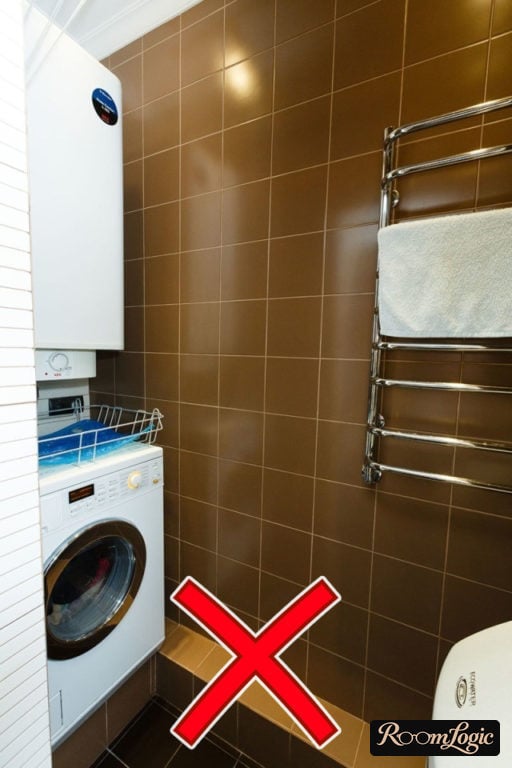
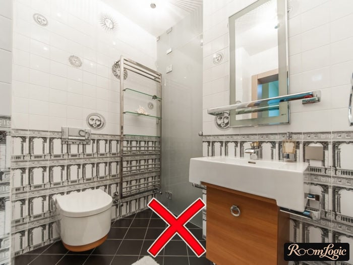
This clearly shows why small square tile in a single color is bad. It looks neither contemporary nor classic, only dated. It is a losing choice from the start. A good appearance is absolutely impossible.
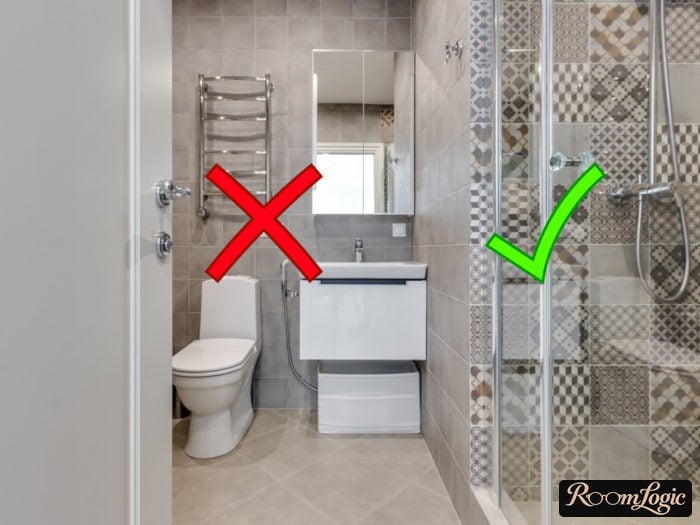
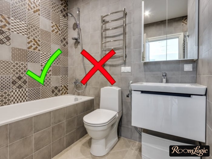
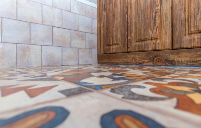
The patterned tile at this size is fine. The main tile does not work because it is too small. It is clearly one collection, but no one forbids us from combining collections. Any large concrete-look tile would look much better with this decorative pattern.
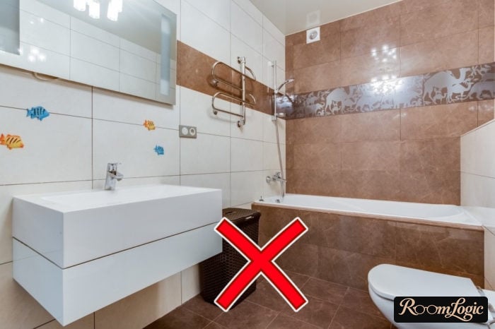
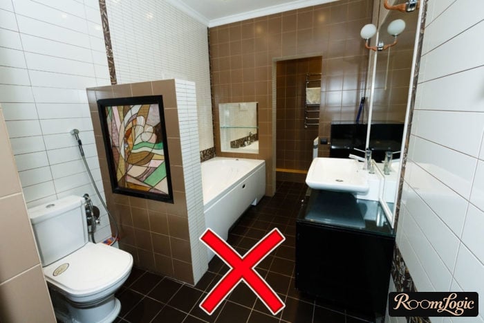
It is better to choose tile that realistically imitates natural materials. These are two examples of the ugliest possible imitations. Even apart from choosing brown for marble and imitation mold on concrete, the decorative pieces, obviously from the same collection, ruin everything too.
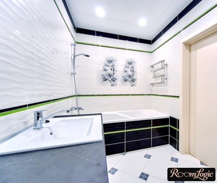
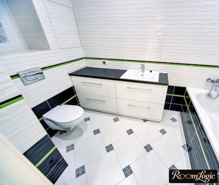
Floor tile should never be installed this way, but let that go. The wall tile is not great, although it combines reasonably well. Even so, you cannot say the bathroom looks good. So what is the problem? This returns us to the idea that something is wrong with these collections.
In expensive collections, the tile is selected to look good in a real bathroom. In cheap collections, the pieces work well together but somehow too deliberately. The finished bathroom ends up looking like a store display.
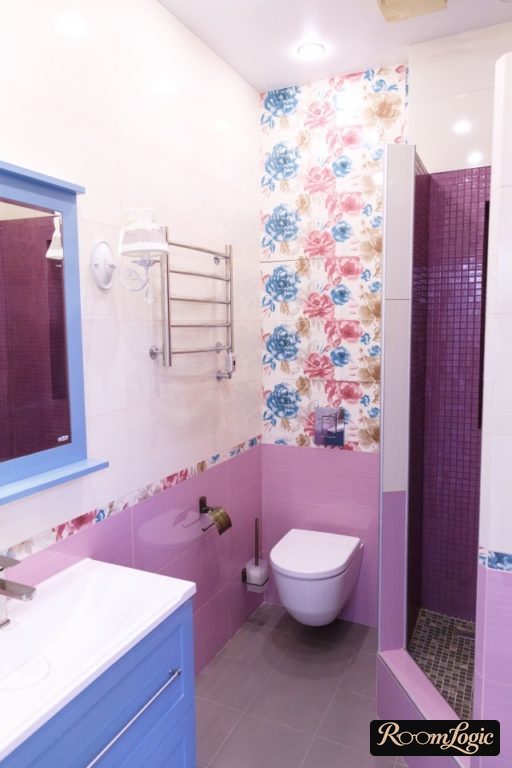
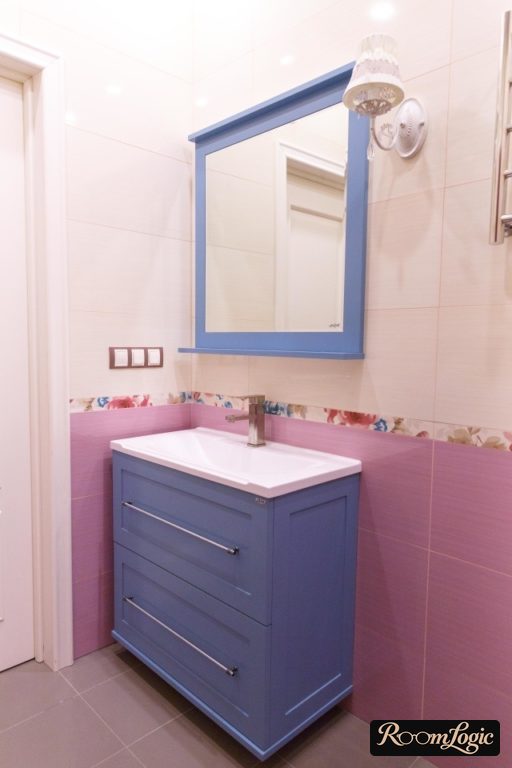
Everything is fine in the first photo. I do not like it, but fine. The second is already worse because the floor color falls outside the overall palette in saturation. This is an example of why bright tile is risky. The photo shows the best possible result, and even it has details.
Choose tile properly, and good luck with your remodel!