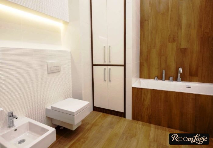
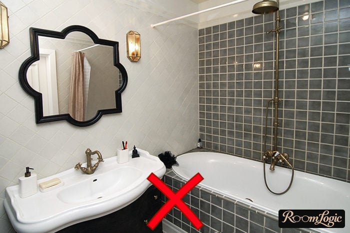
Tile is not a natural material, and its appearance is an imitation.
Contemporary bathroom tile design imitates natural materials: wood, marble, travertine, metal, and concrete. Every pink, peach, red, and other glossy option fails this rule and is immediately out.
If that seems counterintuitive now, I will show a pile of photos proving that tile is a finish, not decor.
6 Rules and 4 Types of Bathroom Tile
Six things that matter when choosing bathroom tile design:
- Light tile is much more practical than dark tile. The main kind of dirt in a bathroom is white mineral spots from dried water.
- The larger the size, the better it looks.
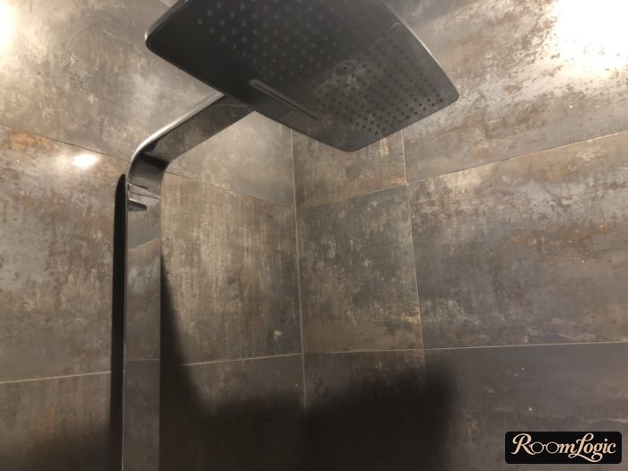
- Matte or semimatte tile looks better in a bathroom, although photos do not show this. A semimatte surface is uneven, with some matte and some glossy areas. Metal-look tile is an example.
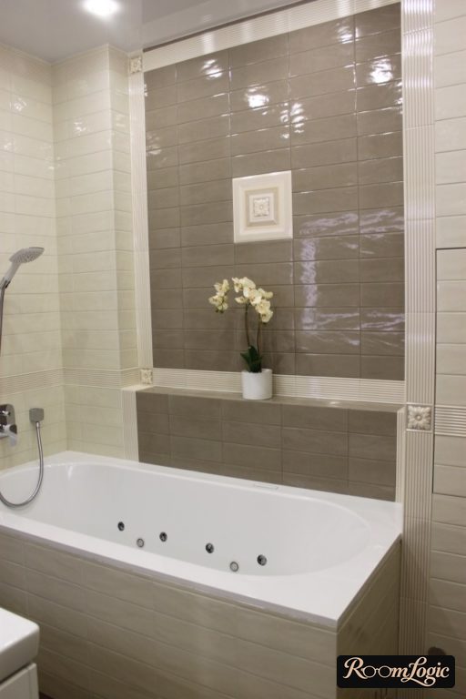
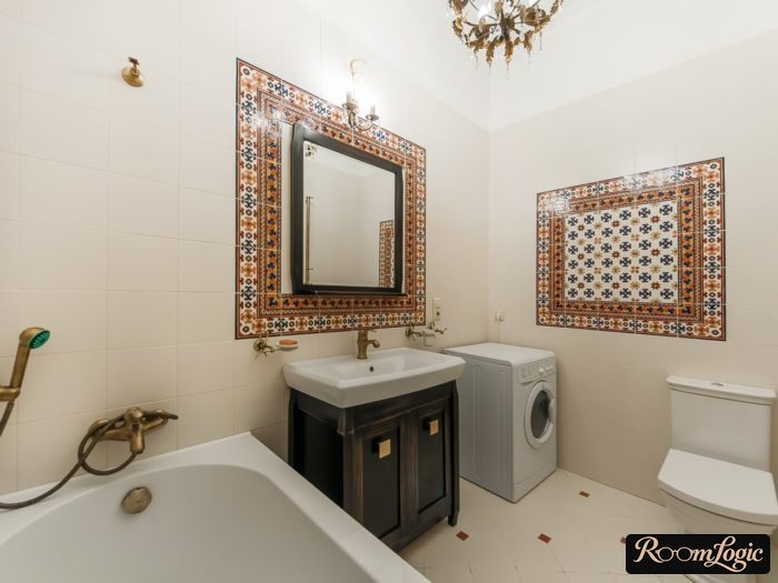
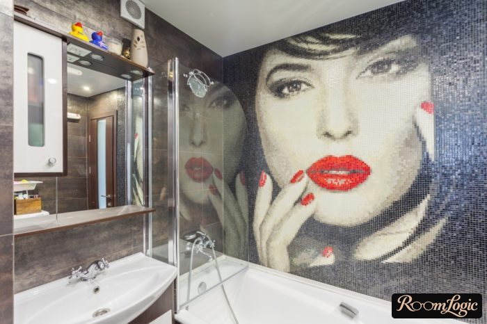
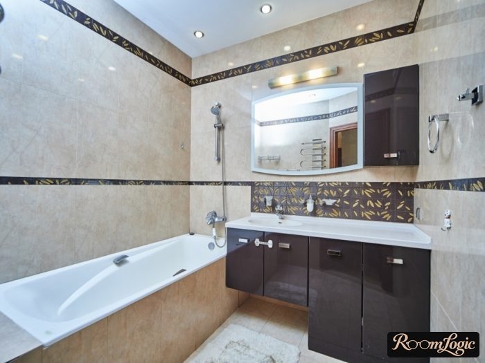
- Decorative inserts, borders, pictures, and flowers are junk and tacky almost without exception.
- Choosing the tile grout color is critically important.
- Proper tile layout, meaning its distribution across the walls, is just as important as the tile itself.
And four types of tile with the right design:
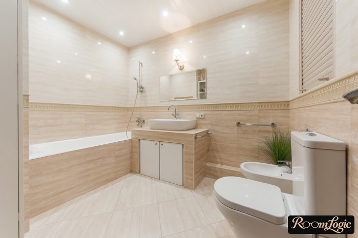
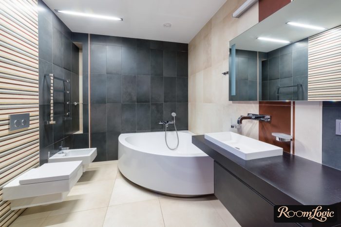
- Imitations of wood, concrete, and travertine.
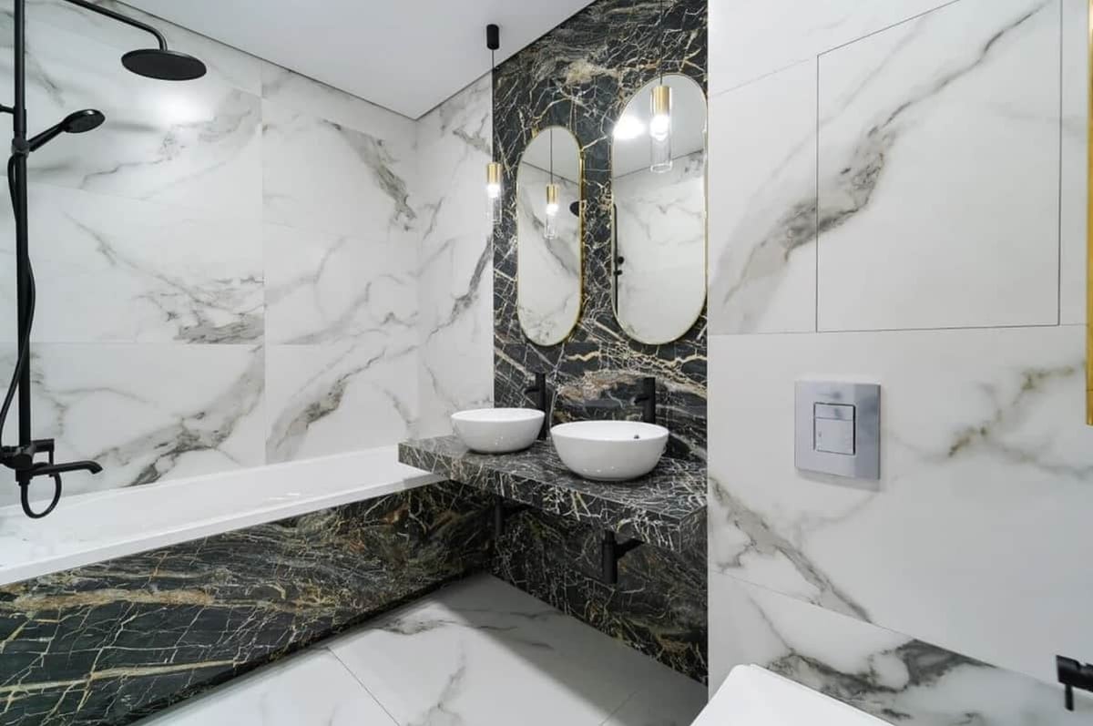
- Imitations of marble, which range from terrible to gorgeous. You need to feel the line precisely; photo examples come later.
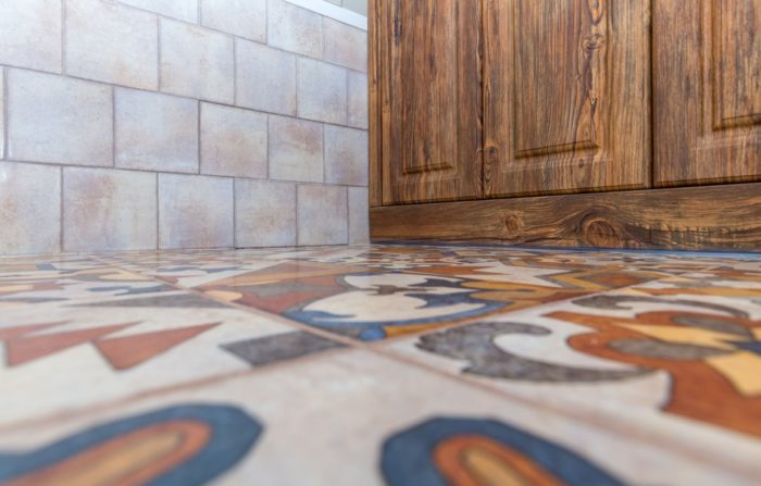
- Patterned patchwork, geometric, pentagonal, and hexagonal tile are decent options too.
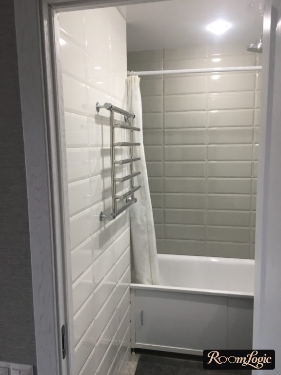
- Solid-colored tile that does not imitate a material can be used only if it has texture. The only solid-color exception is glossy white, including subway tile.
Read separately about how to choose bathroom tile. That article is specifically about the technical details of choosing it.
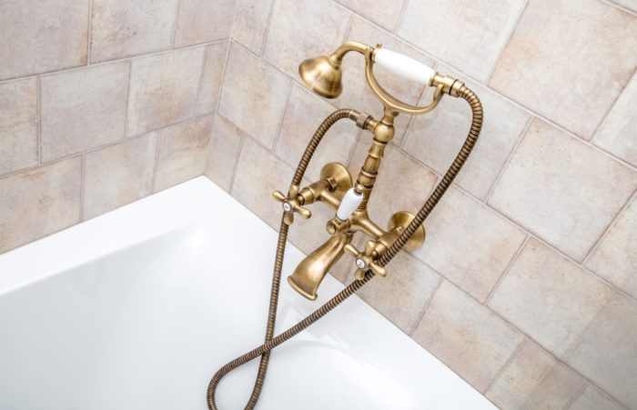
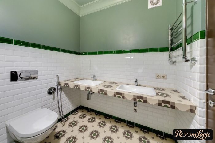
Colored glossy bathroom tile is usually completely pointless. You cannot create a stylish design with it. Here is an example combining only two types of ceramic tile with a perfectly consistent style:
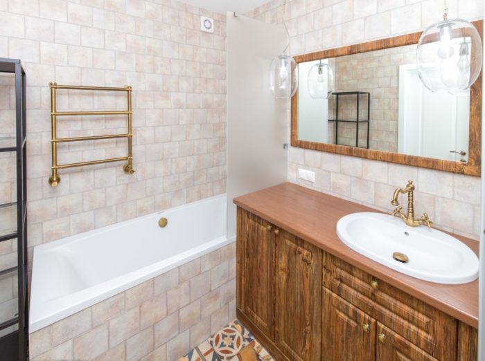
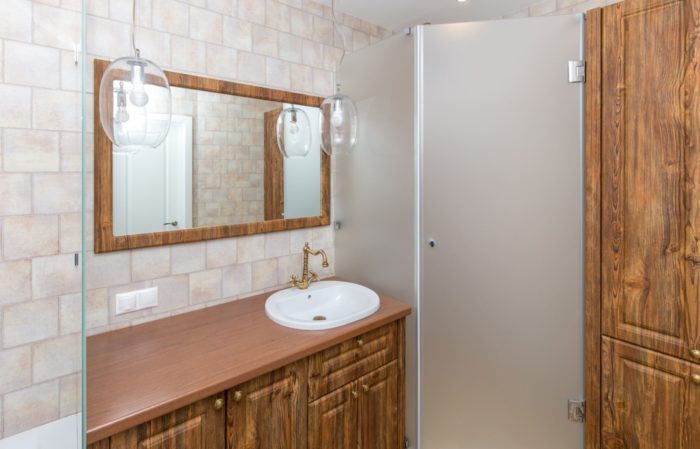
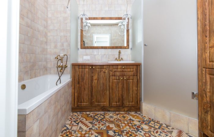
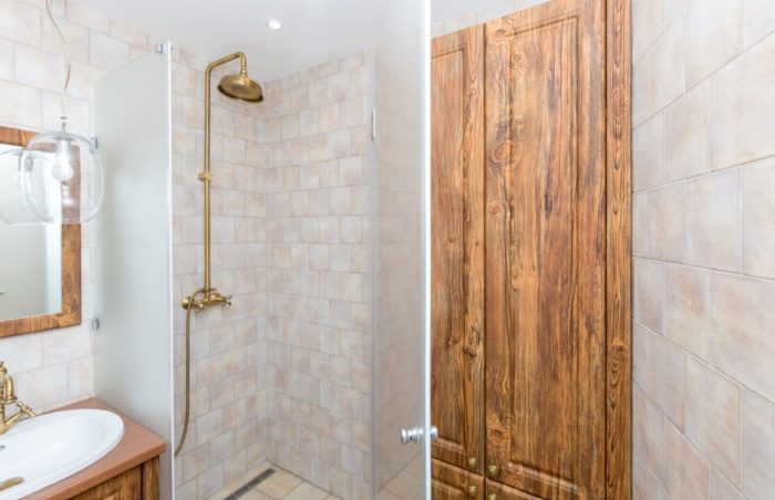
Let’s explain the debatable part. When people first hear about imitations of concrete and wood, they usually imagine a gloomy, rough loft-style bathroom, no less. In fact, this tile can create very different designs. Here comes a perfect example.
This bathroom has a bathtub, separate shower, sink, and wall-hung toilet with a concealed carrier. In other words, it is not small. At the same time, it uses only two kinds of tile: gray with a light concrete look and wood-look tile with stylized painted boards. The proper layout – covered in the last part of the article – made it very stylish and contemporary. Just try to say it is boring:
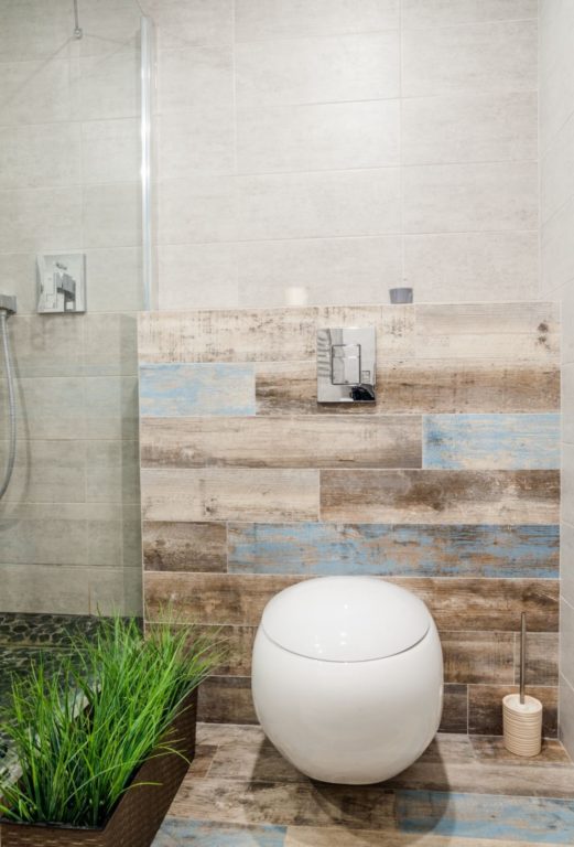
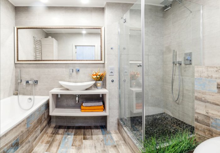
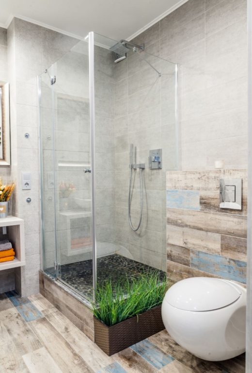
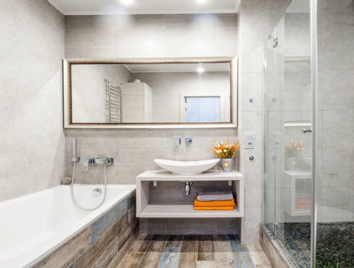
I already used these photos in the article about bathroom design with a toilet because this is a perfect example.
The main thing is to understand that a stylish bathroom is not built only on the finishes. The tile should imitate a real natural material, not some unclear glazed thing.
Examples of Contemporary Tile Design
Ceramic tile in a bathroom is the same kind of finish material as paint or wallpaper in other rooms. It is not an accessory or decor. It should not be flashy or bright.
A finish material, not decor.
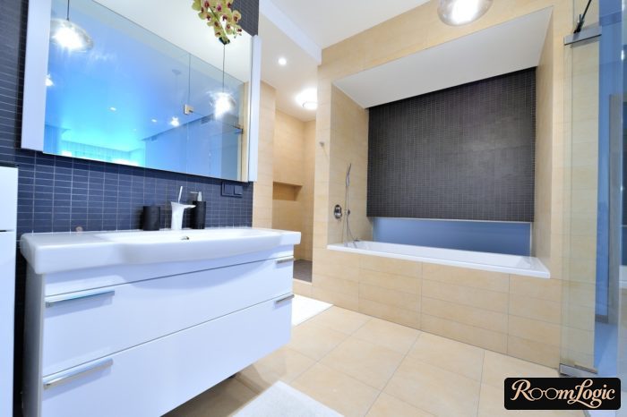
Two or three kinds of tile are enough for an apartment bathroom, including the floor. Wall tile is usually lighter than floor tile.
- This creates a gradient: dark on the floor, lighter on the walls, and a white ceiling.
- A lot of water reaches the walls, and spots show less on a light color.
- All bathroom fixtures are white, and it is better when they do not contrast sharply with the walls.
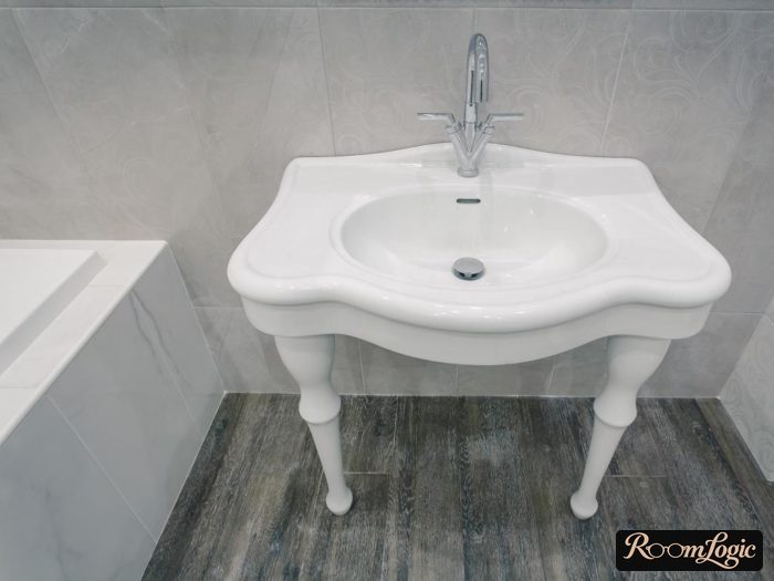
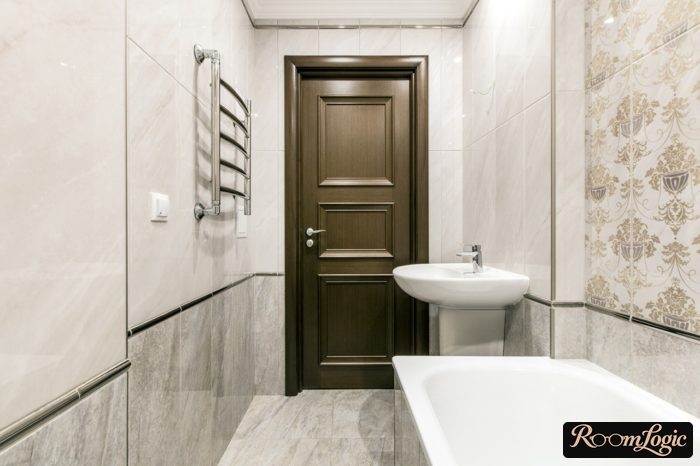
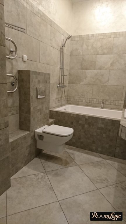
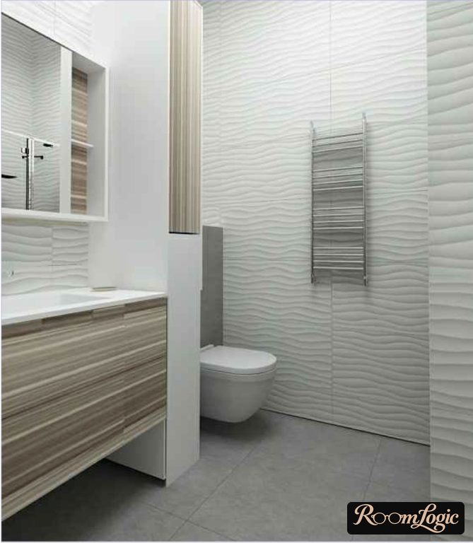
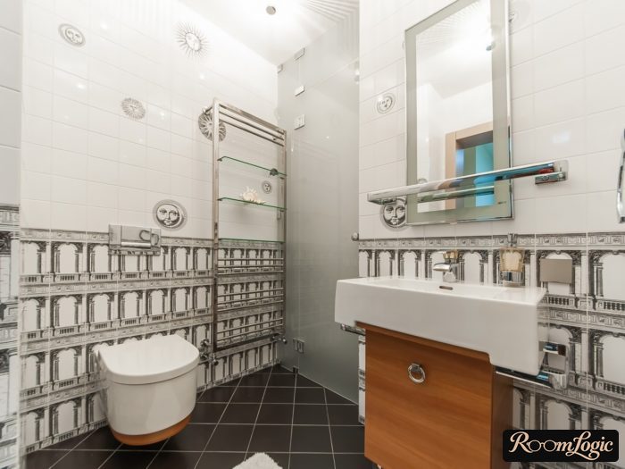
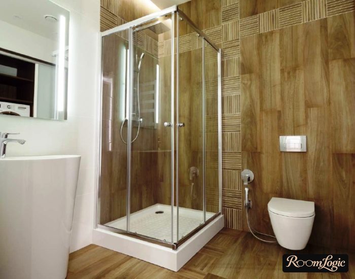
Fashion is debatable in general, but current bathroom design is genuinely sensible. See photos of contemporary bathroom interiors. Now let’s go through the tile. Bathroom floor: wood-look porcelain tile.
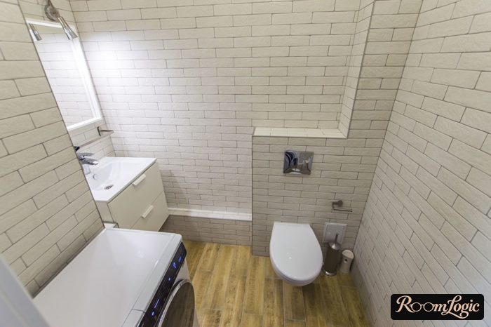
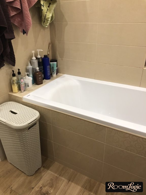
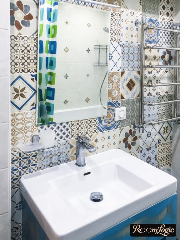
Patchwork is used on bathroom walls:
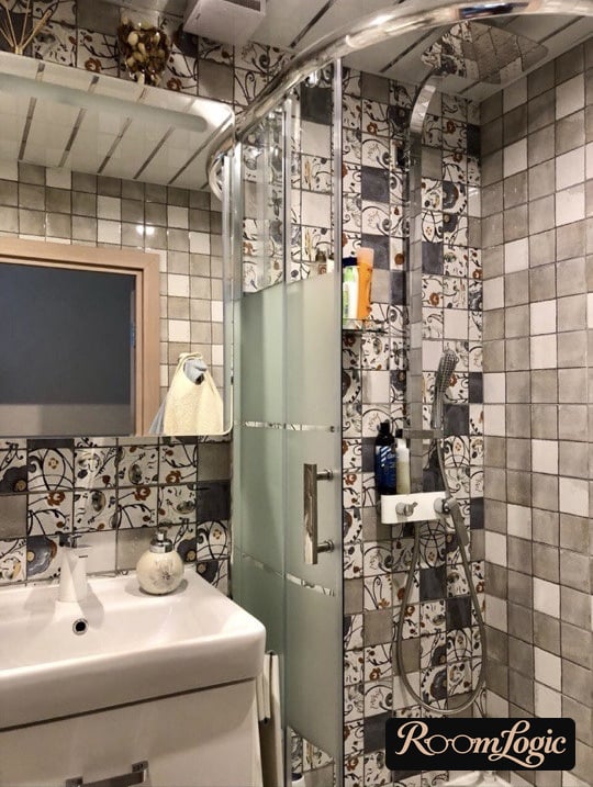
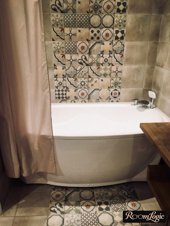
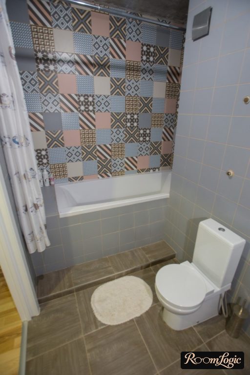
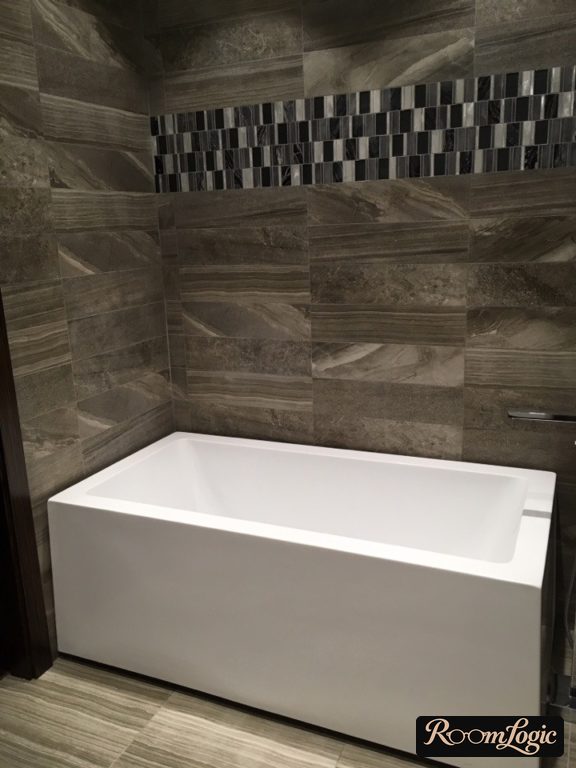
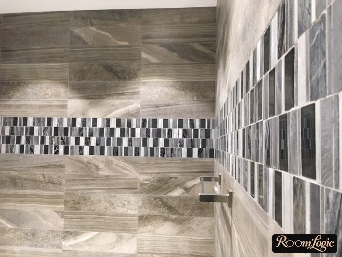
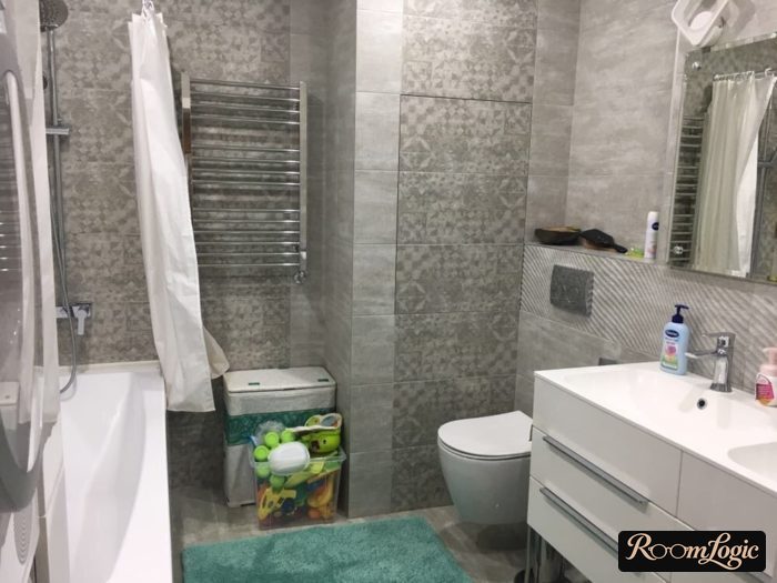
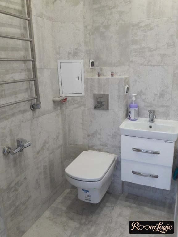
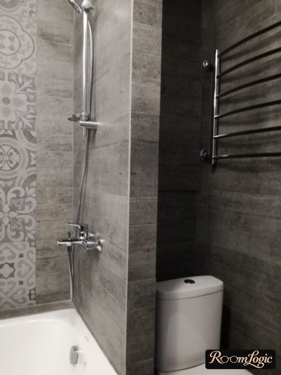
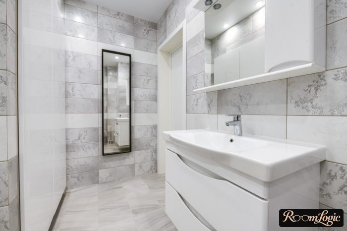
Variations of gray tile look beautiful – no, they are not boring – especially with texture, which looks stylish under lighting. Many of the gray tiles in the photos are quite affordable and look good in real apartments.
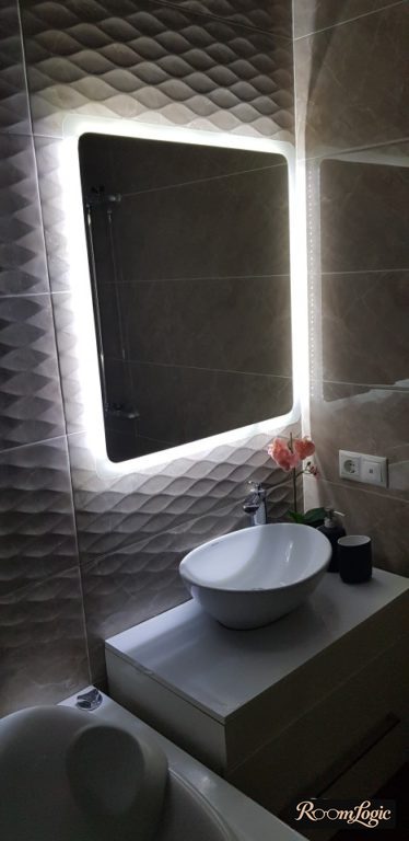
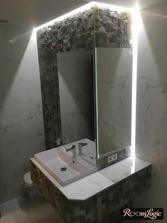
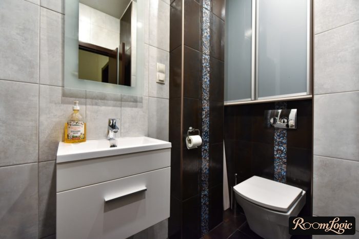
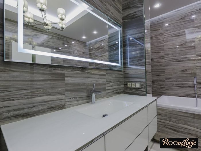
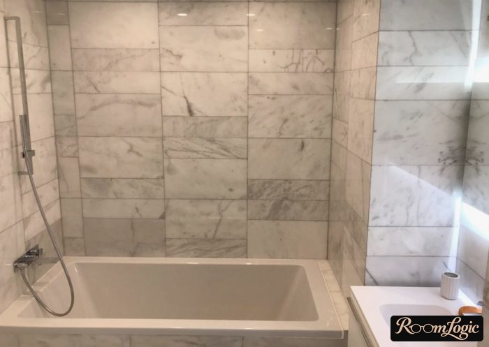
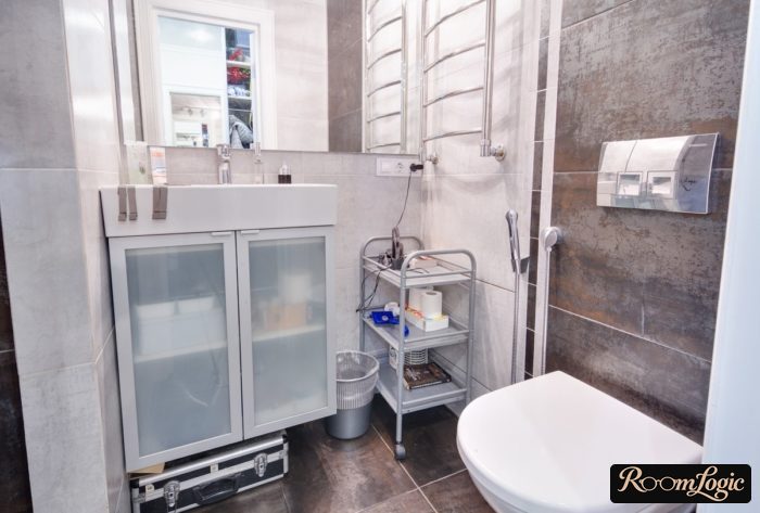
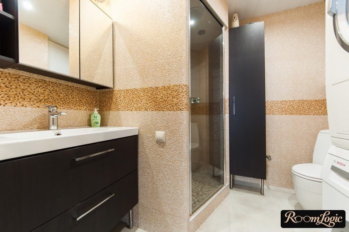
Pixel tile is very practical, although the visual design is a matter of taste:
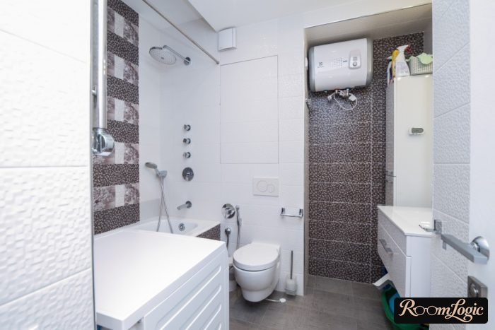
Or its beautiful contemporary relative with raised squares:
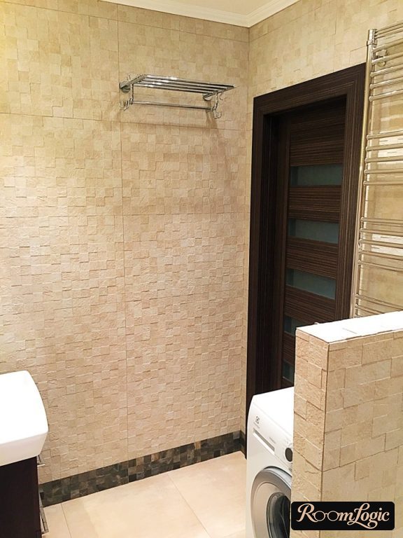
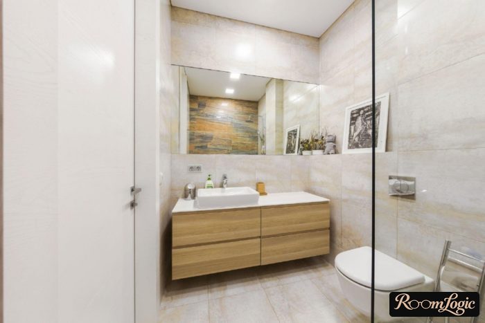
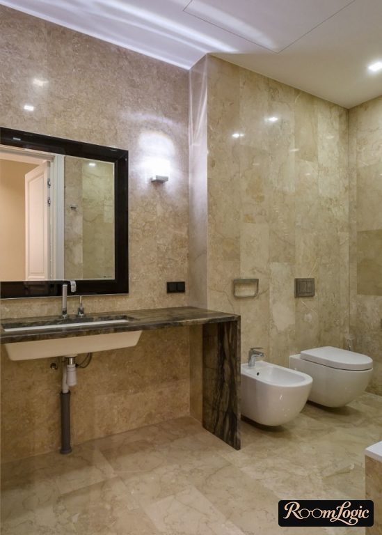
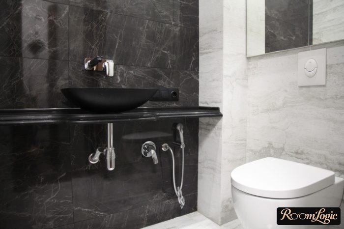
Tile imitating stone, marble, slate, and so on still works perfectly in a contemporary bathroom.
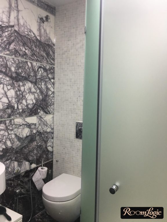
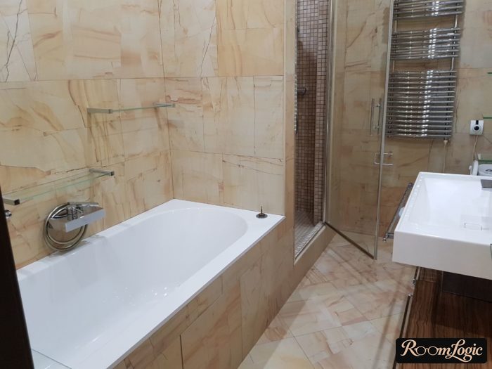
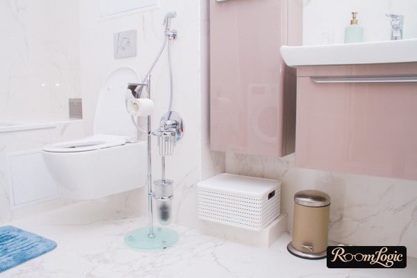
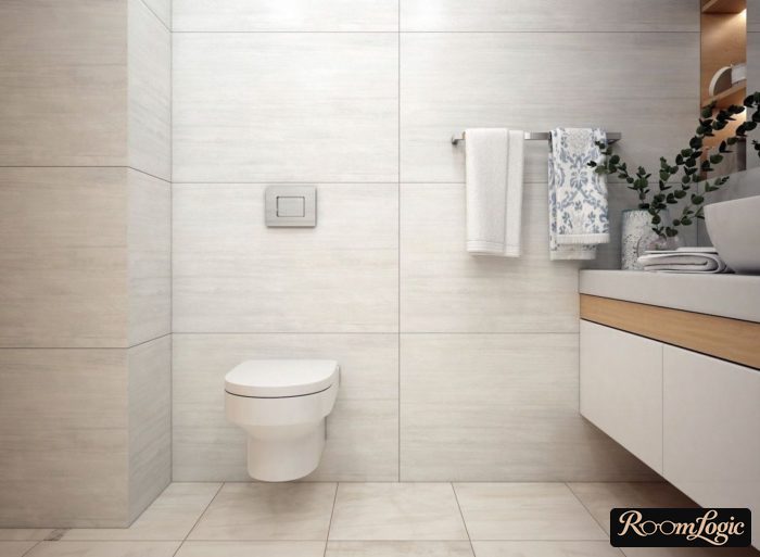
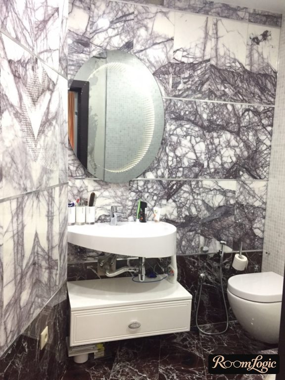
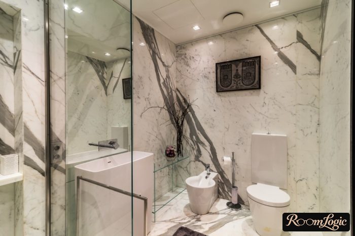
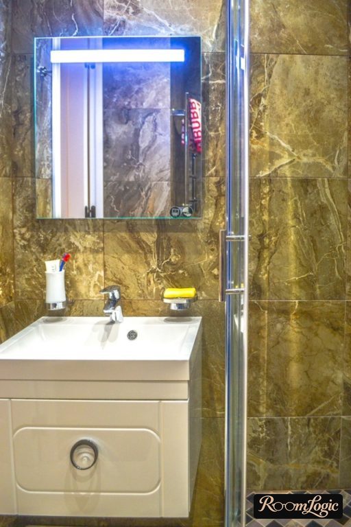
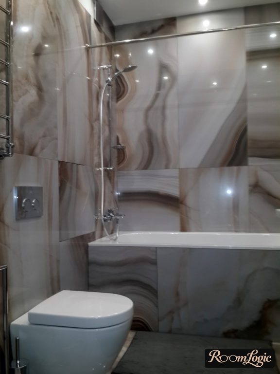
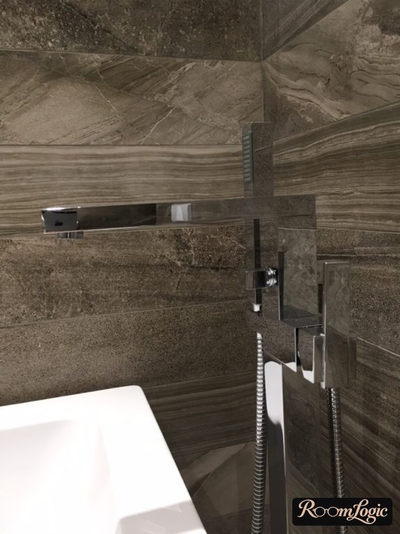
These are all the types of proper bathroom tile design. Everything below is a risk.
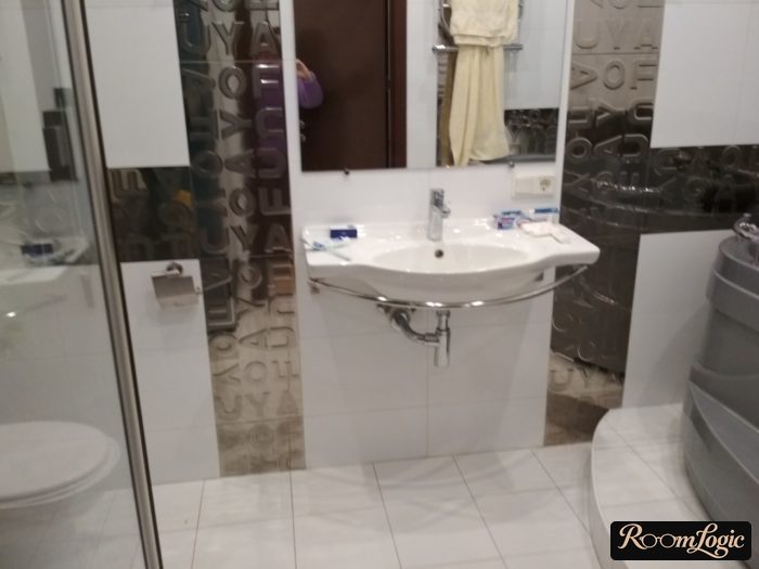
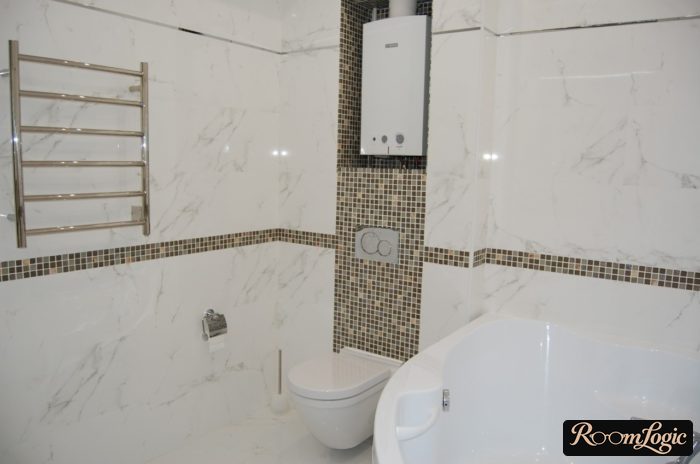
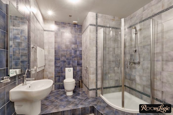
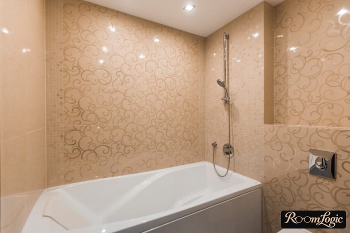
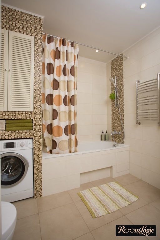
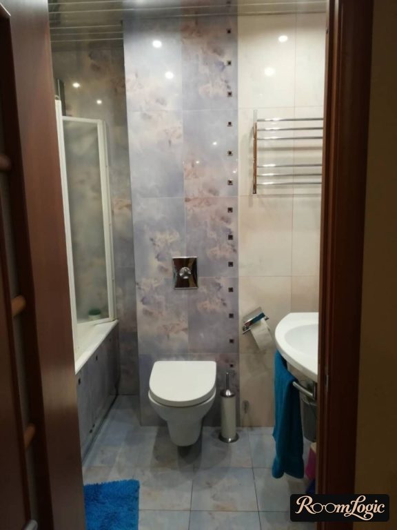
Risky design options include every glossy tile that imitates nothing, with glossy white subway tile as the only proven exception, and layouts or zoning that use mosaic. But that is at your own risk.
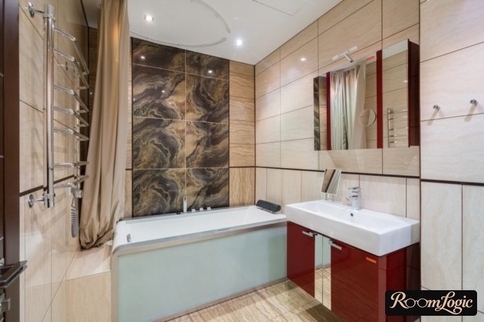
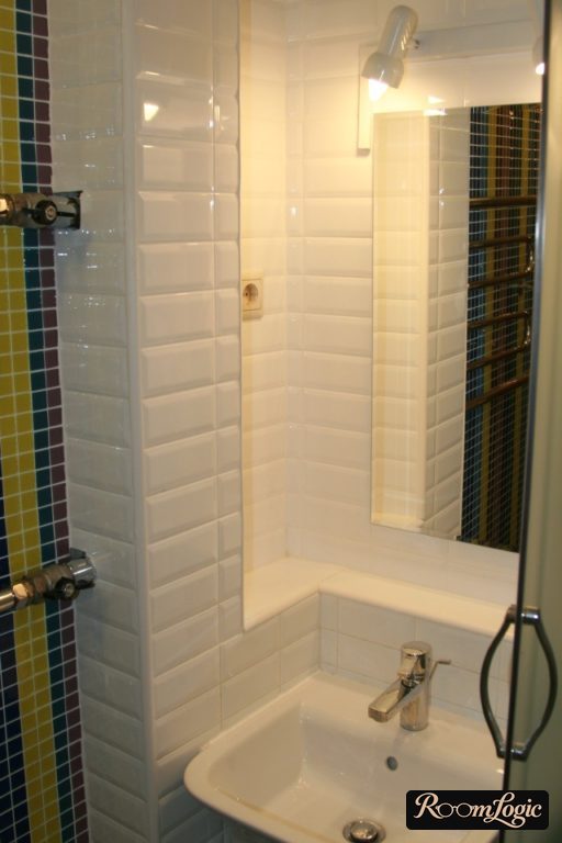
Texture
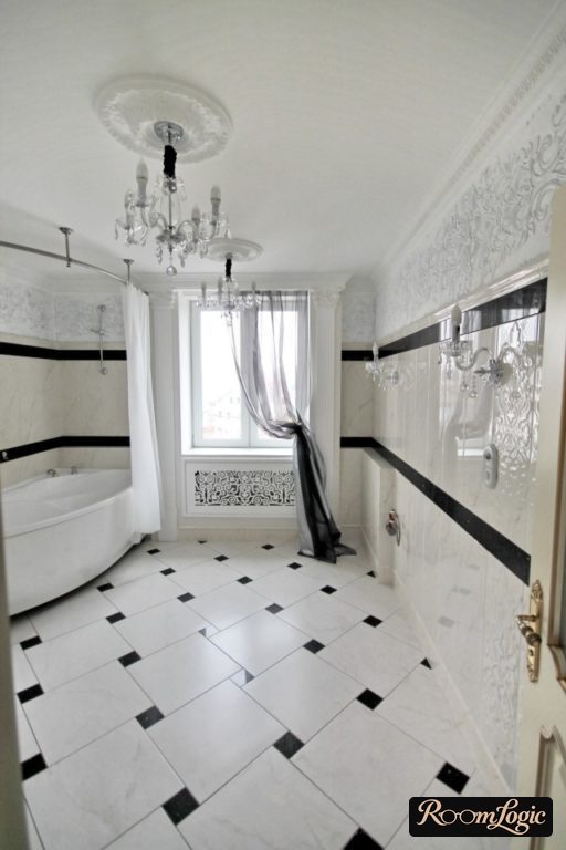
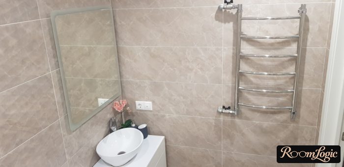
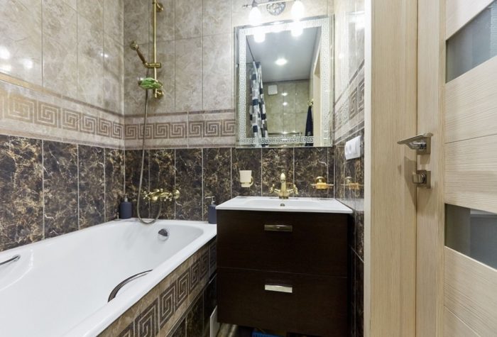
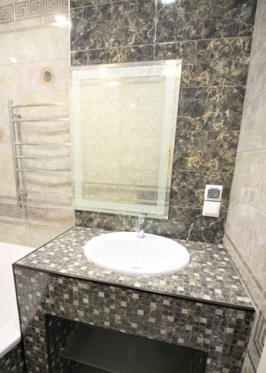
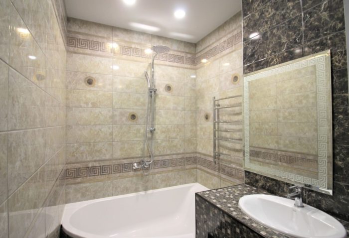
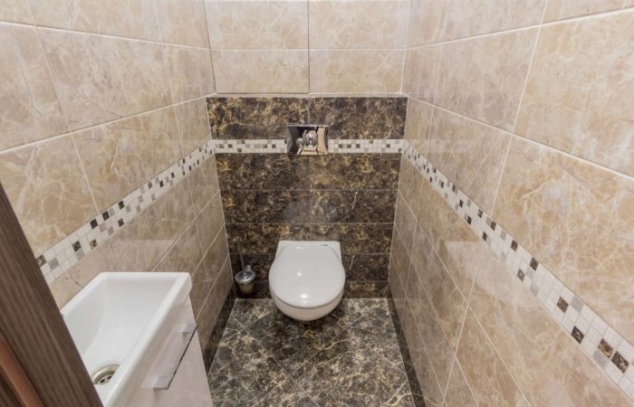
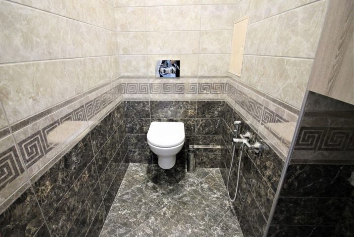
Besides white, only one kind of tile can have no texture: marble-look tile. It works in both contemporary and classic bathroom styles. But the main thing is to understand that marble is a risky option. It is hard to formalize what makes good marble-look tile. So let’s look at specific examples. A very bad imitation of marble:
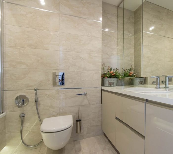
Normal:
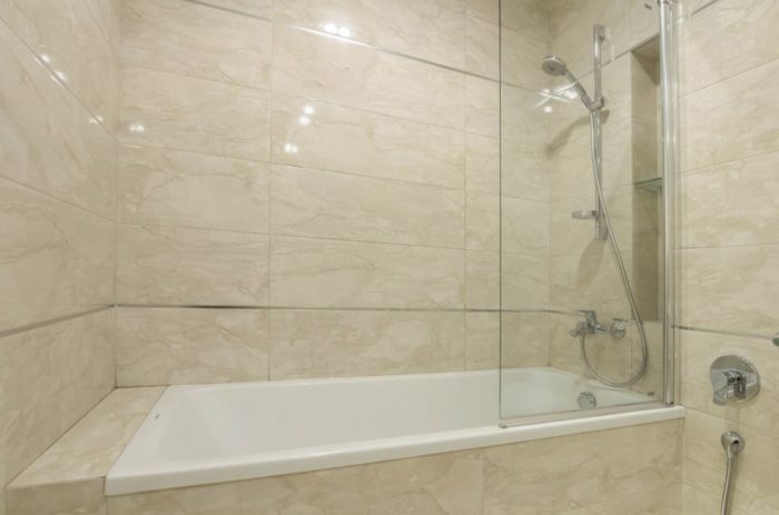
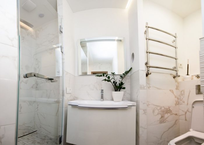
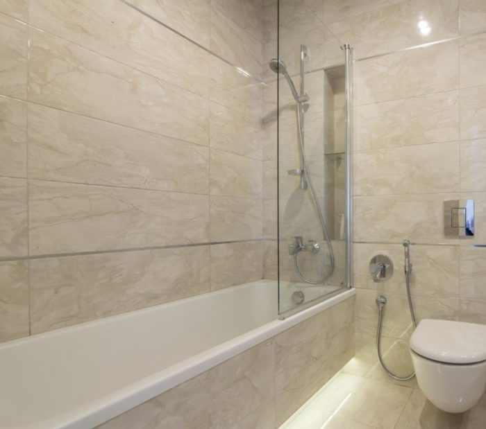
Great:
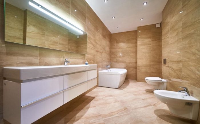
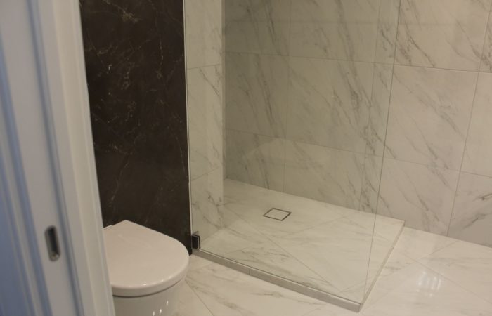
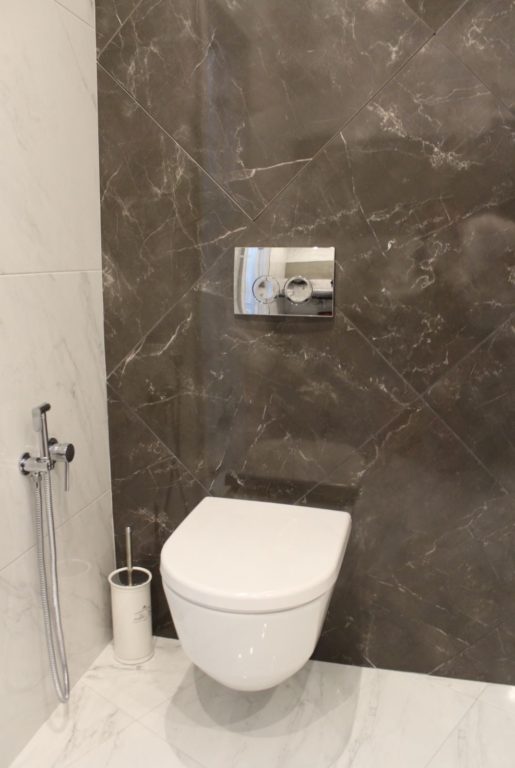
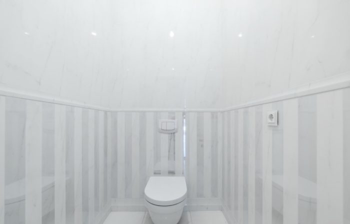
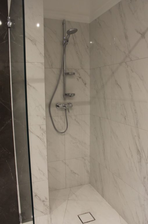
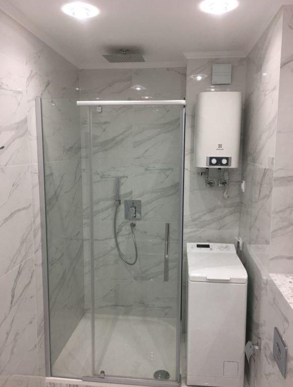
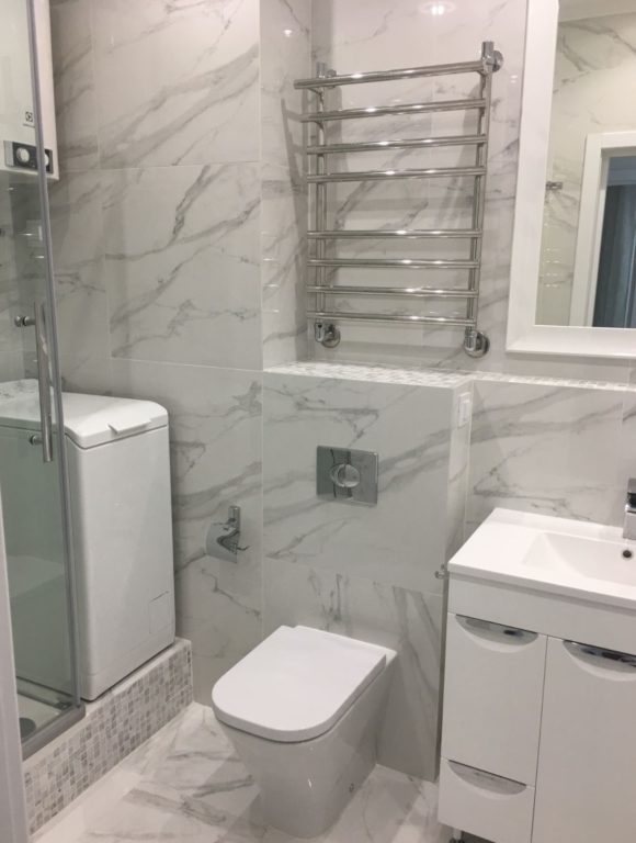
The line between bad and good marble-look tile is thin. If you are not sure, choose something else.
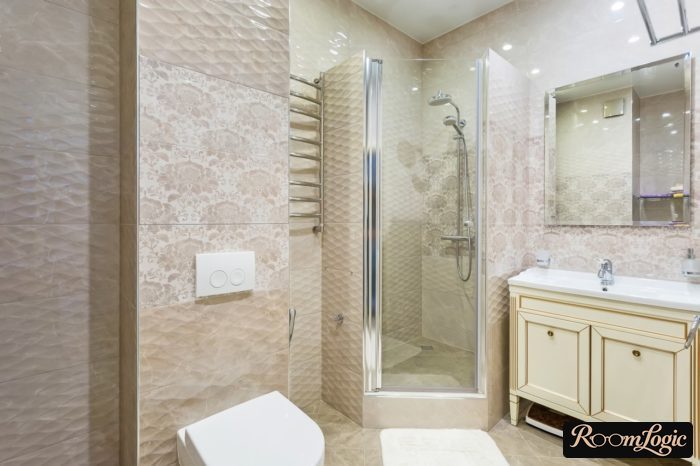
For imitations of every other material, the texture has to be reproduced along with the pattern. It is usually not as obvious on displays as it is after installation. Online photos also show texture very poorly. You need to see everything in person and be sure to touch it.
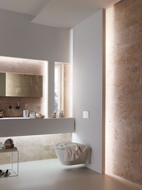
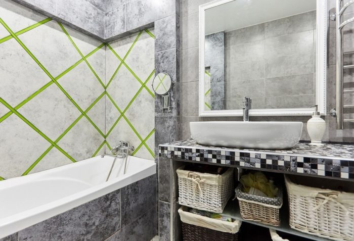
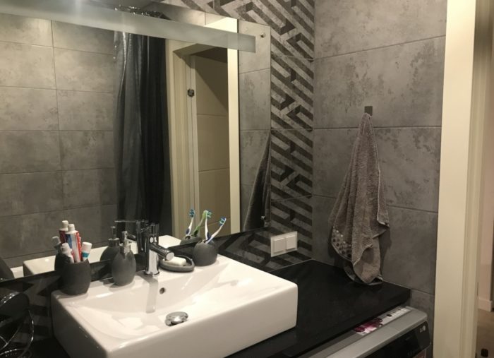
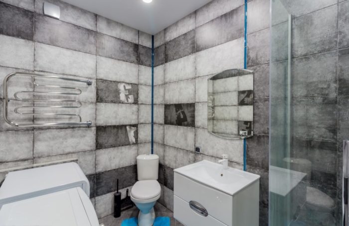
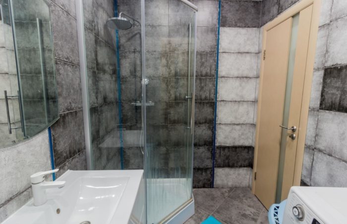
Concrete and wood are the strongest current tile designs. Concrete looks very cool in matte, although matte costs more, and wood works with deep texture. Because concrete is gray and uneven, it is very practical even without texture, and water spots do not show on it. Let’s look at gray tile in real photos.
Expensive matte concrete-look tile:
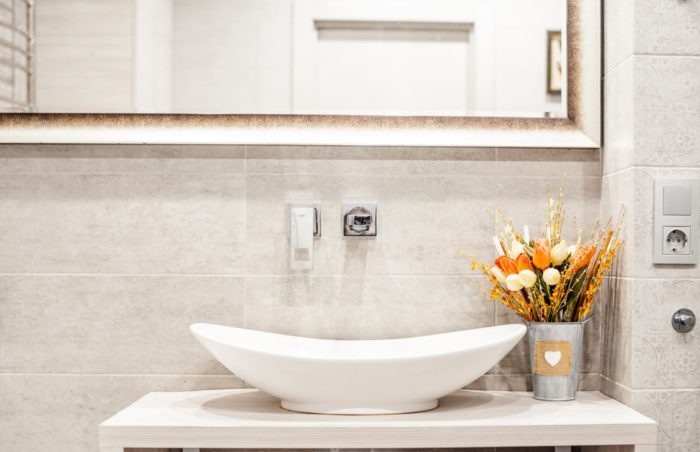
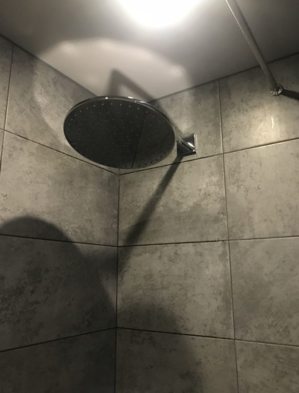
Mid-priced gray tile without texture from the shower bathroom in the first section:
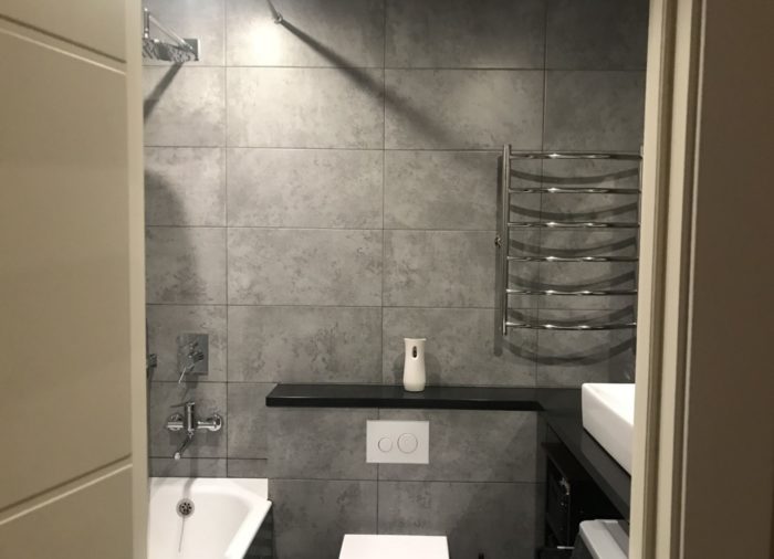
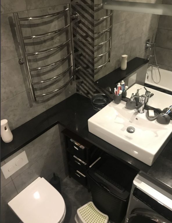
And several budget options from the Belarusian manufacturer Keramin:
Color
A bathroom has a lot of water. When water dries, it leaves white spots from the minerals dissolved in it. No reasonable filter option will eliminate this completely. Trust my experience. To keep beautiful tile looking good beyond the showroom:
The standard bathroom tile colors are light. Otherwise, there will be constant white spots.
And two more hard facts:
- Neutral colors are enough for a stylish bathroom design that is not boring.
- Almost all colored tile is terrible.
This is especially true in a small bathroom interior. To prove immediately that even a bathroom completely finished in gray tile can be cool and not boring, here is a photo:
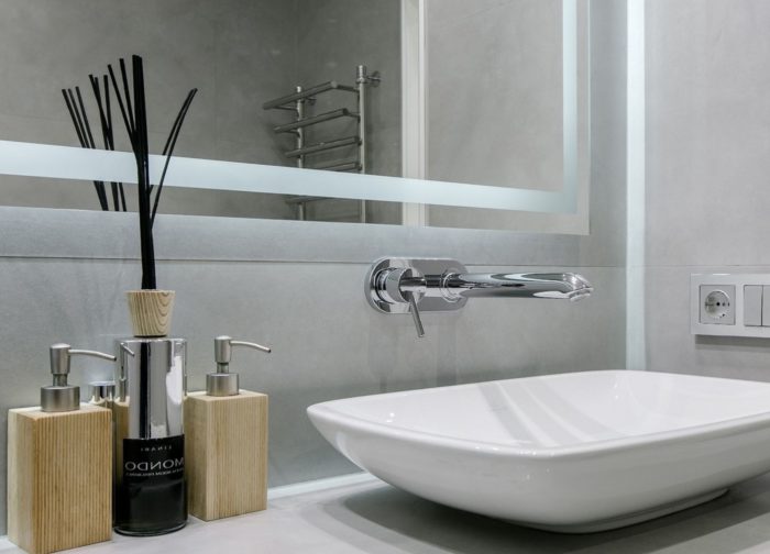
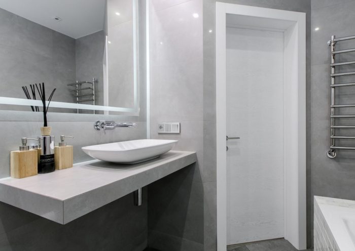
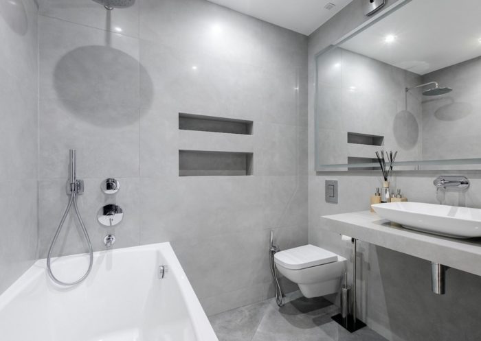
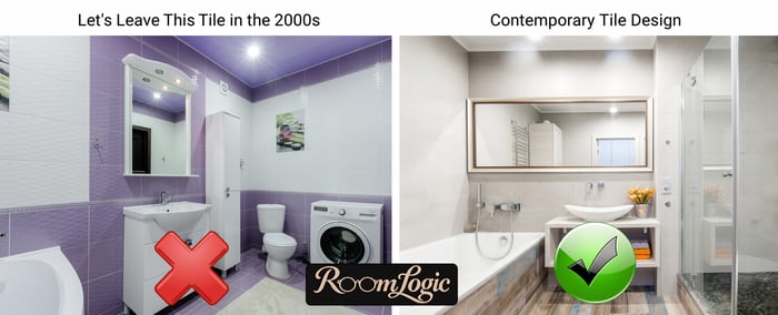
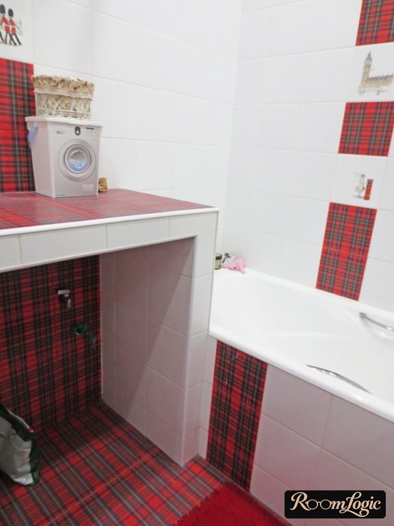
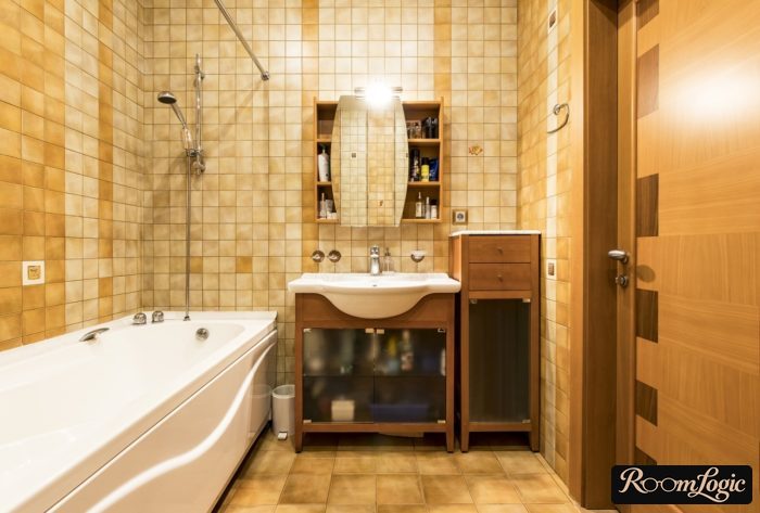
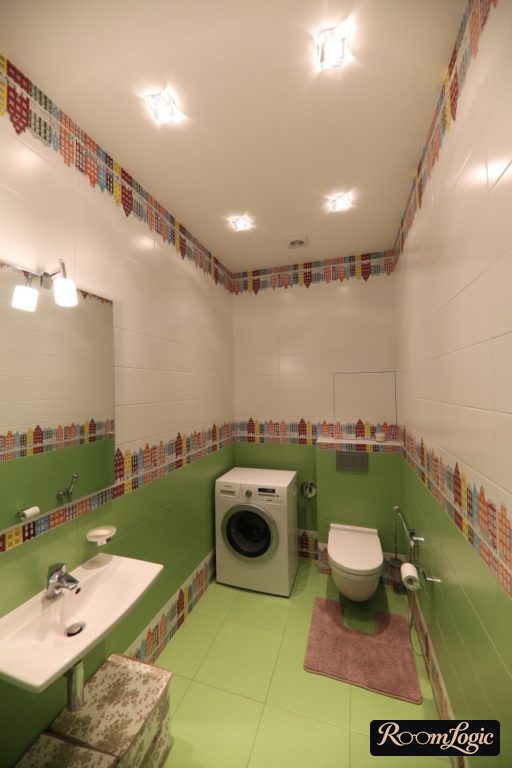
Colored tile design is very difficult because almost all of it is junk that cannot be saved by a perfect layout or any other tricks. But there are rare exceptions. That is why any colored tile is a risk. Sometimes it can work well, but it requires a sense of taste and proportion and very careful selection. Colored bathroom tile when it works and when it does not – the line is very thin:
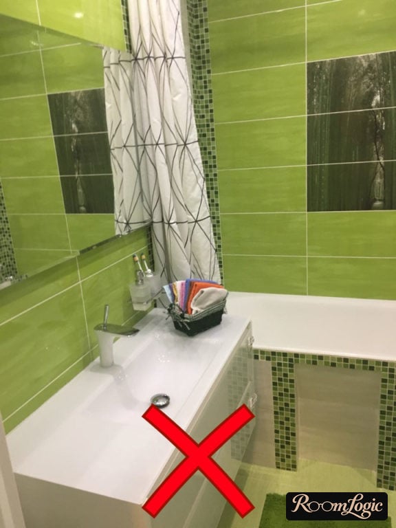
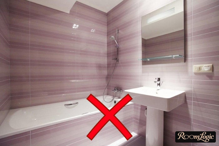
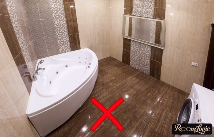
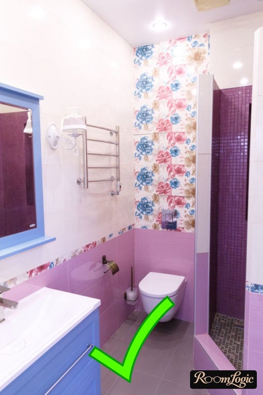
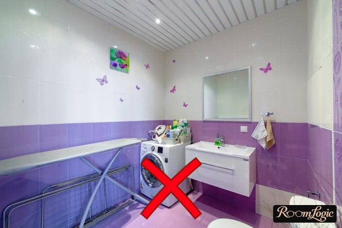
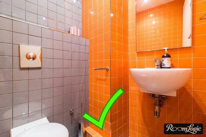
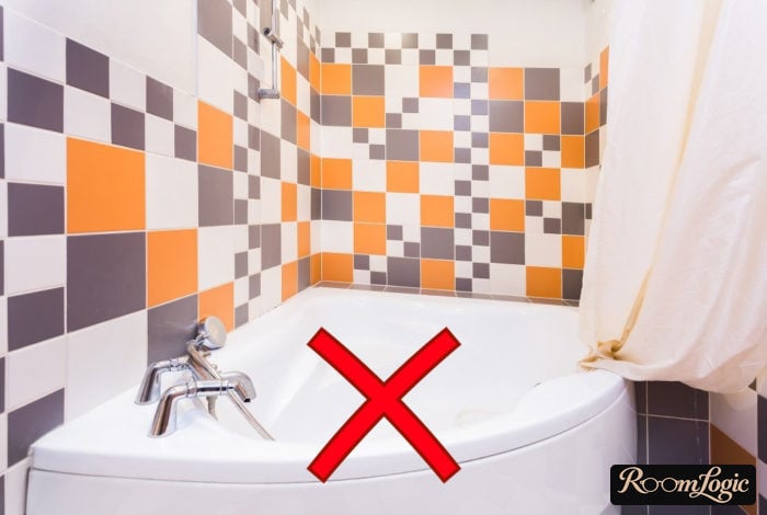
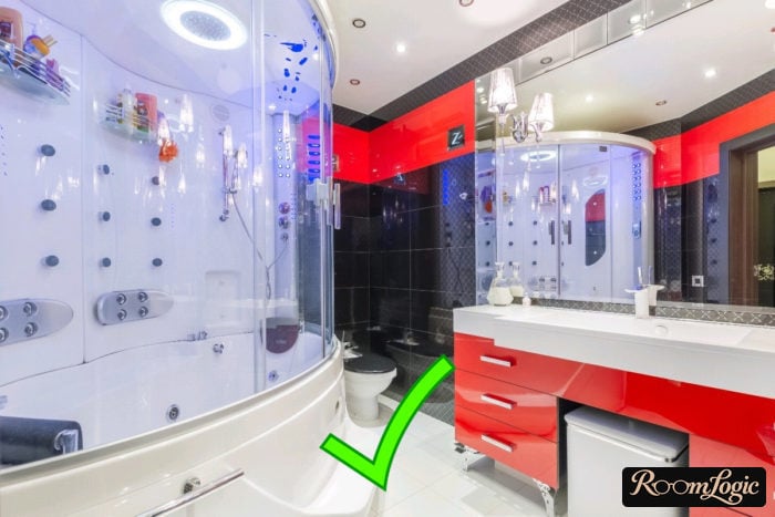
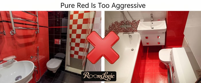
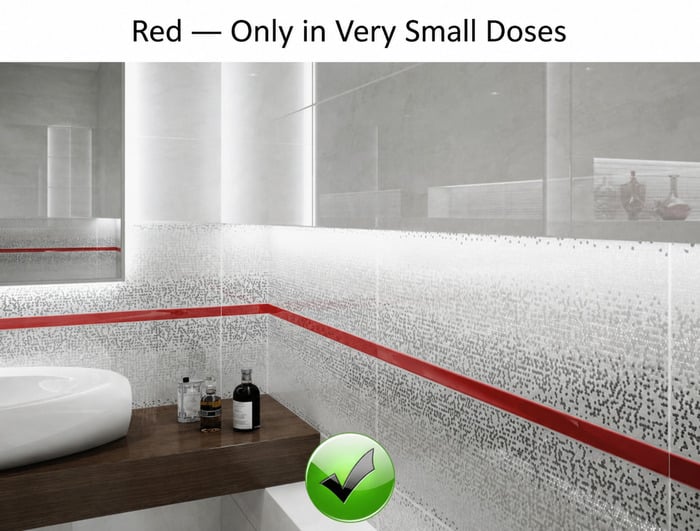
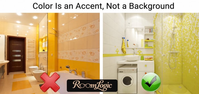
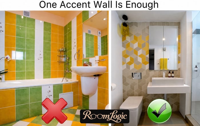
But even decent colored tile should be an accent, not the main tile. The main color should always be neutral. Aggressive colors such as red, pink, purple, and green should never dominate. In short, the same rules described in the article about color combinations, including why pure red is almost impossible to fit properly into an interior.
Photo examples of using colored tile correctly and incorrectly:
And a bonus for anyone who read to the end. When choosing tile design, use the free design services offered by some tile showrooms. Do not be shy about asking a consultant to make a free model of the room with the tile layout. This can protect you from mistakes when combining several collections and help you plan and minimize cuts. It does not obligate you to buy the tile. Good luck with your remodel!